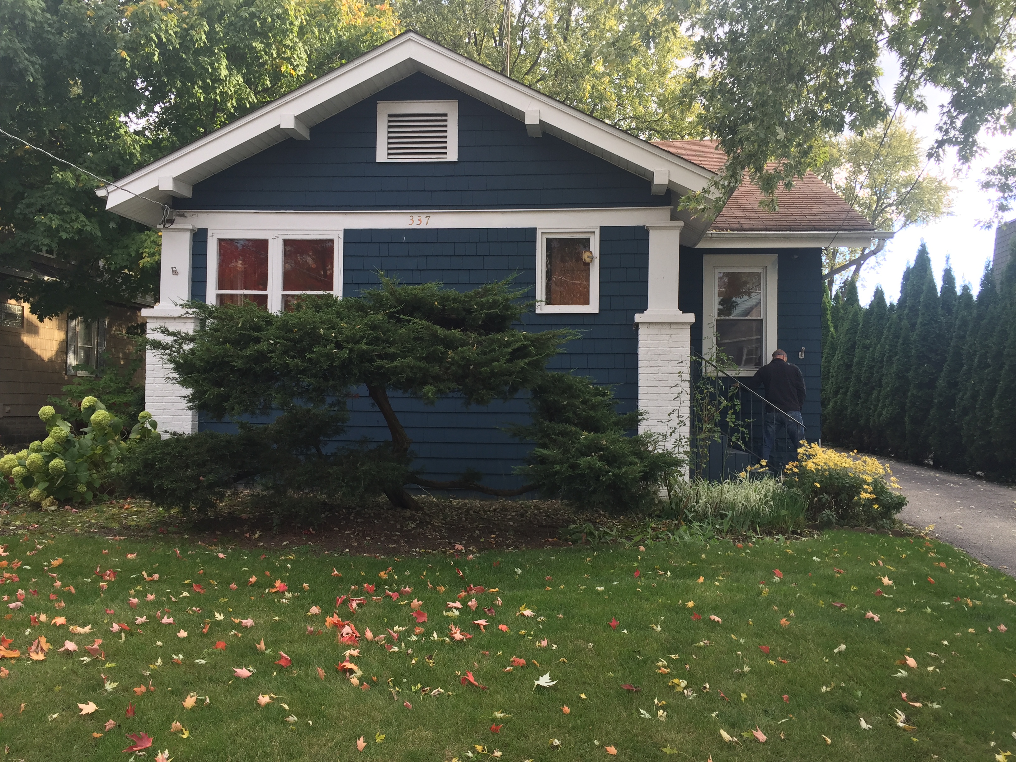
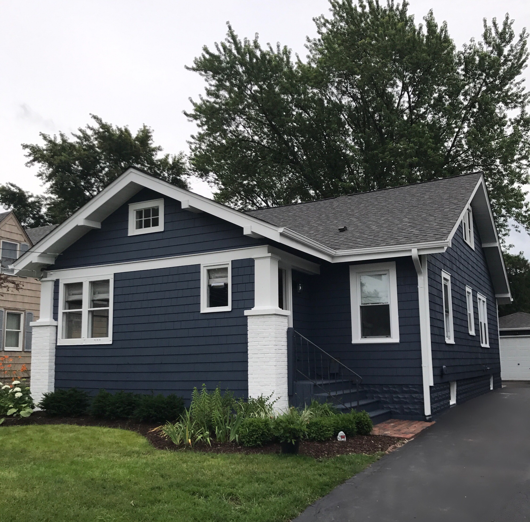
Last October, I shared a new “flip” property that we purchased— a 1931 Montgomery Ward home in our old neighborhood that had so much charm but needed to be brought back to life.
After a pretty grueling 7-month renovation, we sold it in May (to our good friends actually), and now here is the finished tour!
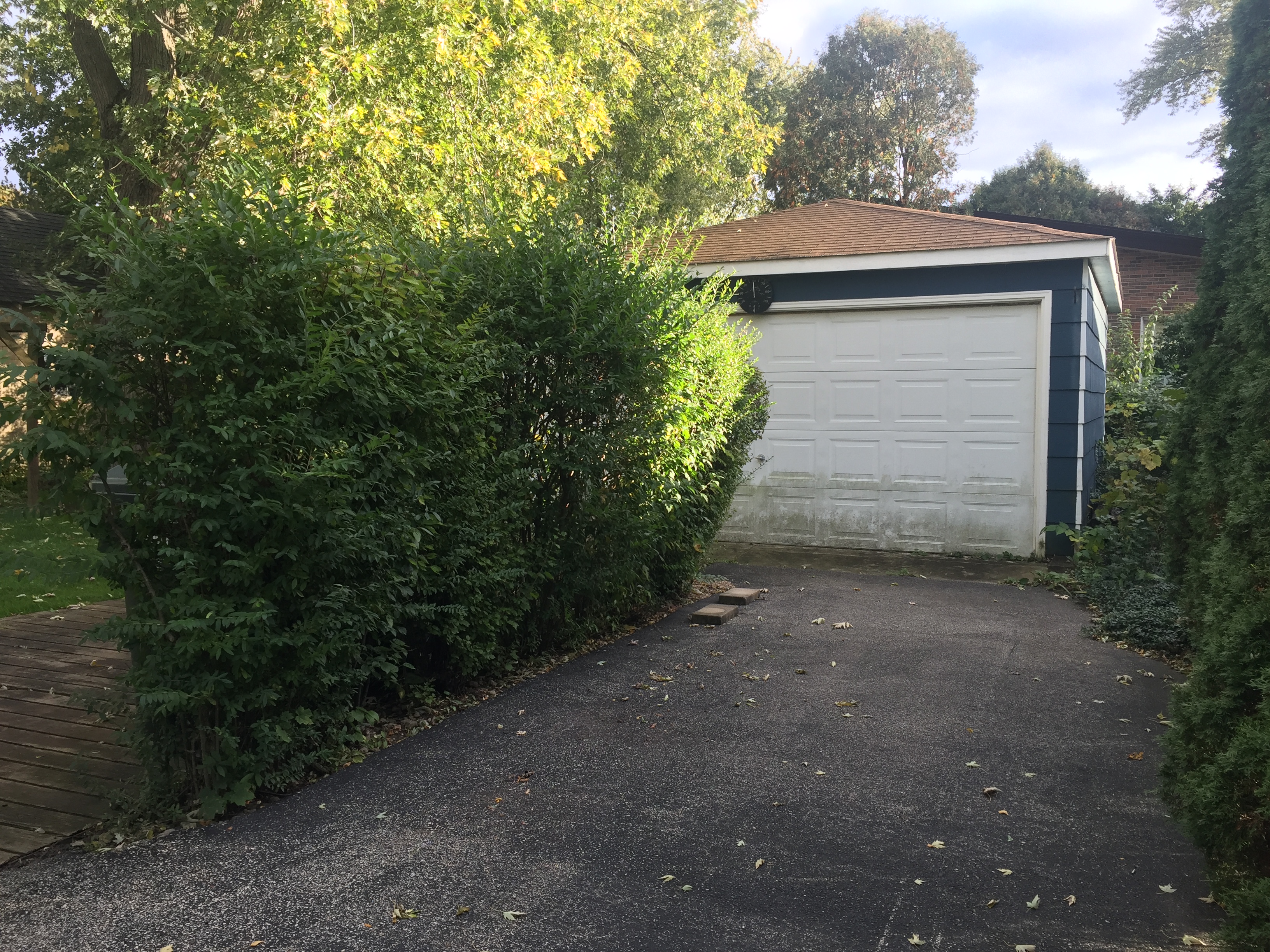
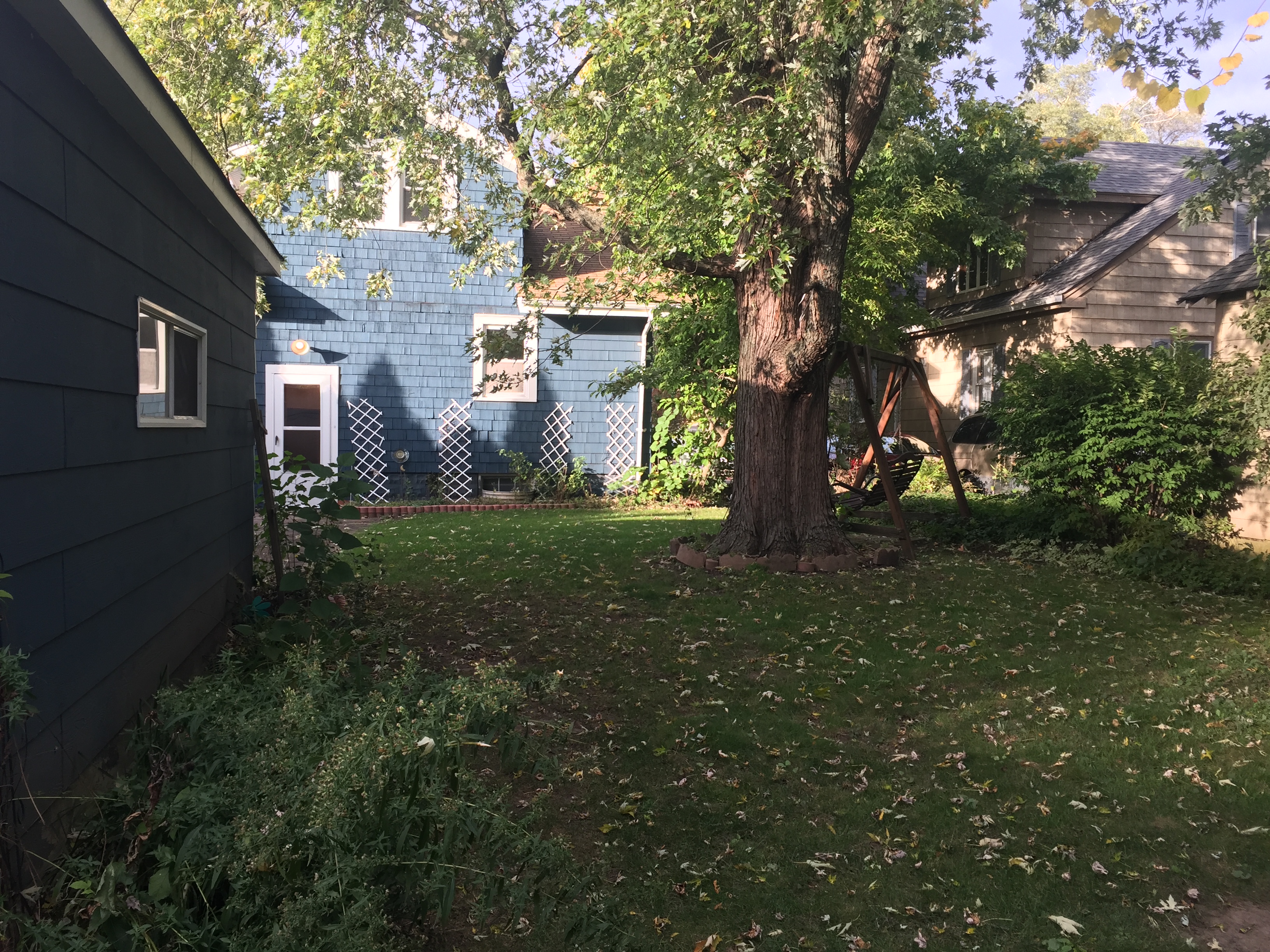
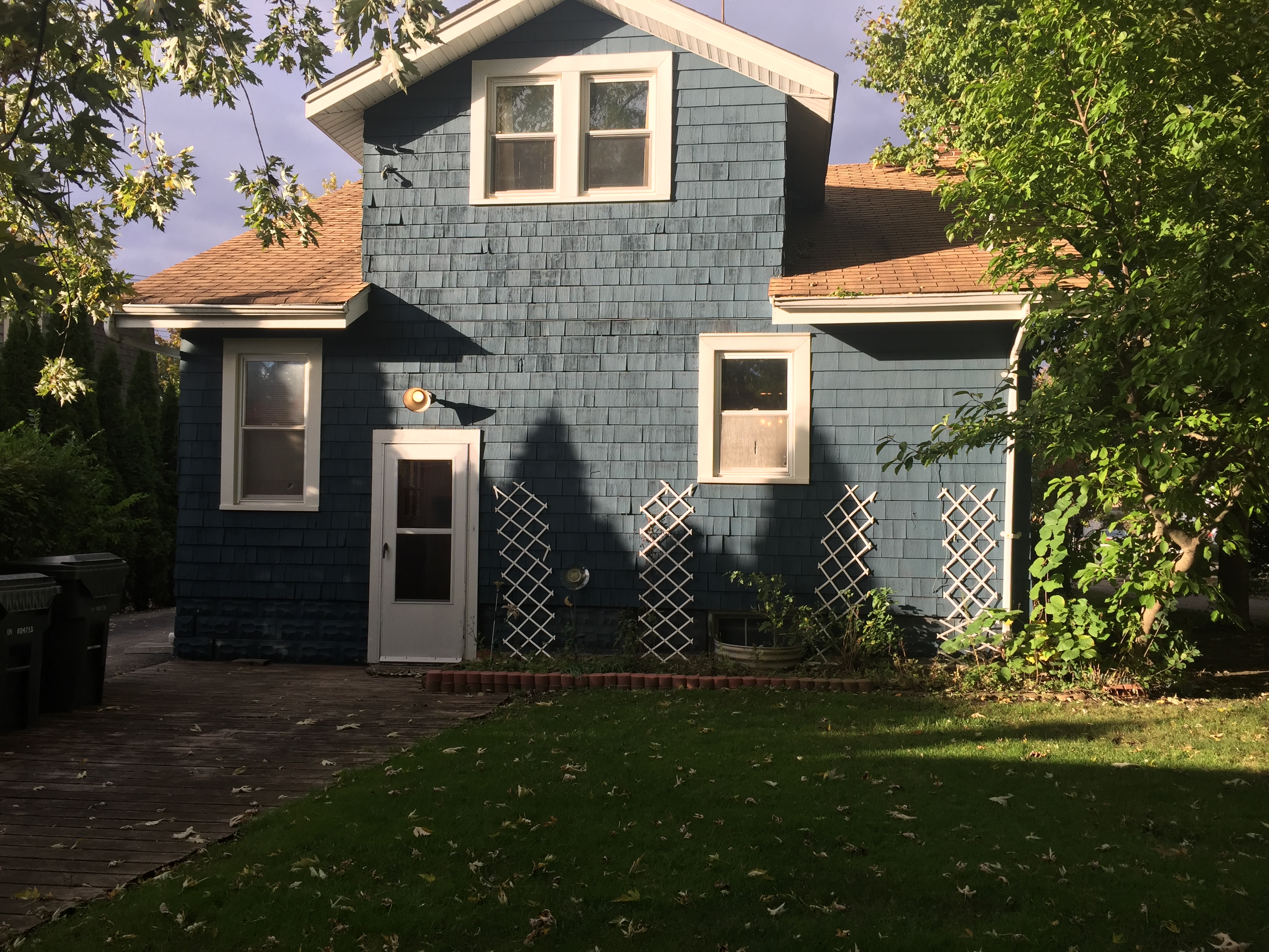
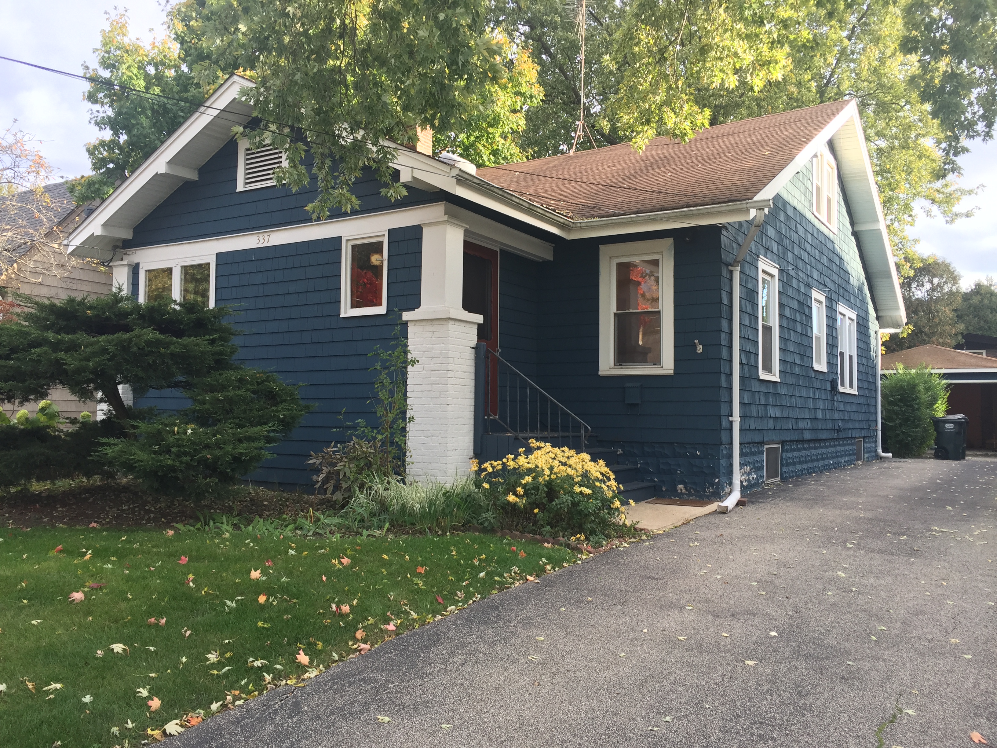
And after a new roof, landscaping, front door, paint (Benjamin Moore Evening Dove), new window on the gable, and fresh asphalt on the driveway:
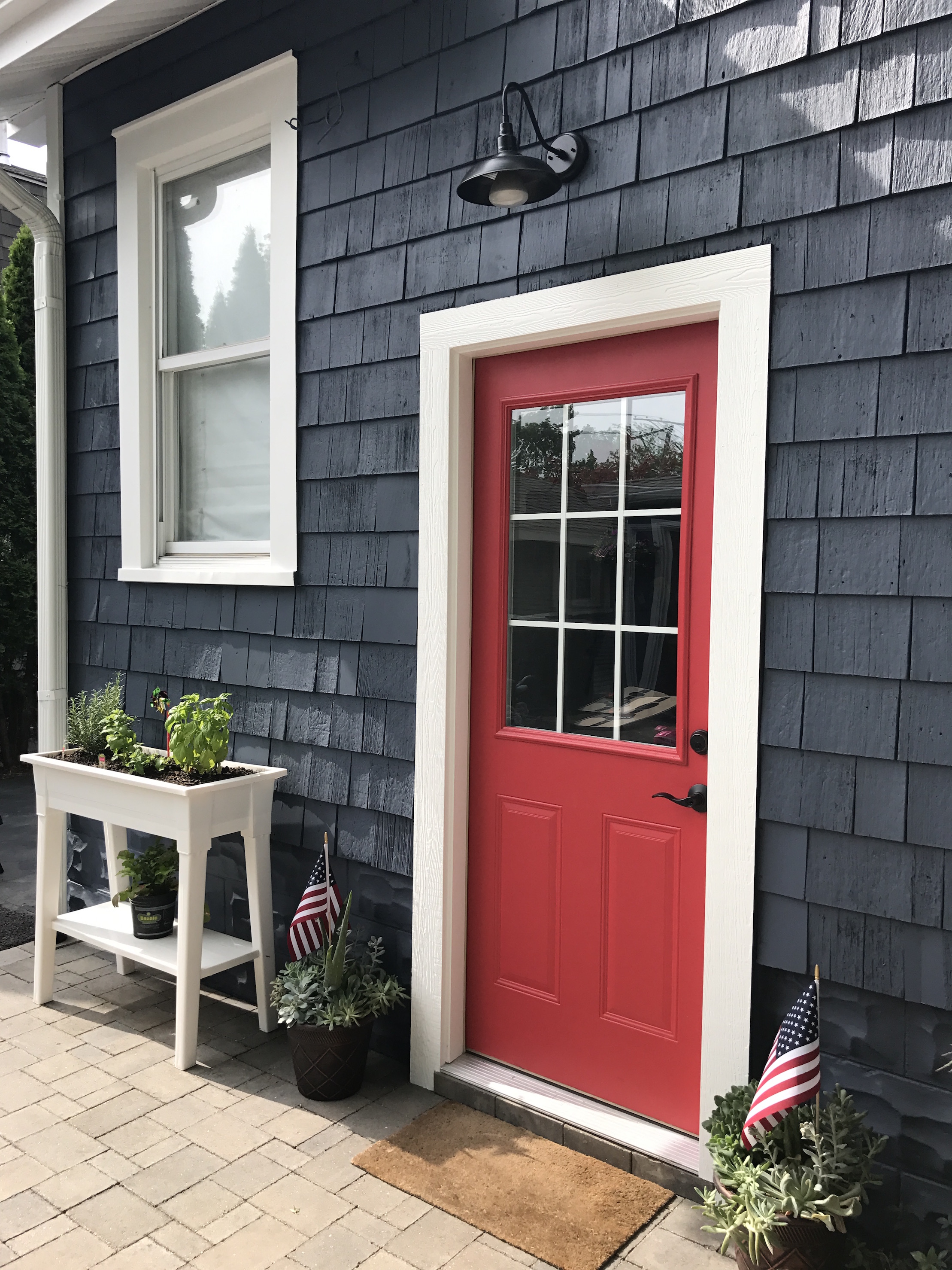
The homeowners choose this fun Poppy color for the front and back doors!
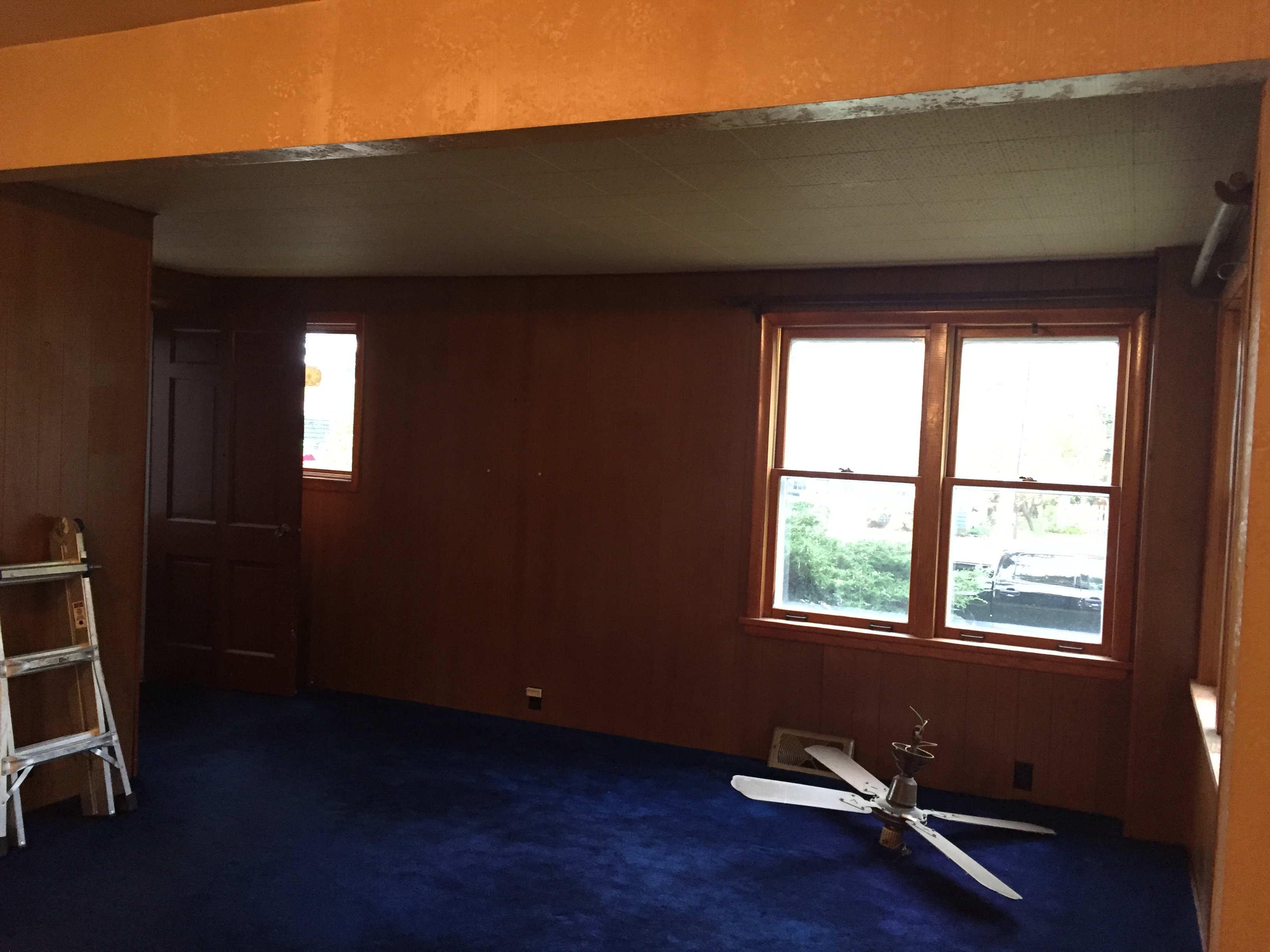
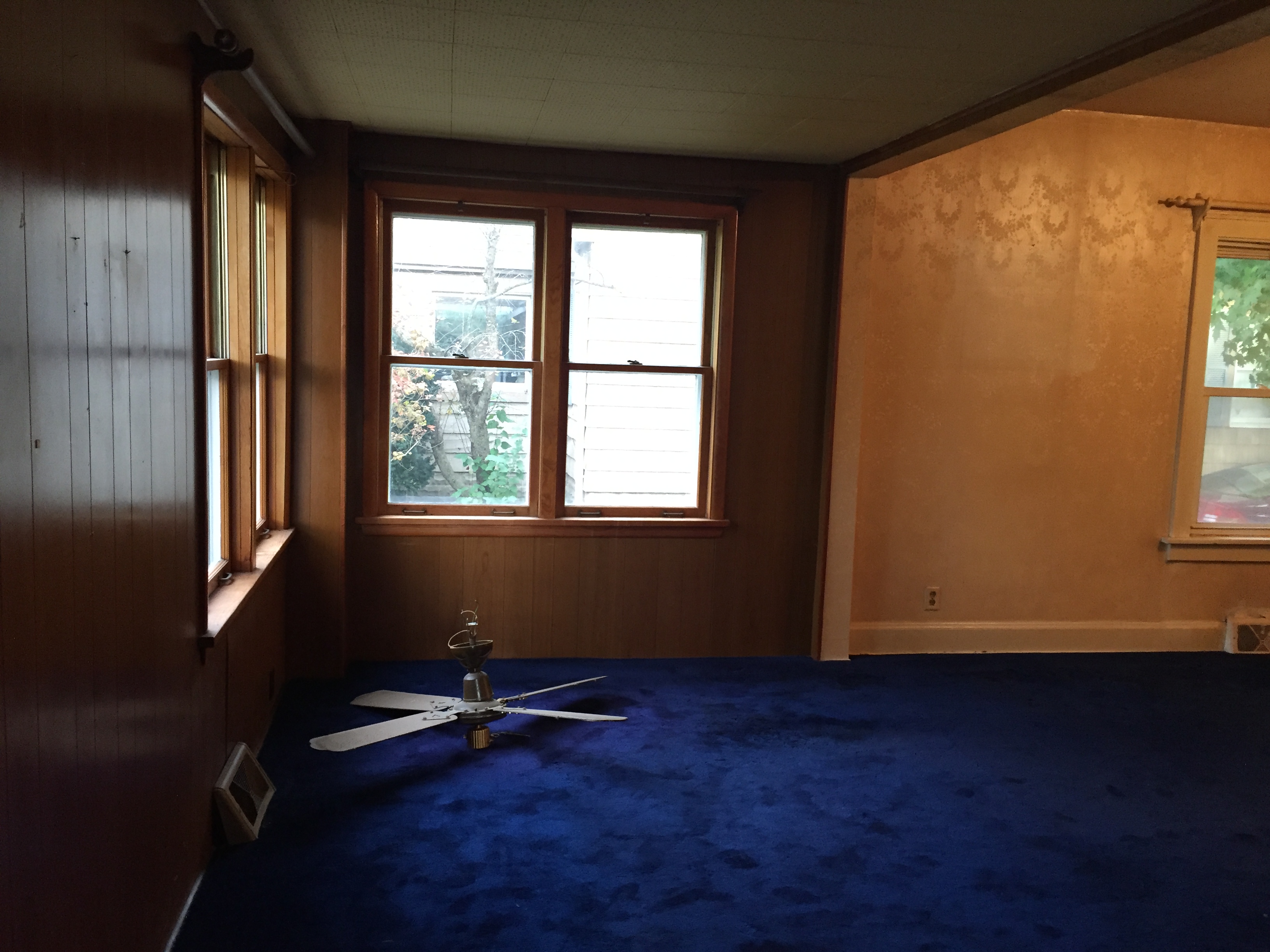
Moving inside, here was the old front room (it used to be a front porch).
And now after opening up the ceiling to create a cathedral ceiling with beadboard, a new chandelier, drywall, paint, stain and more:
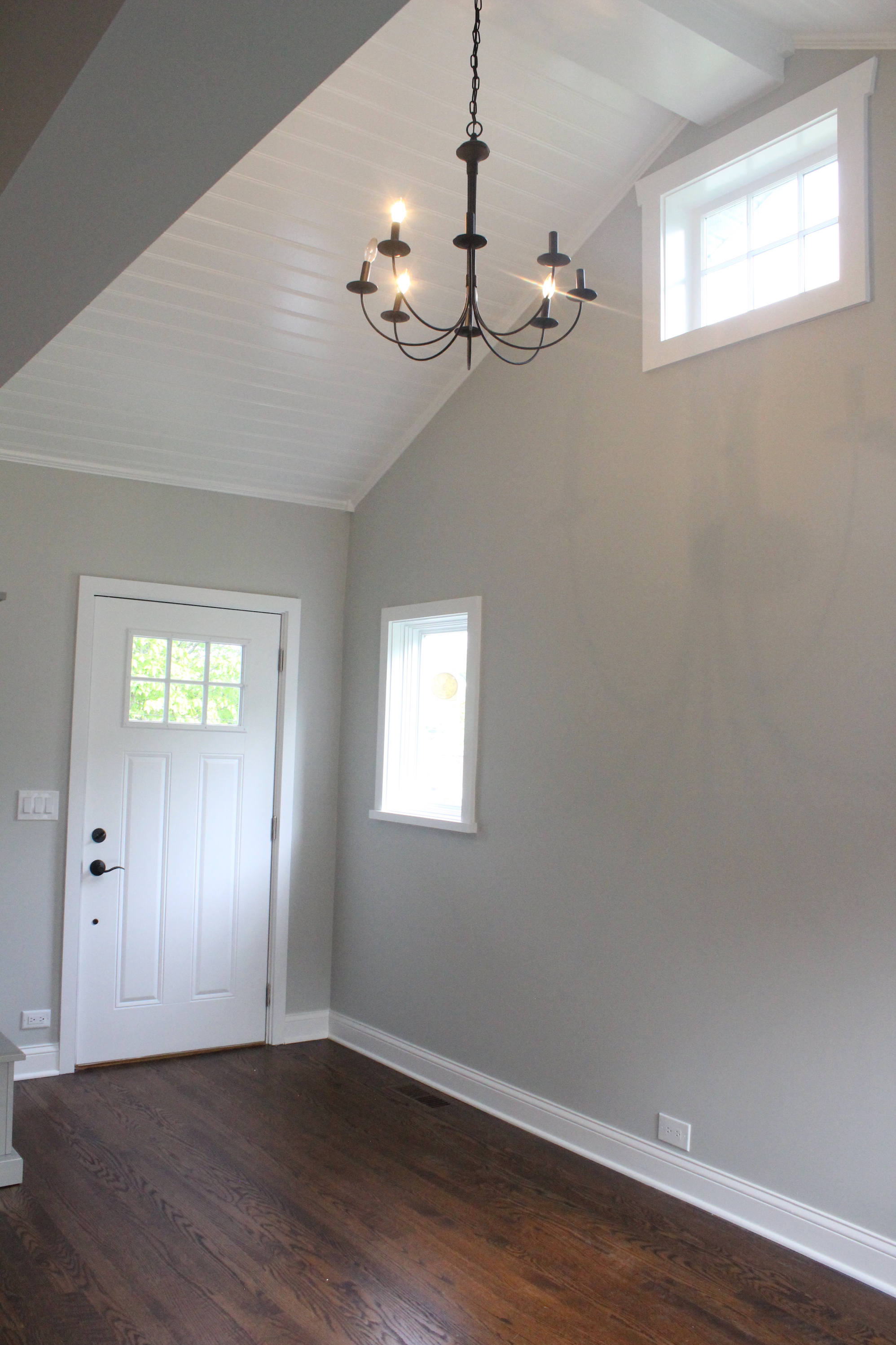 Unrecognizable, right?
Another before shot:
And after:
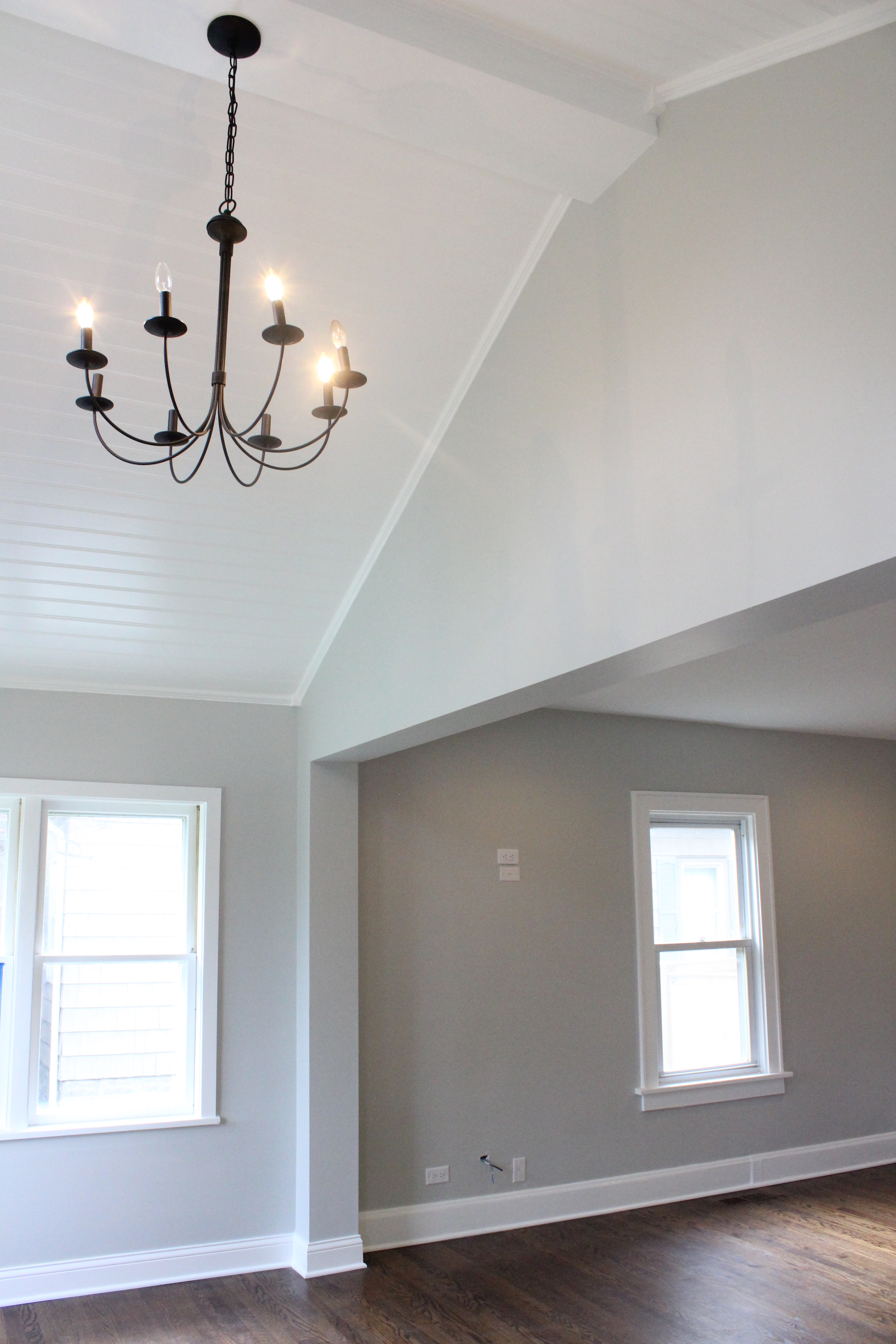
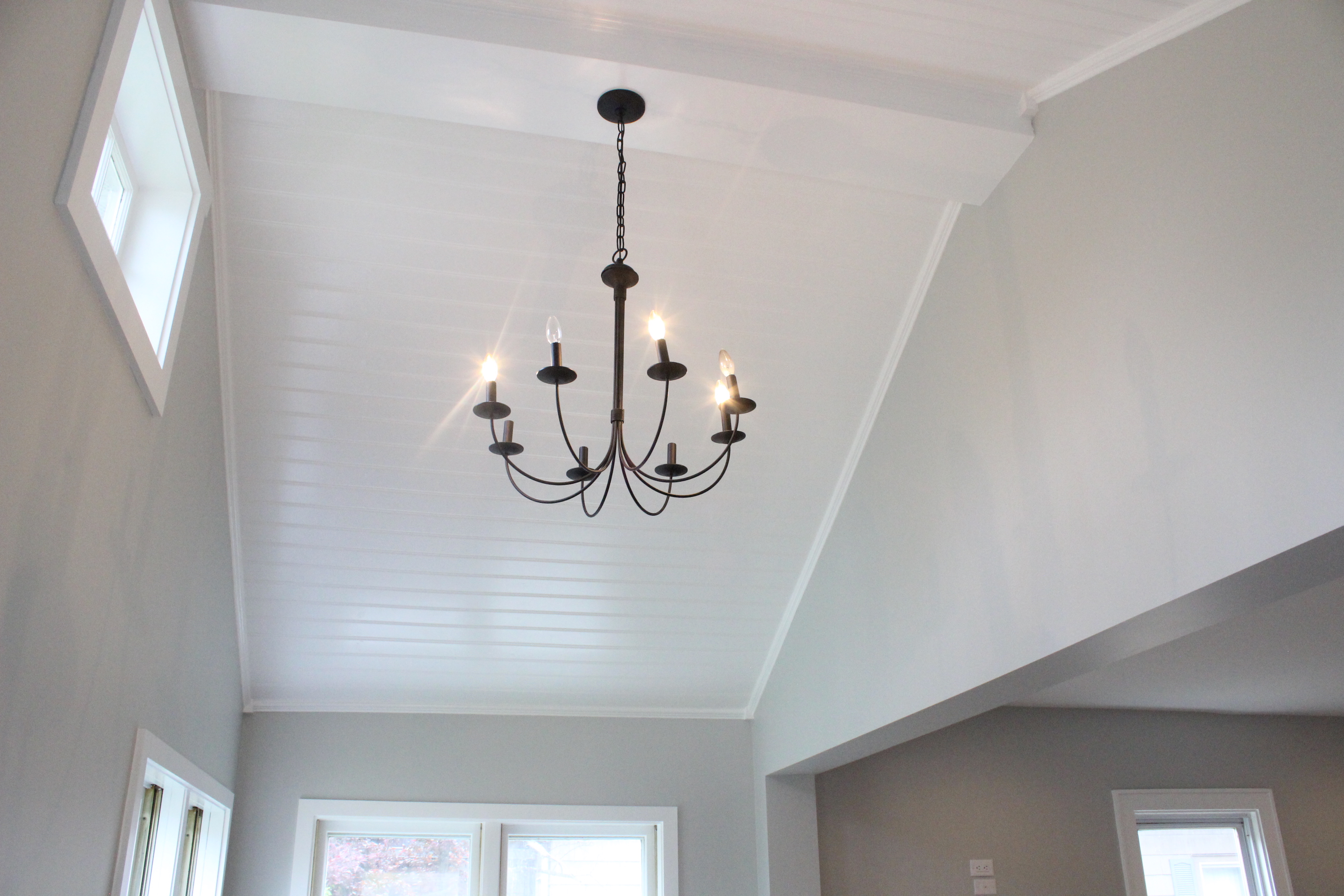
The beadboard ceiling and chandelier is probably my favorite part of the whole house. Such a huge transformation!
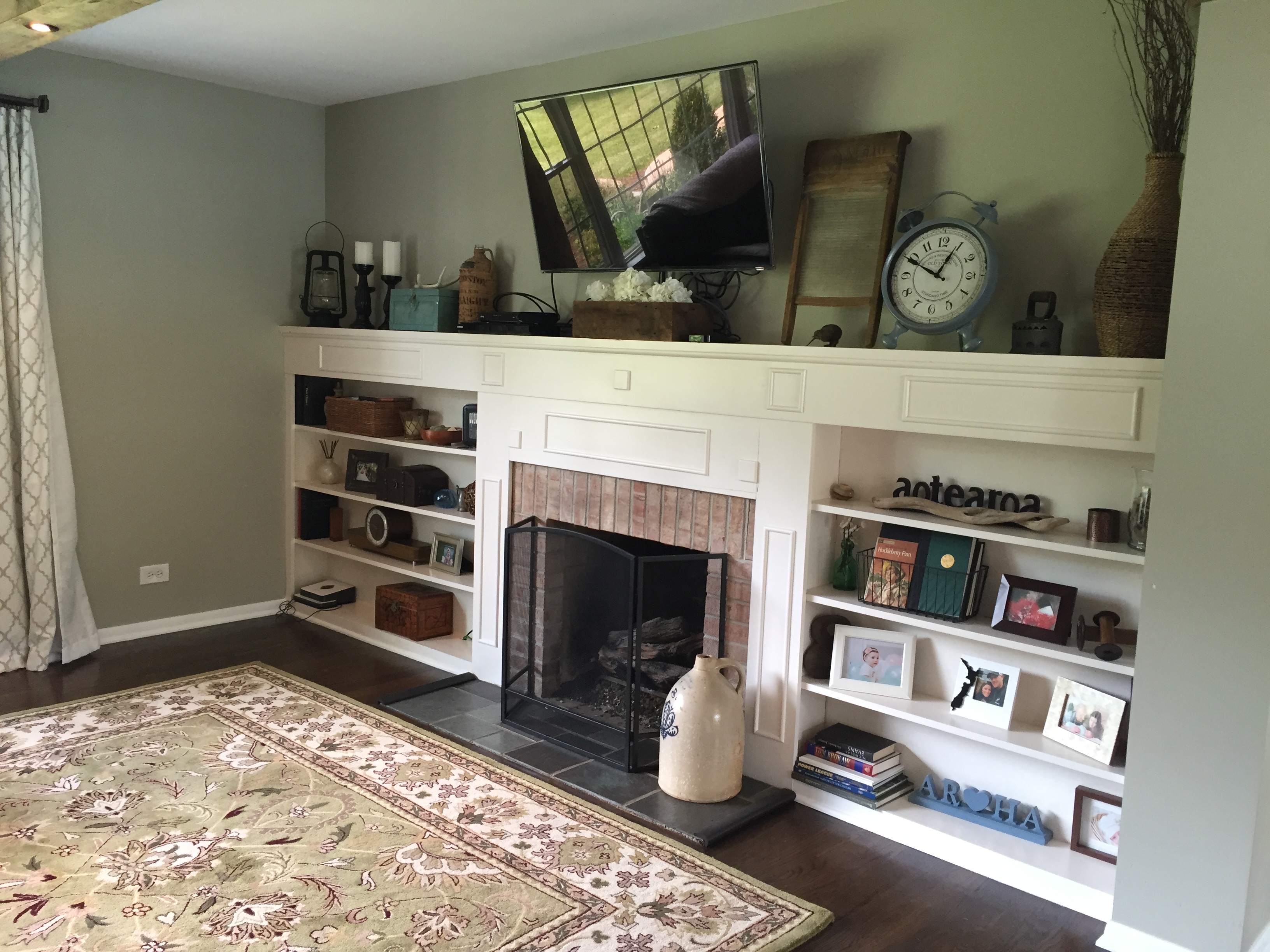
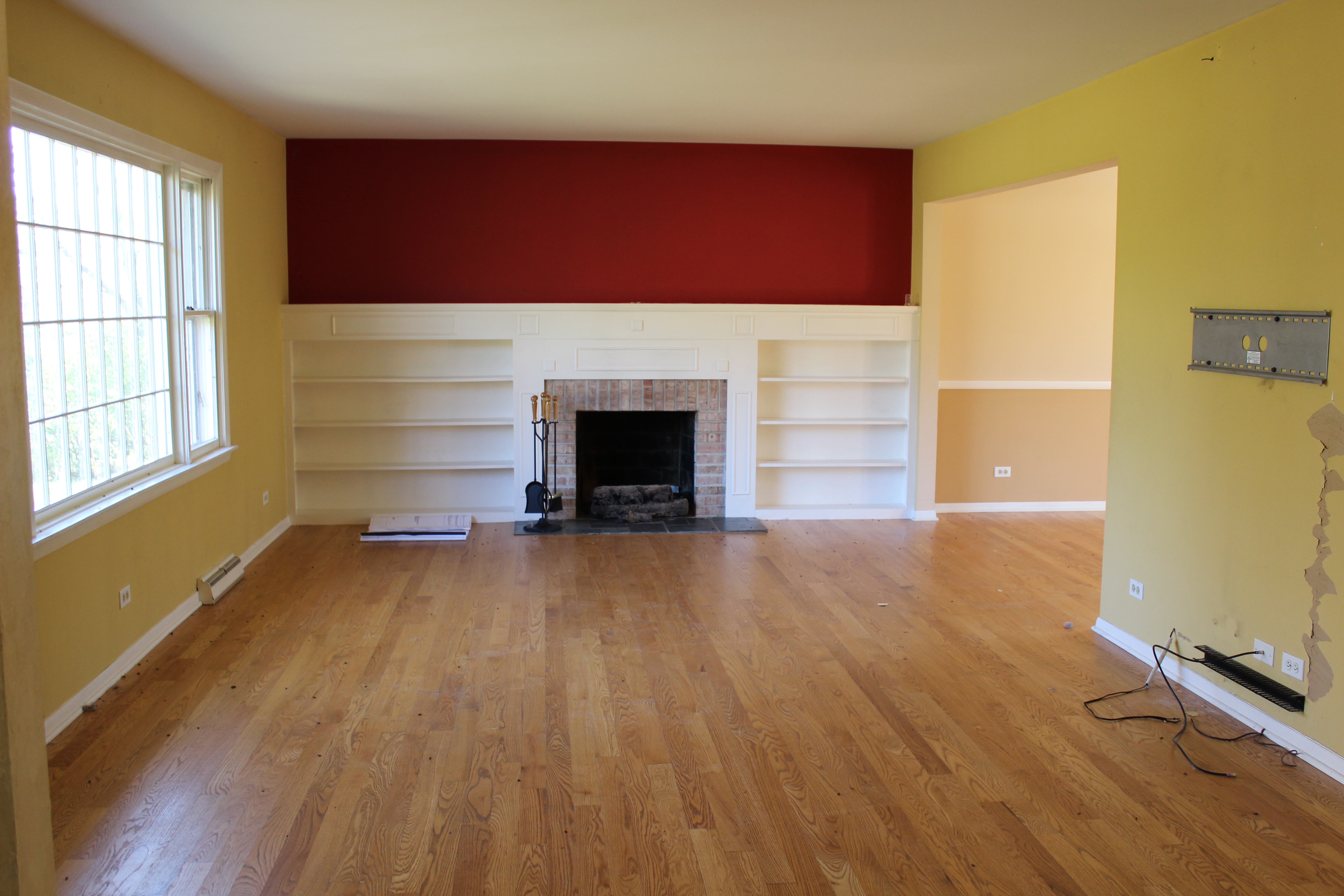
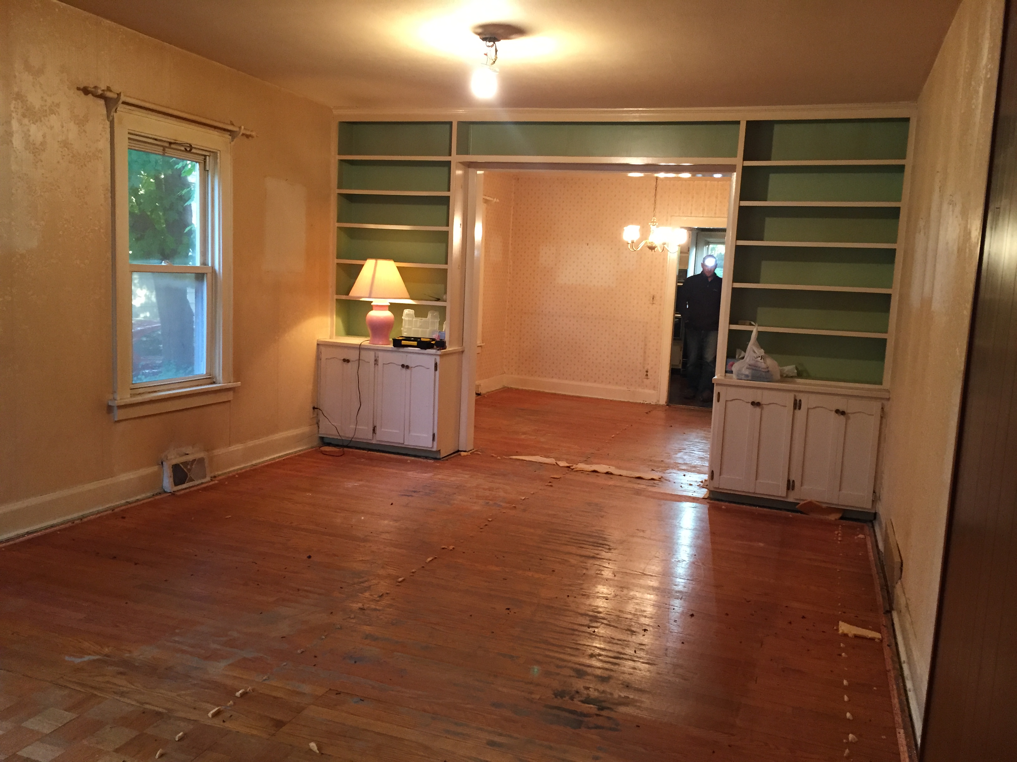
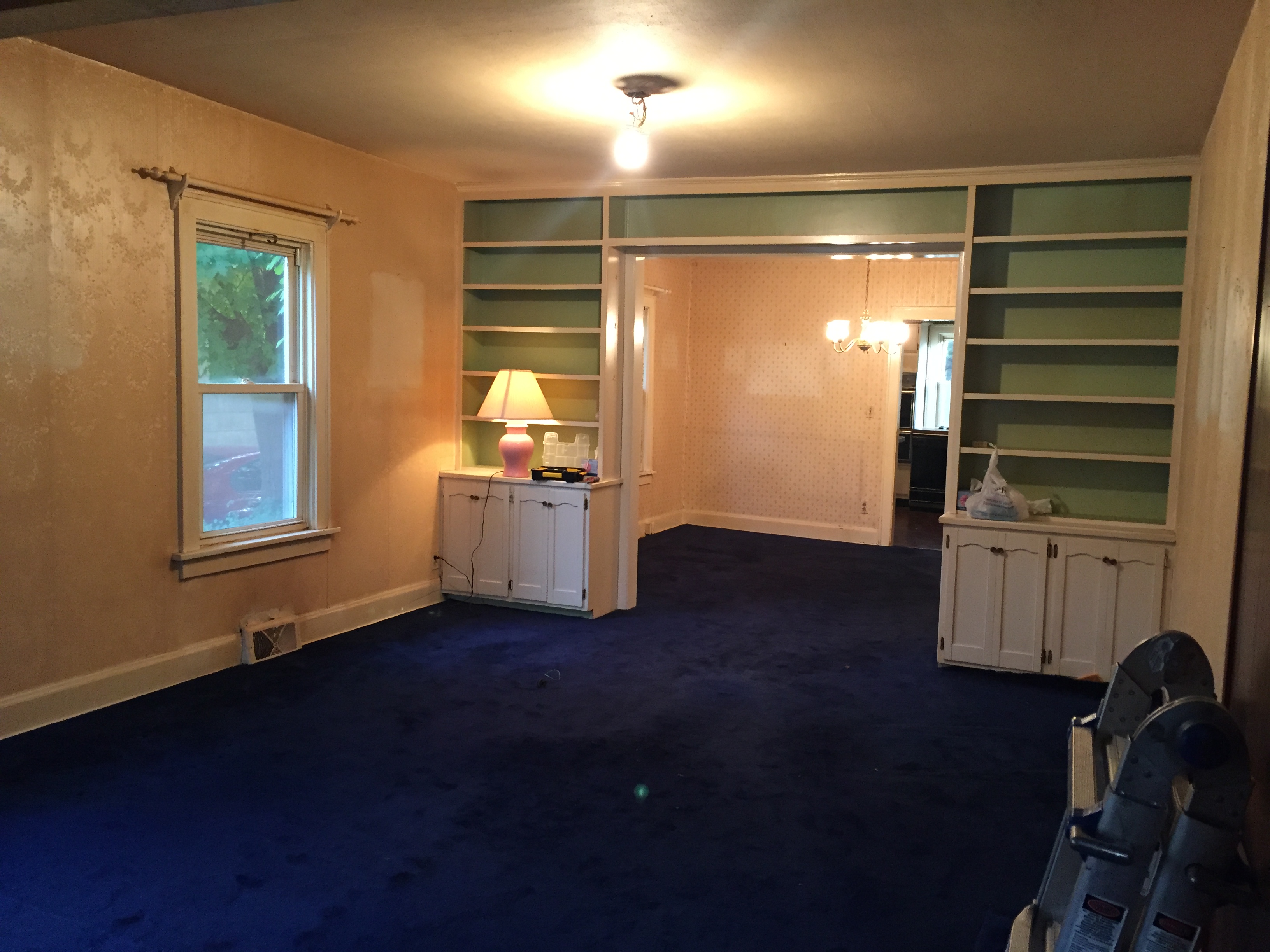
Here was the old living room:
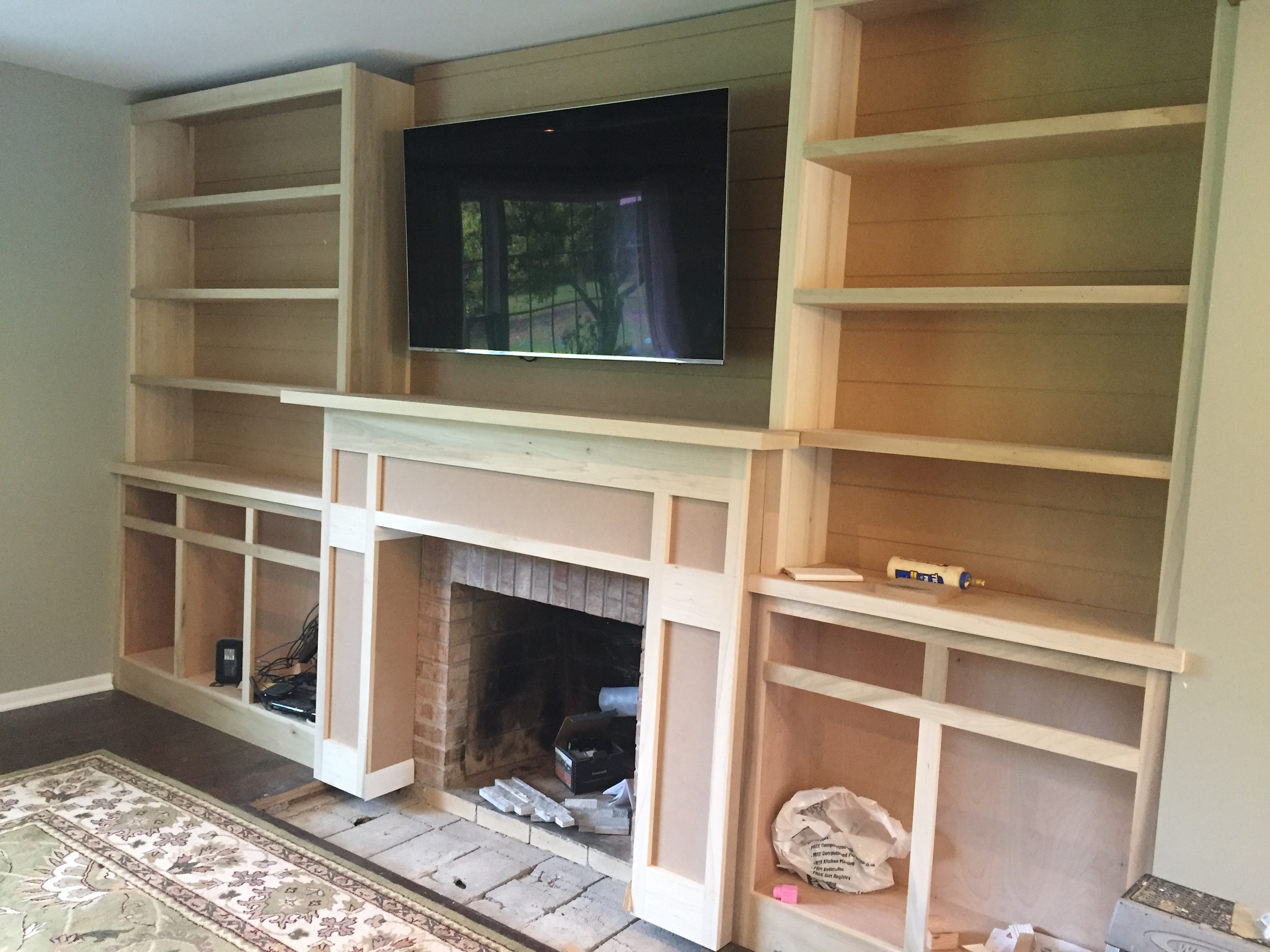
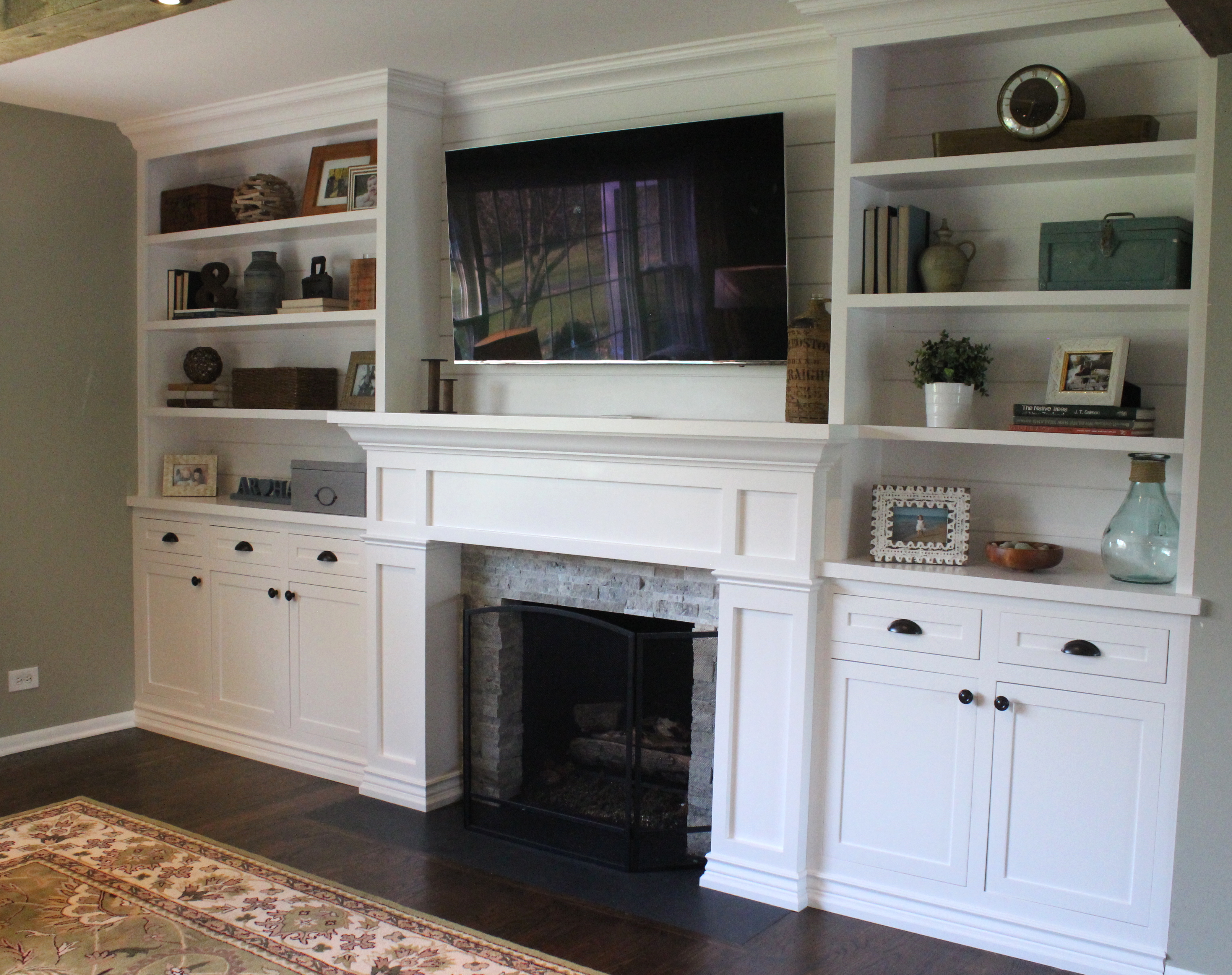
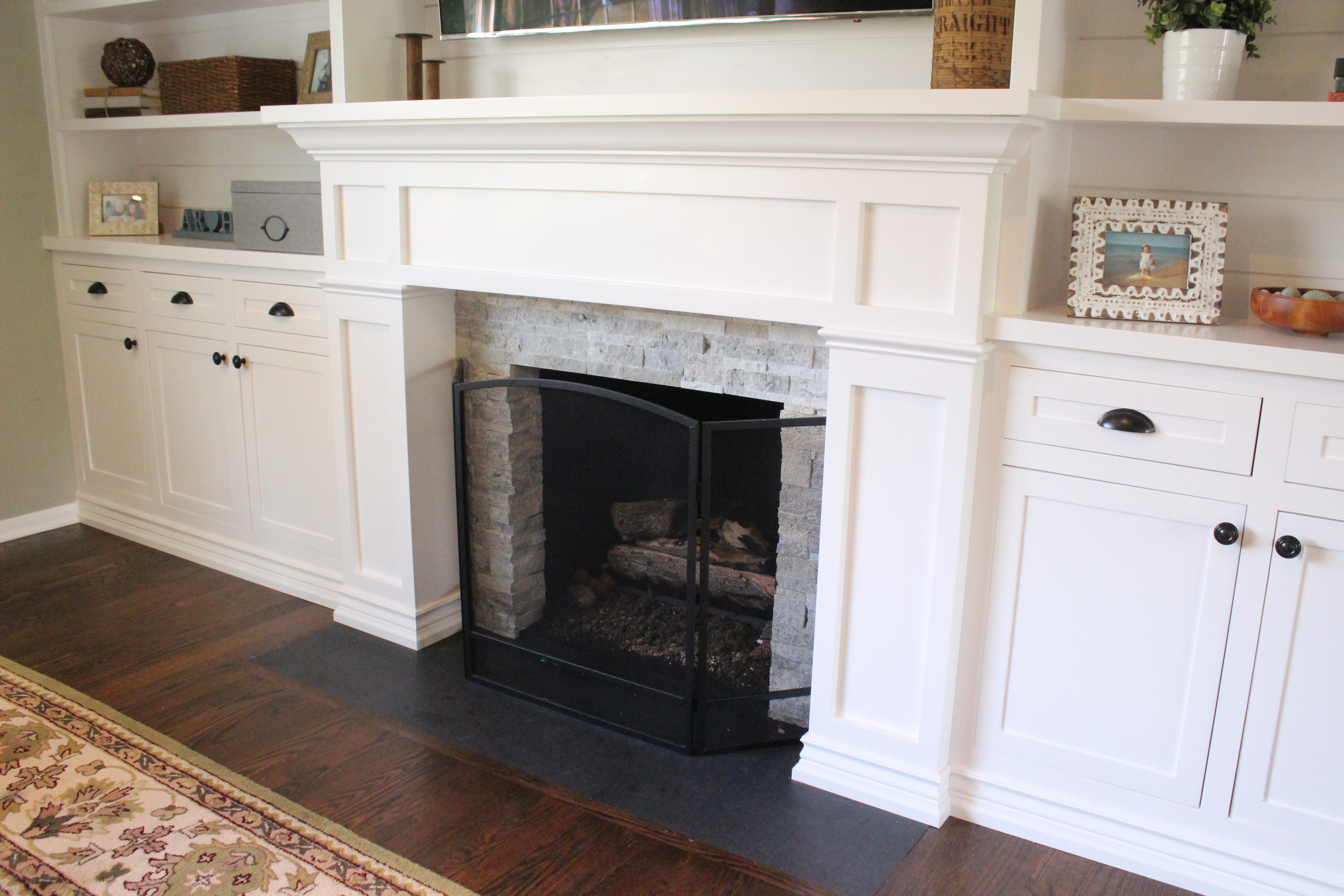
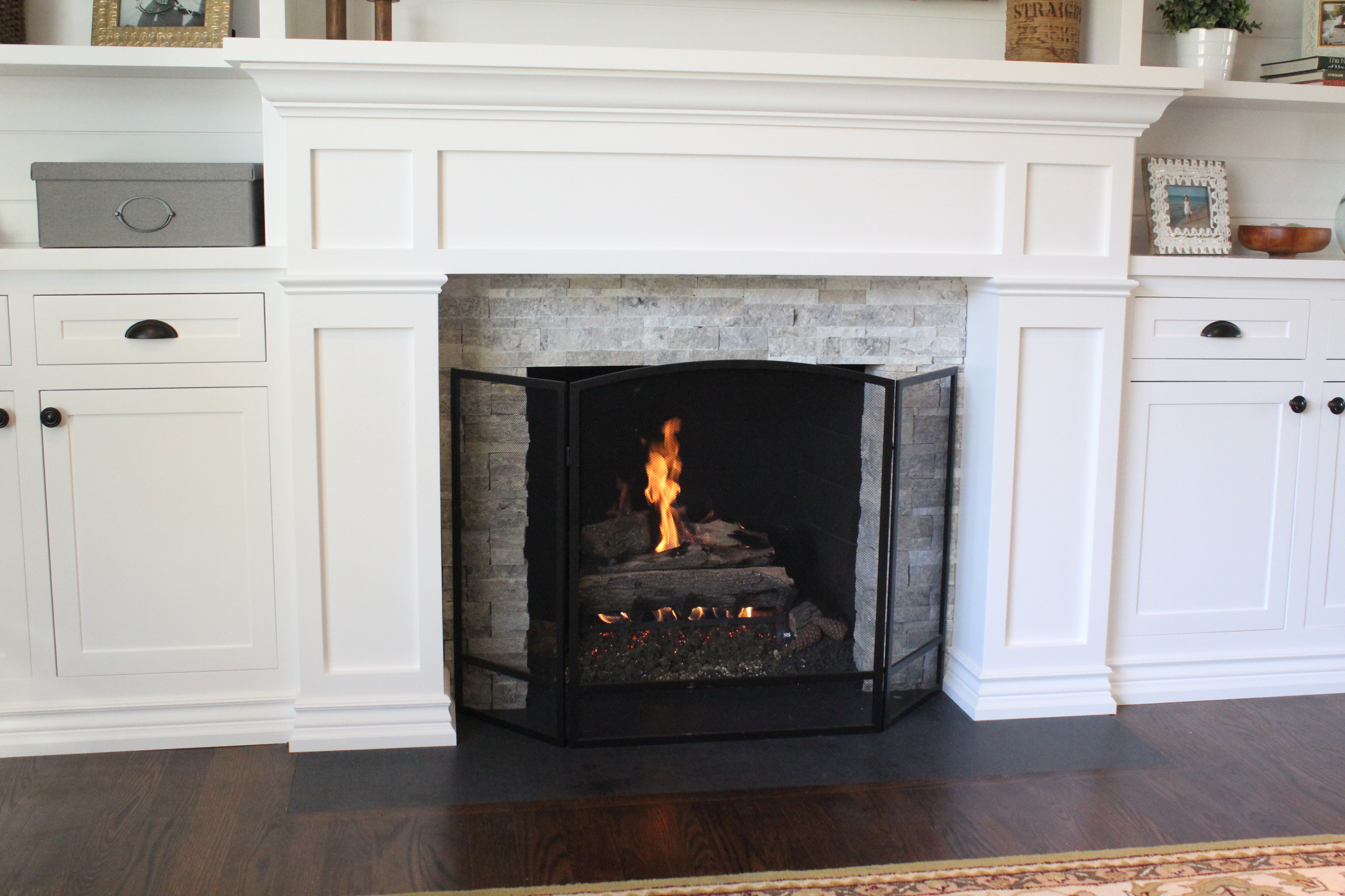
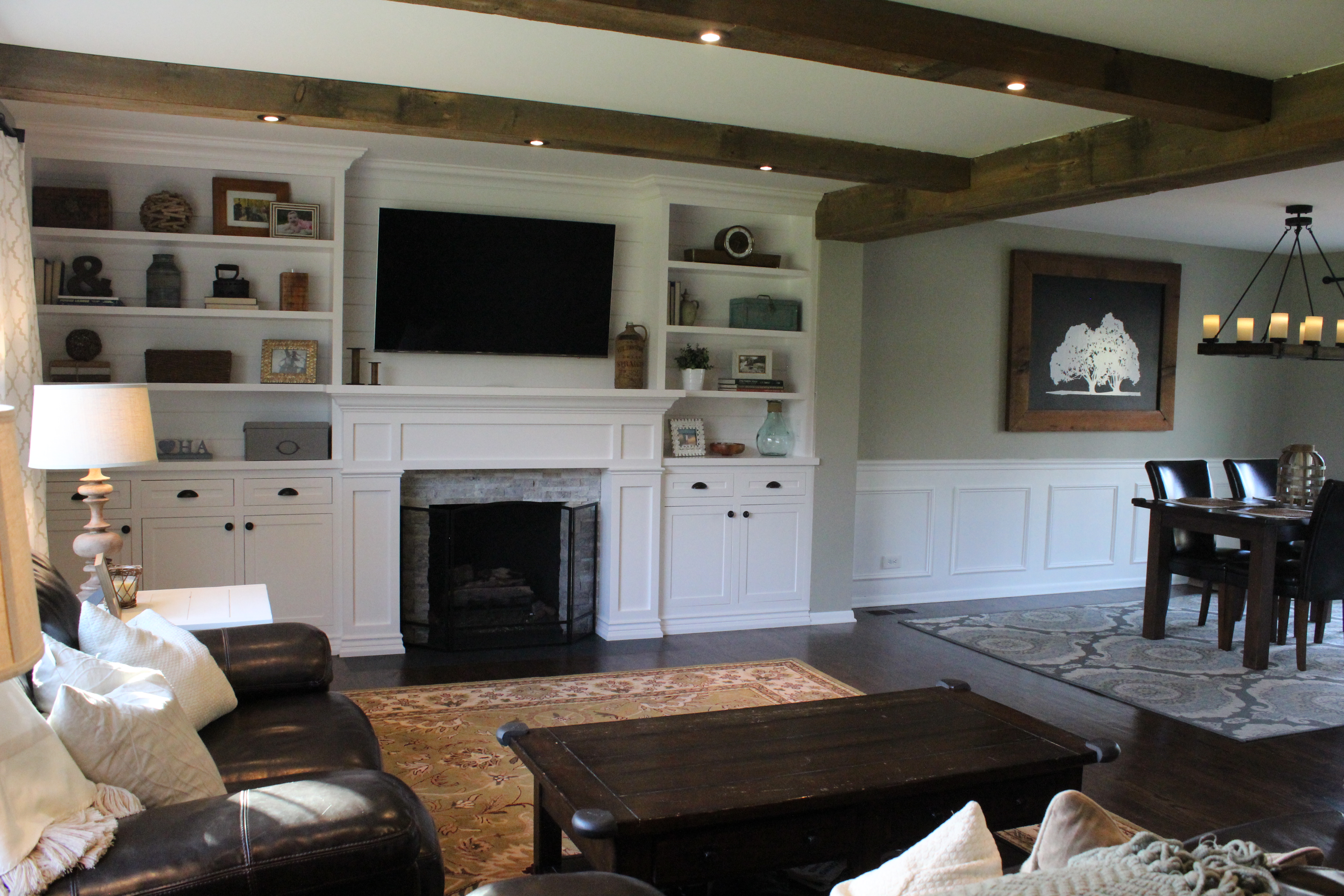
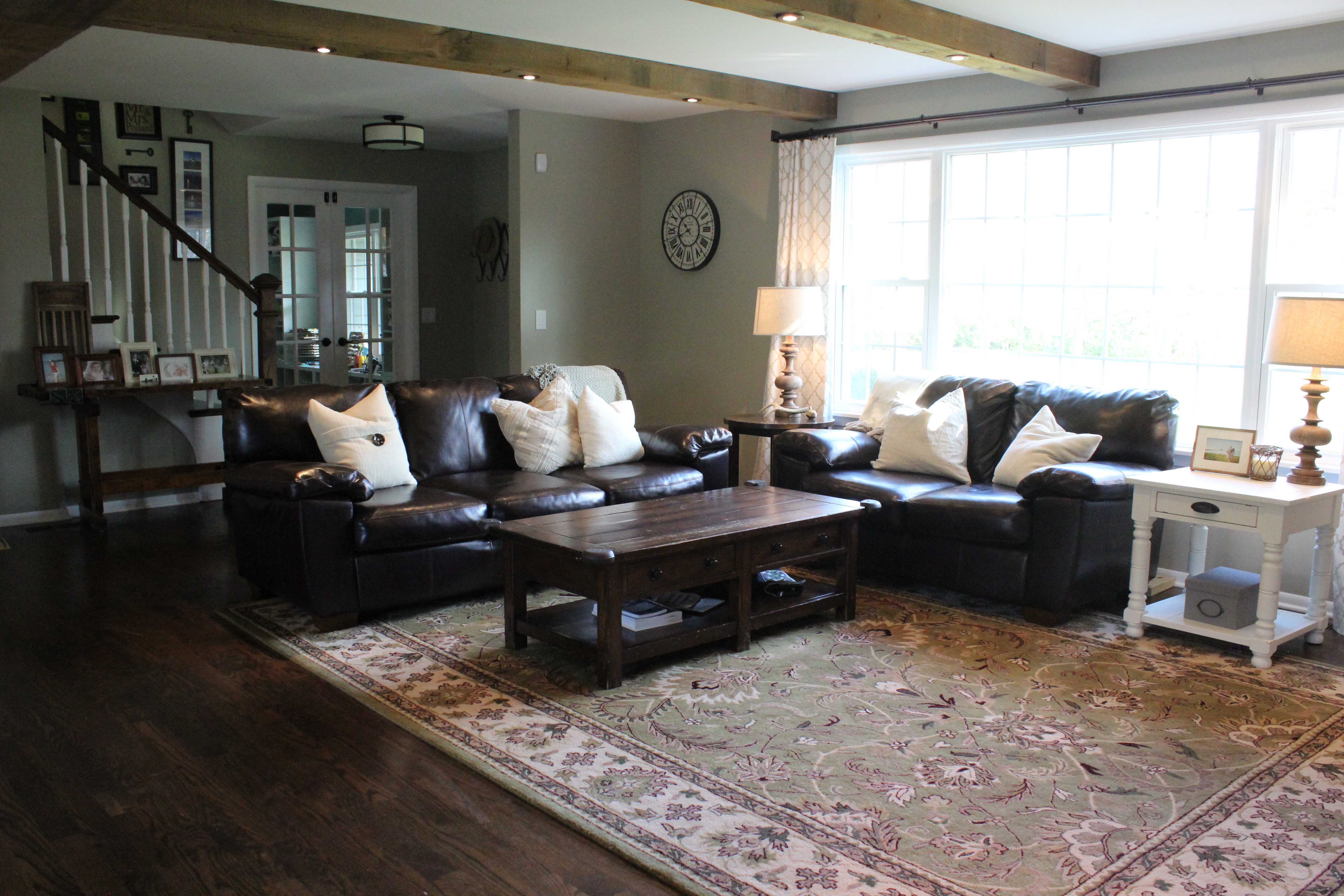
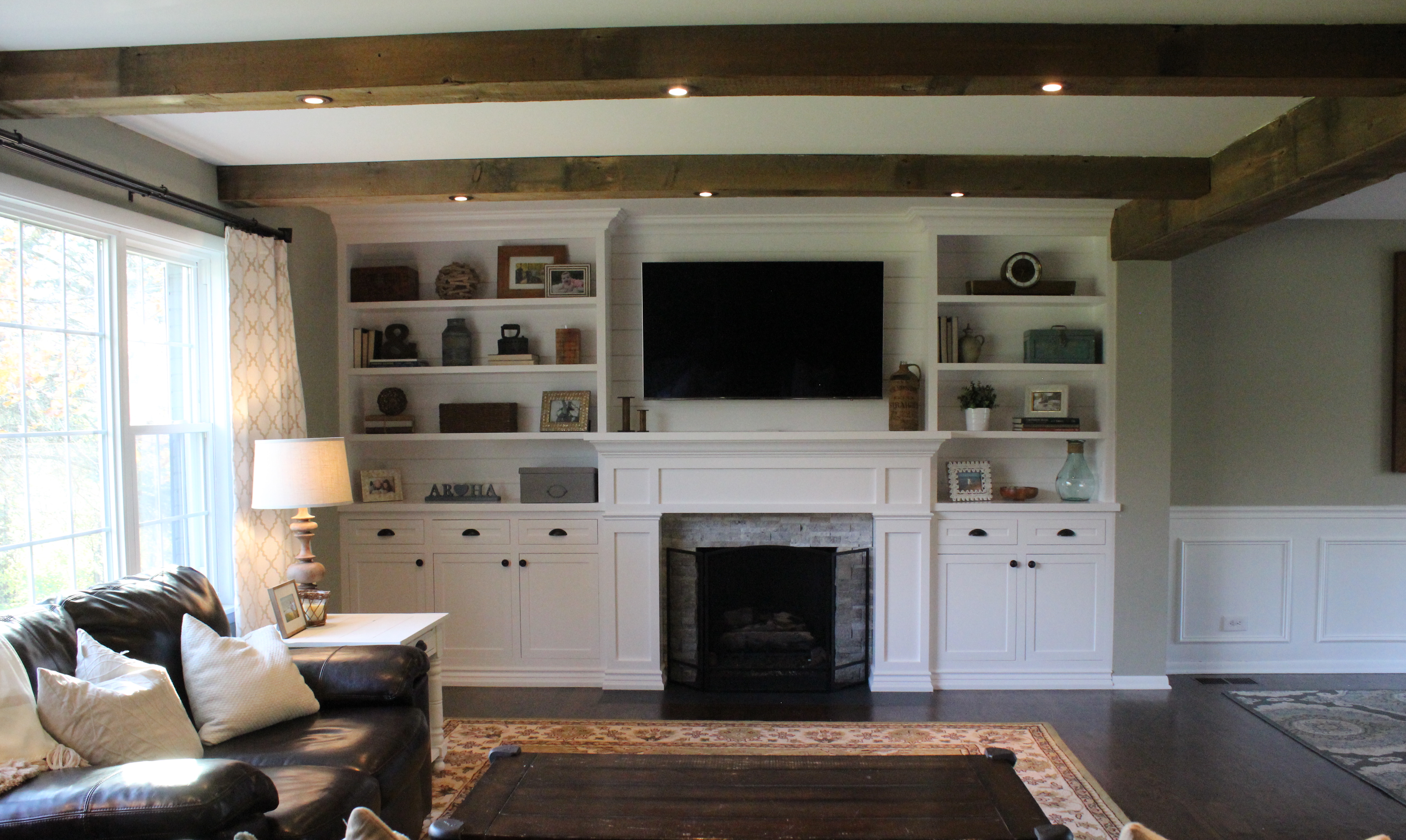
After removing the wallpaper and carpet, painting everything, re-finishing the floors, and installing can lights, we have a beautiful living room:

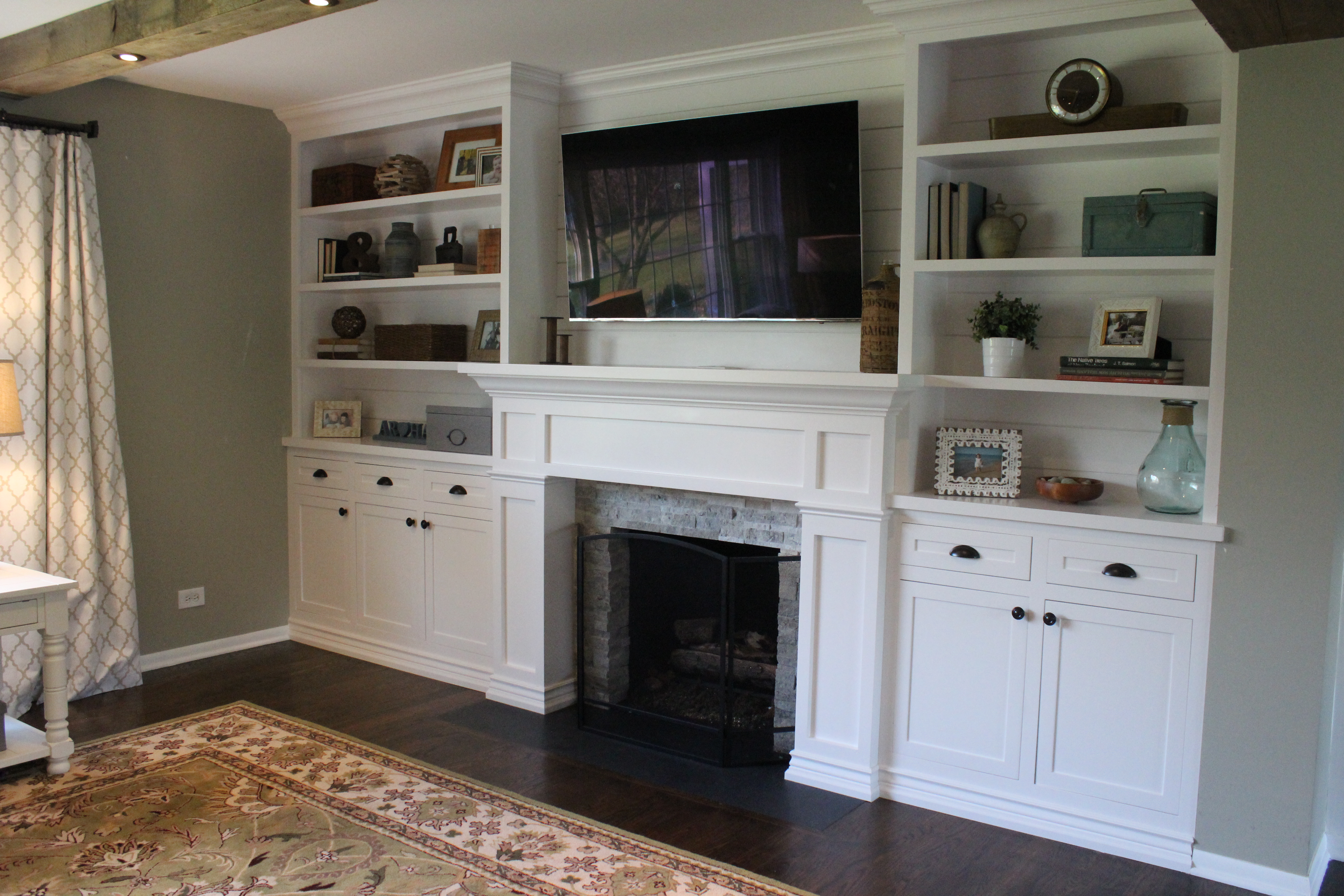
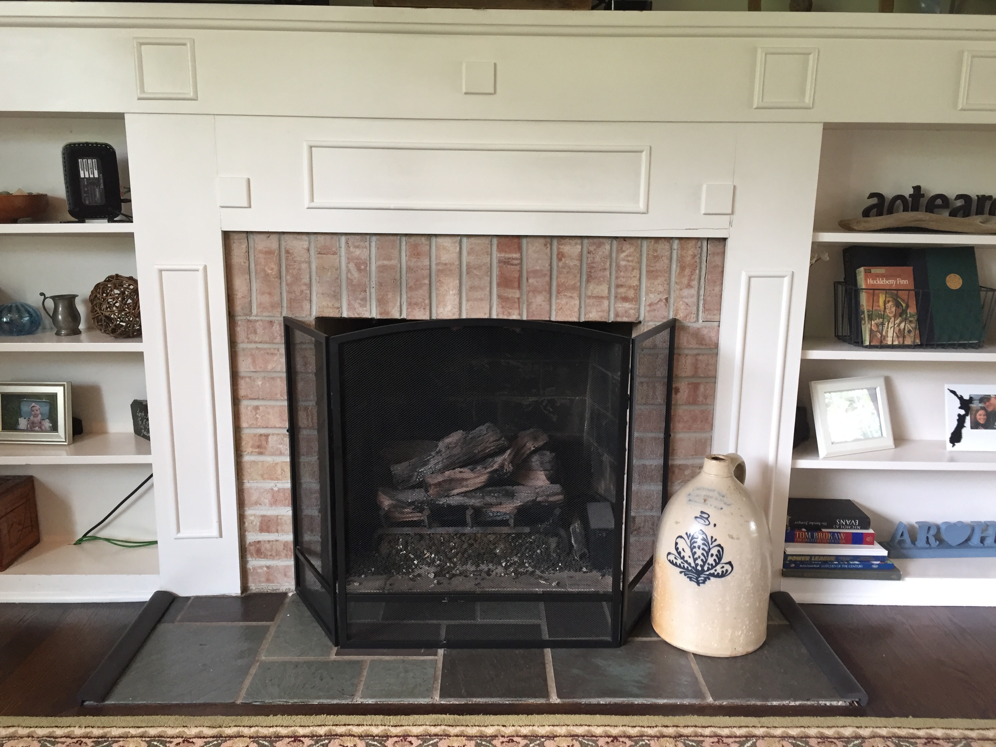
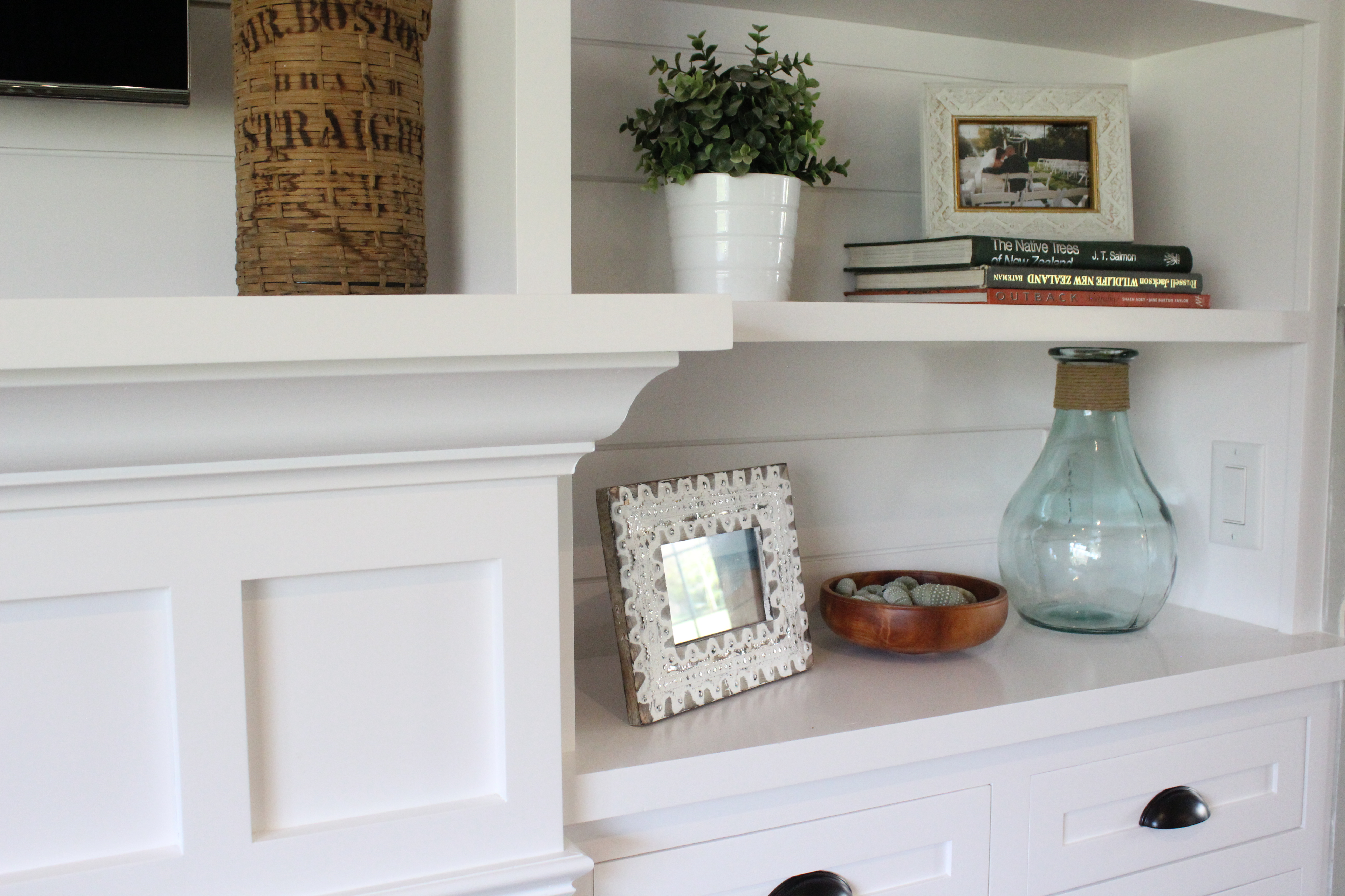
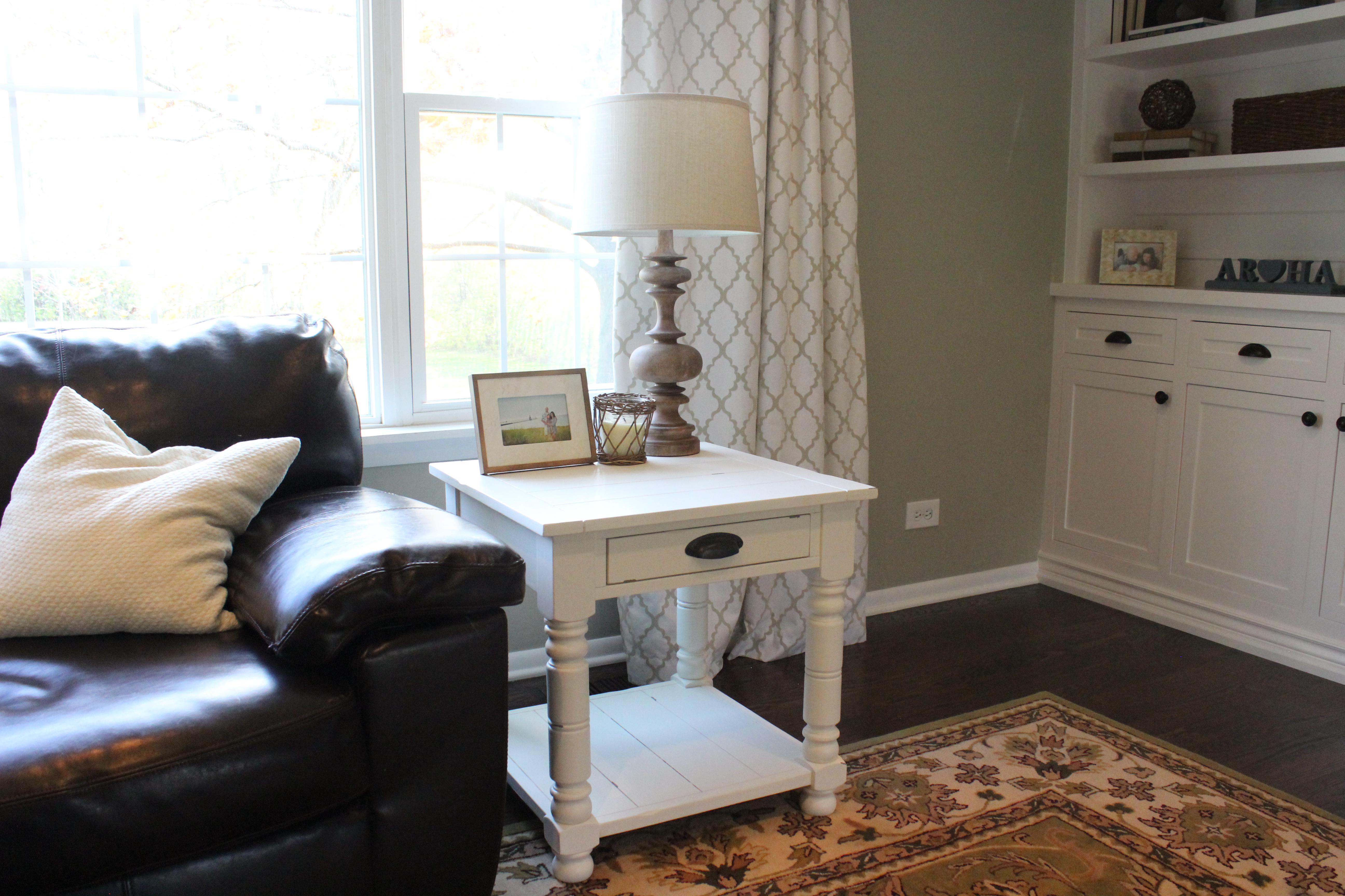
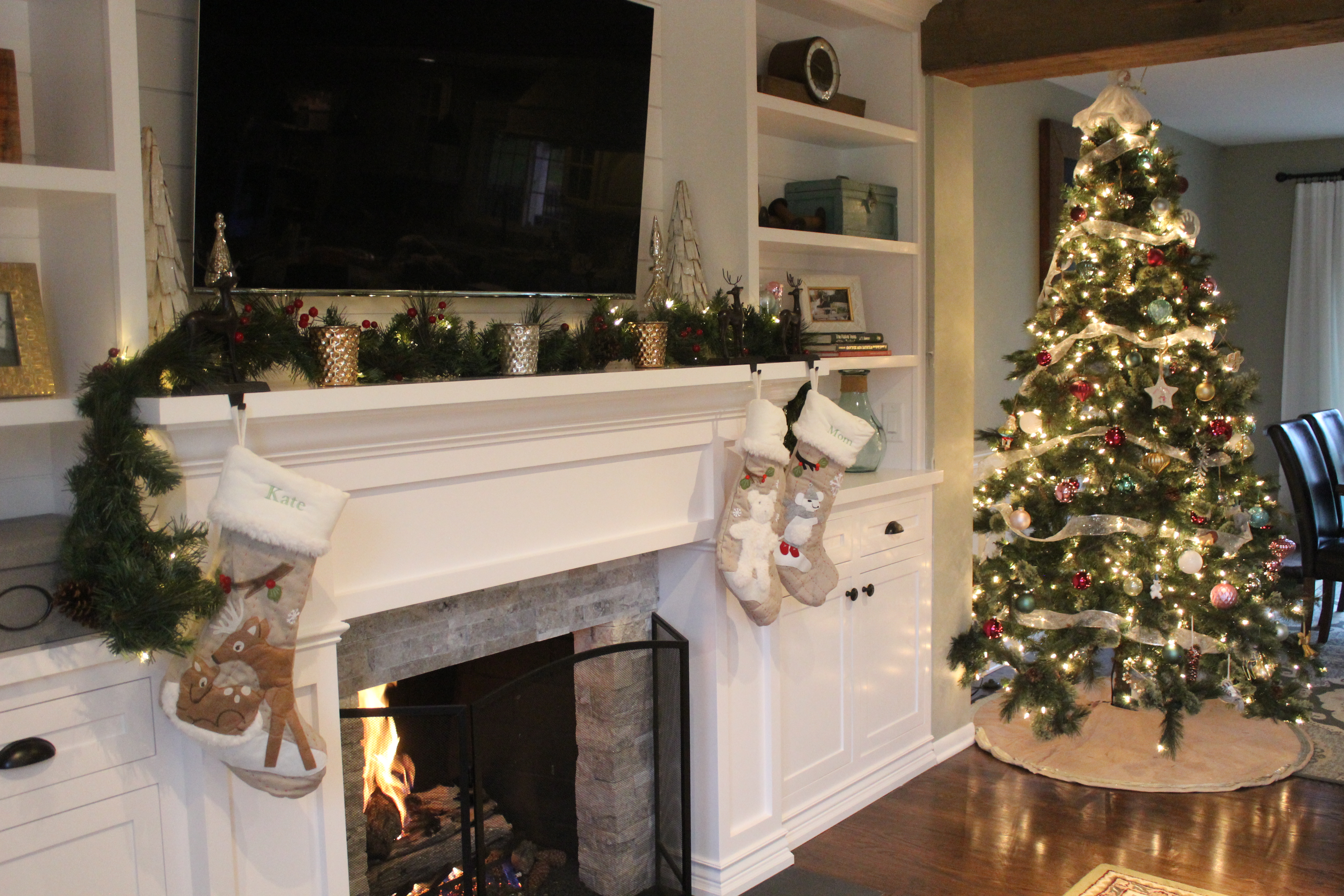
The built-ins give so much character, and they cleaned up so well with fresh paint (Chantilly Lace by Benjamin Moore)!
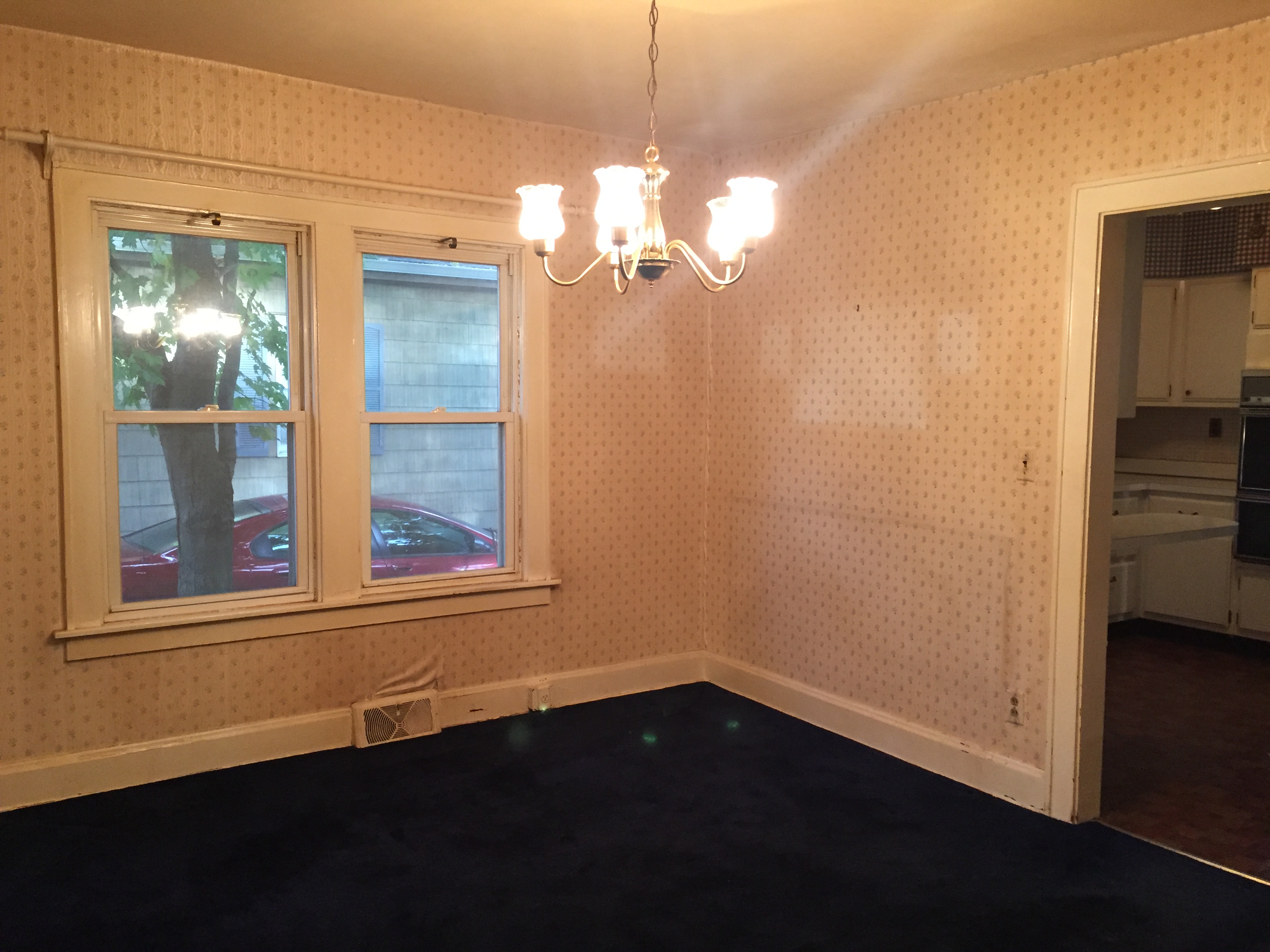
Here’s the same view after we opened up a wall to the kitchen, stripped off the wallpaper and carpet, installed a new light, and of course fresh paint and floor stain:
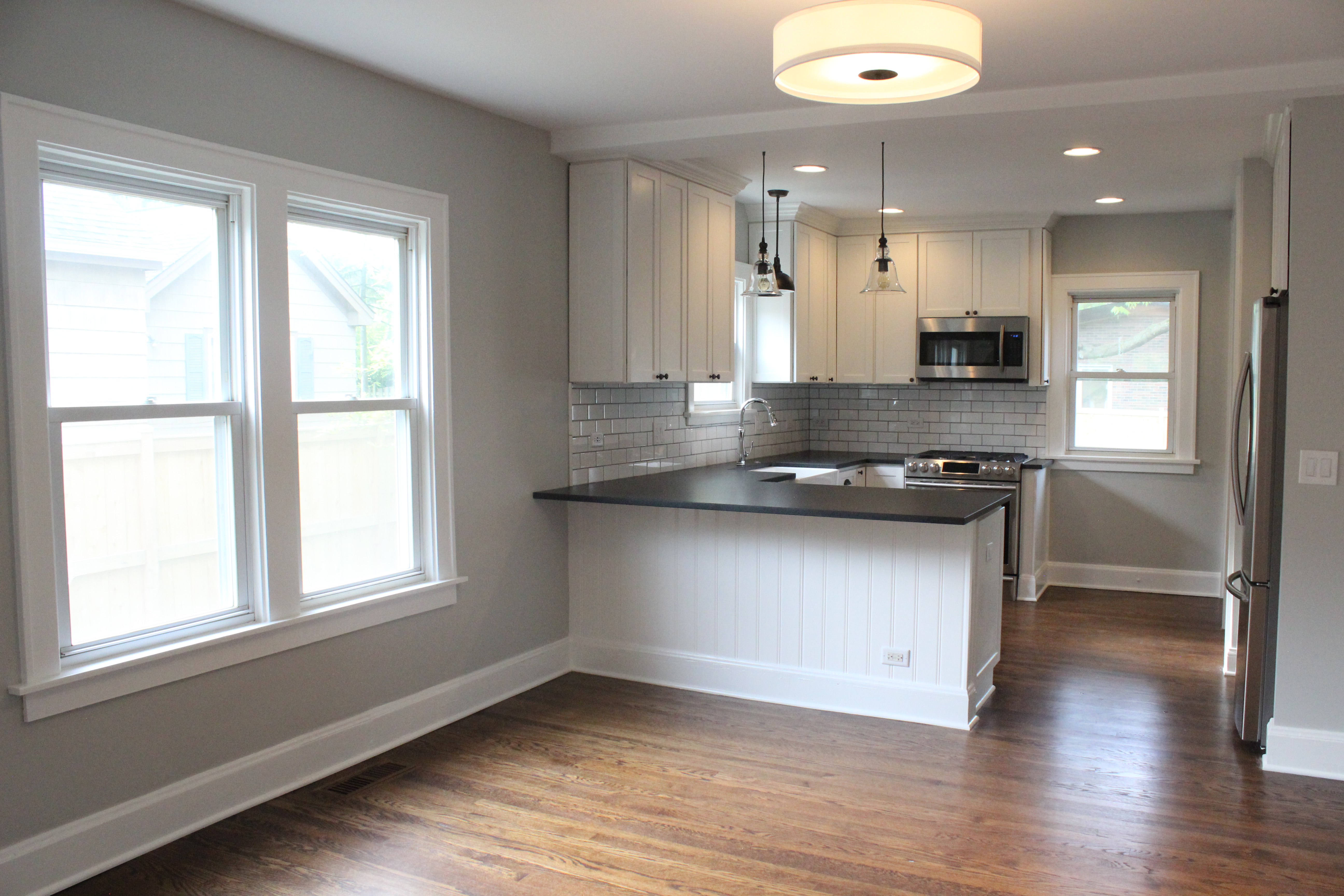 The paint color on the whole first floor is Gray Owl by Benjamin Moore— my favorite warm, medium gray.
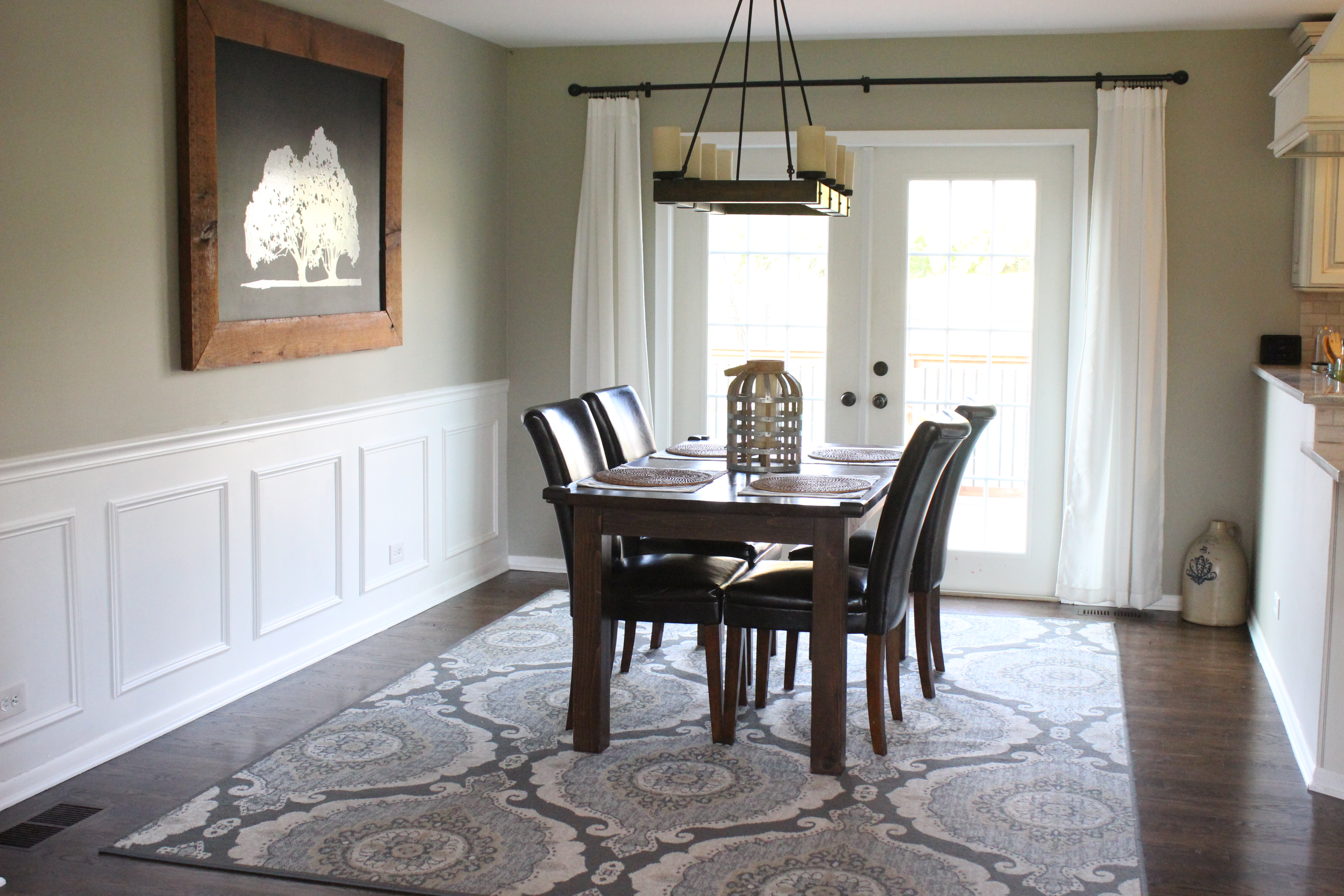
Here’s a look back through to the front of the house from the dining room.
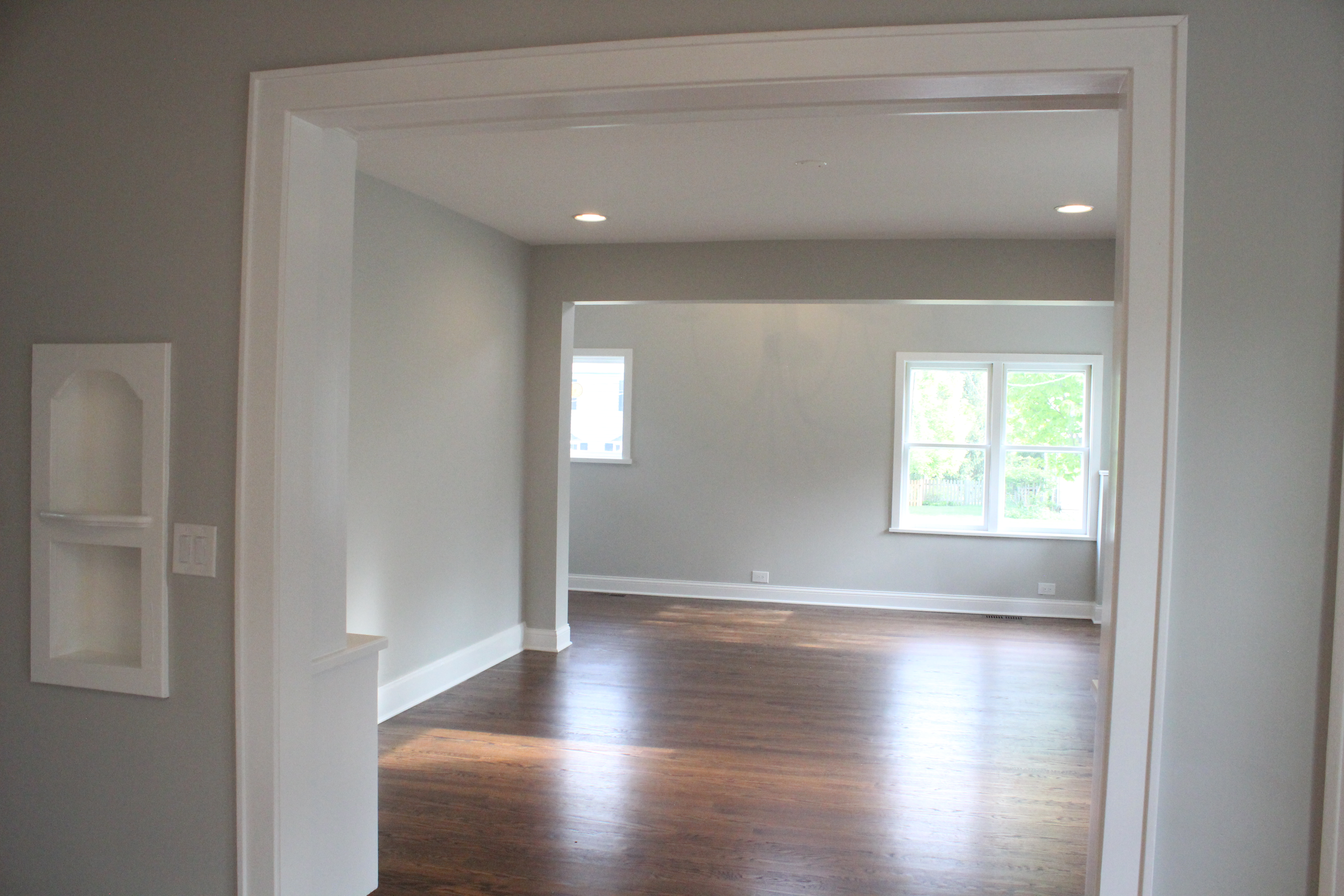
We kept as much of the home’s original character as possible, including that little niche on the left in the above photo, and this cabinet:

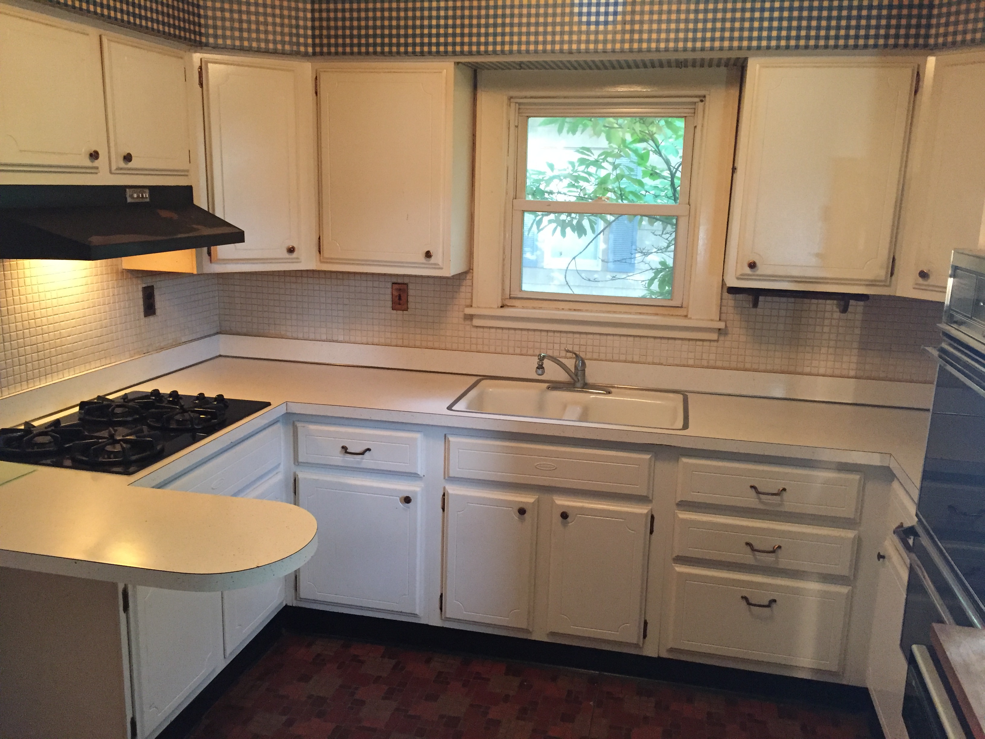
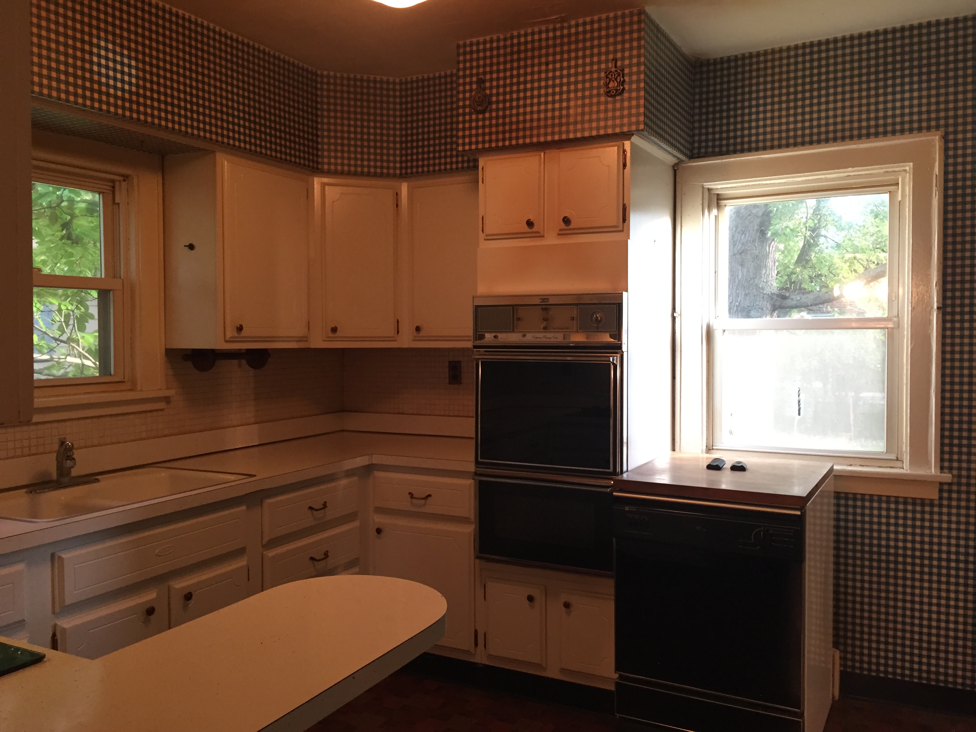
Here’s a look at the old kitchen:
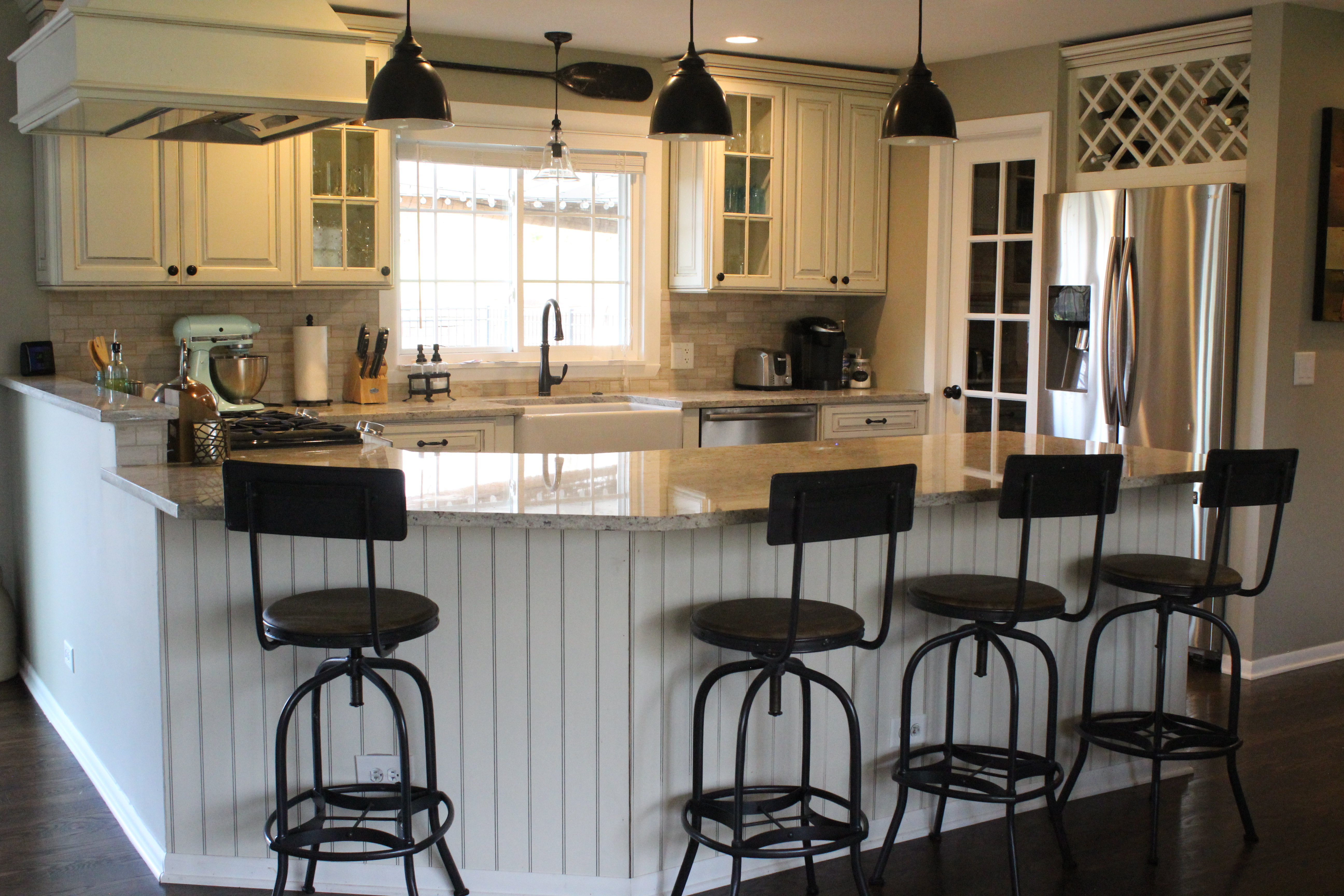
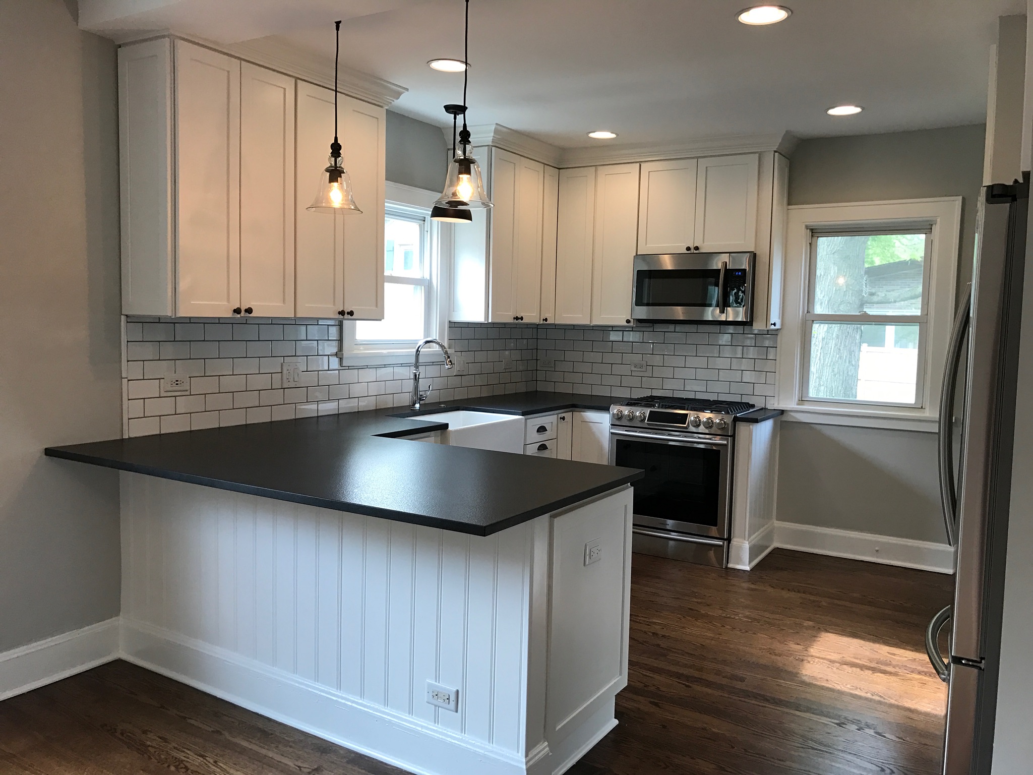
And now after new white shaker-style cabinets by Shrock, leathered black granite countertops, stainless steel appliances, new Kohler chrome faucet, new lighting, a farmhouse sink, oil rubbed bronze cup pulls, and a white subway tile backsplash:
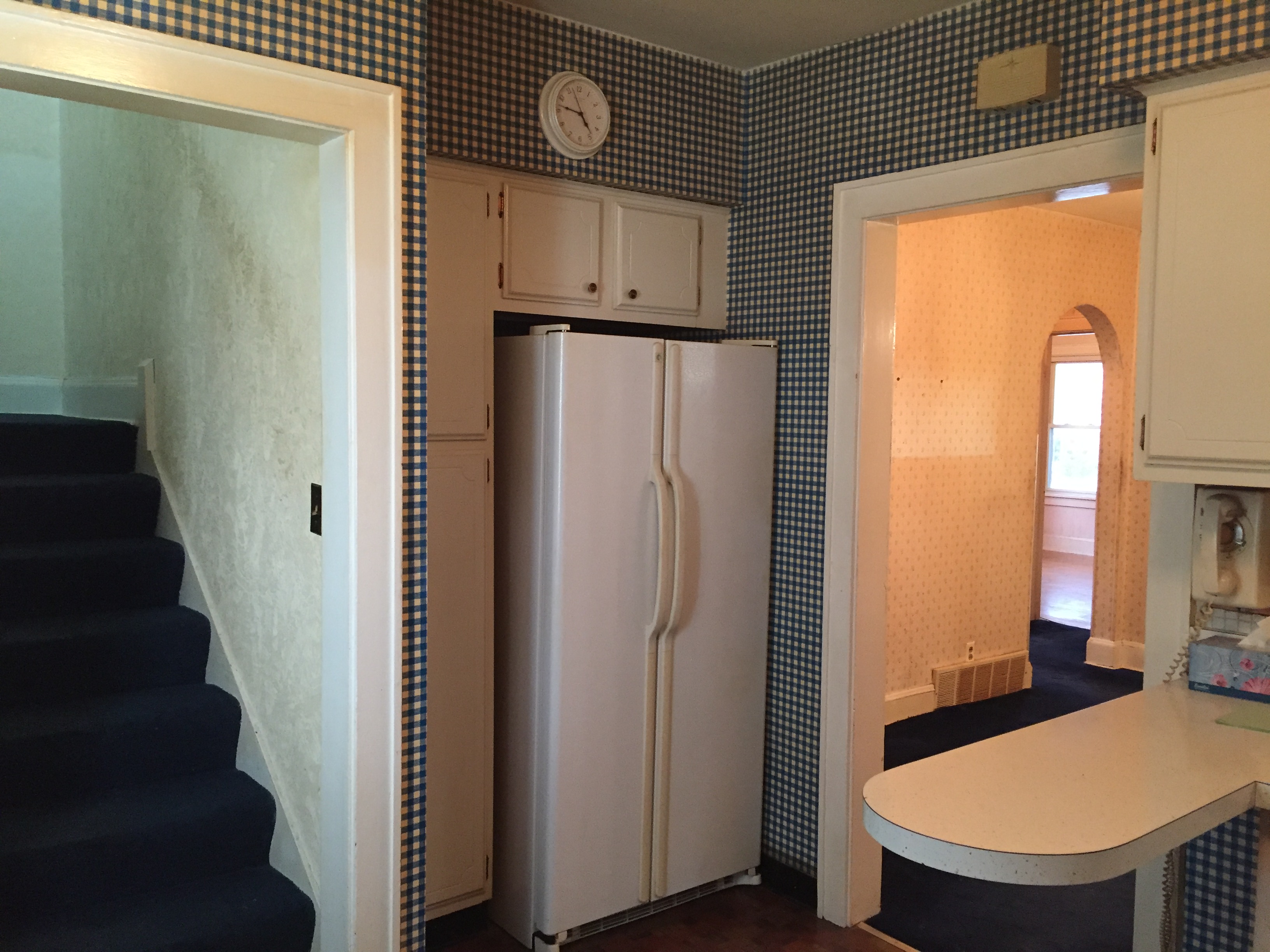
The view of the fridge side before:
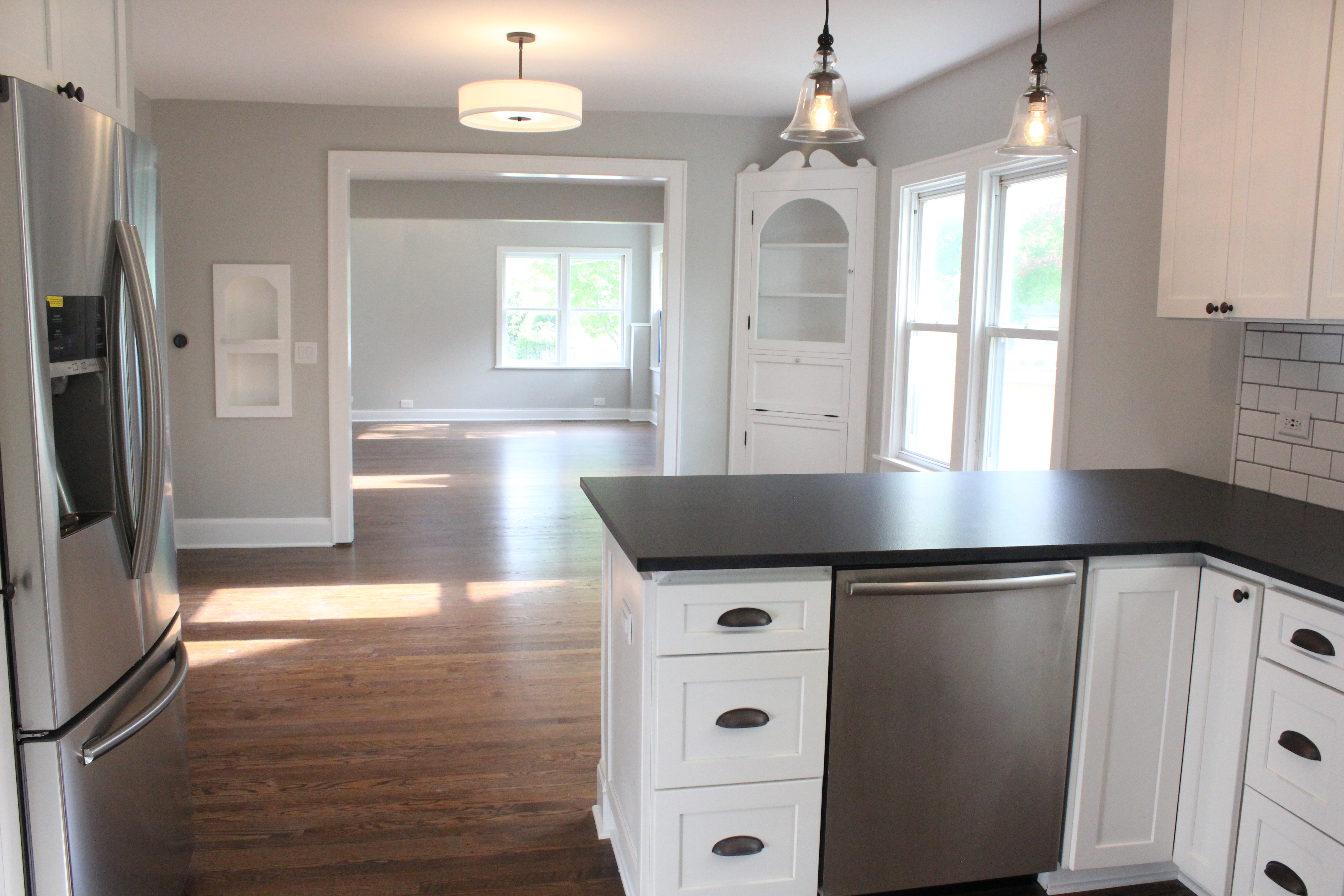
And now with a built out pantry and Samsung french door refrigerator:

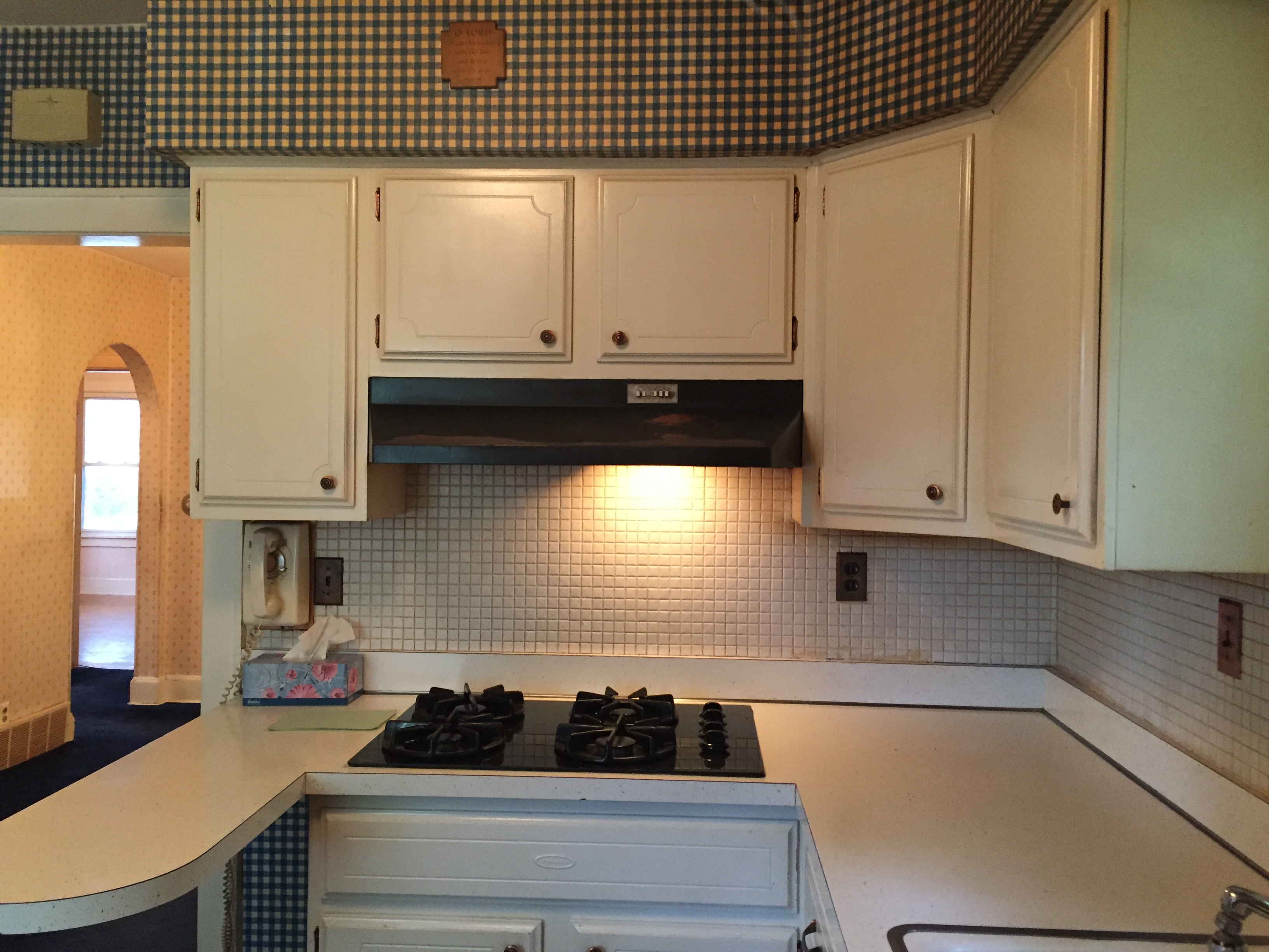
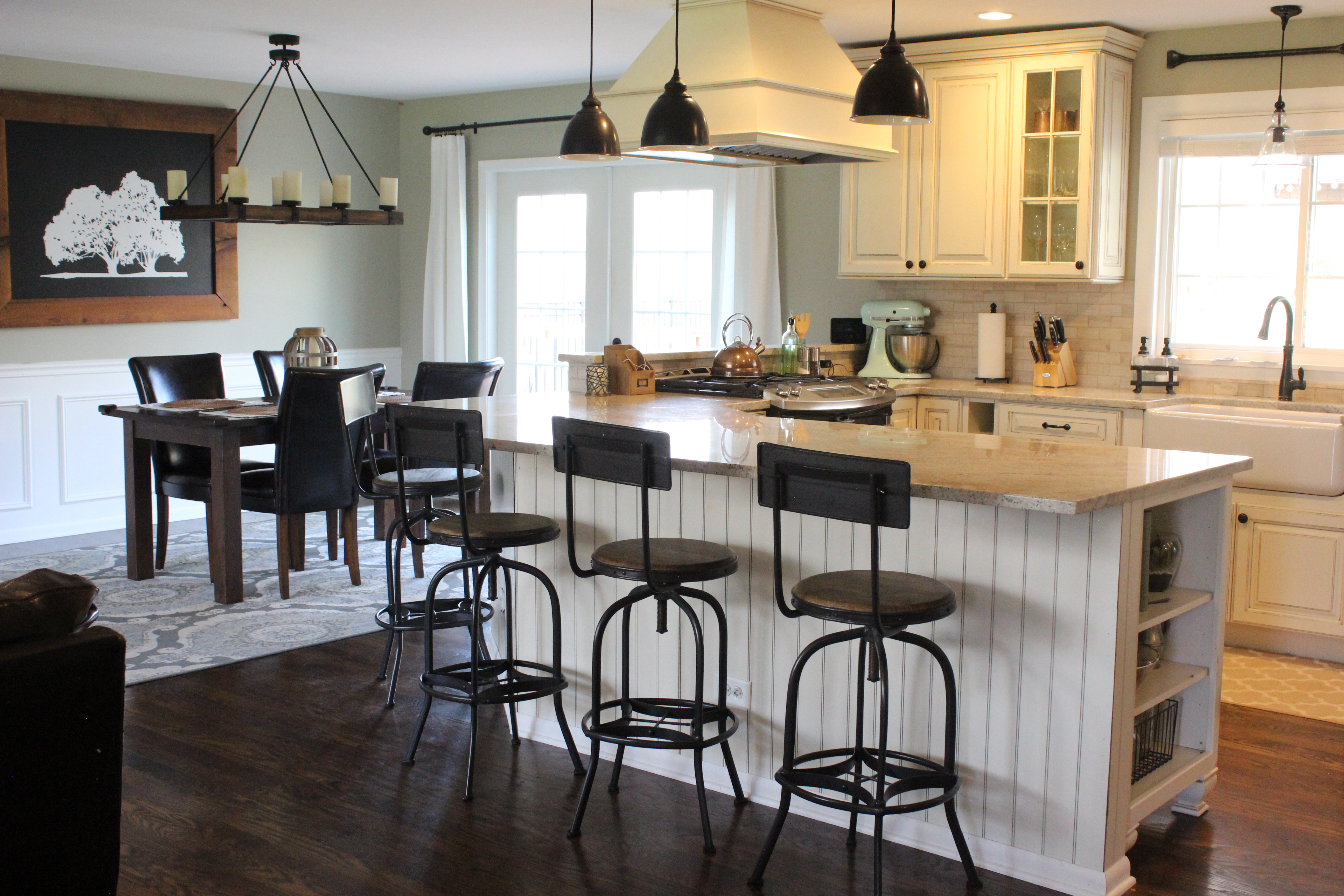
Opening up the wall to create an island peninsula made the world of difference. Here was the before:
And after:
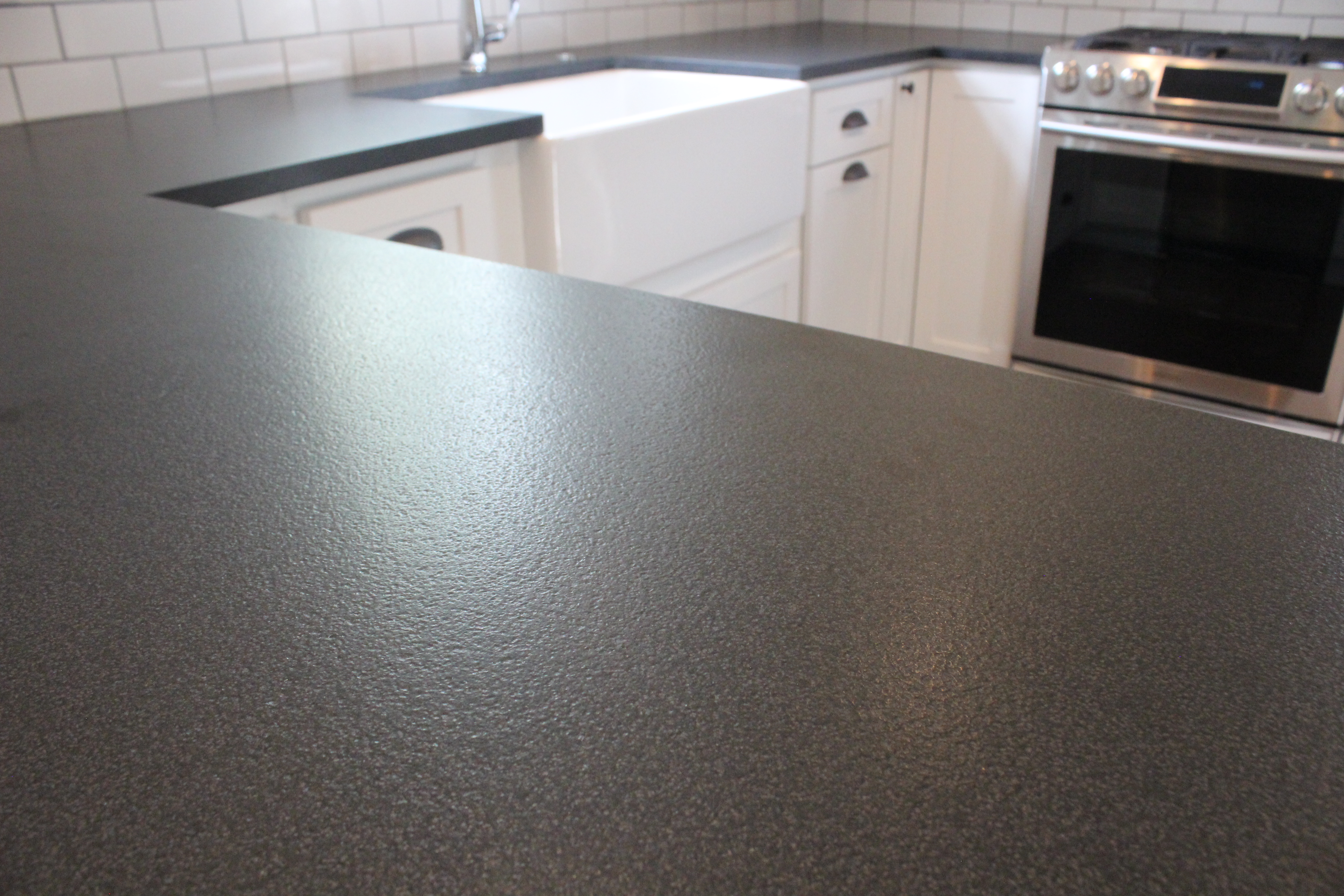
Here’s a close up of the leathered countertops, they look very cool:
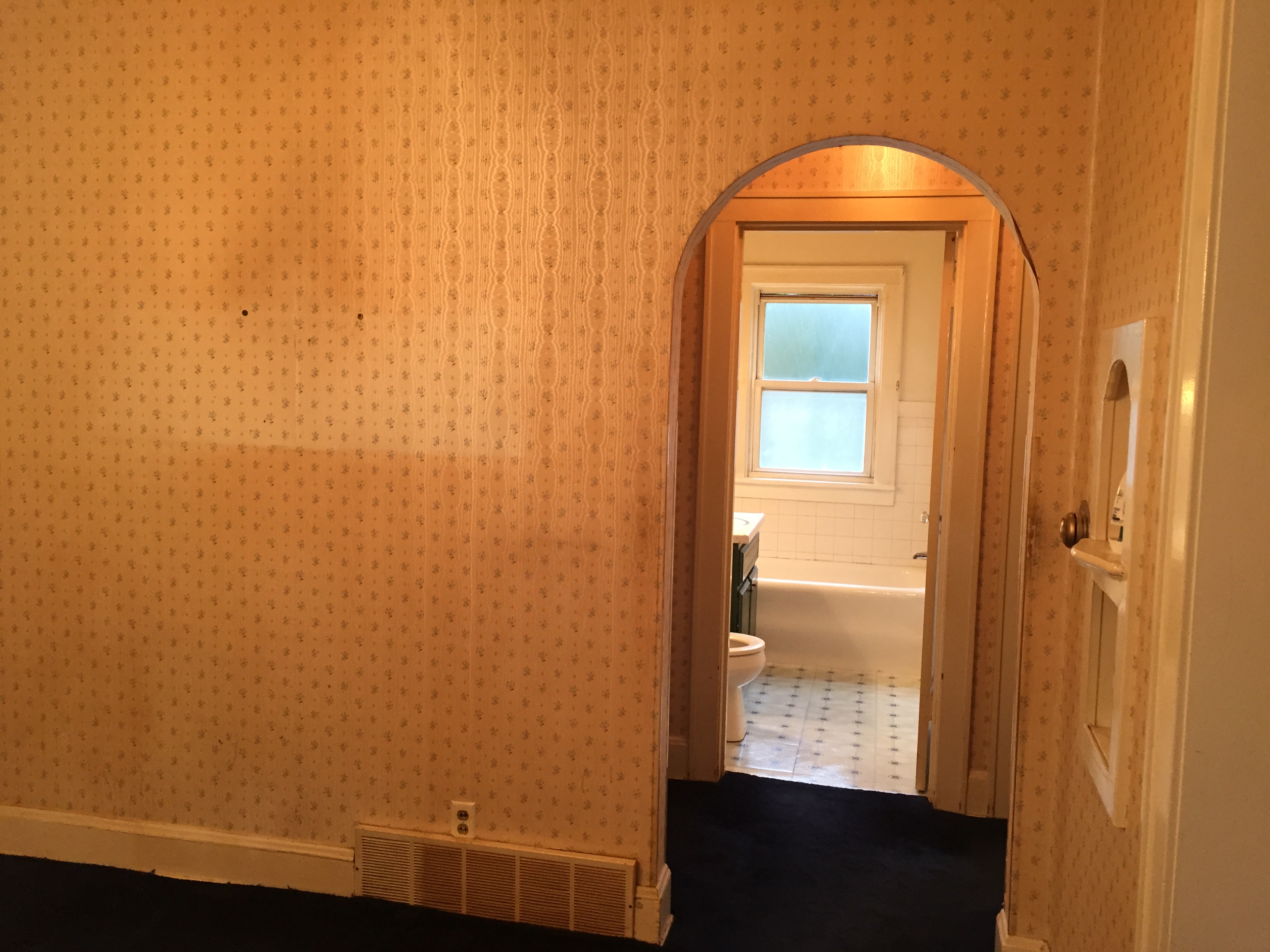
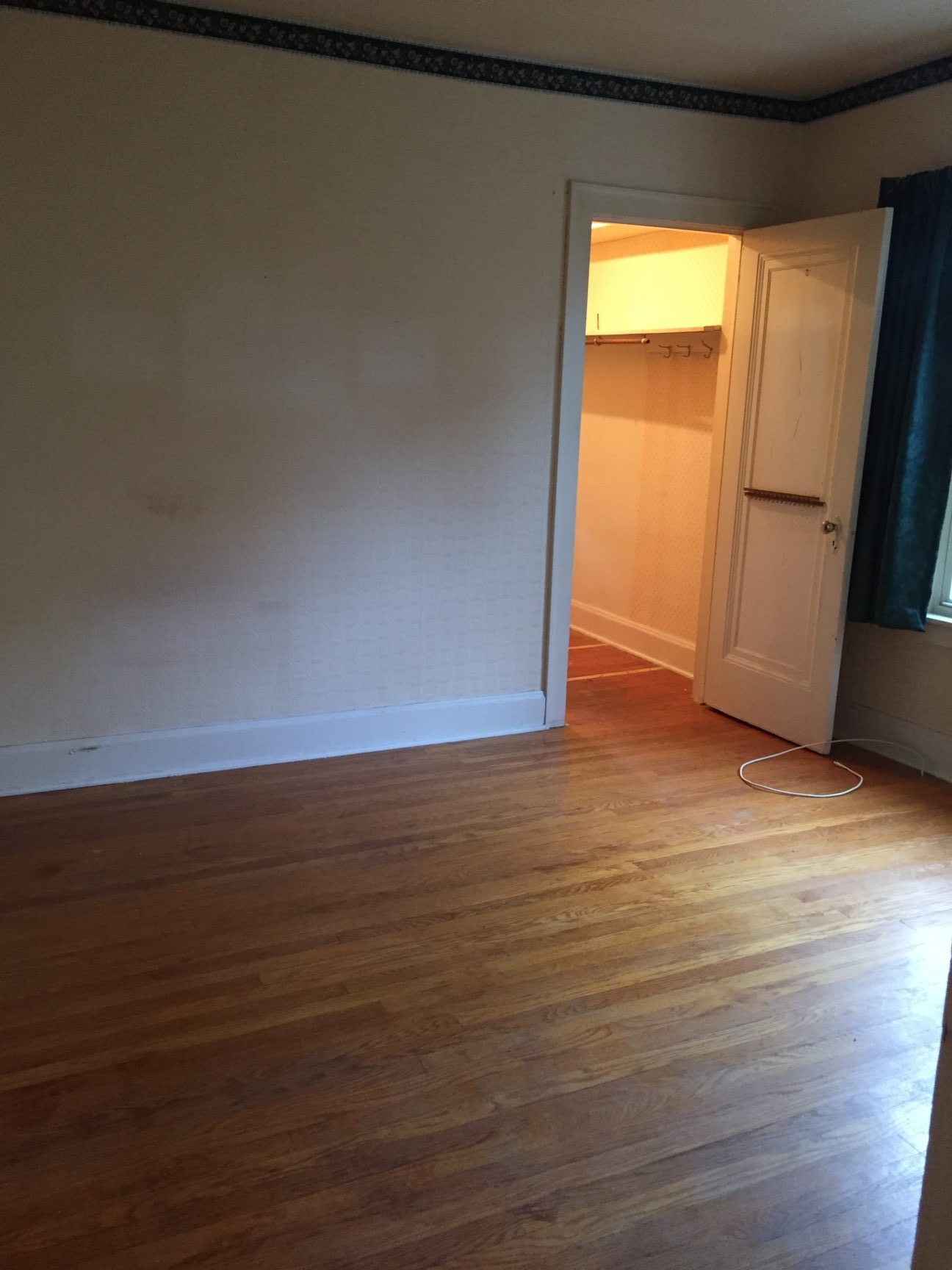
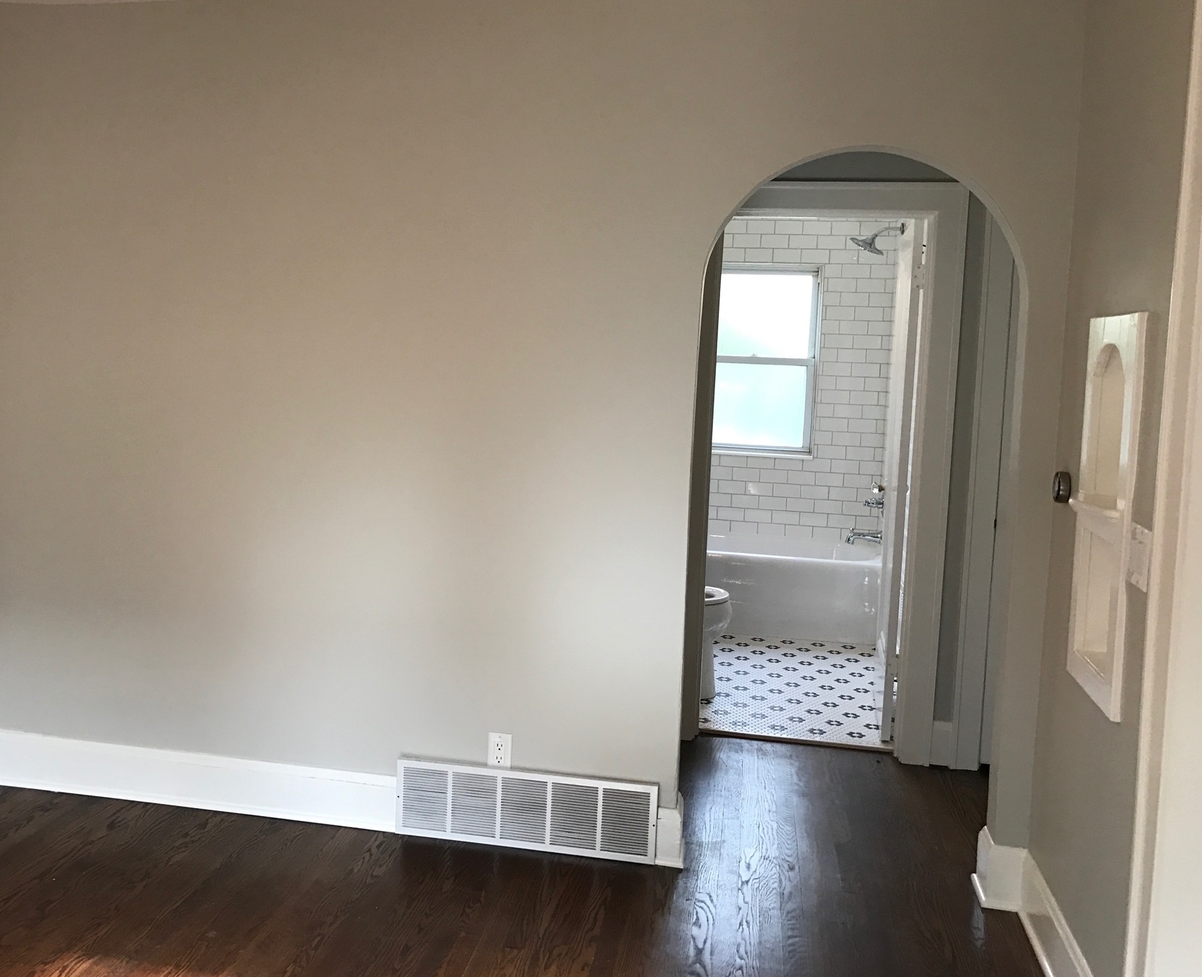
This was the old archway leading to 2 bedrooms and a bathroom (you can see the marks on the wallpaper from someone smoking in the house for 40 years!)
And now:
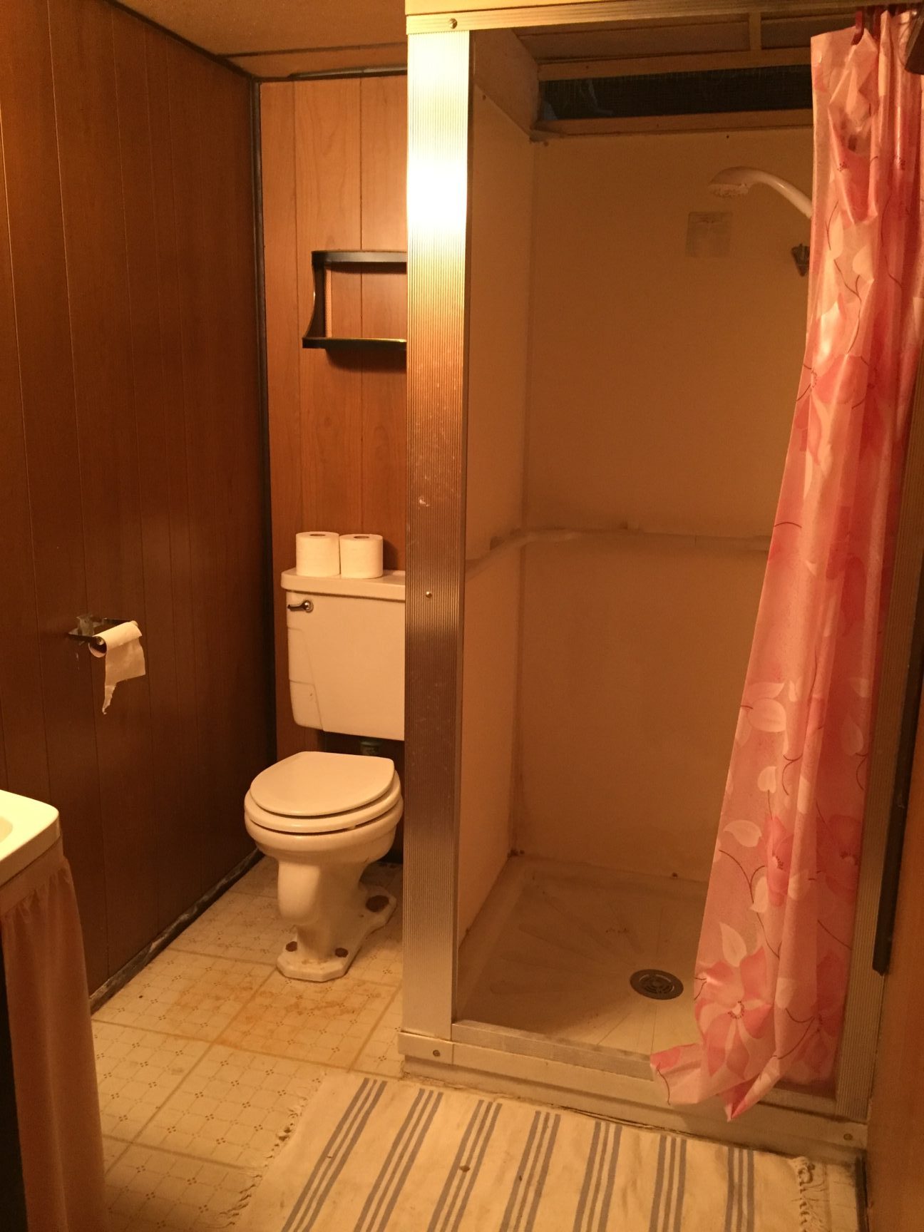
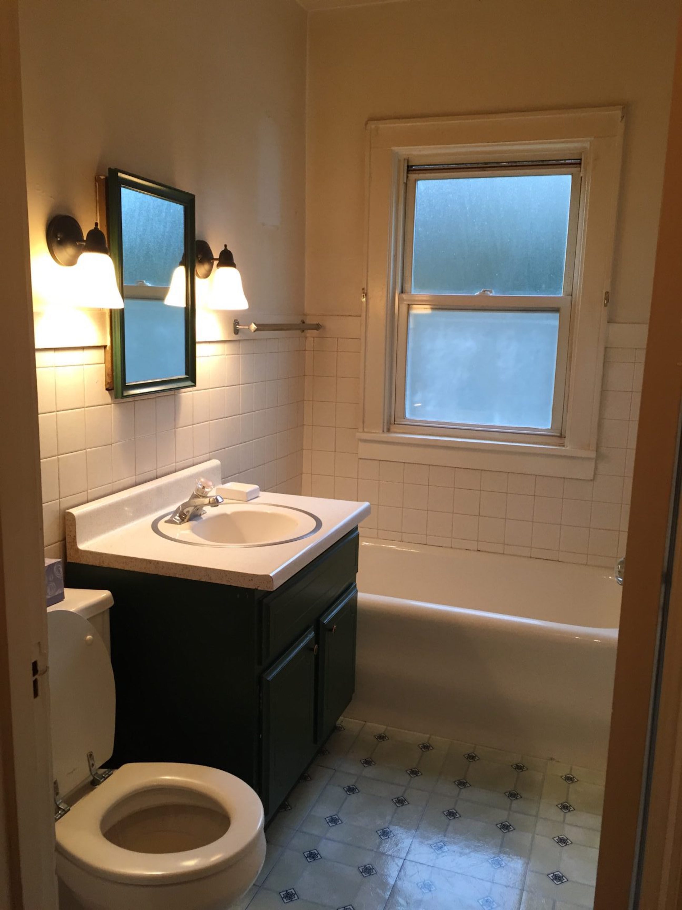
Here was the old bathroom:
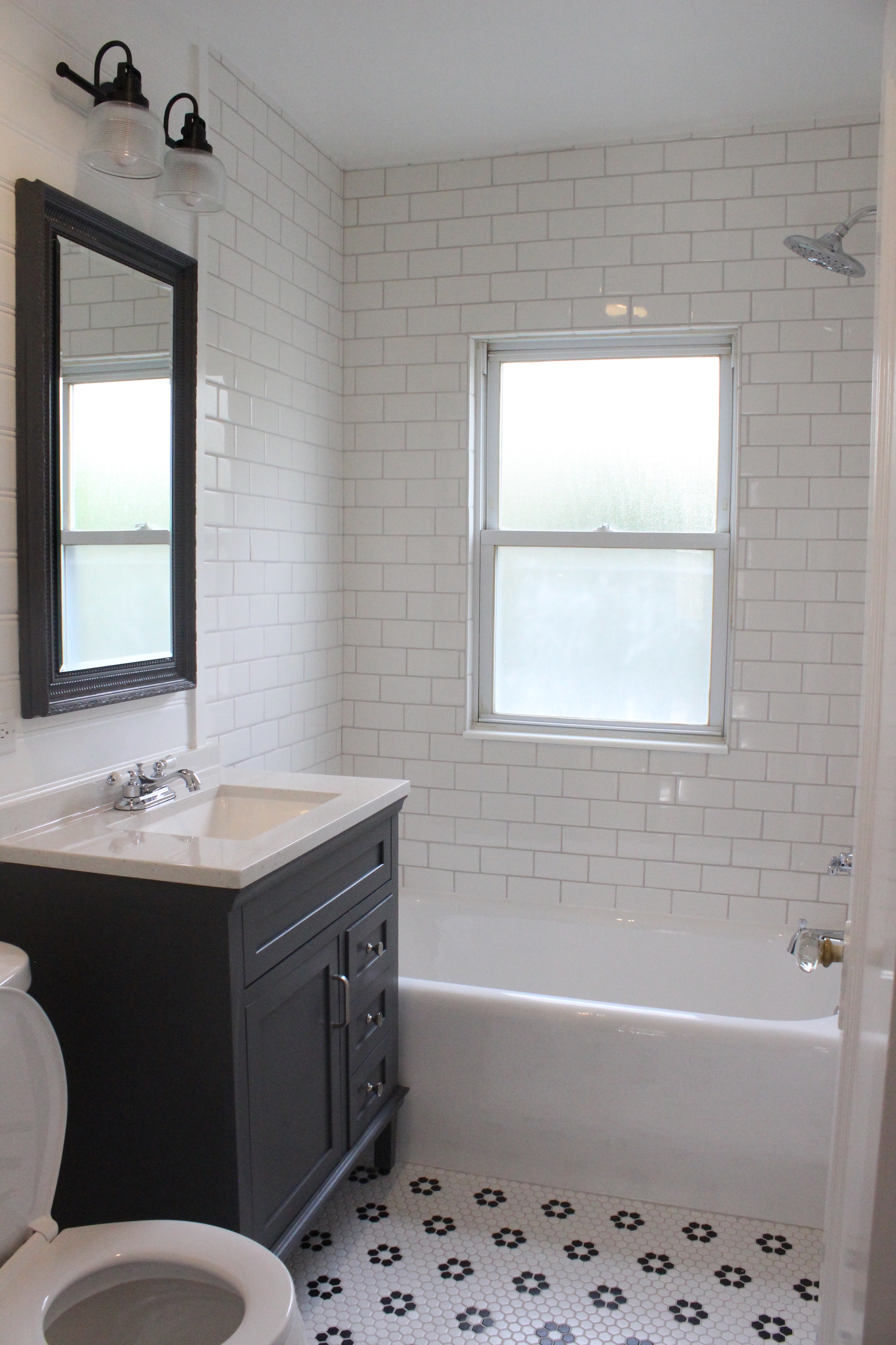
And now after a new subway tiled shower, gray vanity, vanity light, toilet, chrome fixtures, tub reglazing and more:
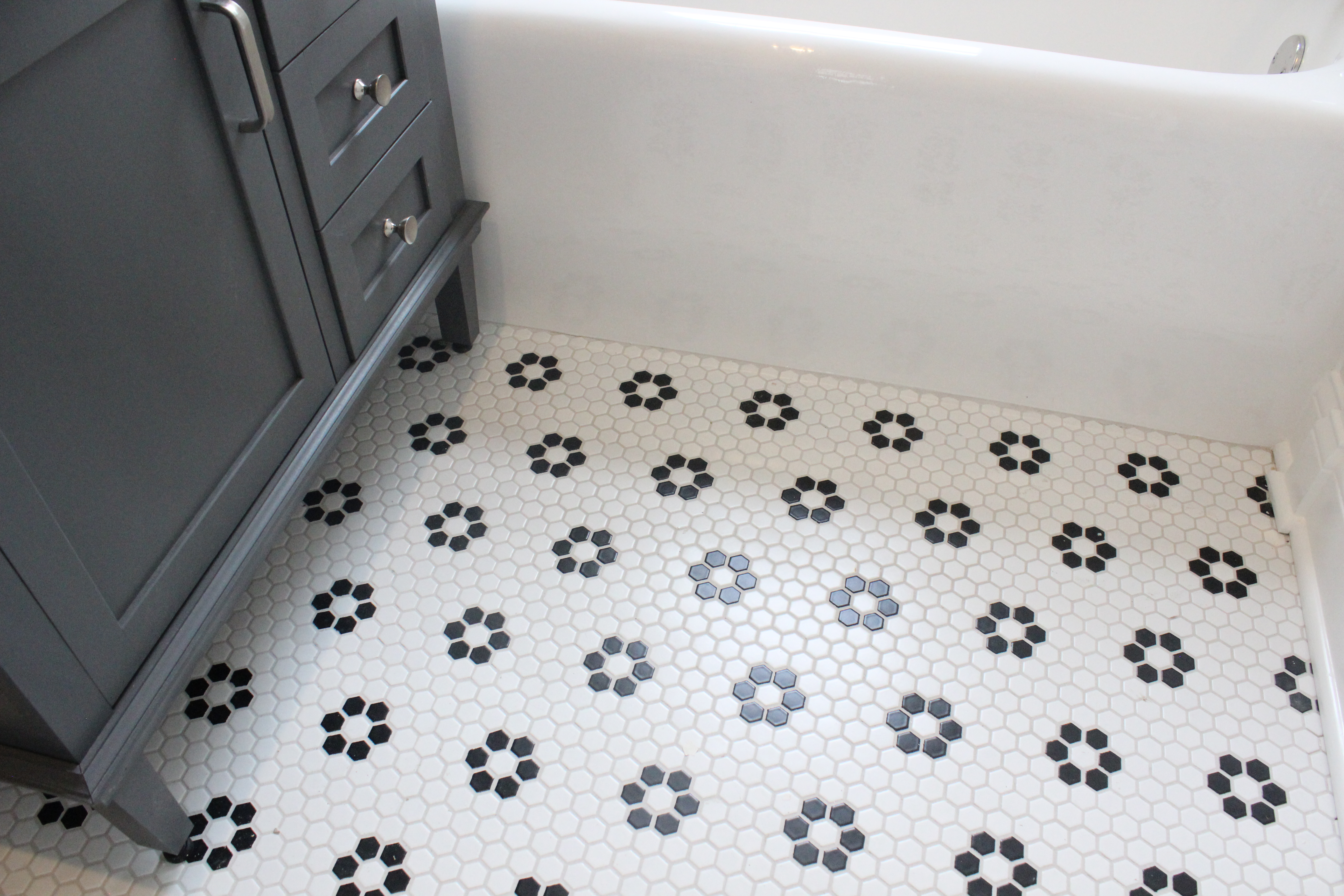
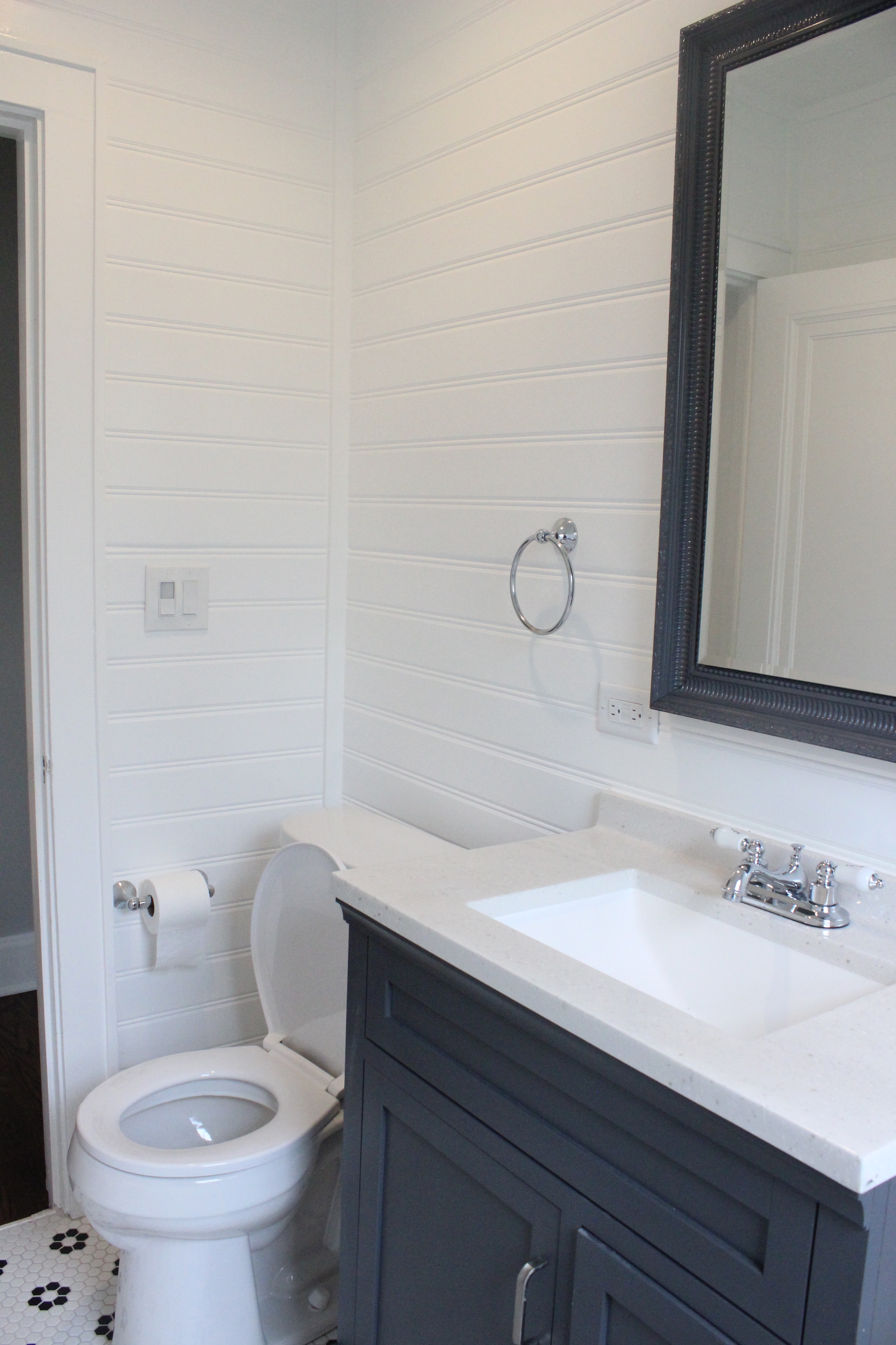
The vintage style hexagon flower tile from Home Depot is one of my favorite parts of the house:
We installed white shiplap on the walls:
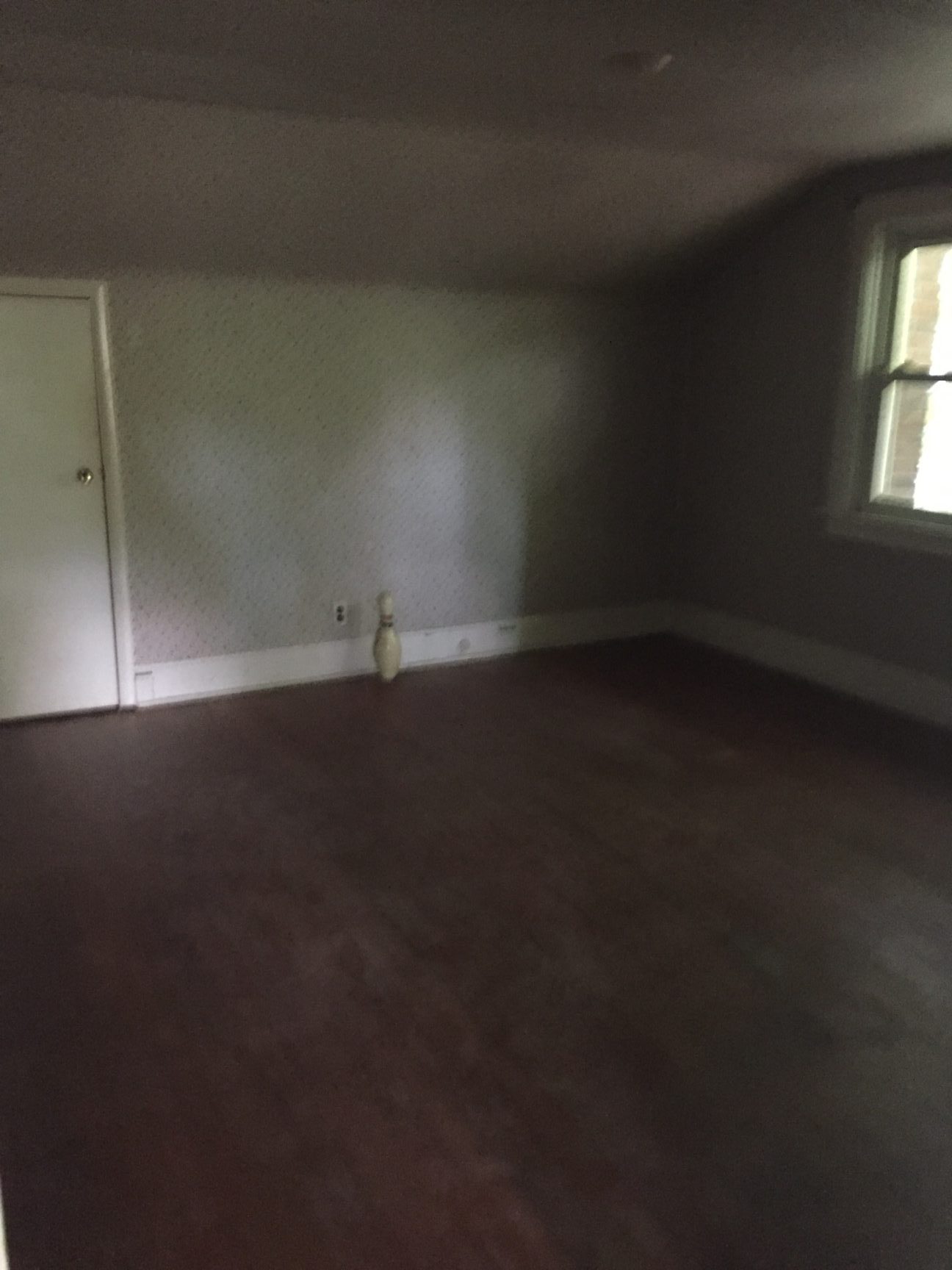
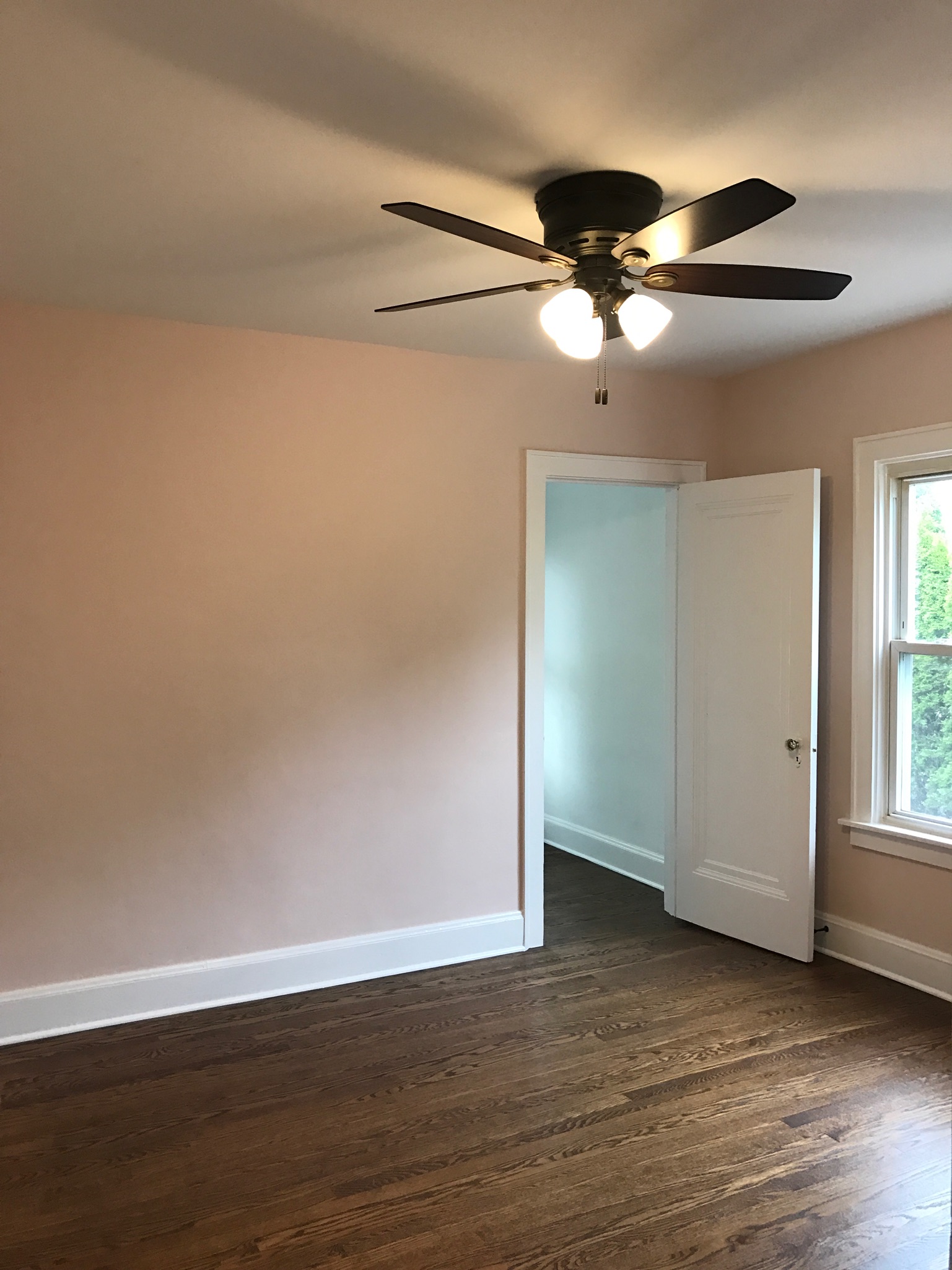
Here was one of the bedrooms before:

And now with a new bronze ceiling fan, floors refinished and paint (Faint Coral by Sherwin Williams):
The 2nd bedroom before:
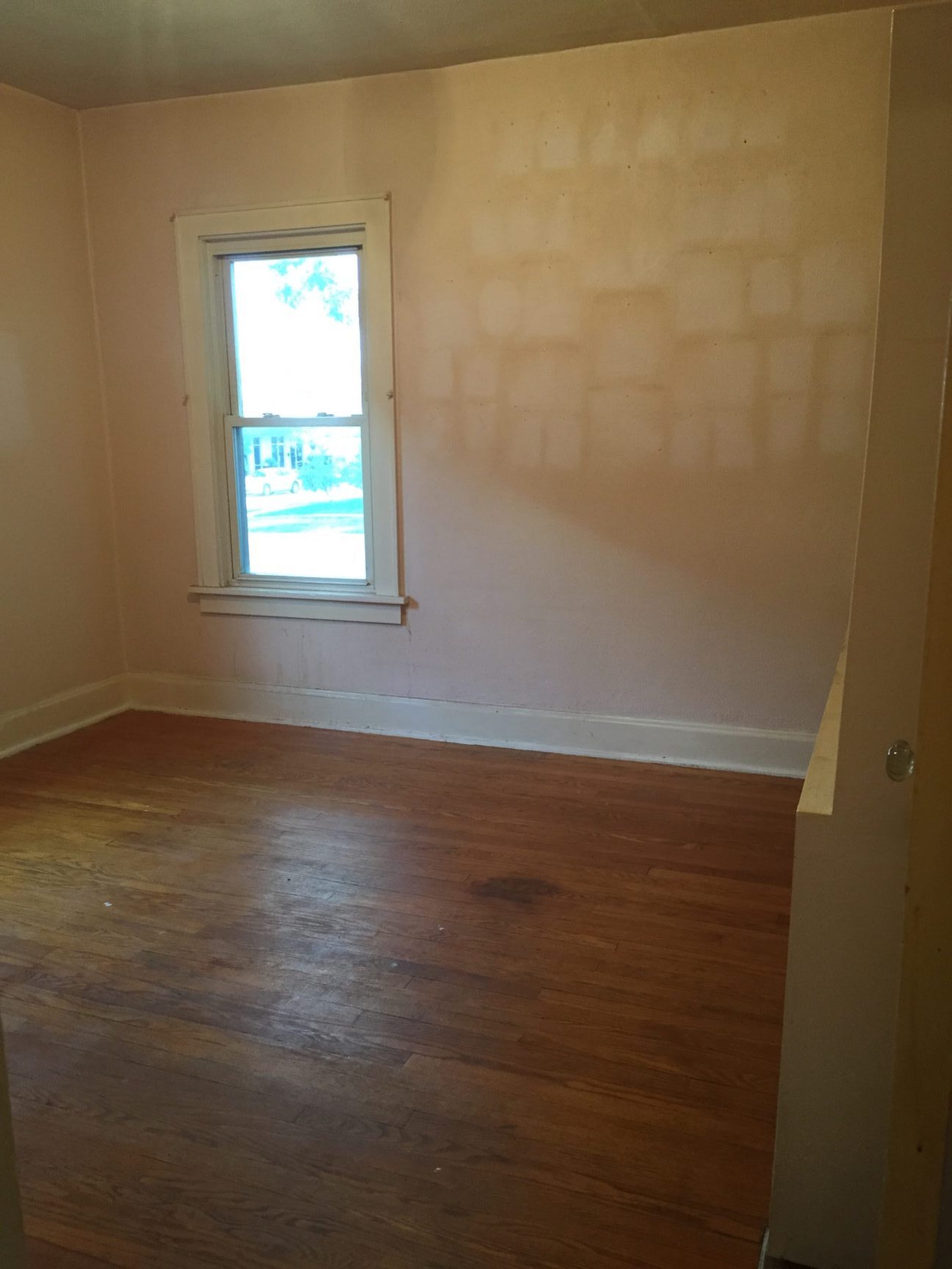
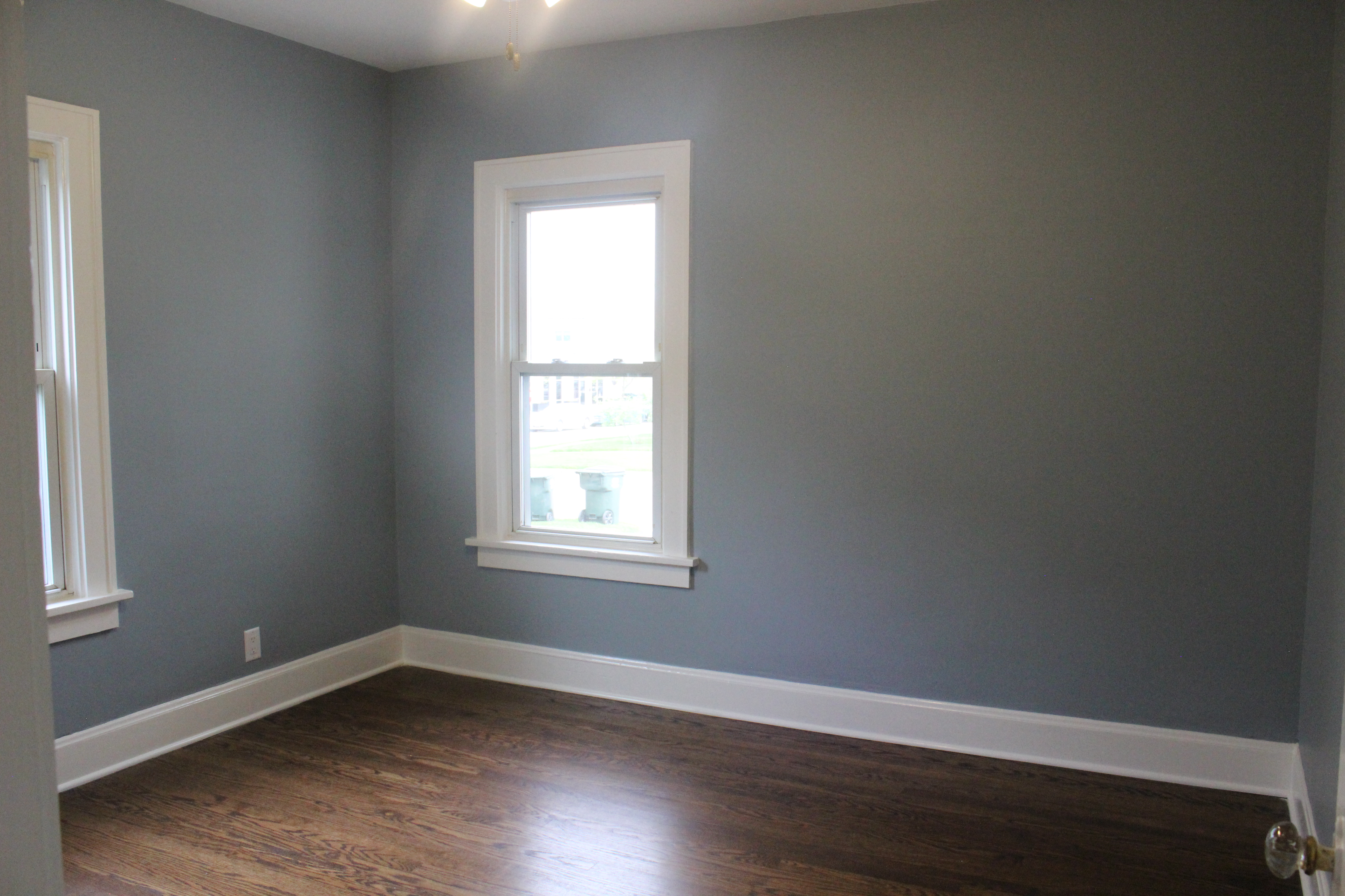
And now (paint is Nimbus Gray by Benjamin Moore):
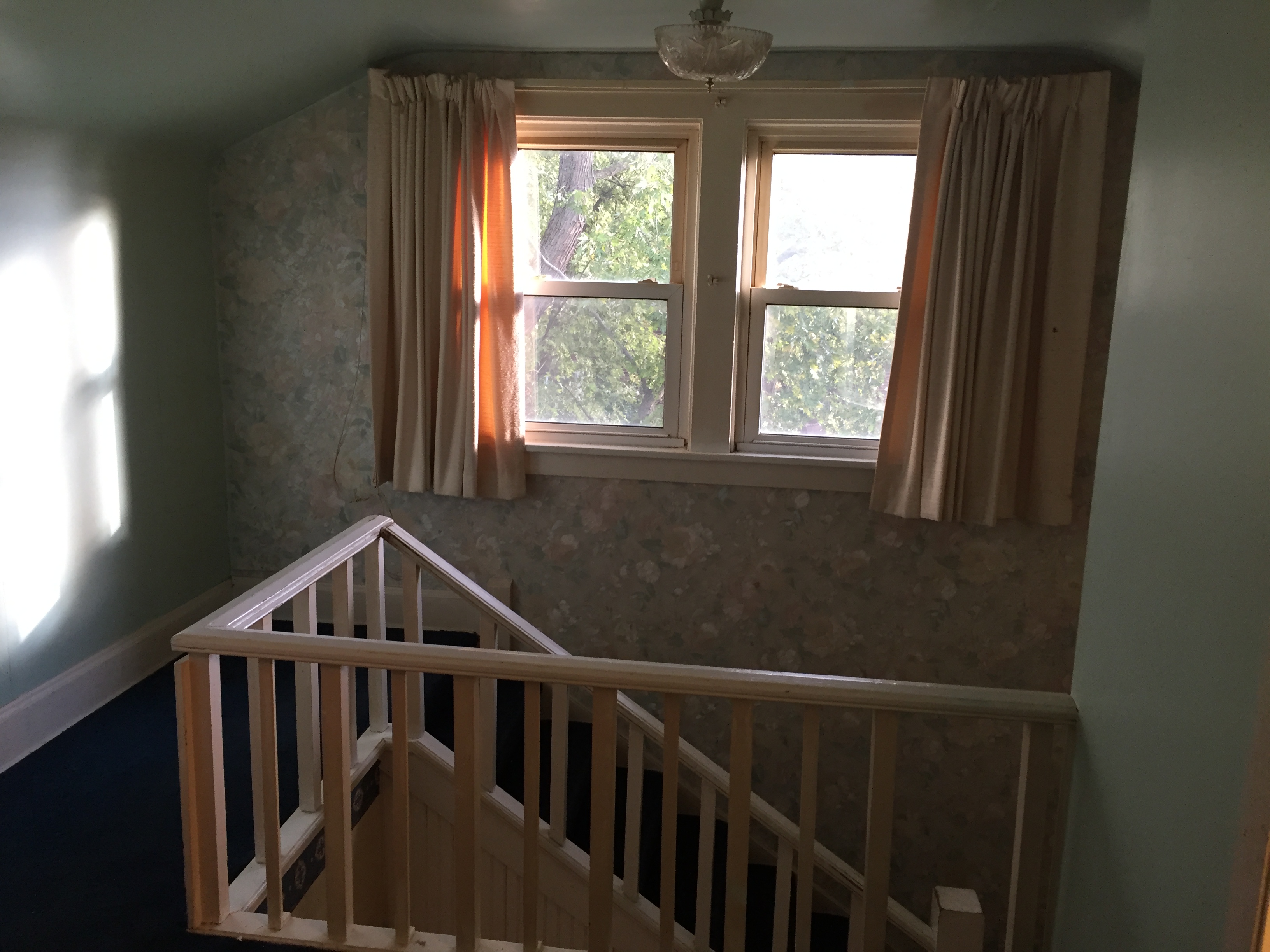
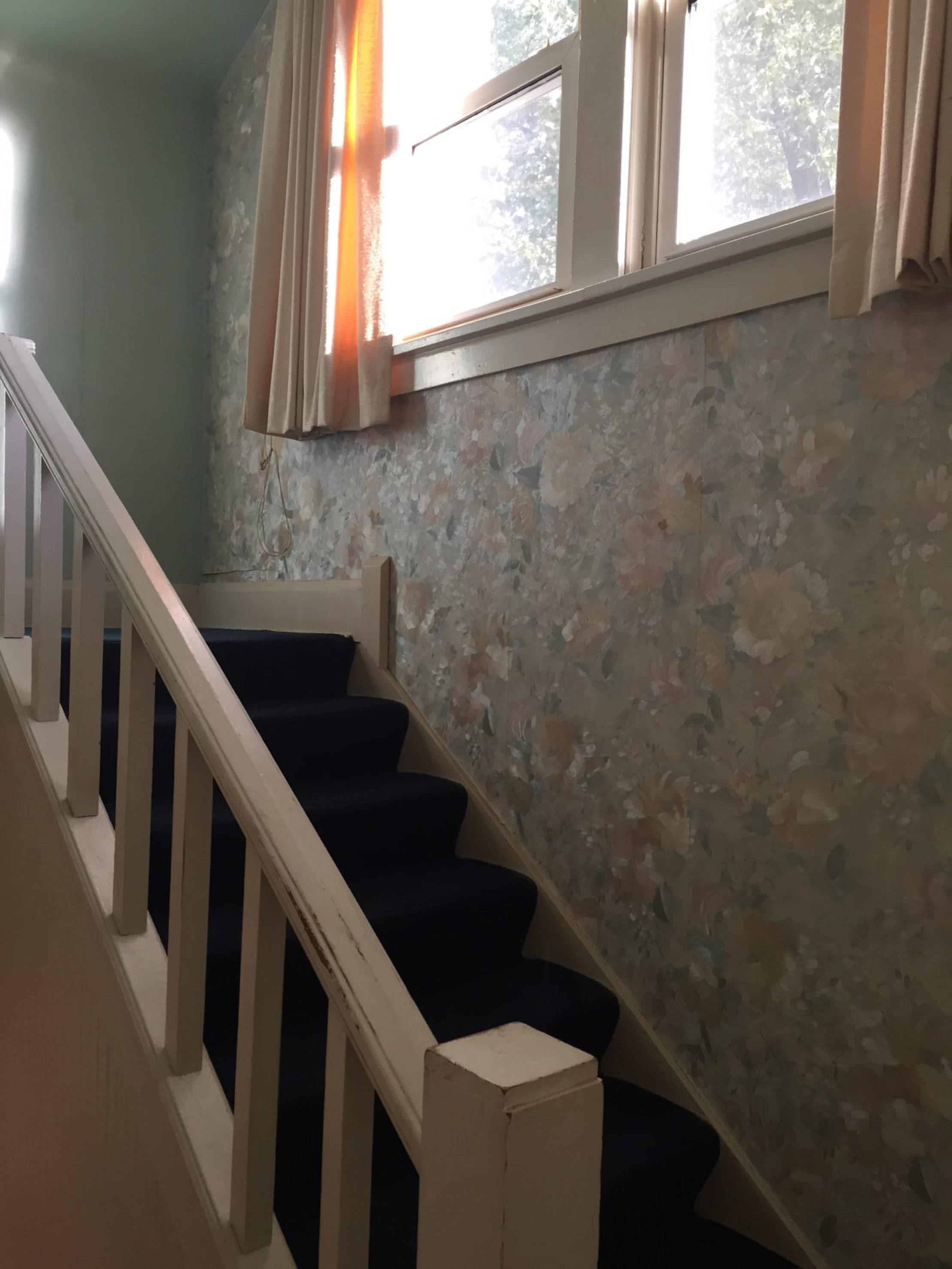
Here was the old view of the stairs leading up to the 2nd floor:
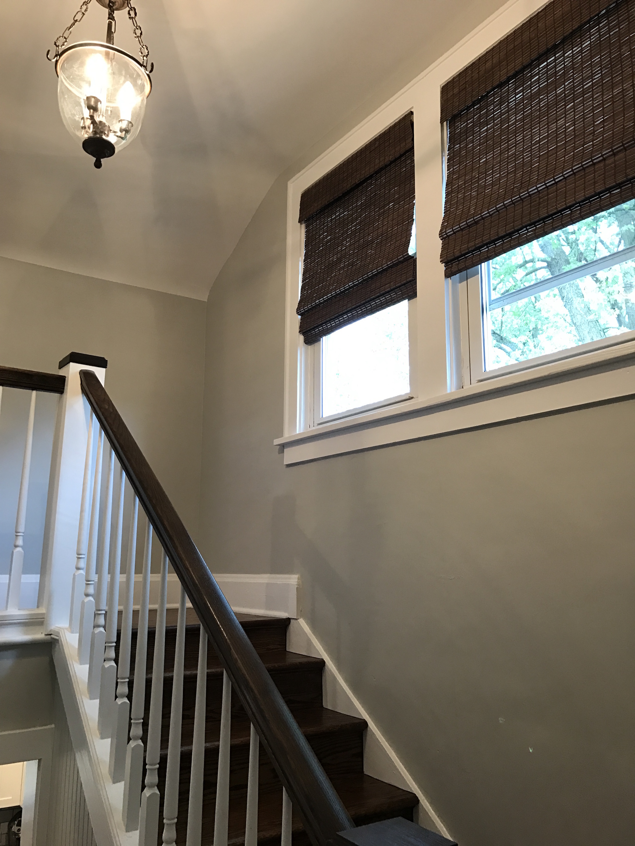
And now after new railings, paint, stain, a new chandelier, and roman shades:
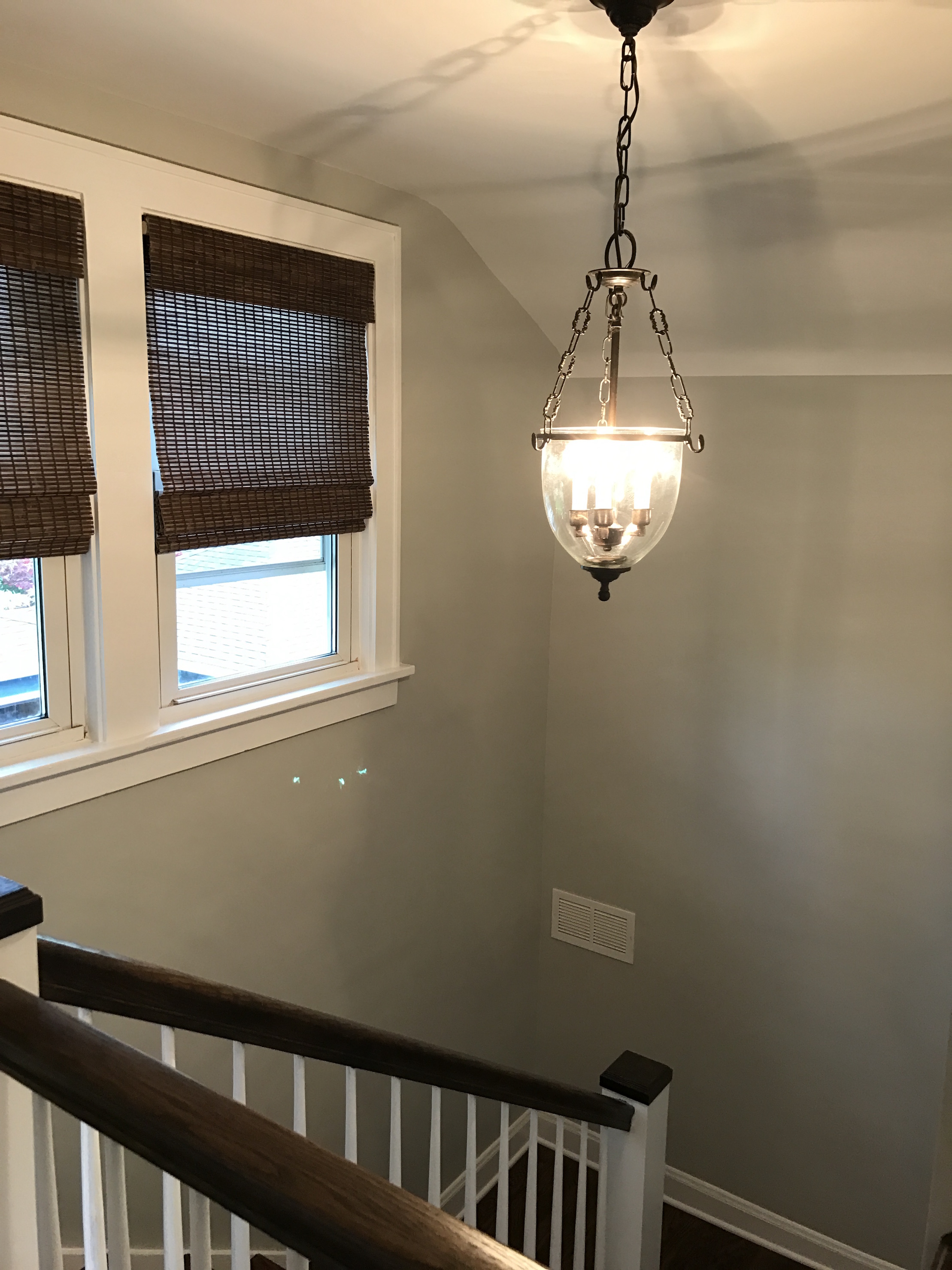
Here’s a view from the top of the stairs before:
And now:
We totally changed the layout upstairs. It used to be 2 small bedrooms and a TINY powder room.
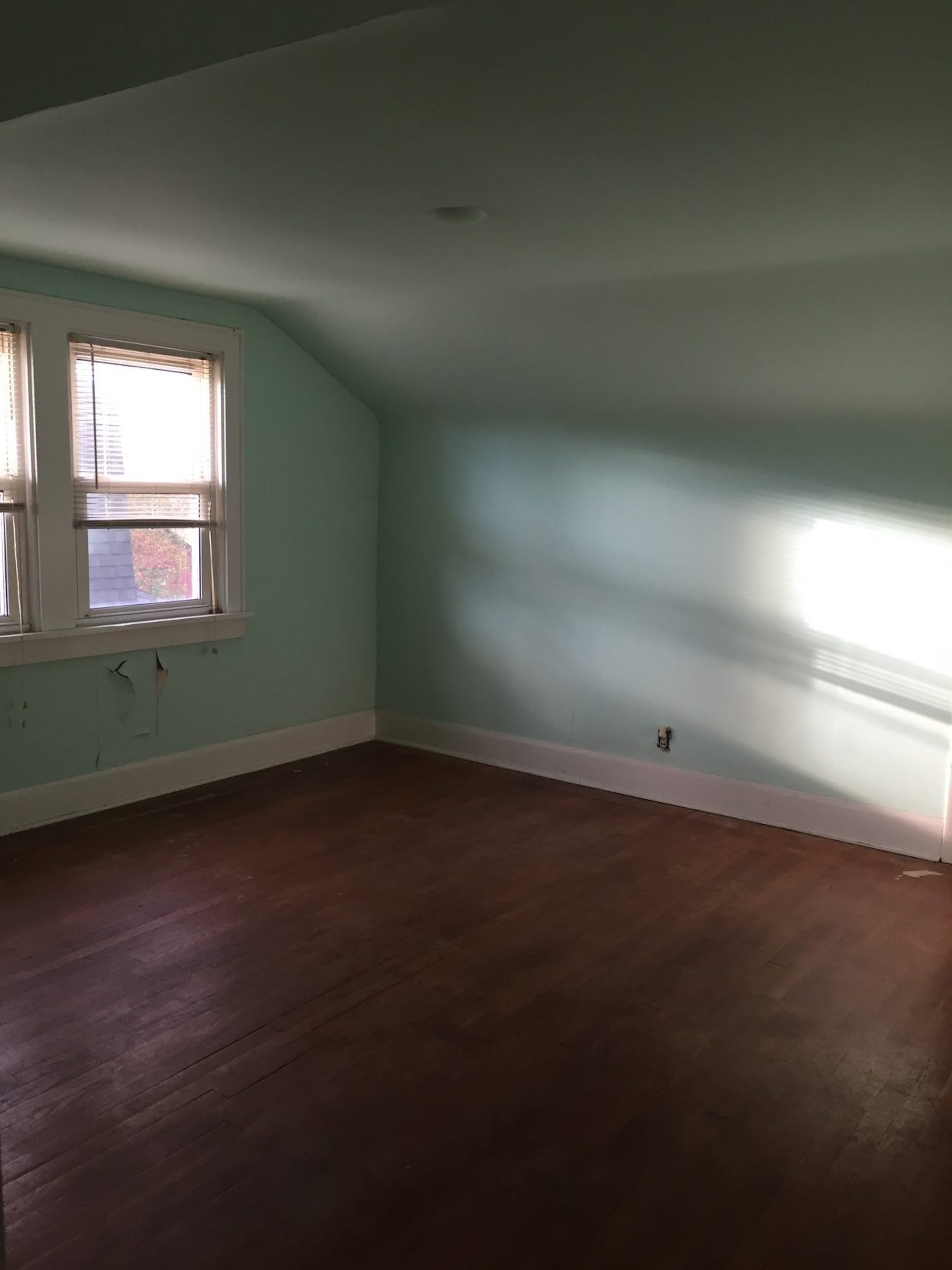 We changed it into one big master bedroom, walk in closet and master bath.
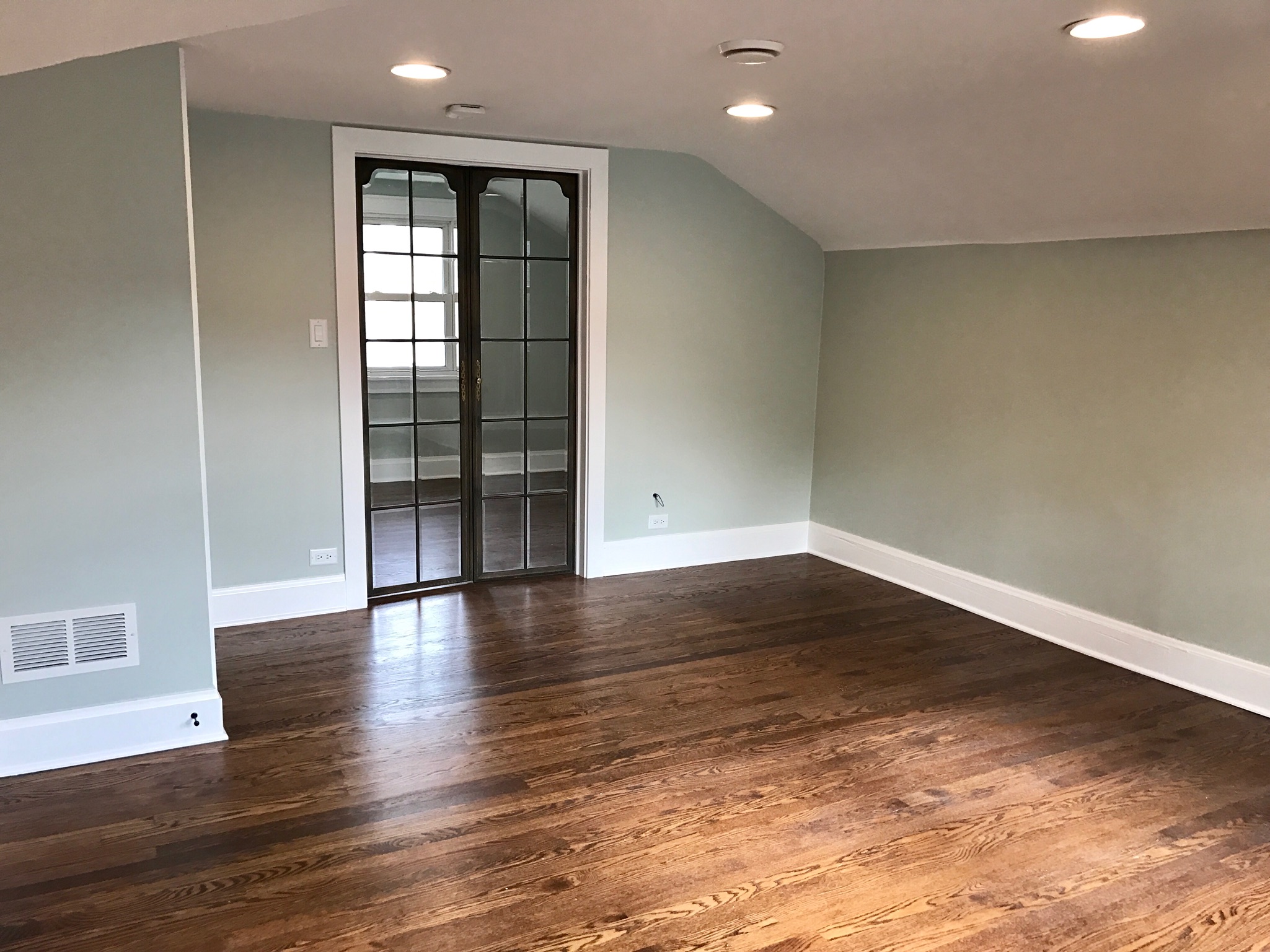 Aren’t those doors leading to the walk-in closet AMAZING? The homeowners found them at a salvage shop.
Here’s a view of the opposite side of the master bedroom:
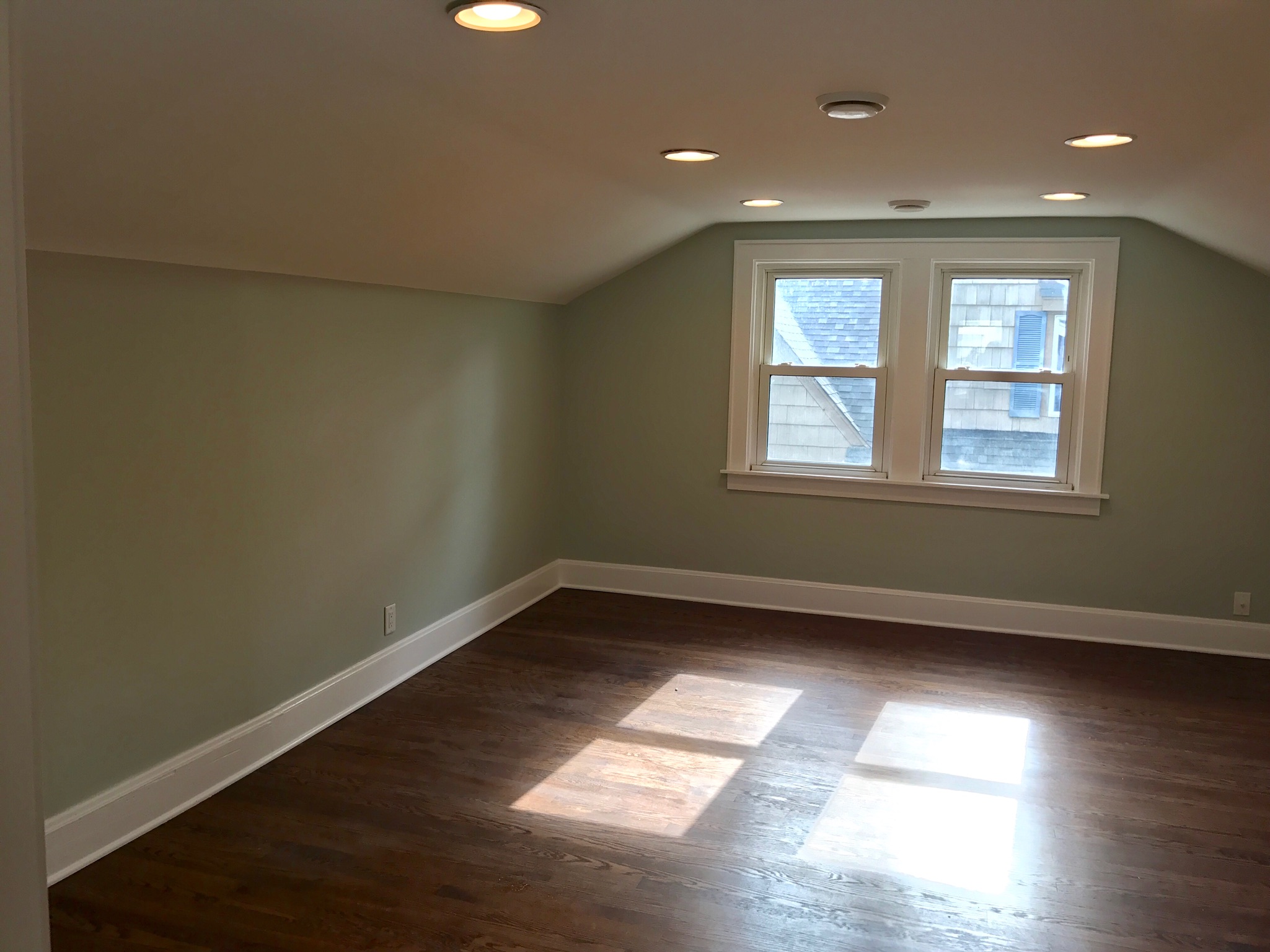
We added recessed lighting, re-finished the floors, and painted the walls Sea Salt by Sherwin Williams.
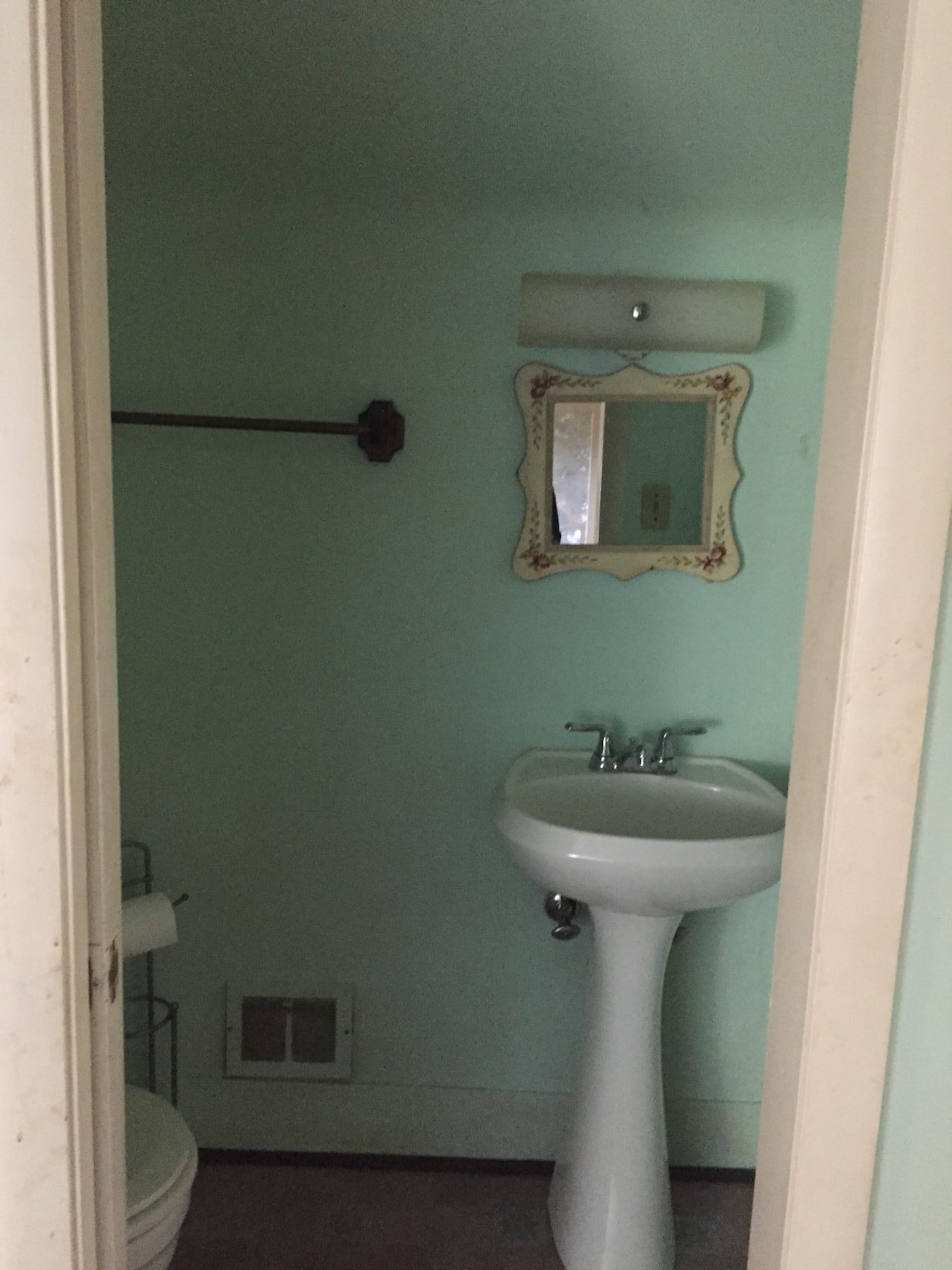
Here was the old upstairs powder room:
We gutted this and built out a whole new master bathroom with a marble tile shower, Kohler Brushed bronze fixtures, antique gold mirror, marble top white vanity, chrome globe sconces and more:
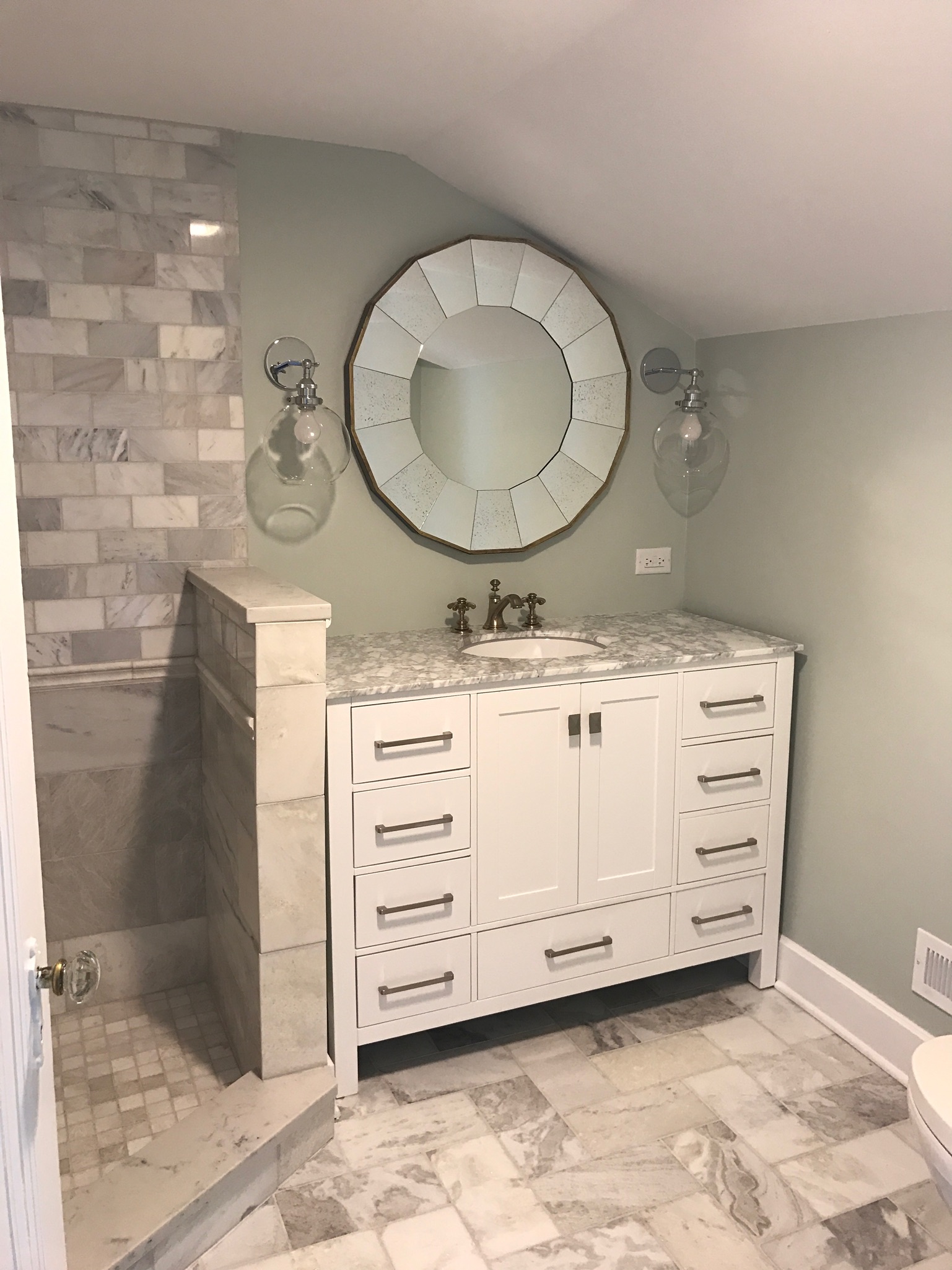
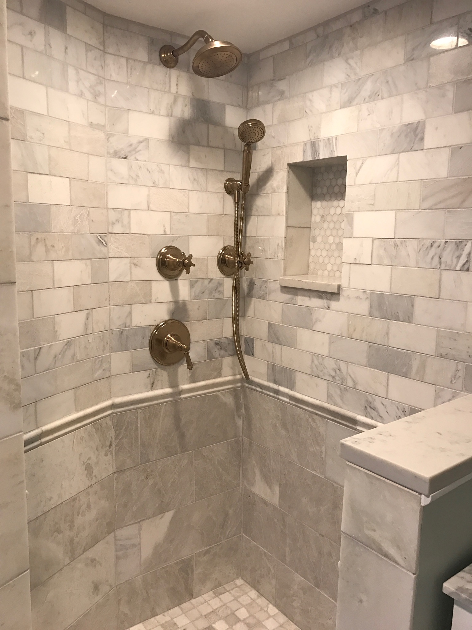
(The glass shower doors went in after I took these pics).
I really love how the whole upstairs is their master retreat.
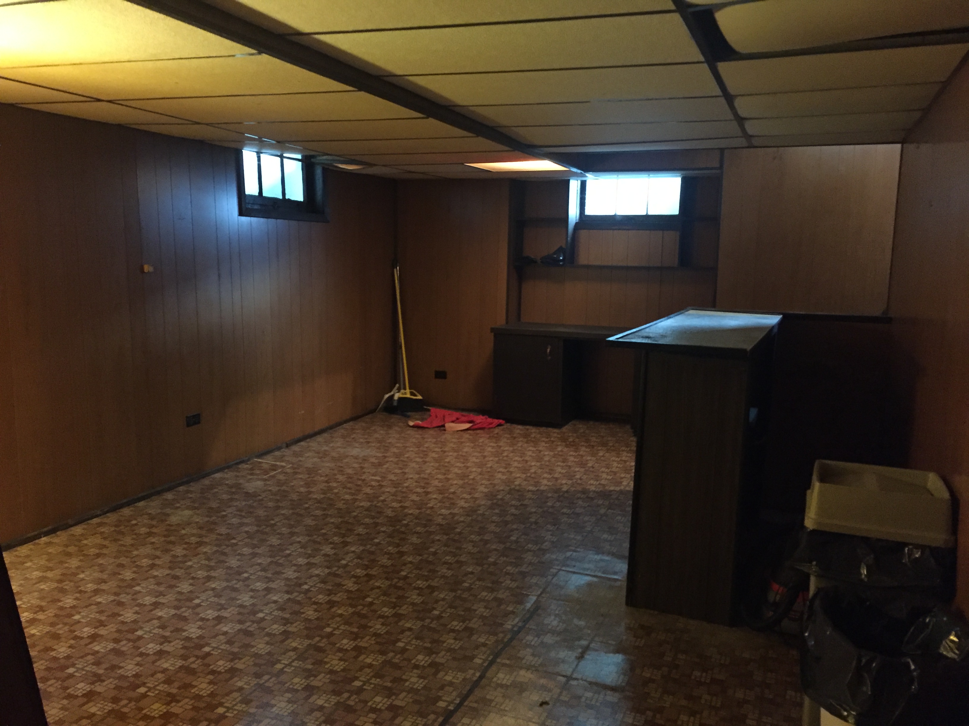
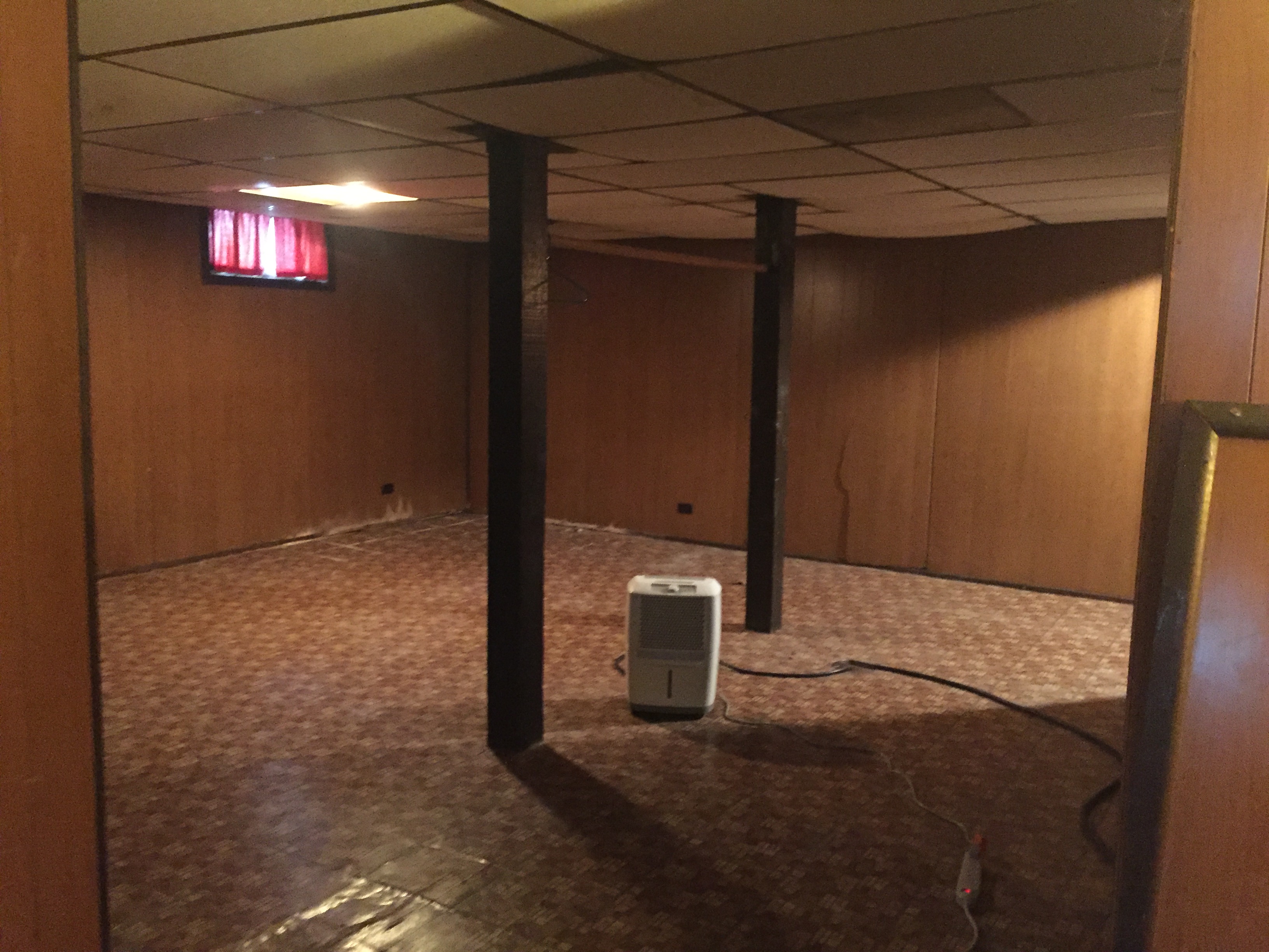
Moving down to the basement, it was straight out of the 1970’s with wood paneling and a drop ceiling.
We completely demo’d this out, and found some major structural issues that took a lot of extra work. But in the end it turned out beautiful: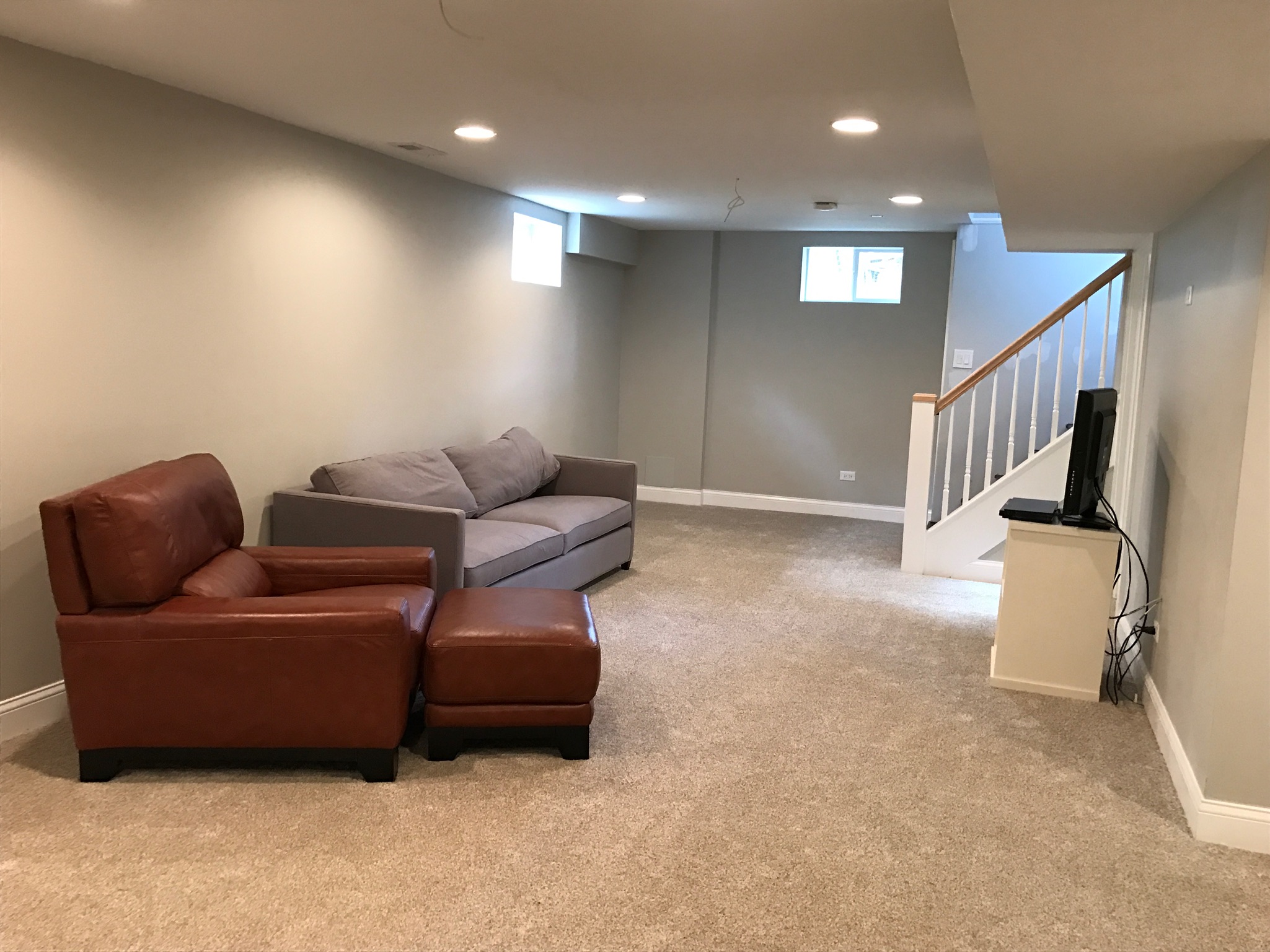
The wall color is Agreeable Gray by Sherwin Williams. Here’s the view of the other side before:
And now:
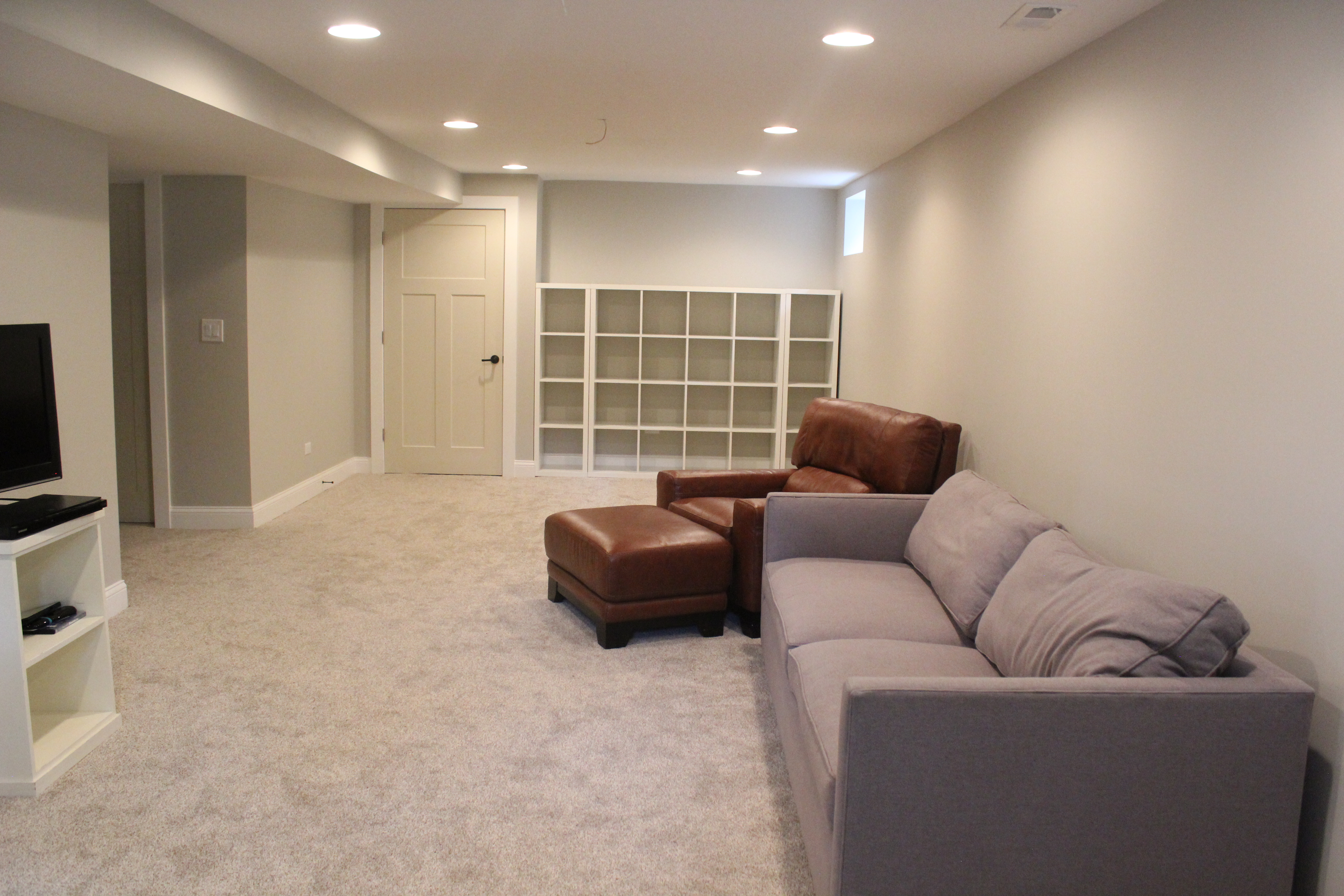
The cubbies are Ikea Kallax, like we have in our playroom. The homeowners have that area set up as a playroom with toys and a chalkboard on the little wall on the left.
This was the old basement bathroom:

And now:
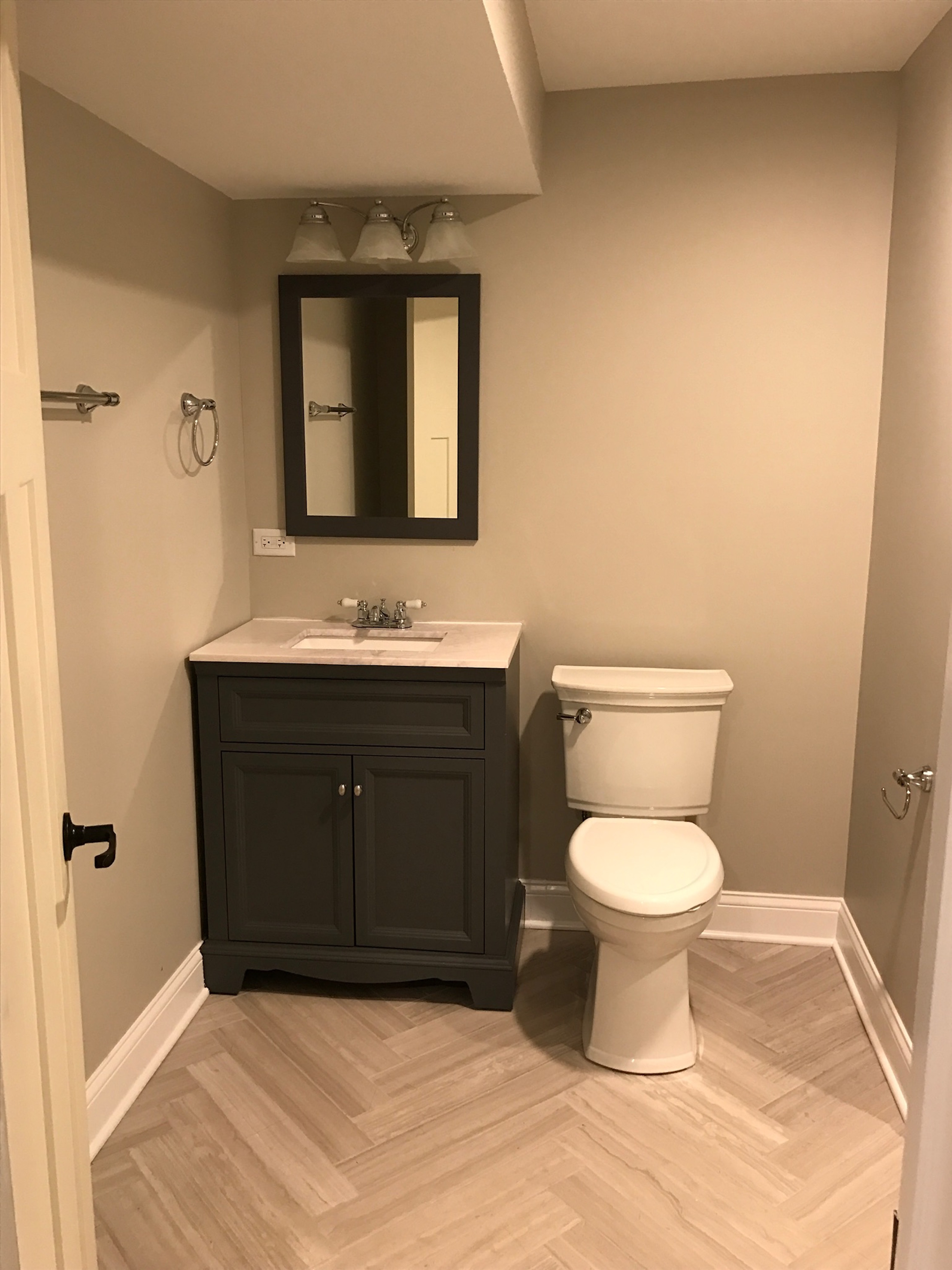
I just love the floor tile that we laid in a herringbone pattern.
We had space for a large shower and did a dark gray and white stripe pattern with chrome fixtures:
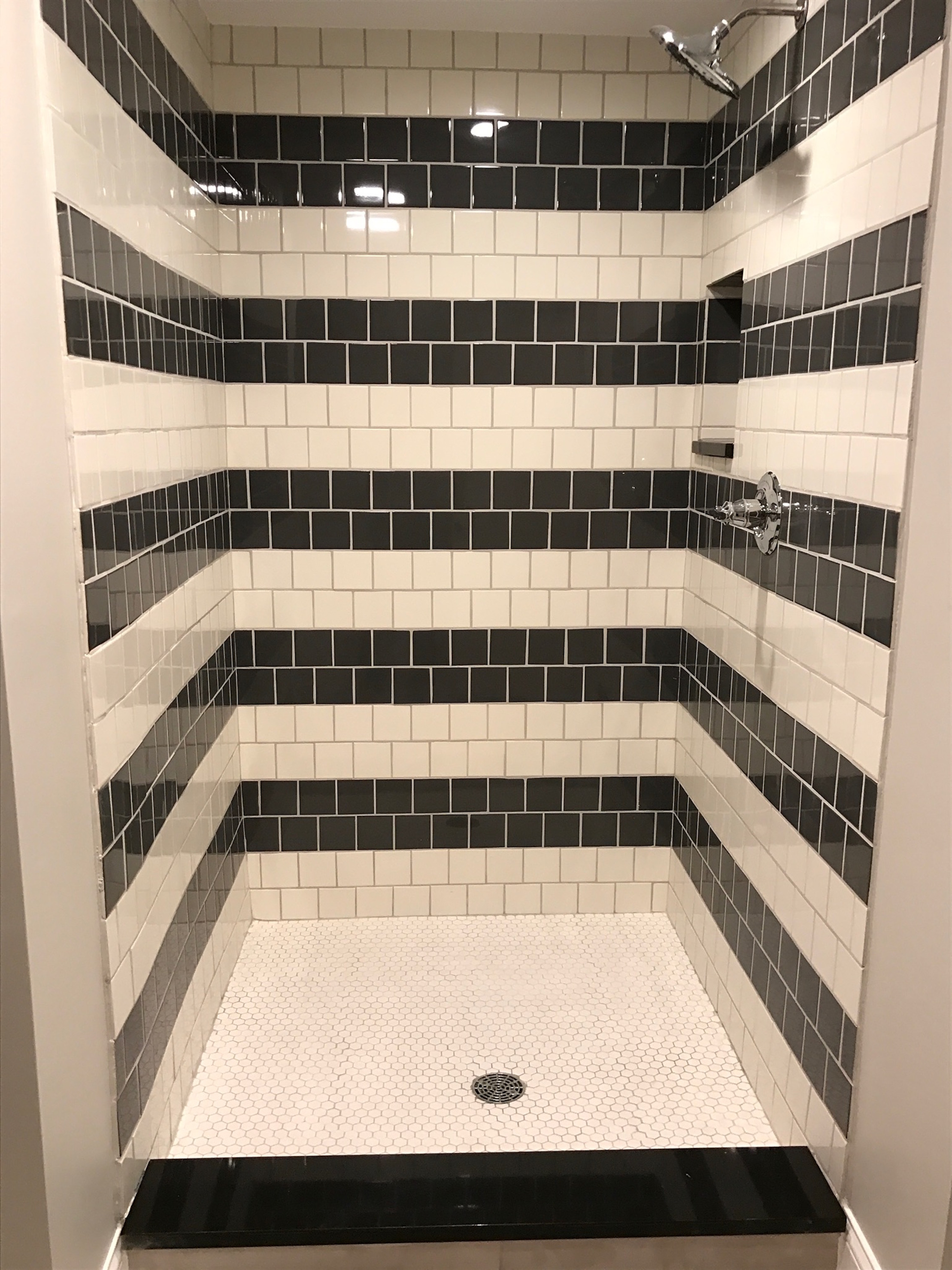
(Again the shower doors weren’t on yet)
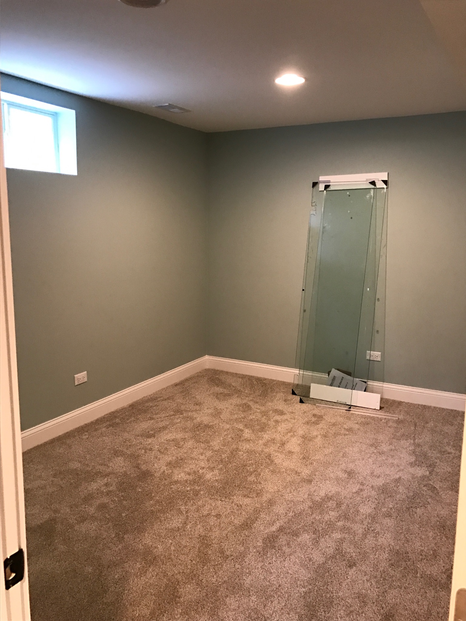
We also created a bedroom in the basement (wall color is Palladian Blue by Benjamin Moore):
Lastly, we created a laundry room in the basement, and used the Ikea Kallax cubbies for storage again:
That concludes the tour! It was a huge undertaking and a ton of work, but it turned out even better than we imagined. And unlike other flip/rental properties we have renovated, we actually get to enjoy this one AFTER it’s finished because our friends live there. Win, win!
If you’d like to see some of the other properties we have “flipped,” find our rental property renovation here and another “flip” we did 4 years ago here.

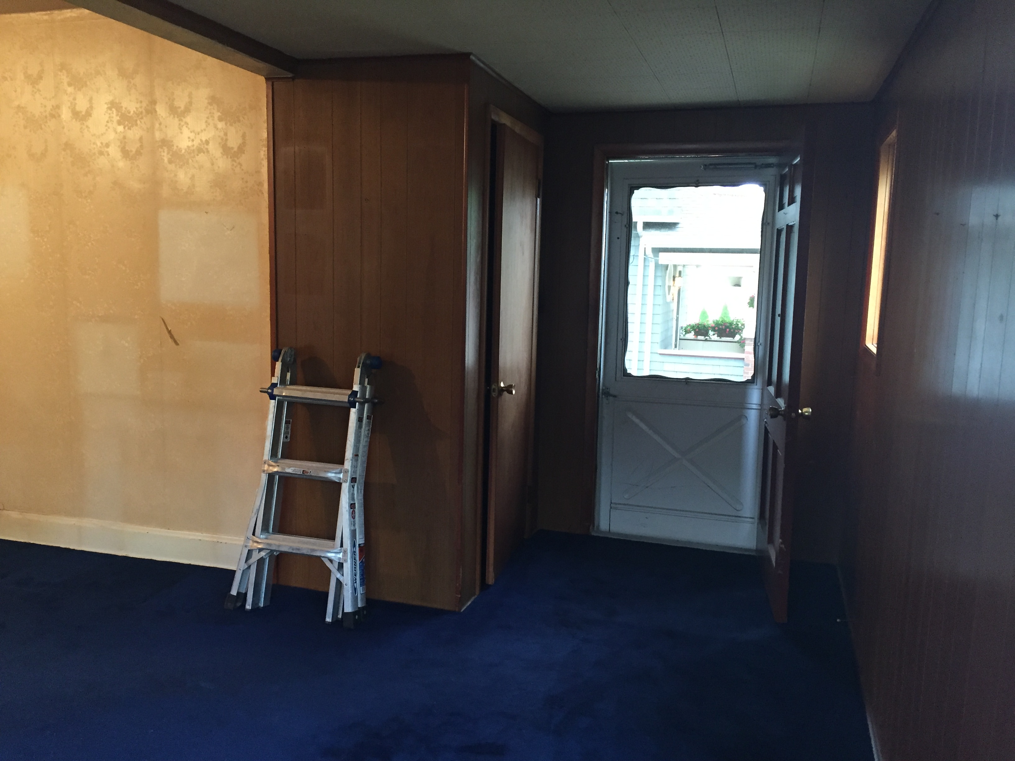
 Here was the old dining room: