Archive | Flooring RSS feed for this section

5 Years Later (What’s Changed)

24 Oct

Today marks 5 years since we closed on 12 Oaks, so I thought we should recap everything we’ve been able to accomplish since October 2012.

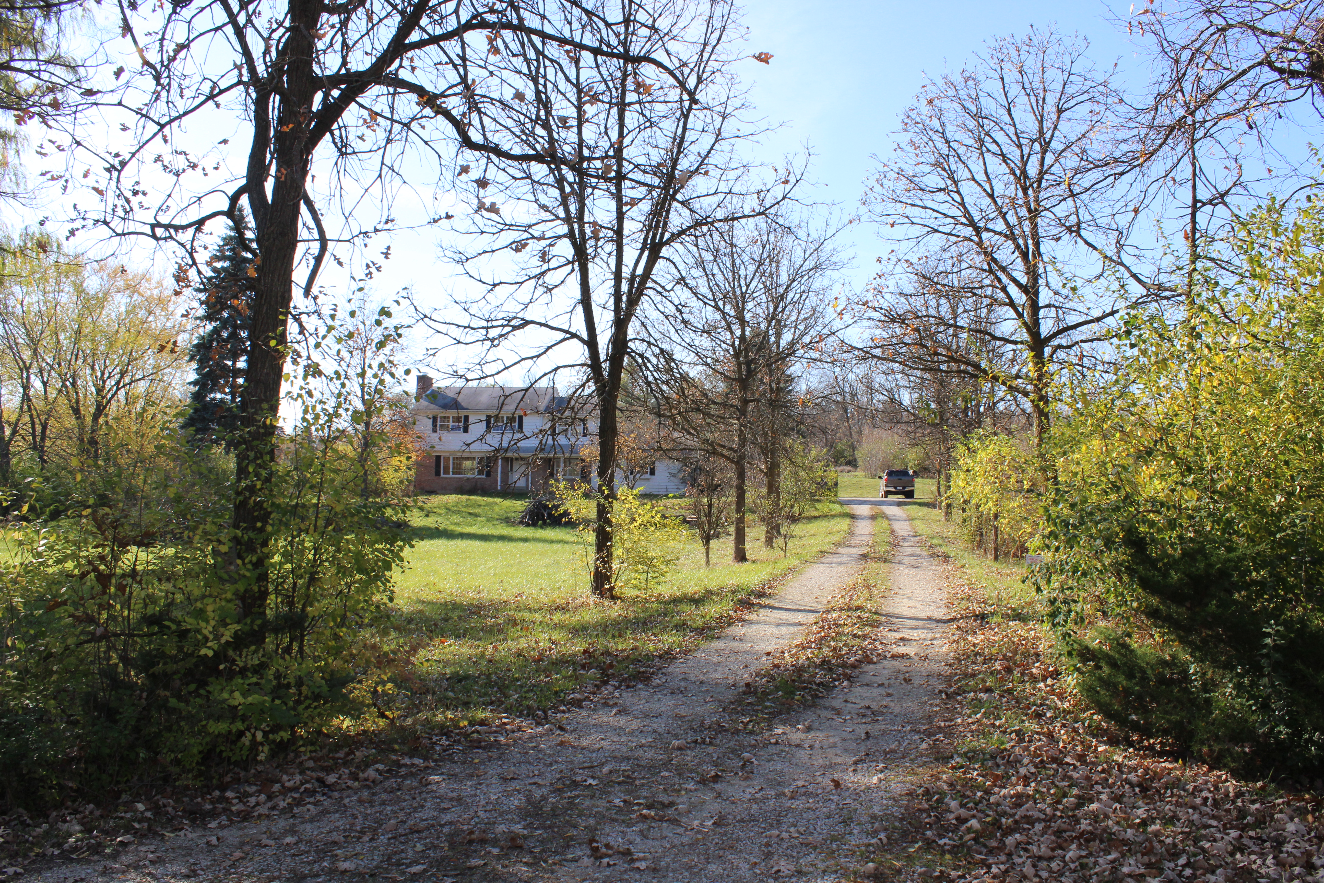
Here we go, starting with the driveway which was just gravel and so overgrown.

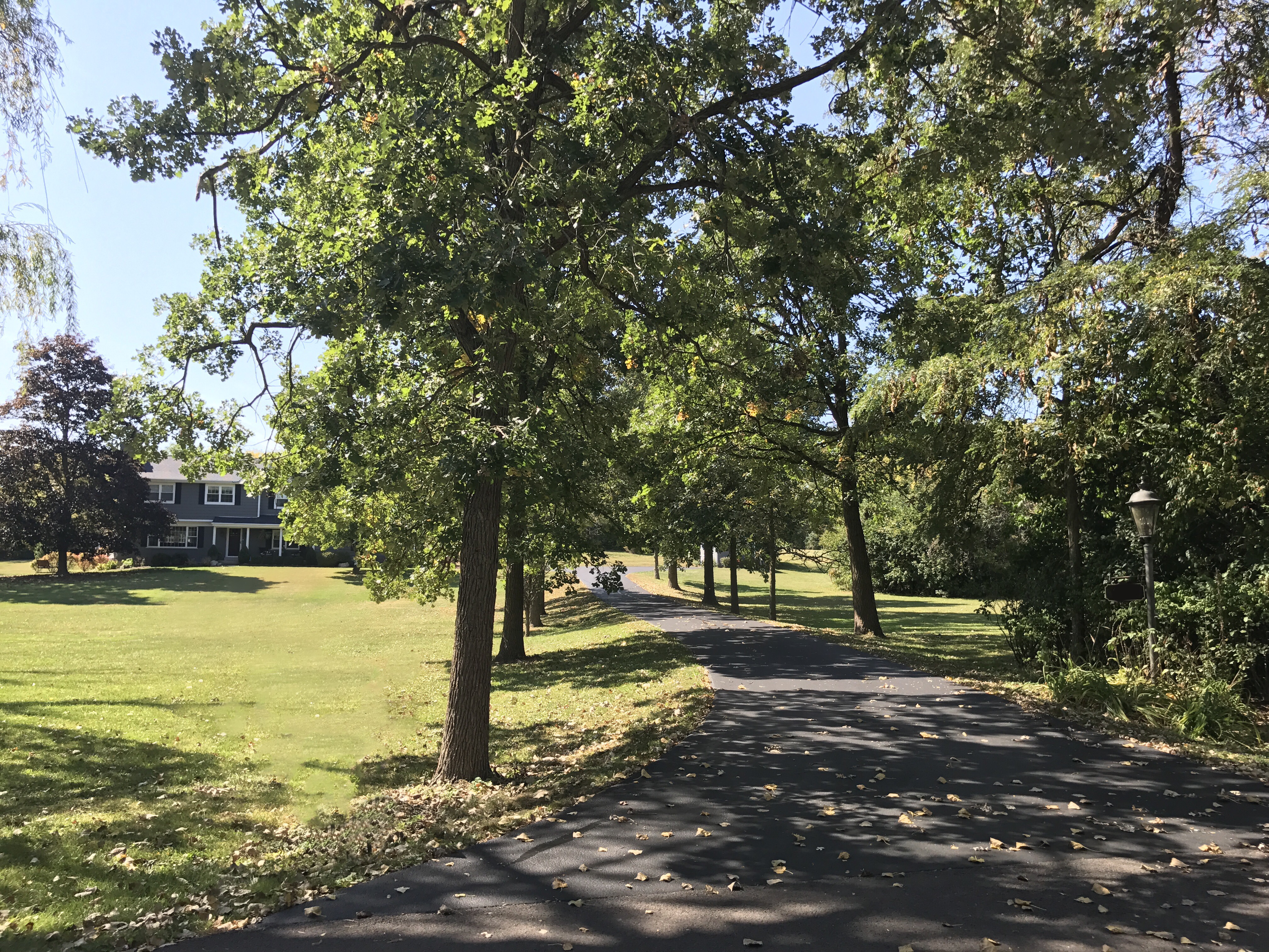
Here is the same view now:

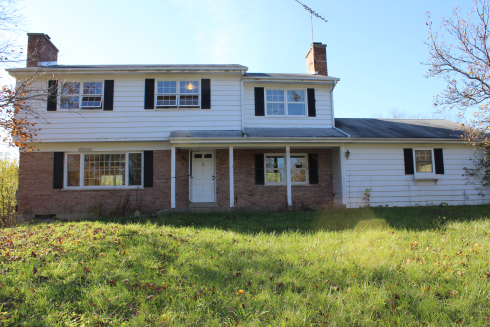
The front of the house was in need of some major TLC. Overgrown weeds, old broken windows, chipped paint, etc., etc.

Front Oaks Exterior Before

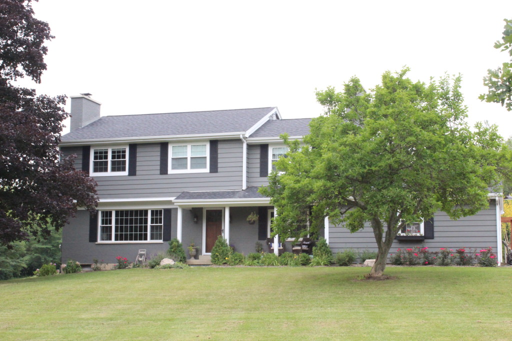
After A TON of work including a new roof, windows, landscaping, door, and paint, here she is now:

IMG_4813

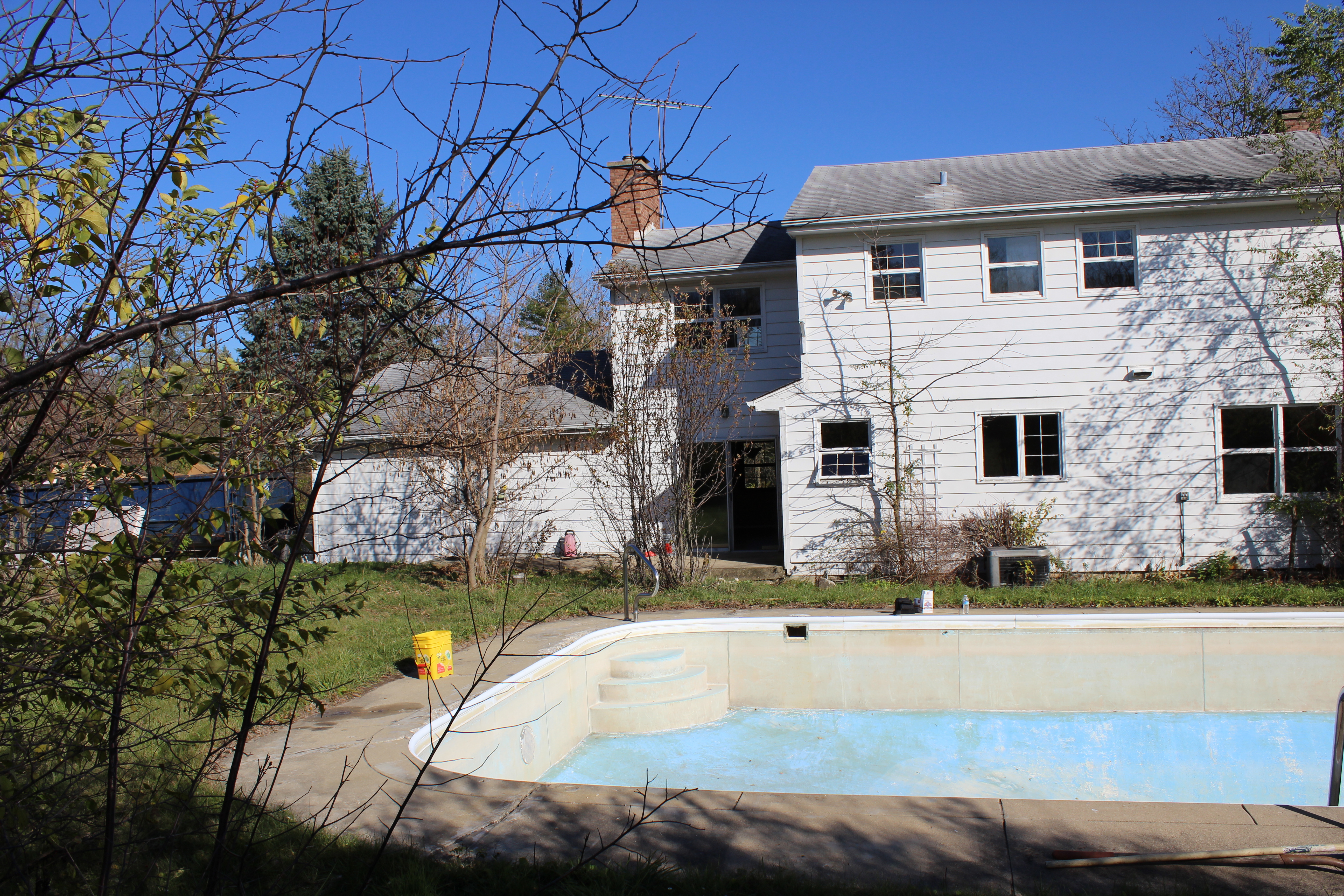
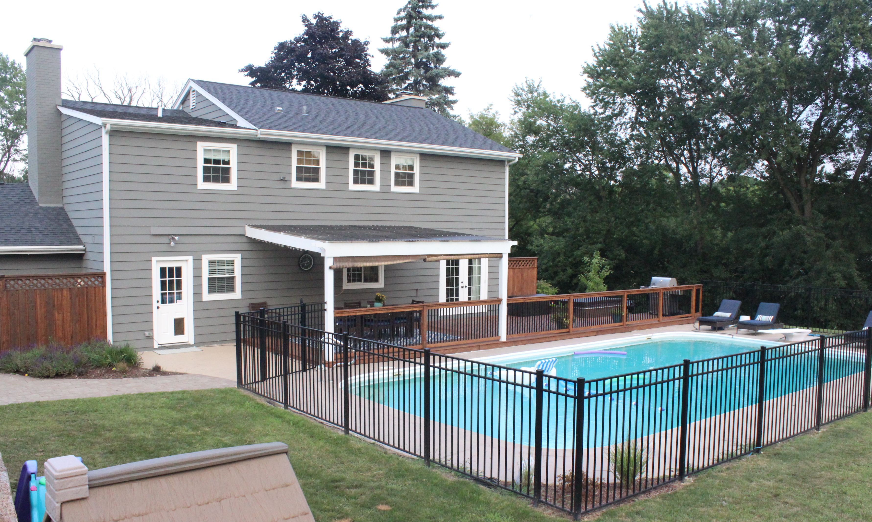
Moving to the back of the house and pool, we had this mess:

12 Oaks Before 387

And now after a deck, pergola, small addition (left side of the pergola), pool fence, garbage enclosure, landscaping, etc. (More on the backyard transformation here.)

IMG_5890

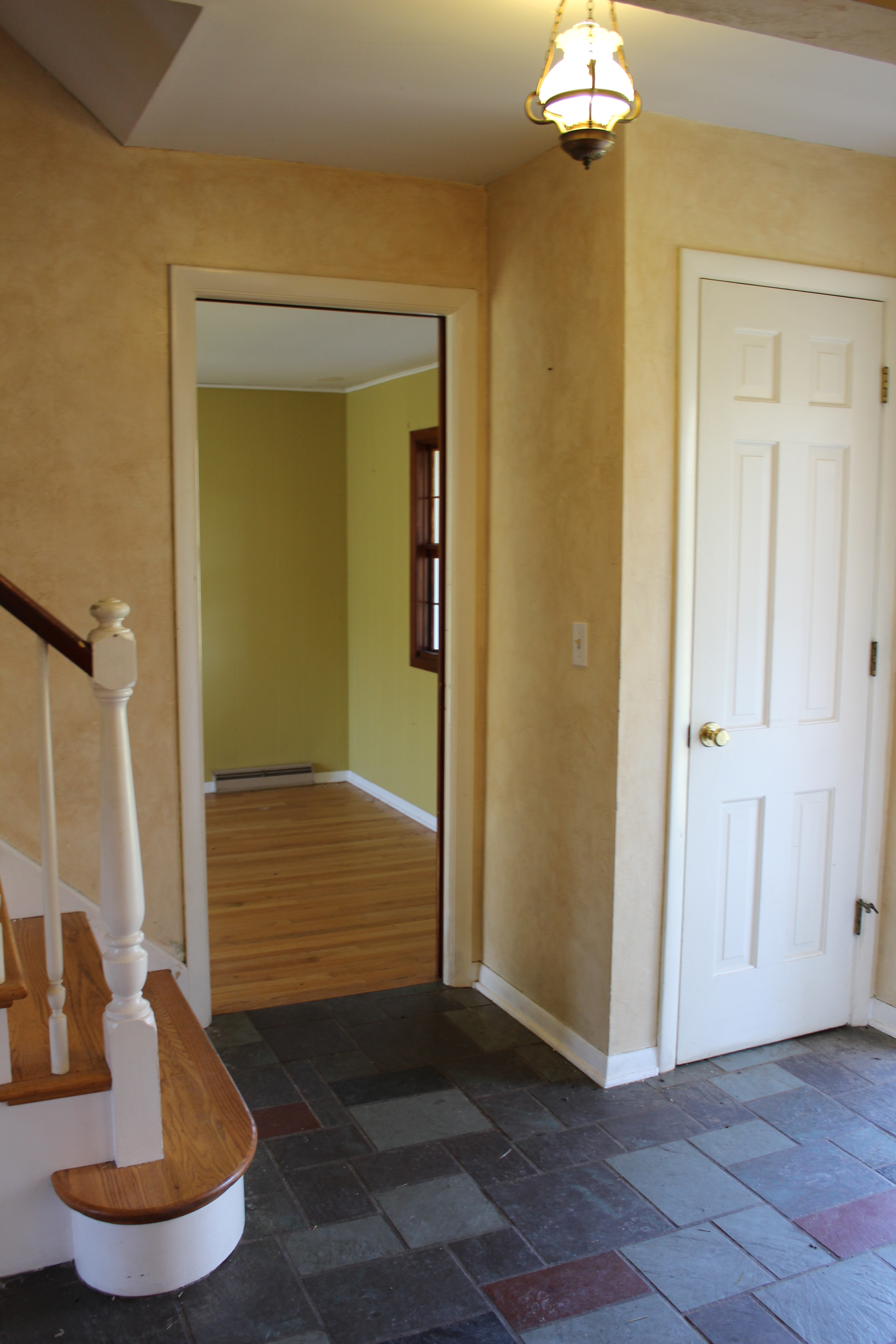
Here was the entryway/stairs 5 years ago:

12 Oaks Before 156

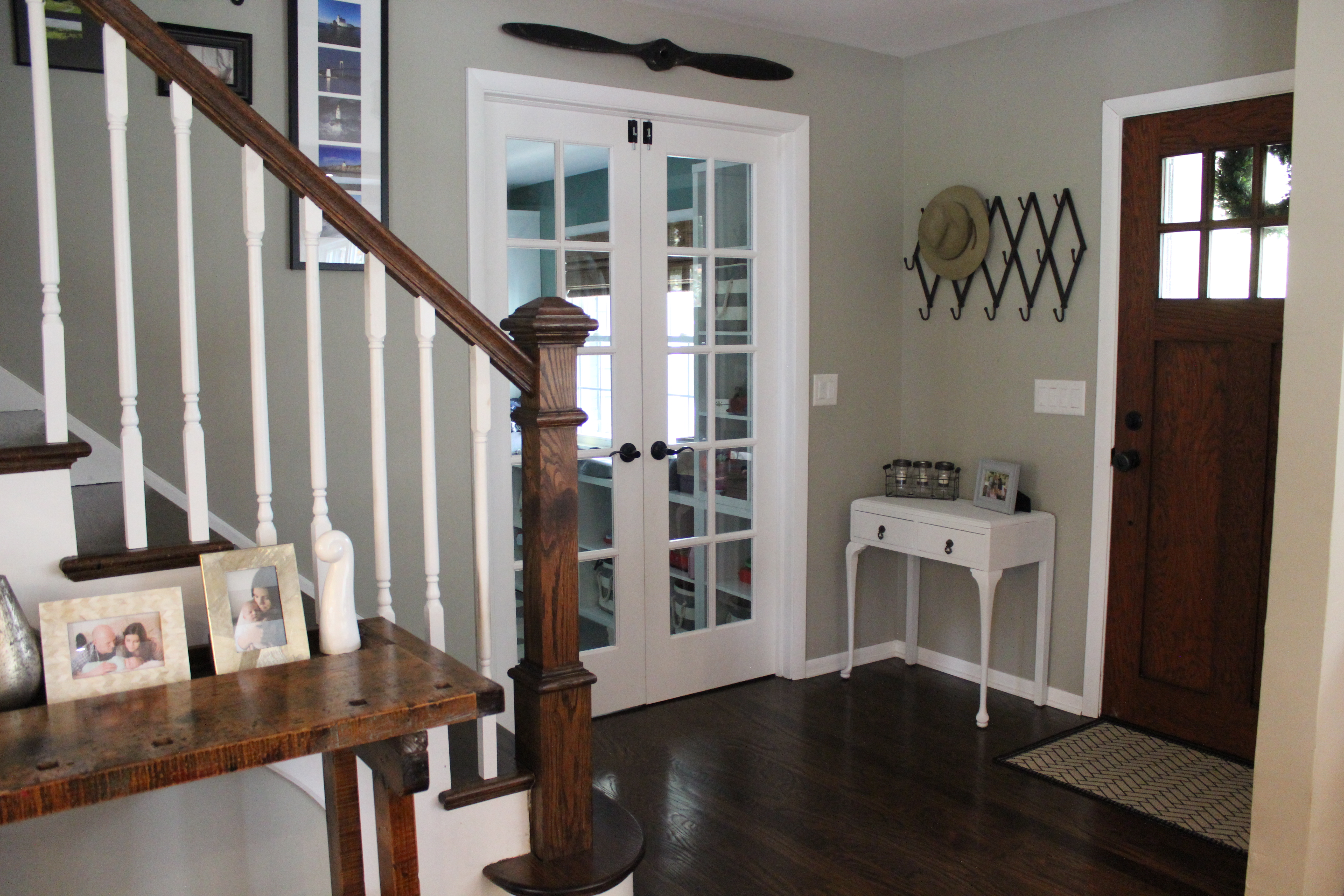
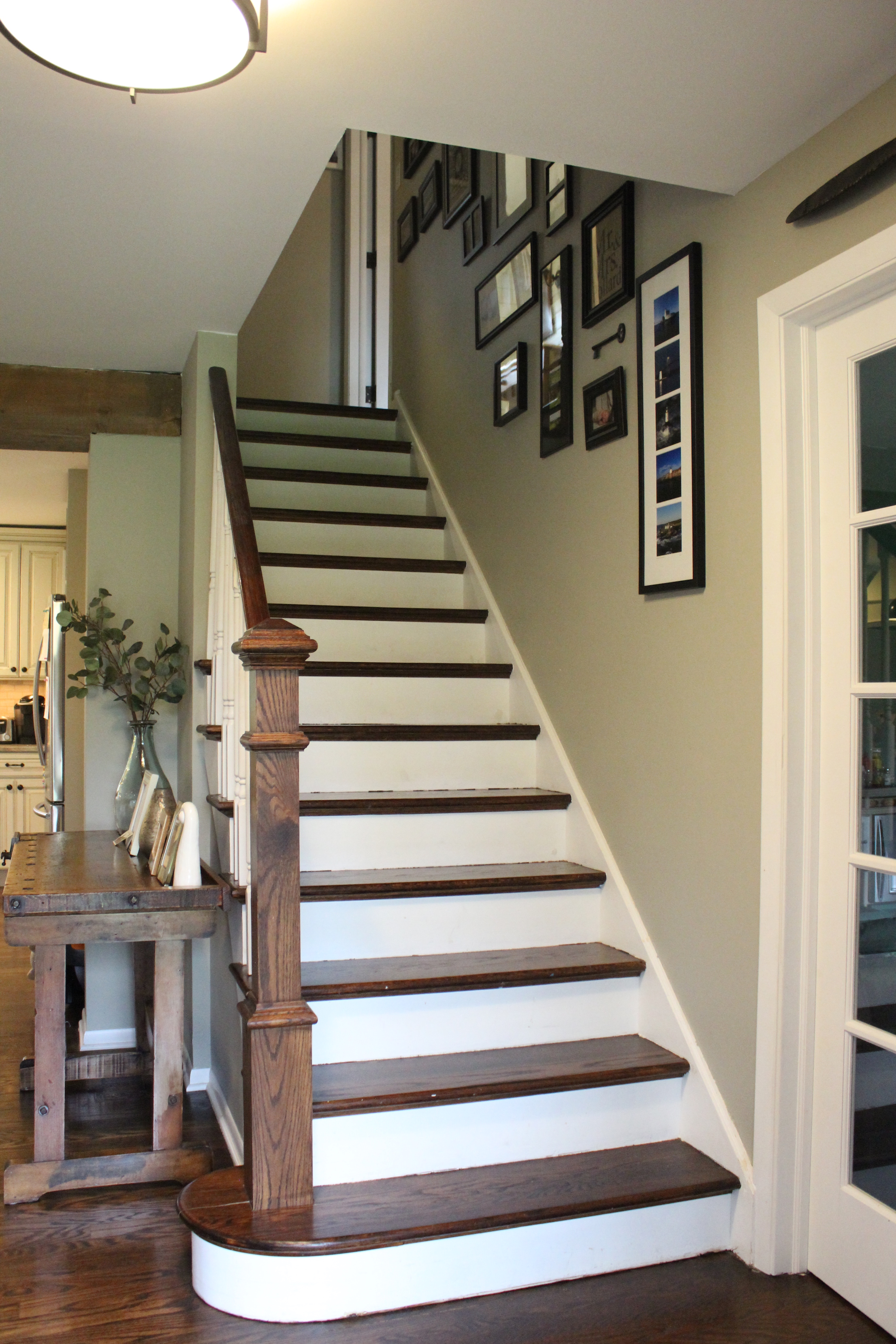
And now after removing the closet, putting in french doors to the now playroom, new hardwood floors, stain, paint, etc.:

See more about our stair and entryway makeover here.

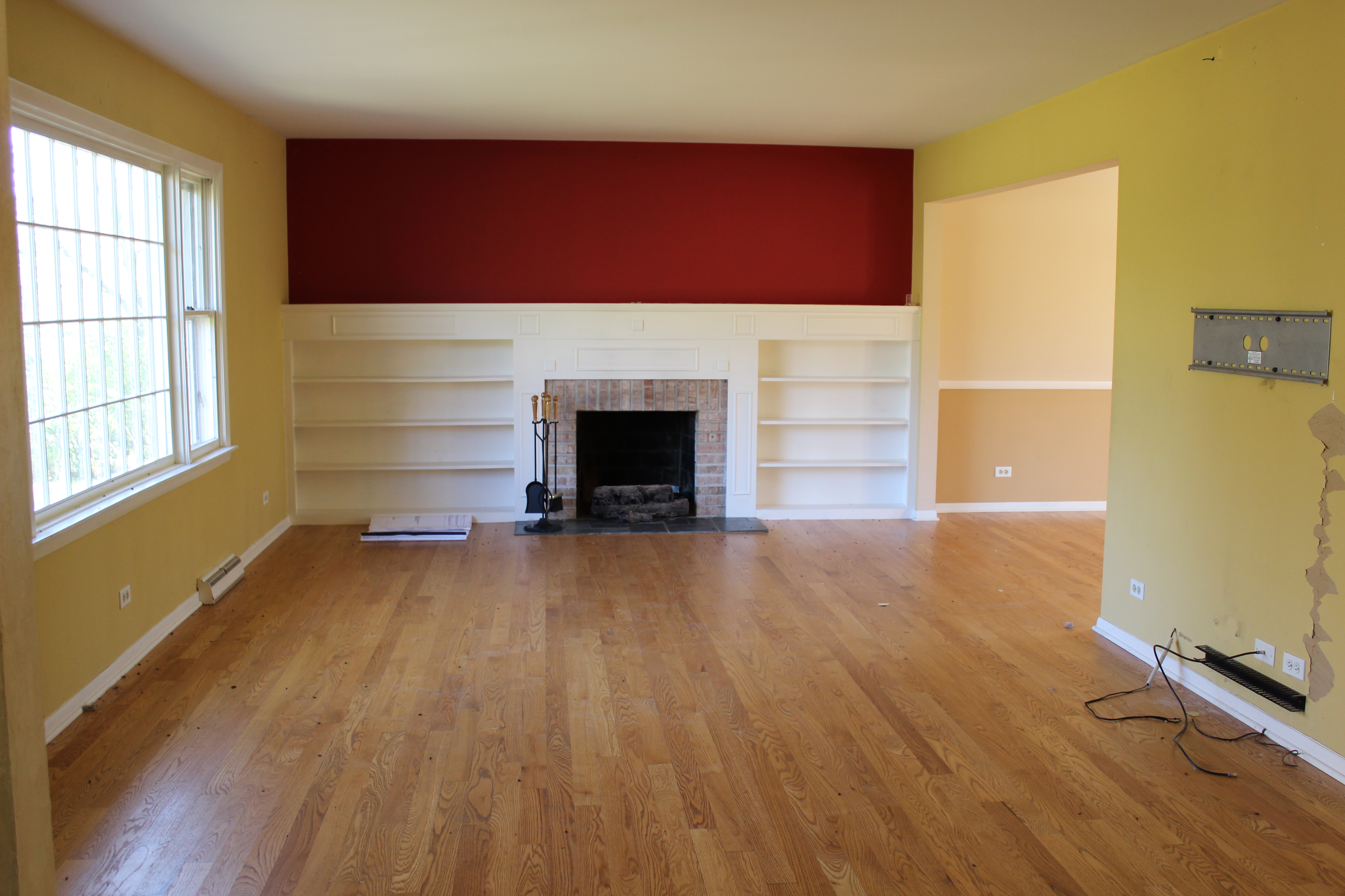
Here was the living room 5 years ago which was closed off from the kitchen:

Living Room on Closing Day

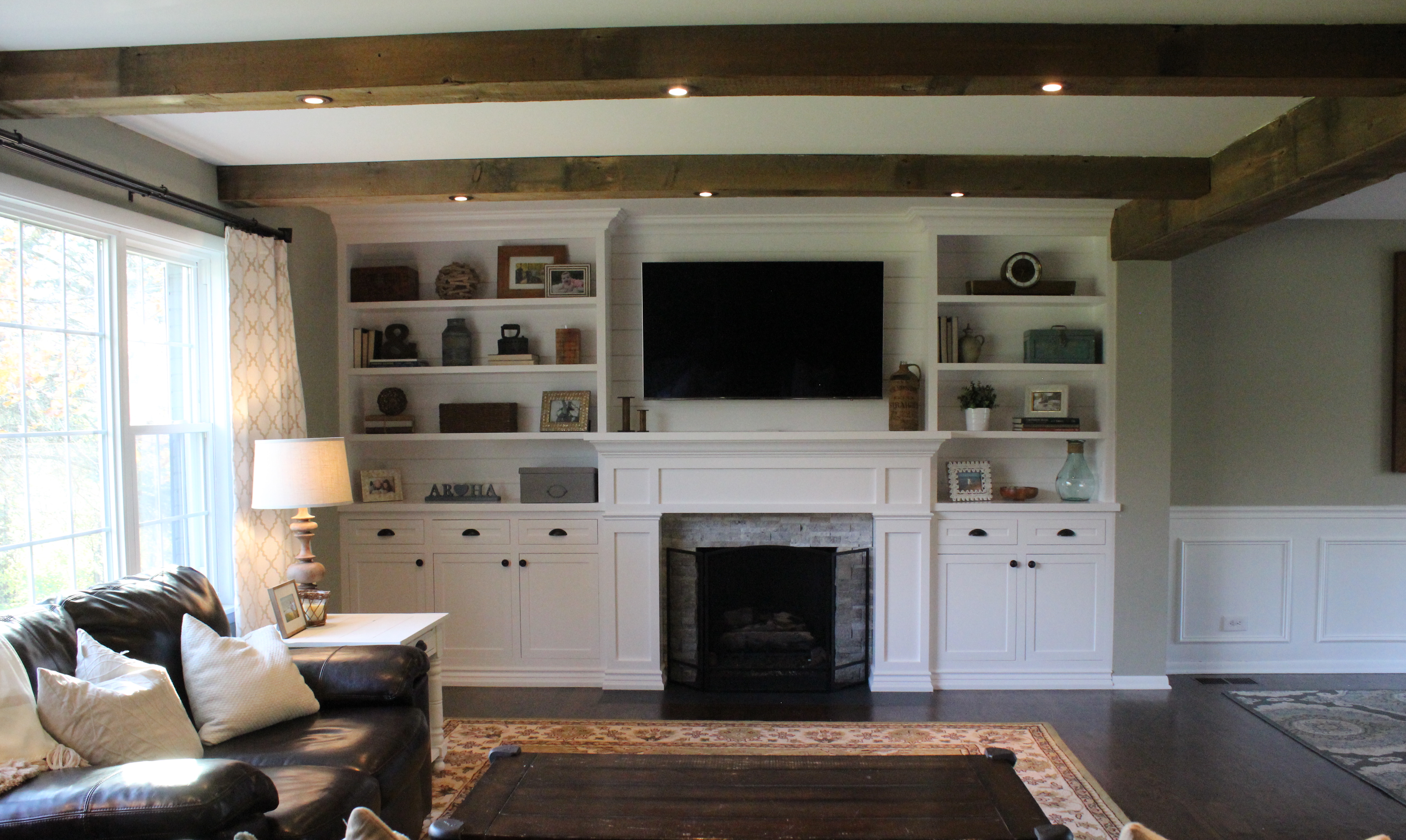
And now its all one big open space with barn wood beams, new built ins, and more:

living-room-new

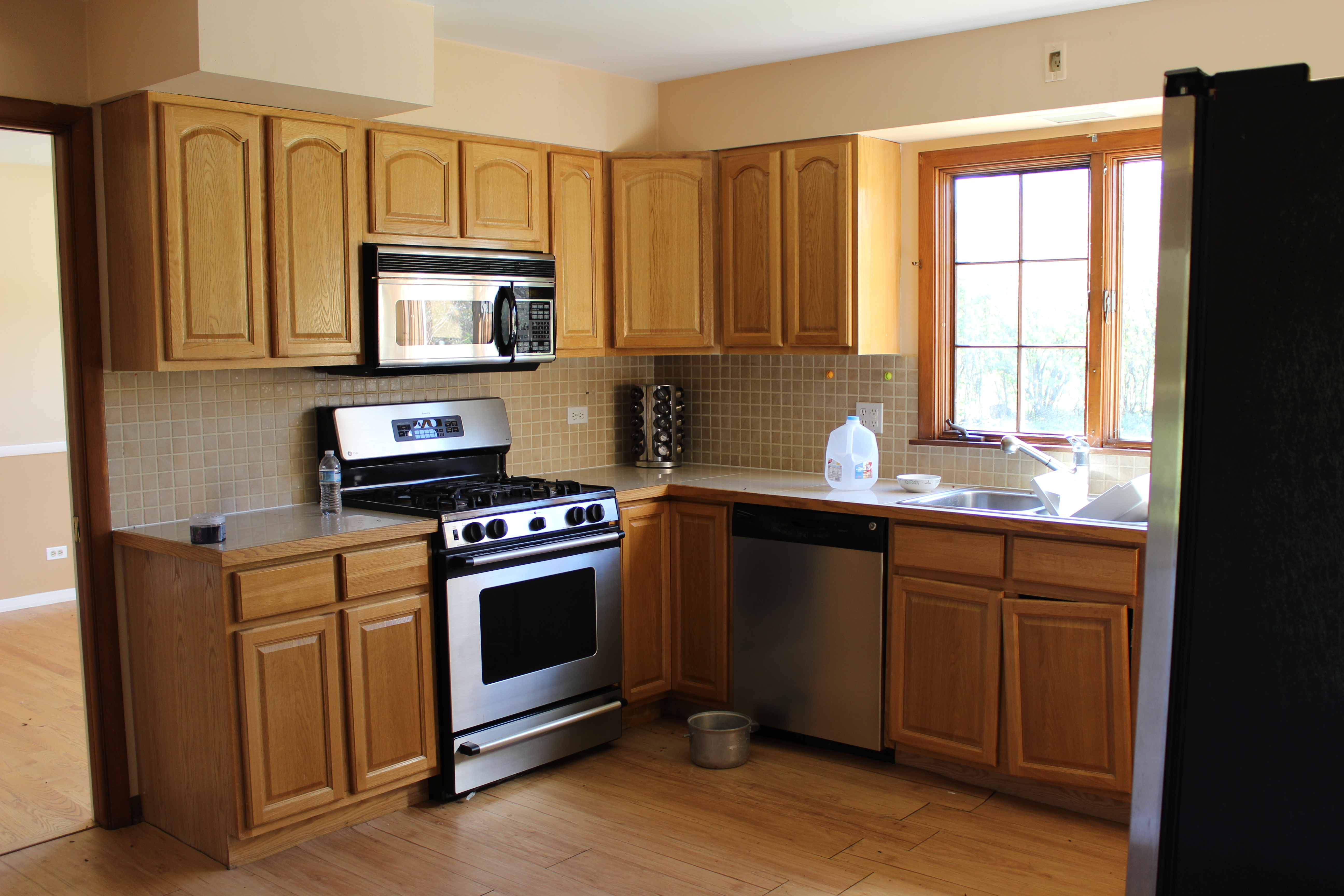
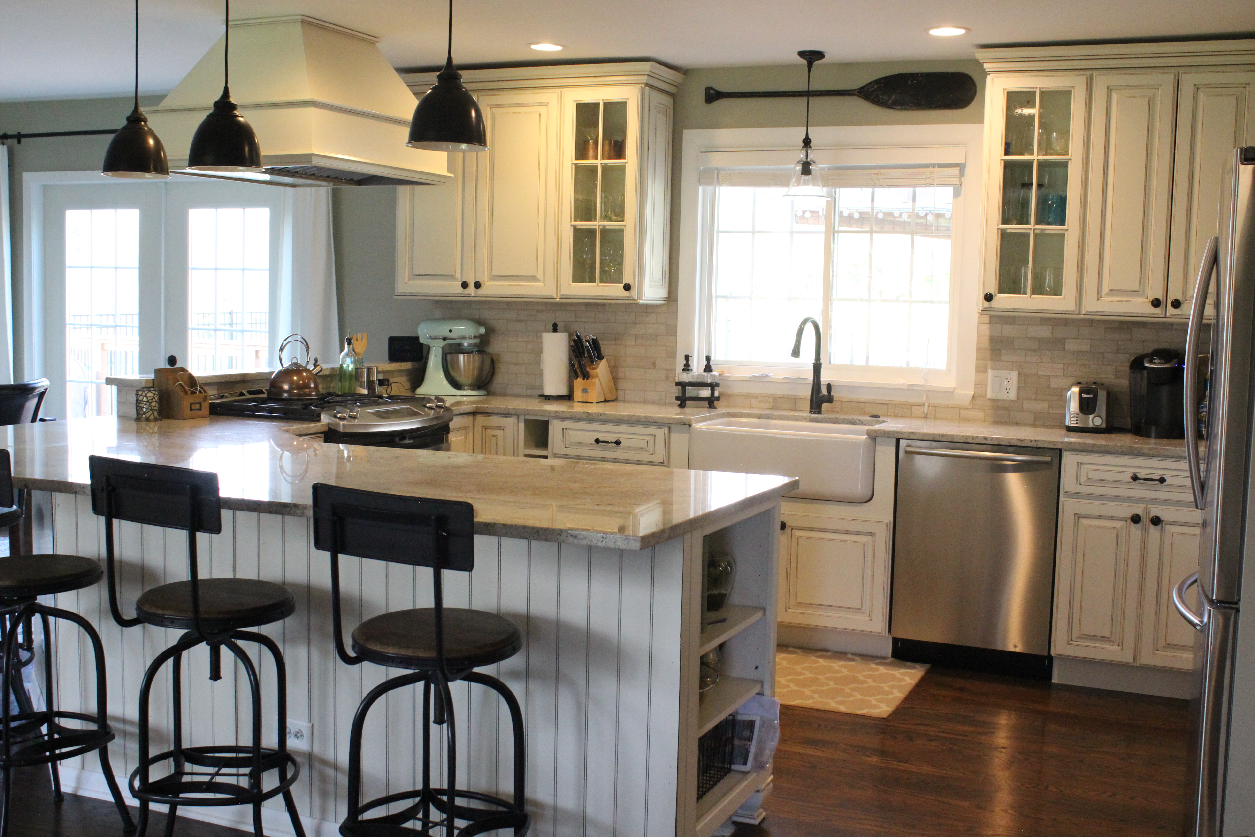
Here was the kitchen 5 years ago:

Kitchen

And here it is now after a full gut and kitchen remodel:img_6052
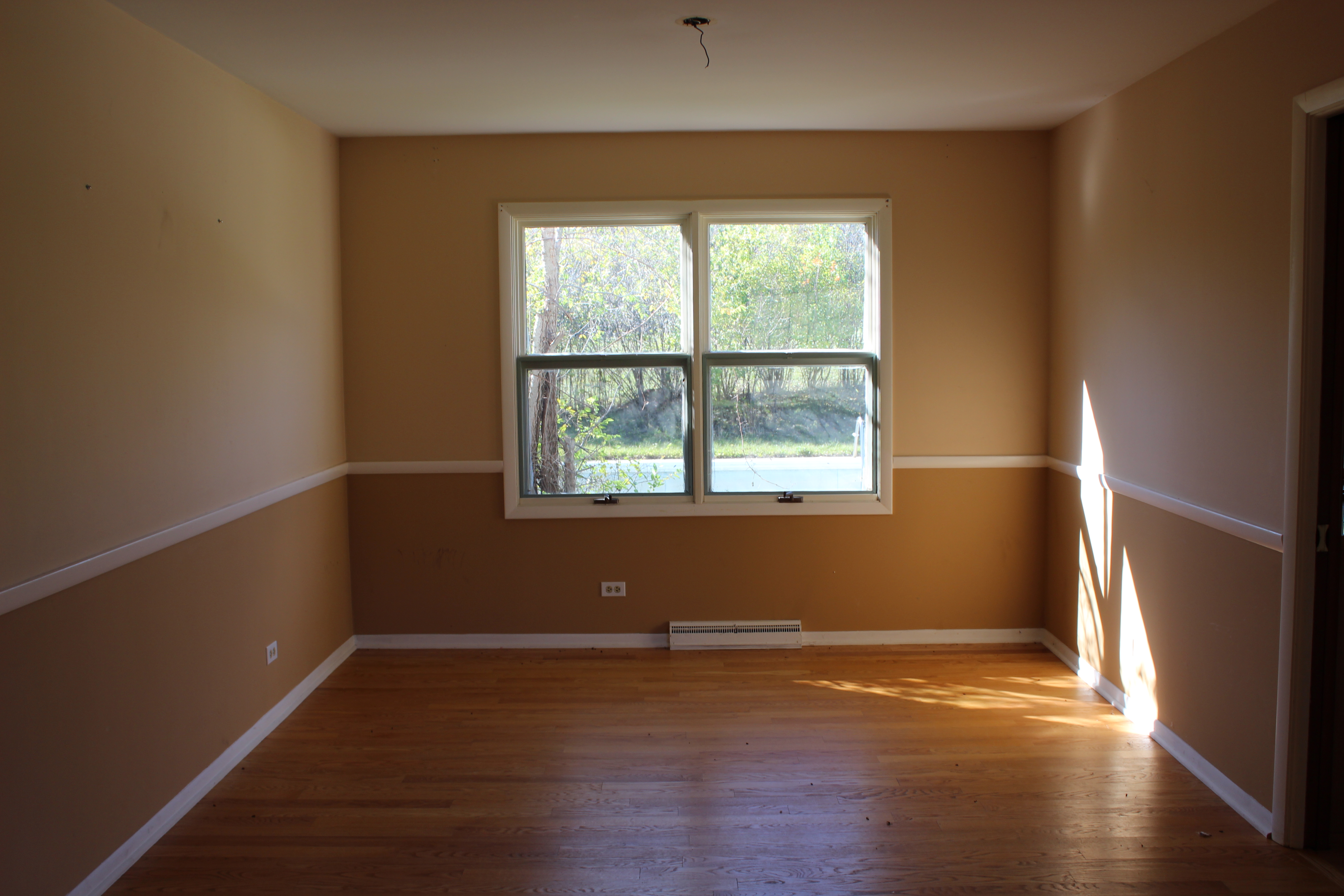
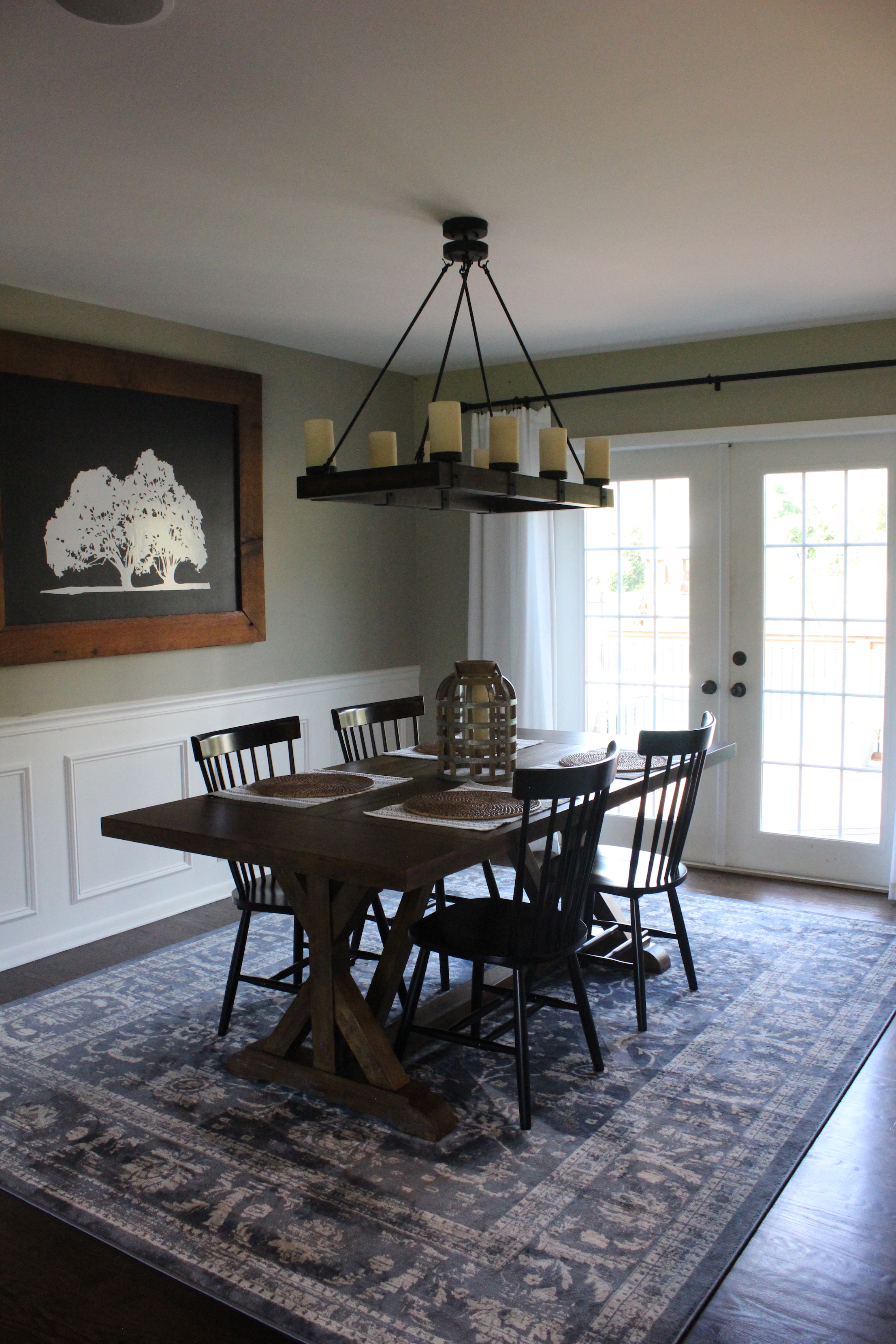
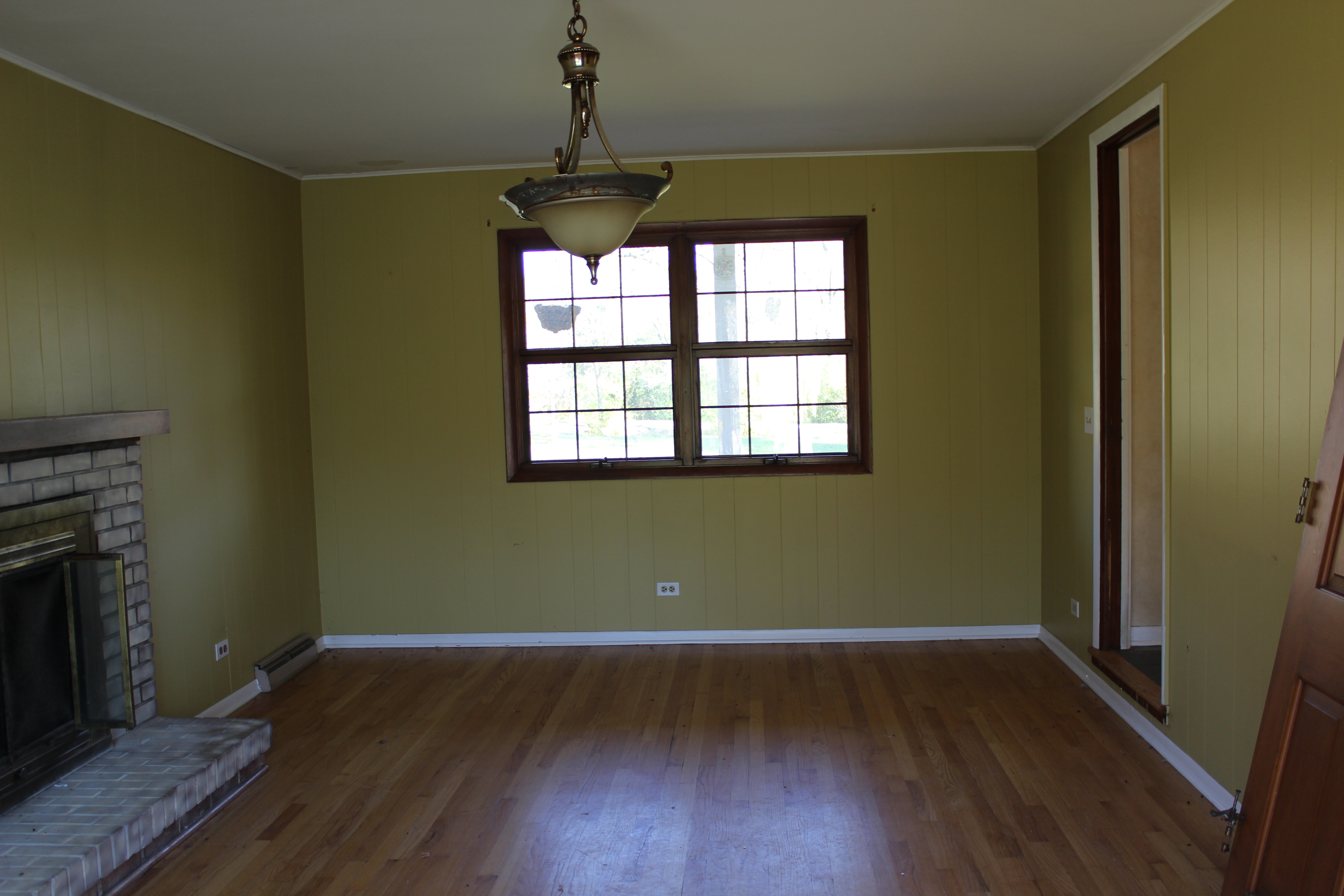
This was the dining room before:

12 Oaks Before 137

And now after opening it up to the kitchen, installing french doors to the deck, new stain, paint, lighting, etc.:

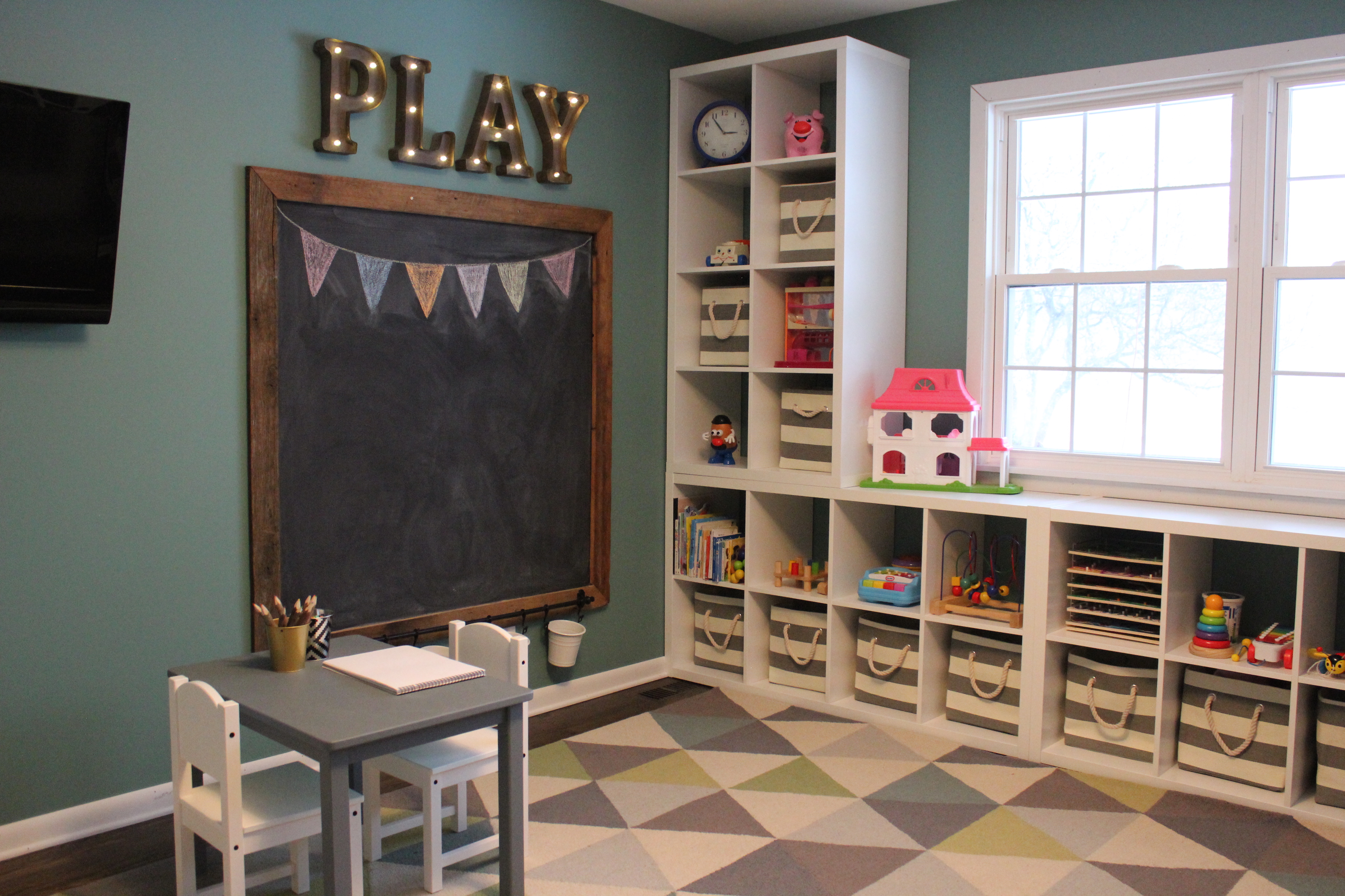
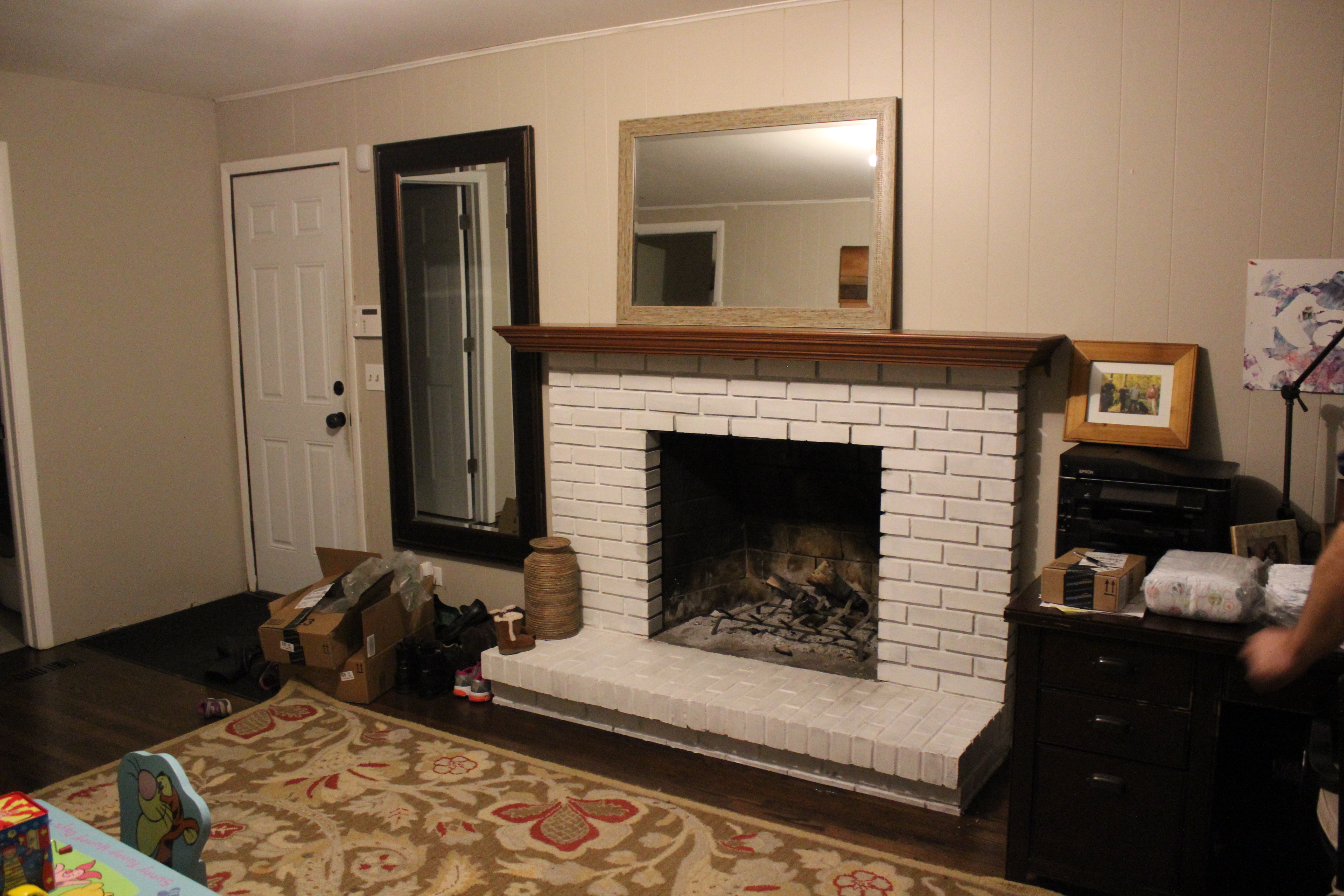
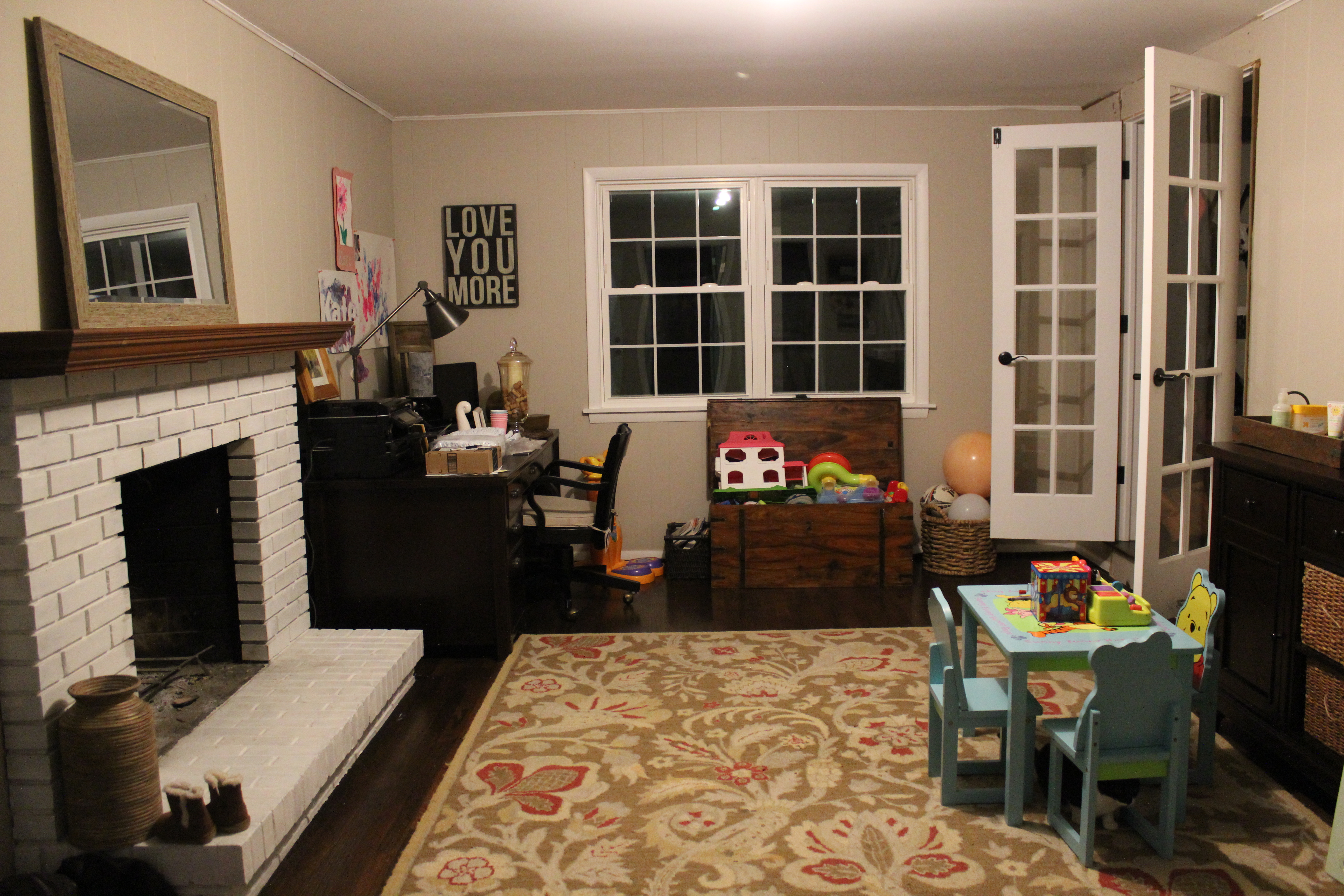
There was a weird den on the other side of the stairs:

We turned it into a fun & functional playroom:

right corner good

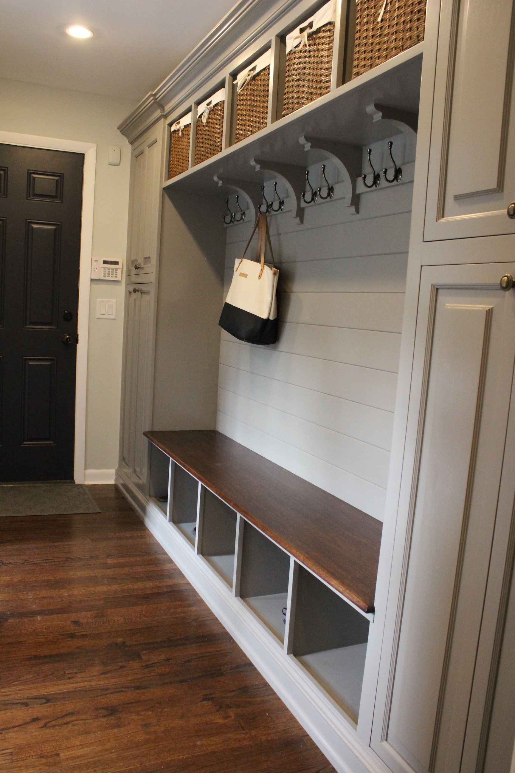
And built a mudroom on the other side of the playroom off of the garage:

mudroom-whole-view

There used to be a powder room/laundry room combo on the first floor:

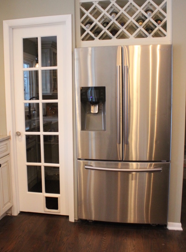
We incorporated that space into the kitchen and walk-in pantry:

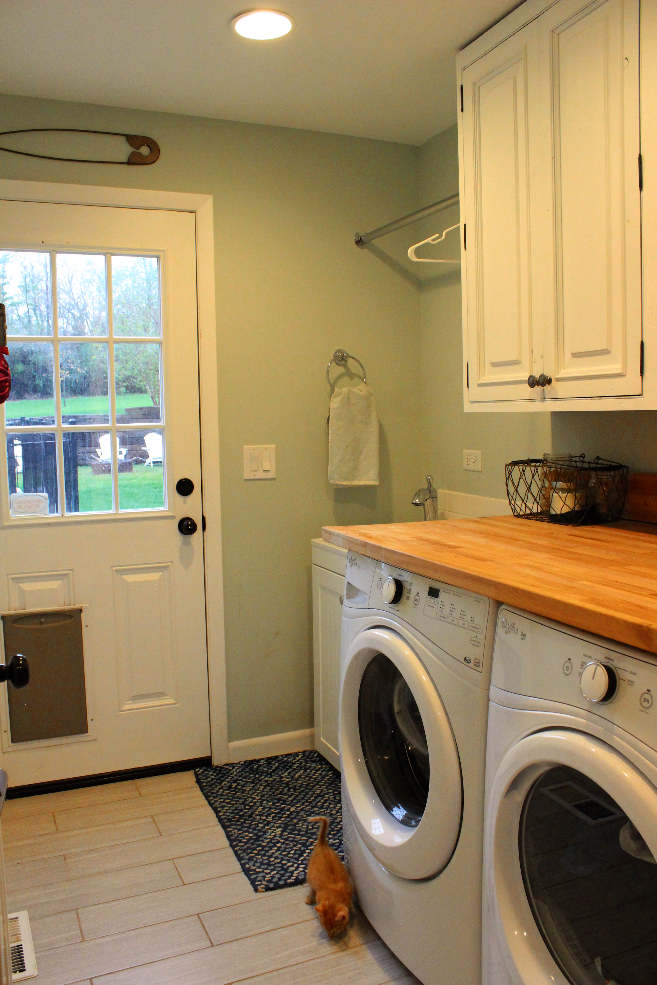
And then built a separate powder room and laundry room as part of the addition:

(There’s a cameo by our new kitten, Simon!)

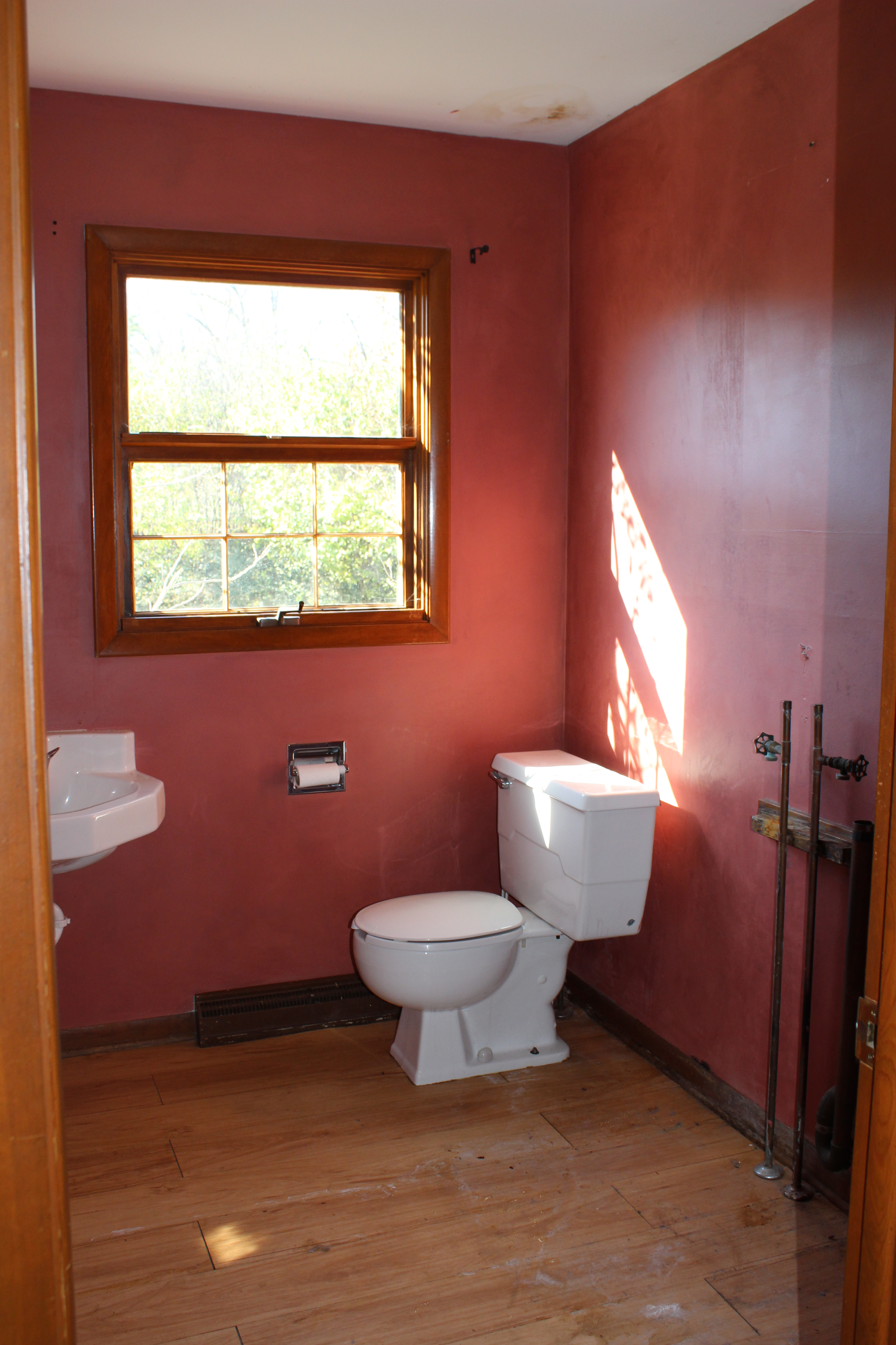
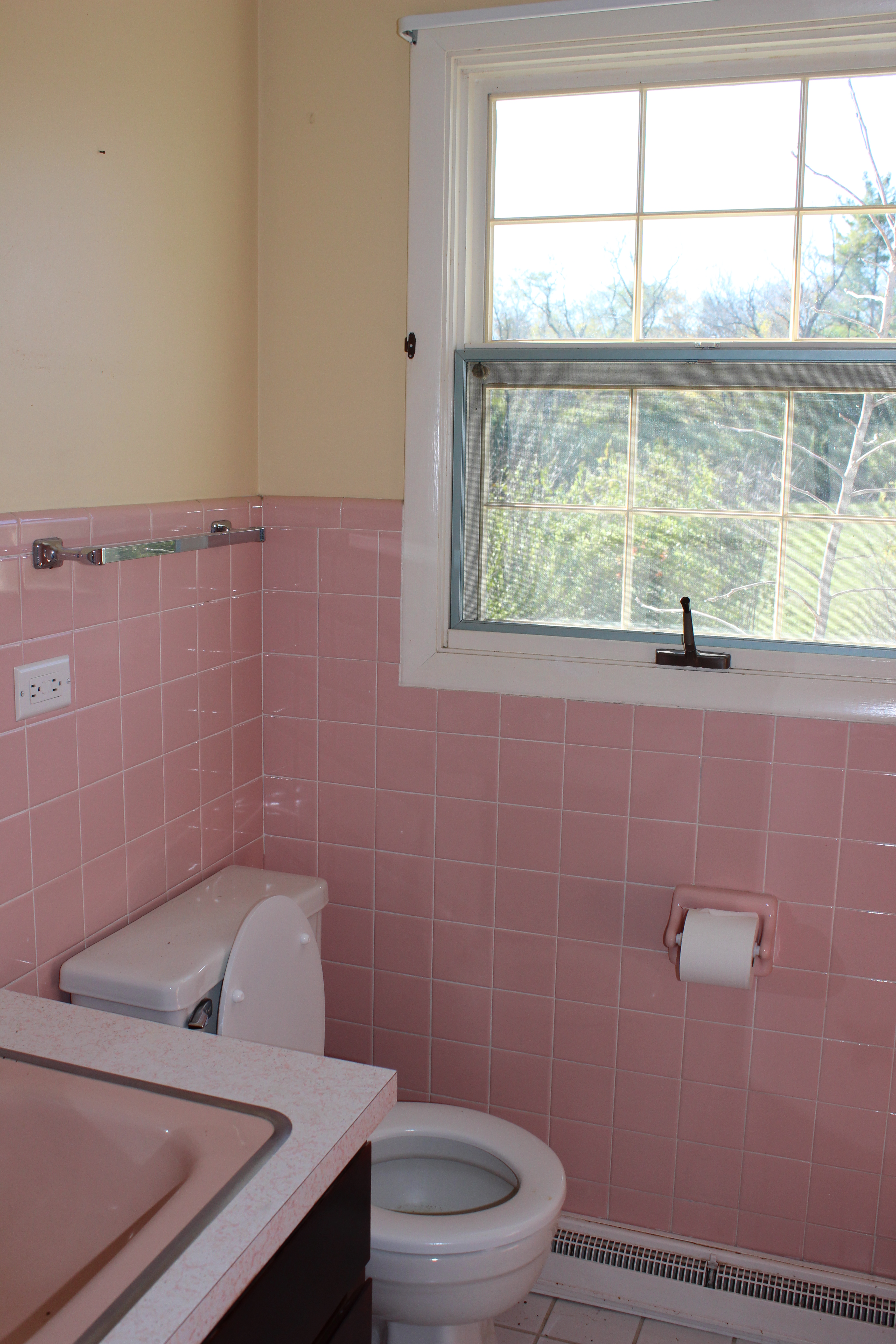
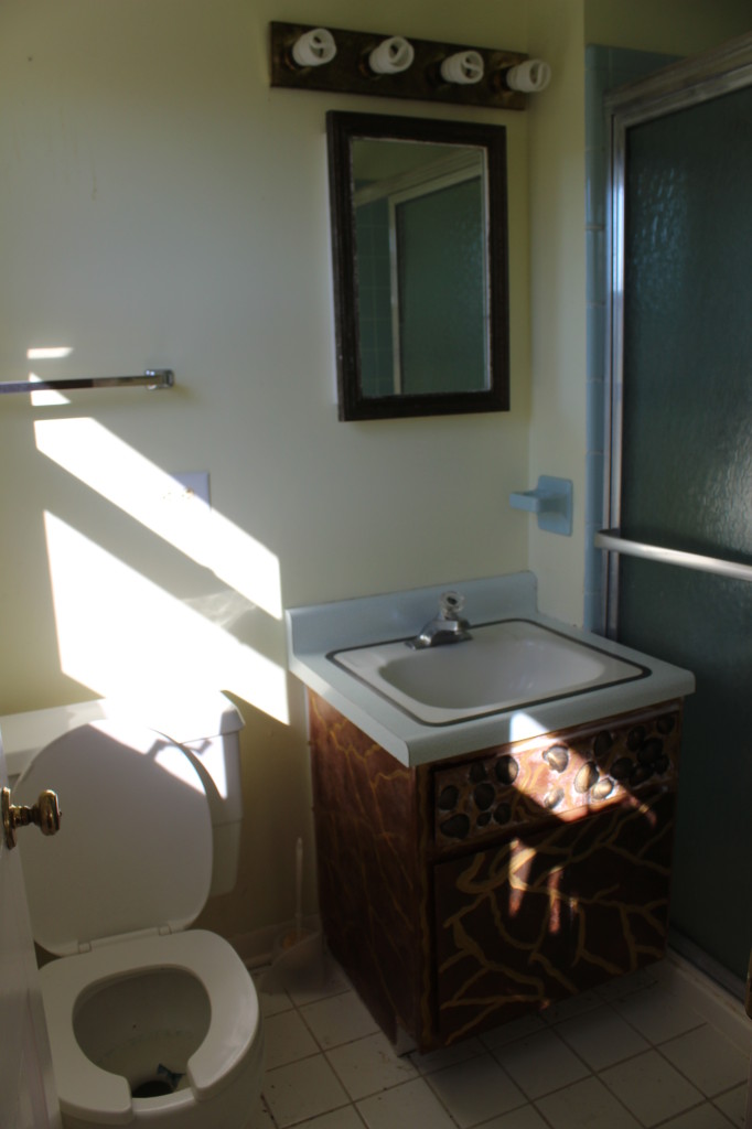
Moving upstairs, we have the old guest bathroom:

Pink bathroom before

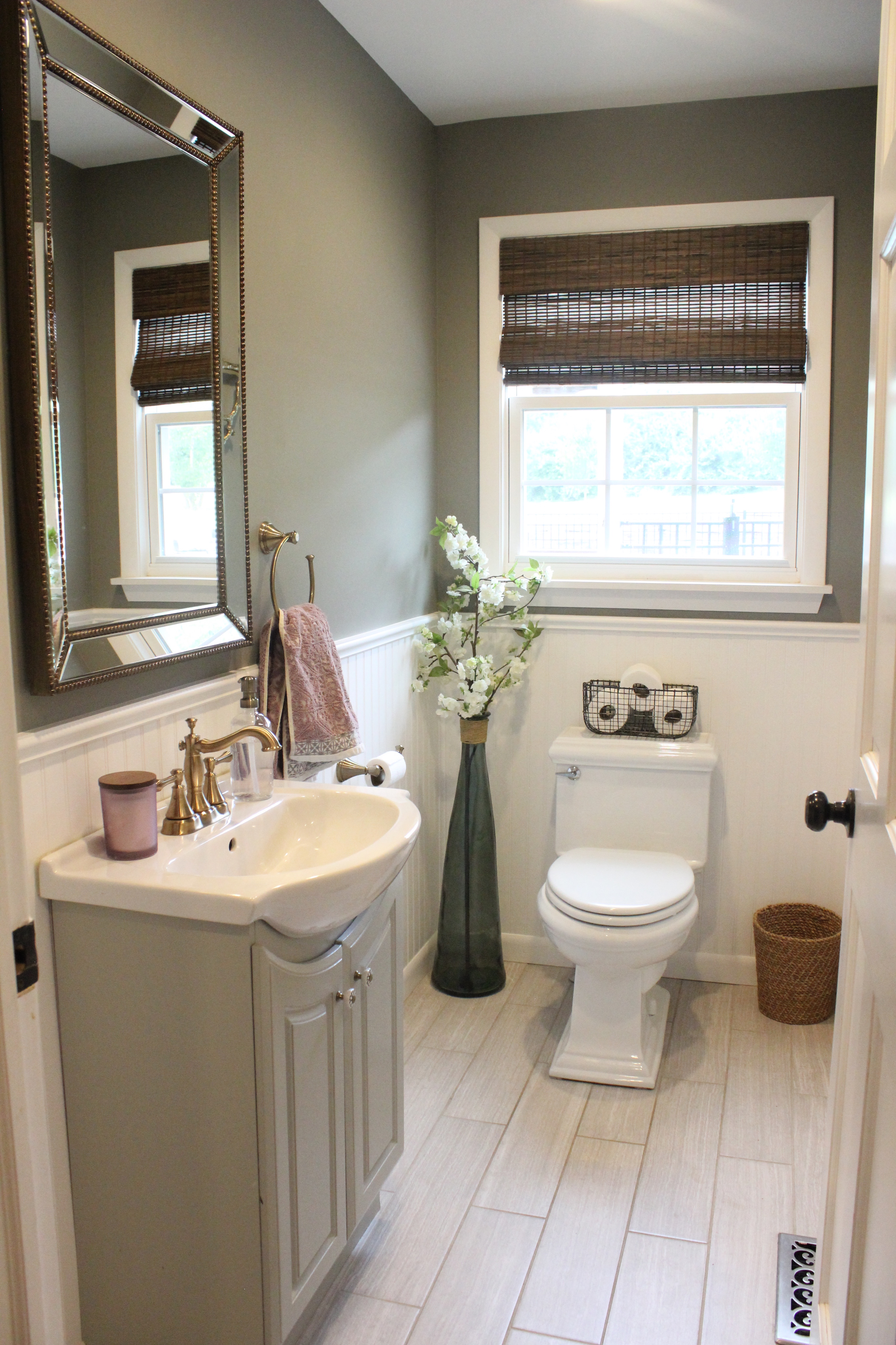
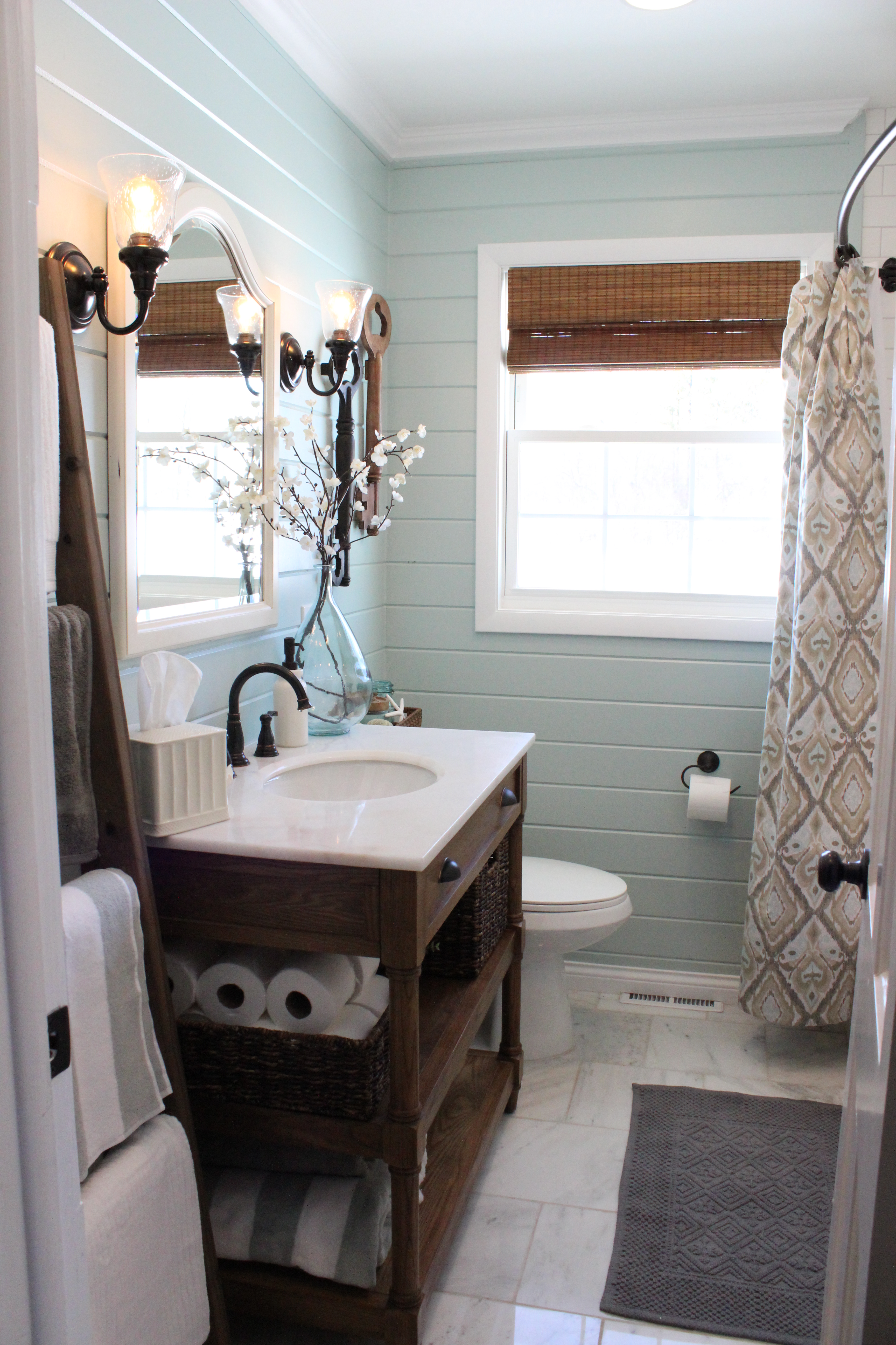
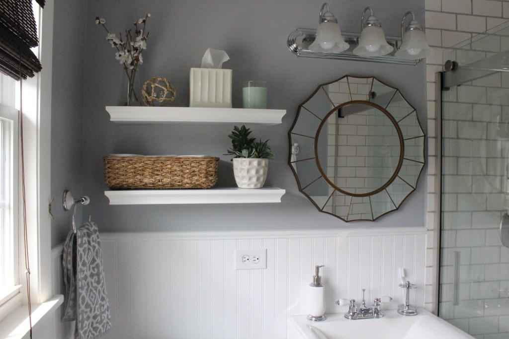
Which turned into what I affectionately call the “Pinterest bathroom,” after it got really popular on there, ha! (See more after pictures/sources of the bathroom here.)

IMG_2632

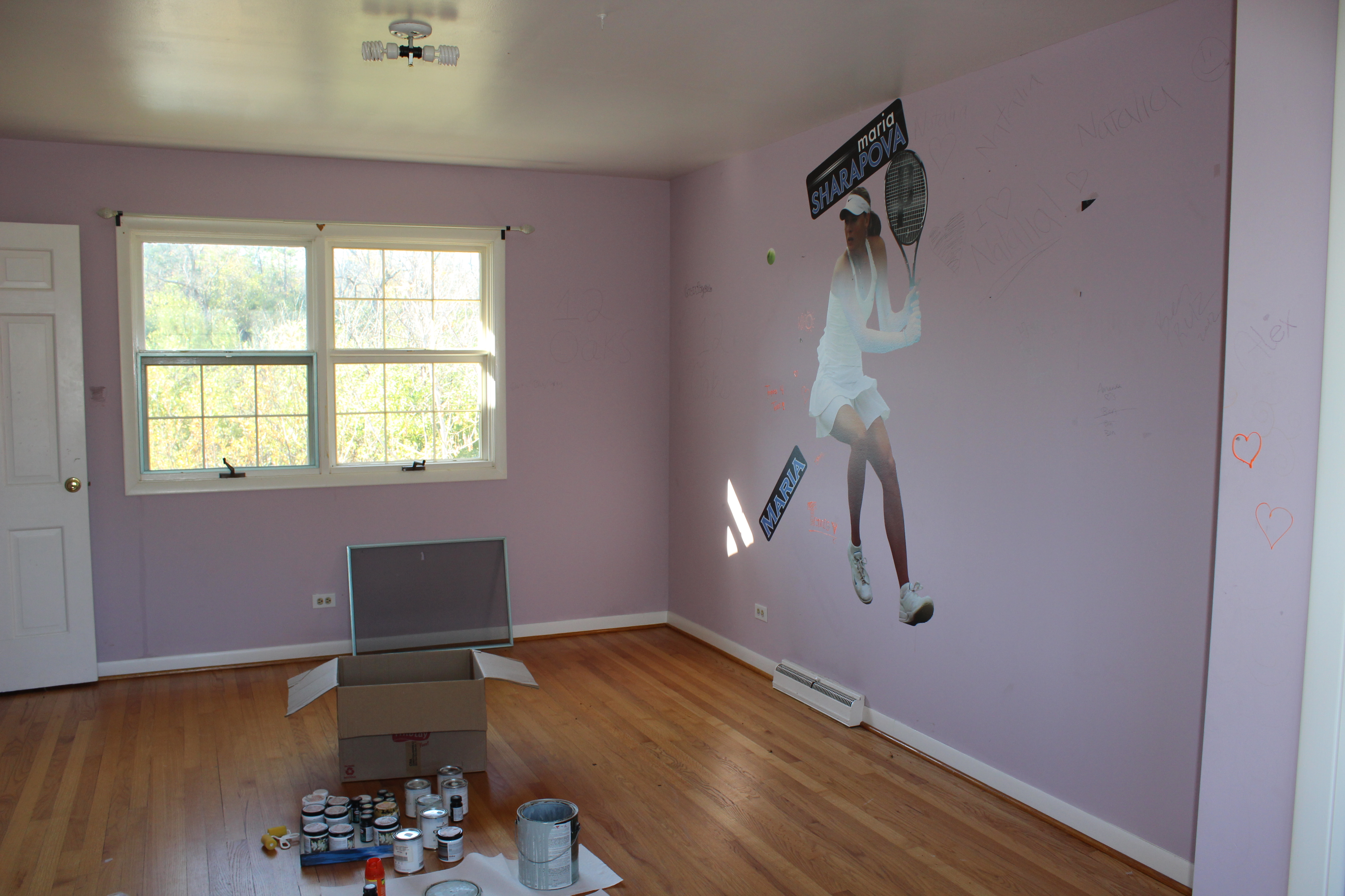
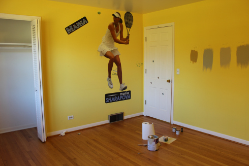
This was what our master bedroom looked like 5 years ago (Go Maria Sharapova! lol)

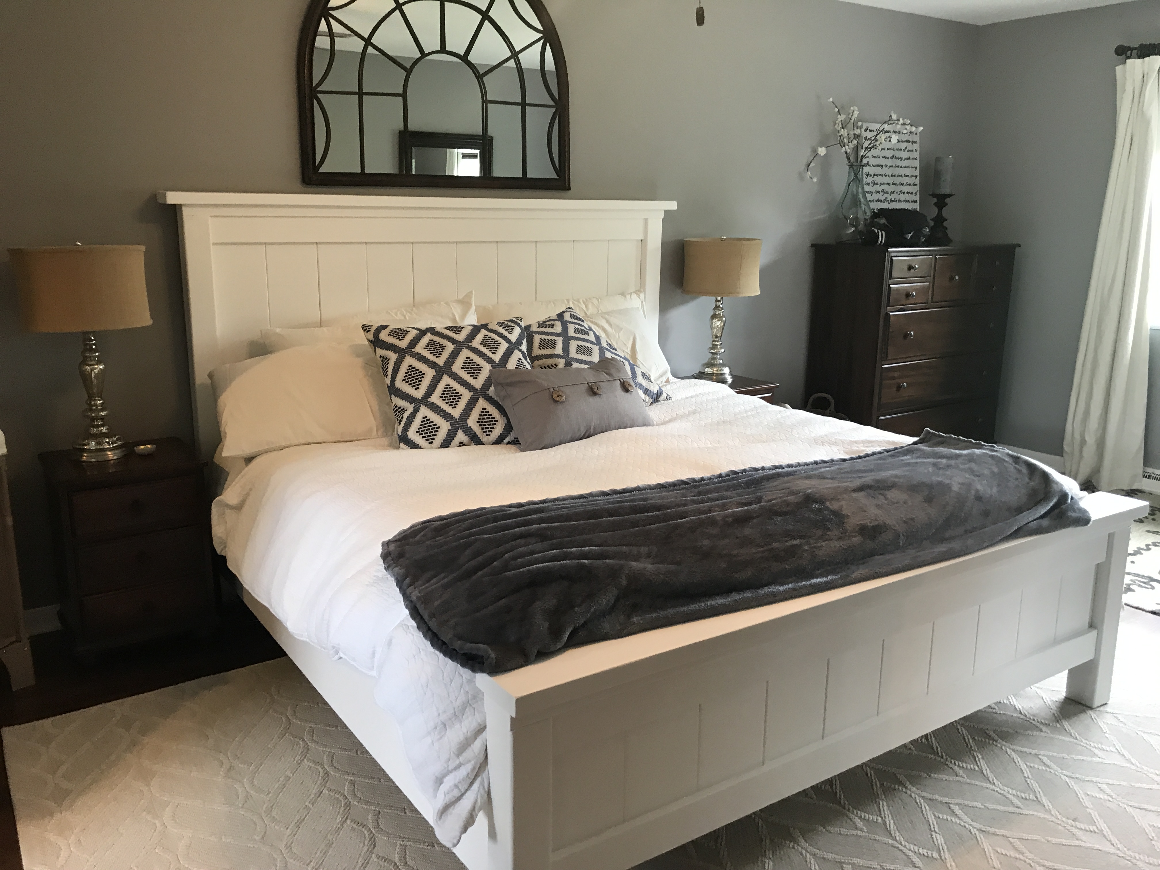
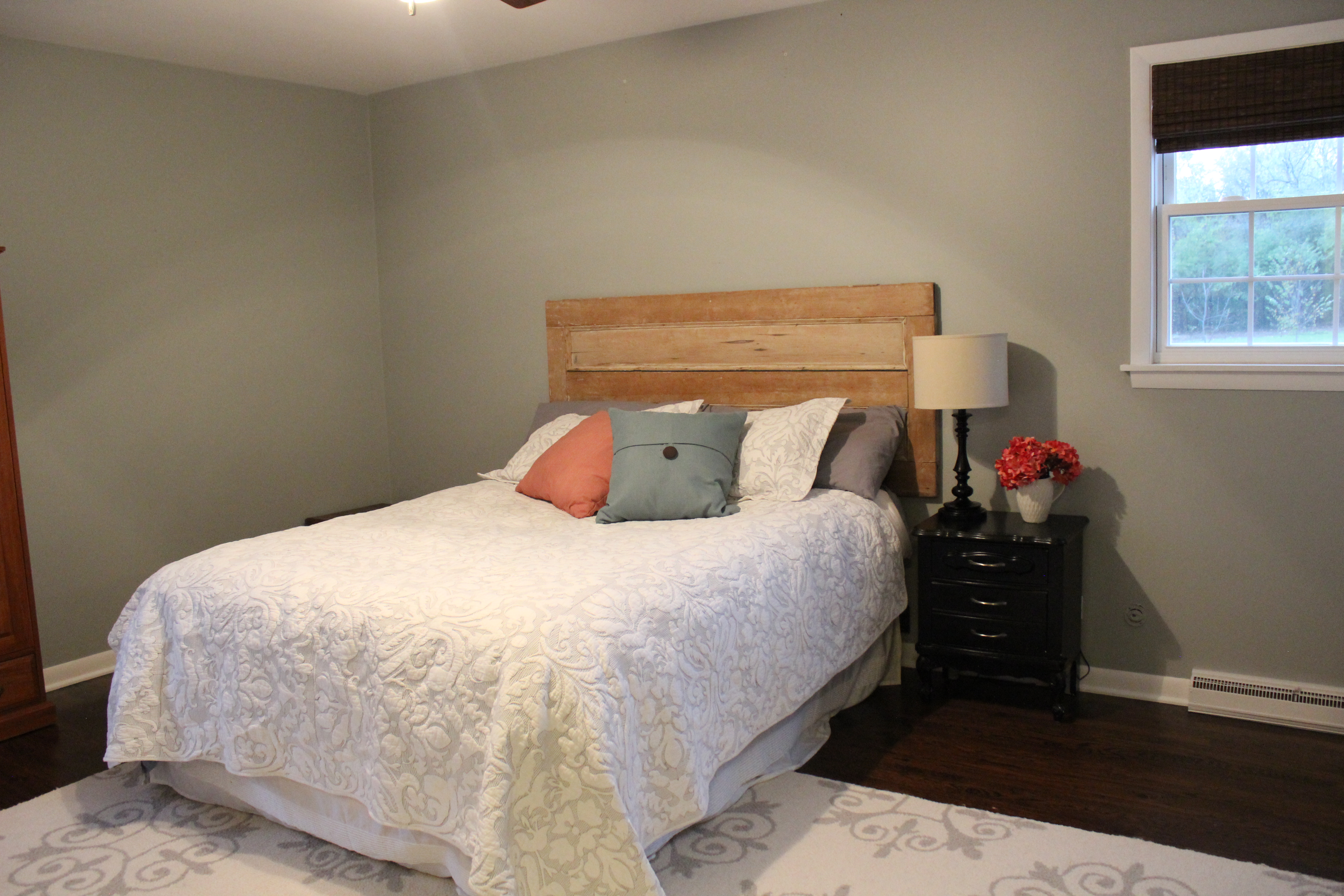
And here it is now:

Connected to our master is the upstairs part of the addition which includes a new walk-in closet and master bathroom:

There was another Sharapova bedroom 5 years ago:

Spare Bed 1 Before

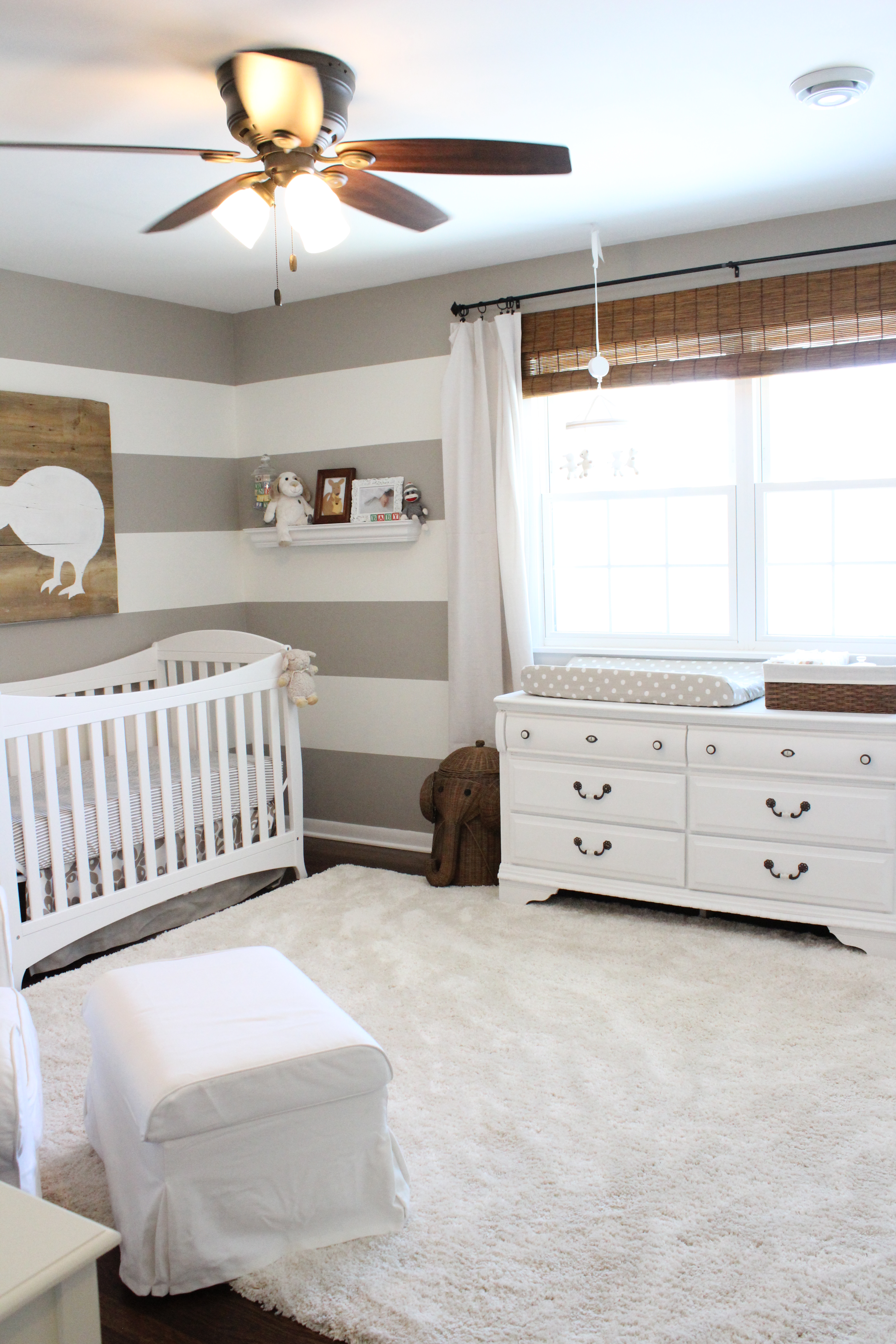
This turned into our nursery:

IMG_4281

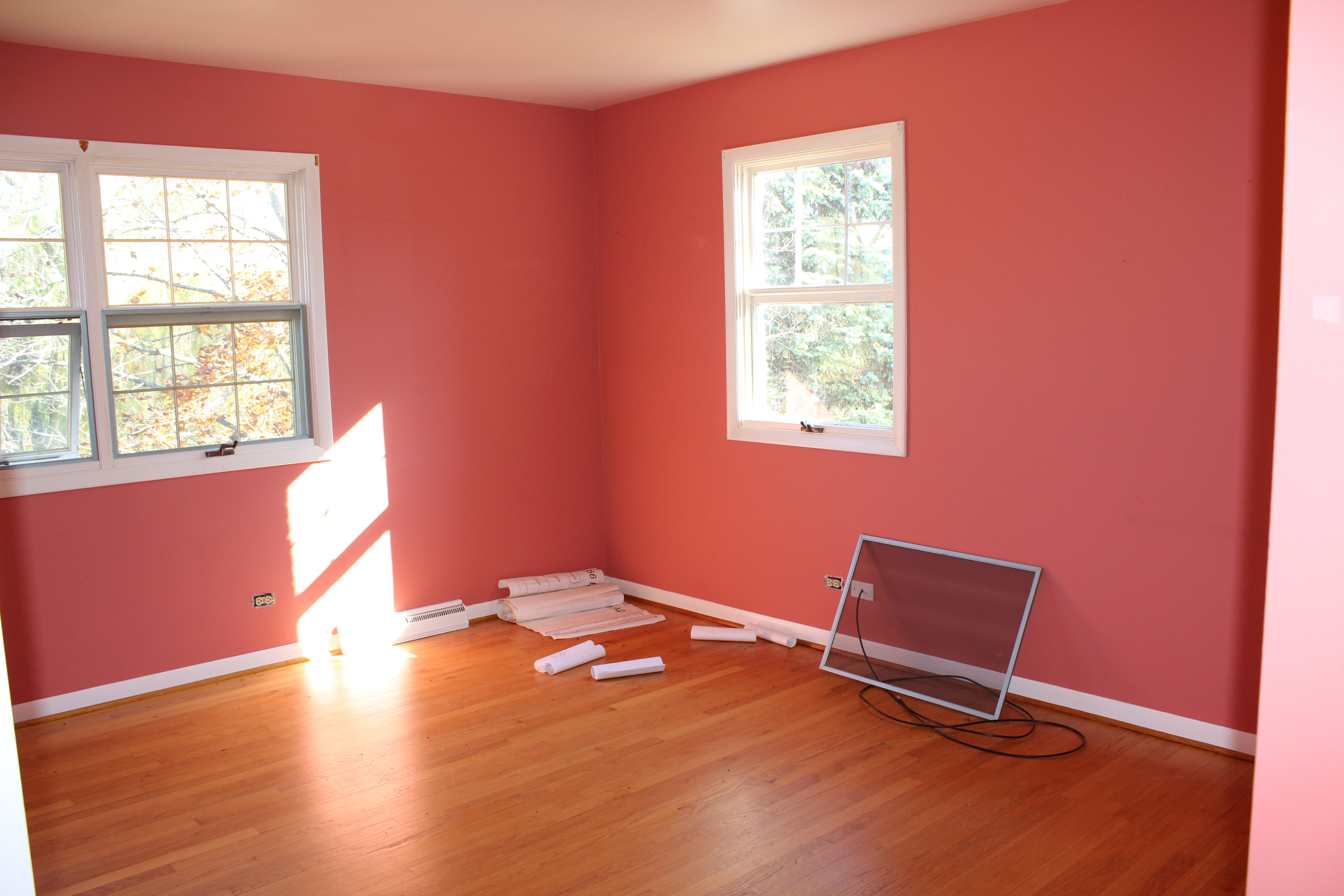
Another upstairs bedroom 5 years ago:

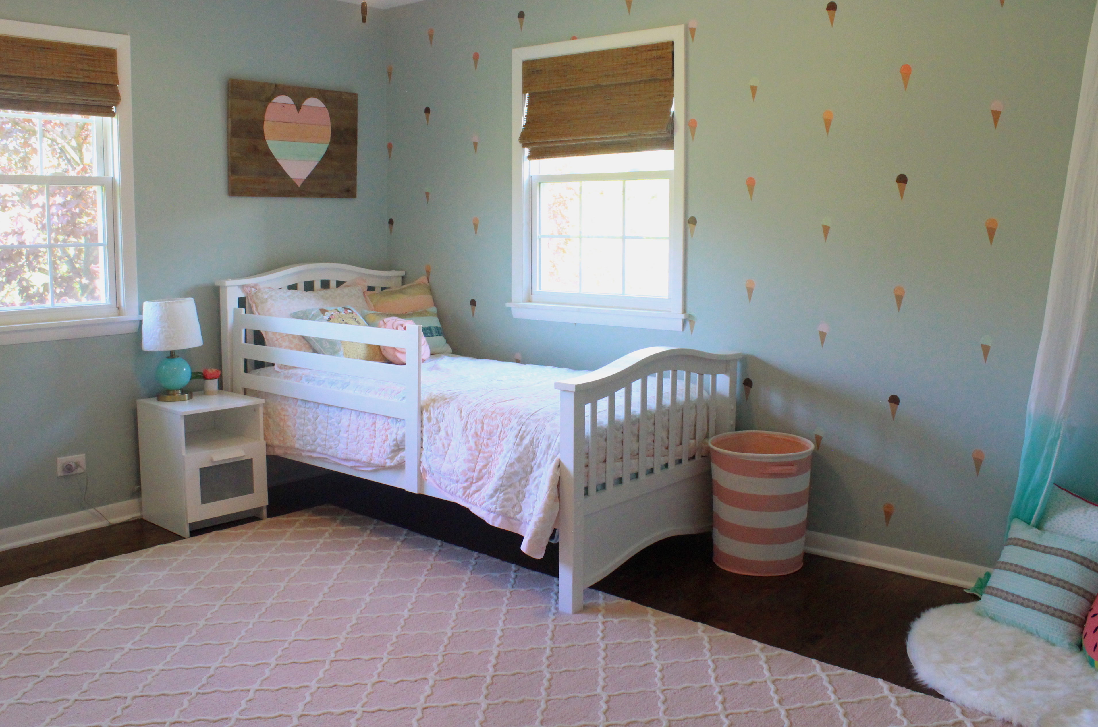
Is now our daughter’s “big girl” room:

The former master bathroom, which is now a guest bathroom, looked like this 5 years ago:

Master Bathroom

And here is the renovated guest bath now:

IMG_5533

Lastly, here is our current guest room, which admittedly is a catch-all for old furniture. I will re-do it hopefully soon.

Whew! I’m super proud of all we’ve been able to accomplish at our home over the past 5 years, not to mention the 3 flips/income property houses we also renovated during that time, plus welcoming 2 amazing kiddos!

There’s still plenty left on our to-do list, particularly on the outside/pool area, the garage, basement, and maybe even building a barn. Thanks for following along on our journey!

SaveSave

SaveSaveSaveSaveSaveSaveSaveSaveSaveSave

SaveSaveSaveSave

SaveSaveSaveSave

SaveSaveSaveSave

SaveSave

SaveSaveSaveSave

SaveSave

SaveSave

SaveSave

Creating a Playroom & Mudroom

21 Dec

We are smack dab in the middle of an exciting project at 12 Oaks— creating a playroom and mudroom from what was a weird den/office.

This is what the room was looking like before we started. We hardly ever used it and it is basically the last room in the house we haven’t renovated.

IMG_5596

We had a desk in one corner (that we never use), and Kate had some toys in there, and that is about it.

IMG_5597

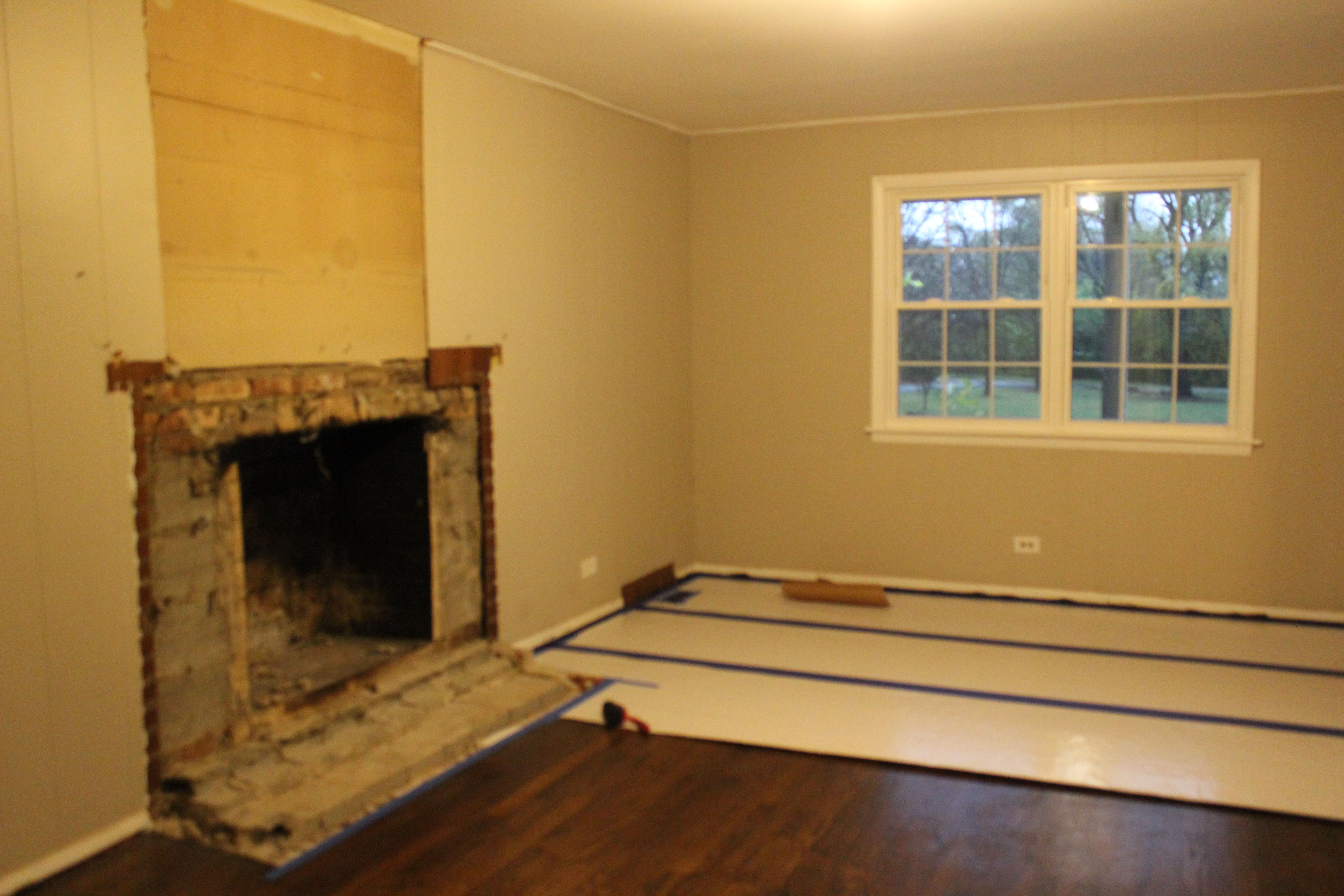
The fireplace takes up half of the room, it’s dangerous for little ones and would need to be re-done anyway, so we decided to cover it up (GASP!) Some may think that is a crime but it just didn’t work for our family and our needs. We still have a much nicer fireplace in our living room, and could always open it back up down the line if we wanted to.

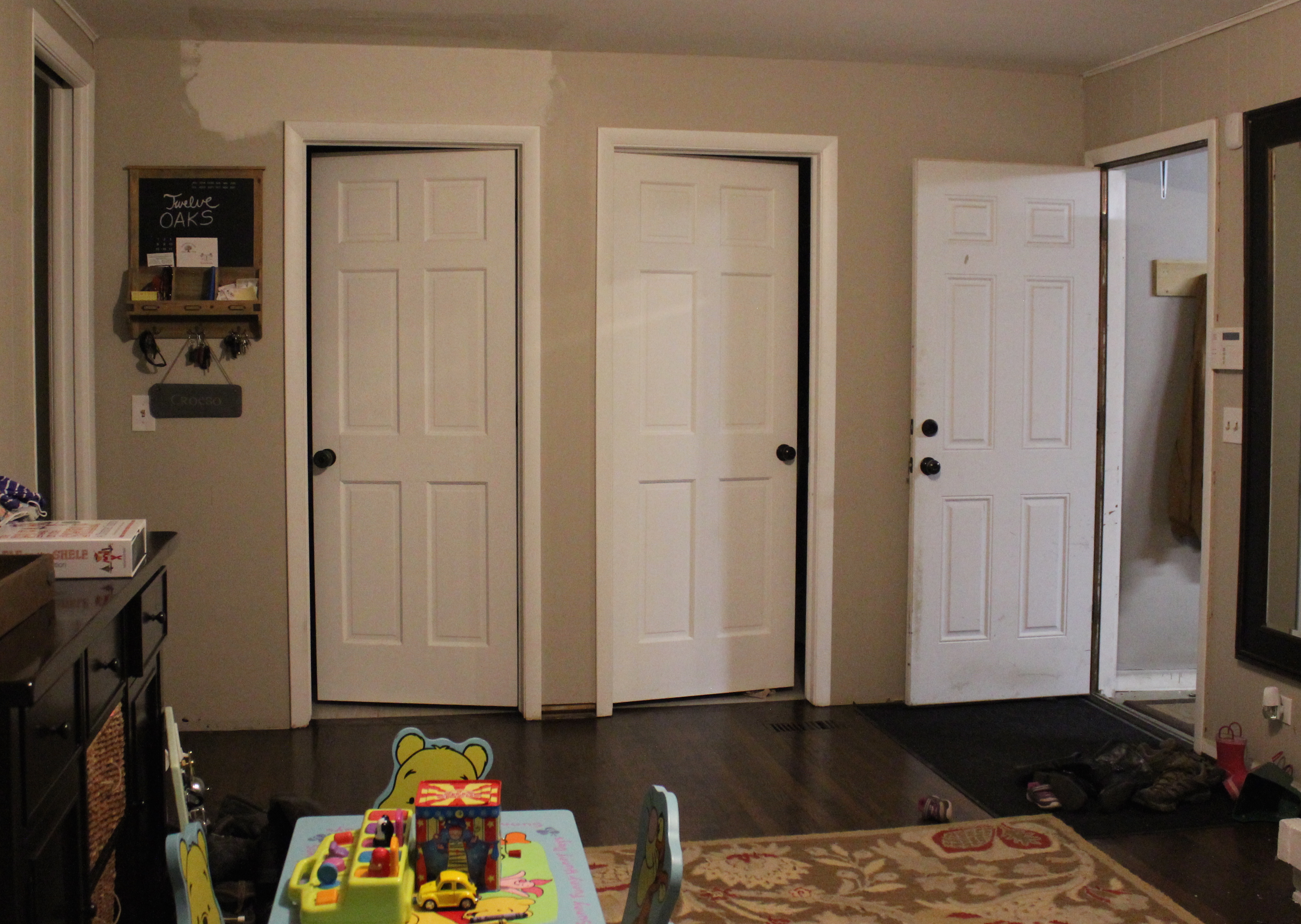
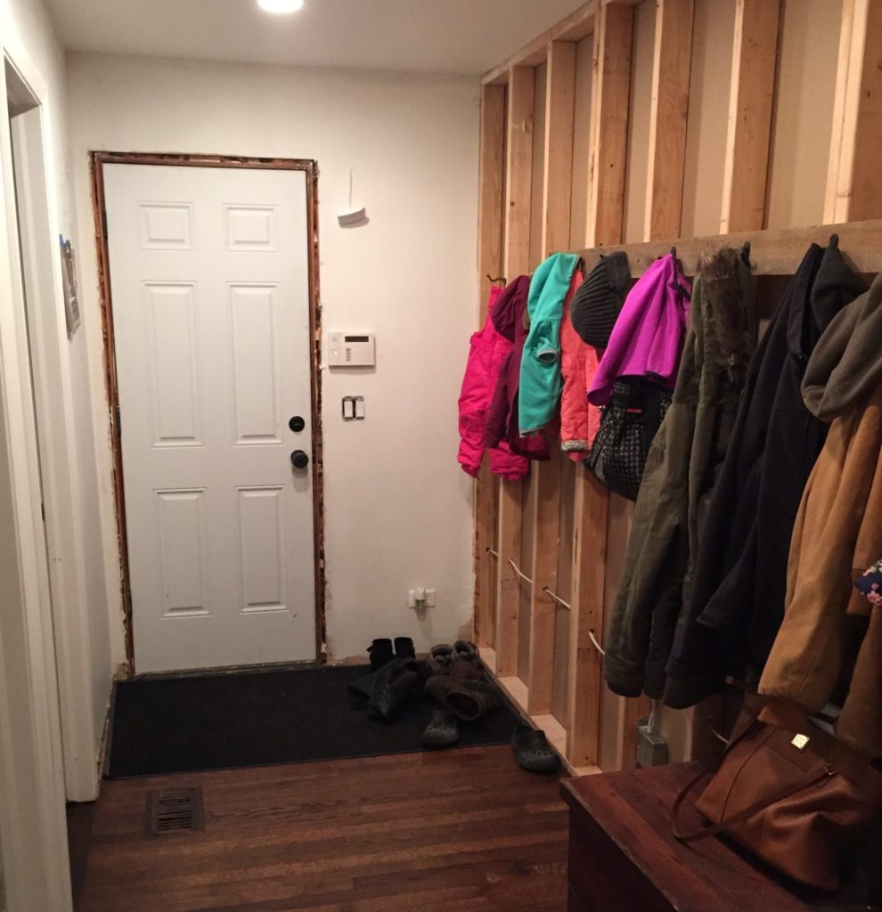
Here’s the other side of the room, the door to the garage is on the right, the laundry room and powder room are in the center, and the doorway on the left leads to the kitchen. So this room was basically a pass through as we came in the house and took off our shoes, coats, brought in groceries, etc.

IMG_5599

We decided to put up a wall here to make a nice mudroom off of the garage, and then it closes off the playroom to make a cozy little room for Kate to play in.

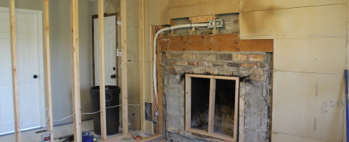
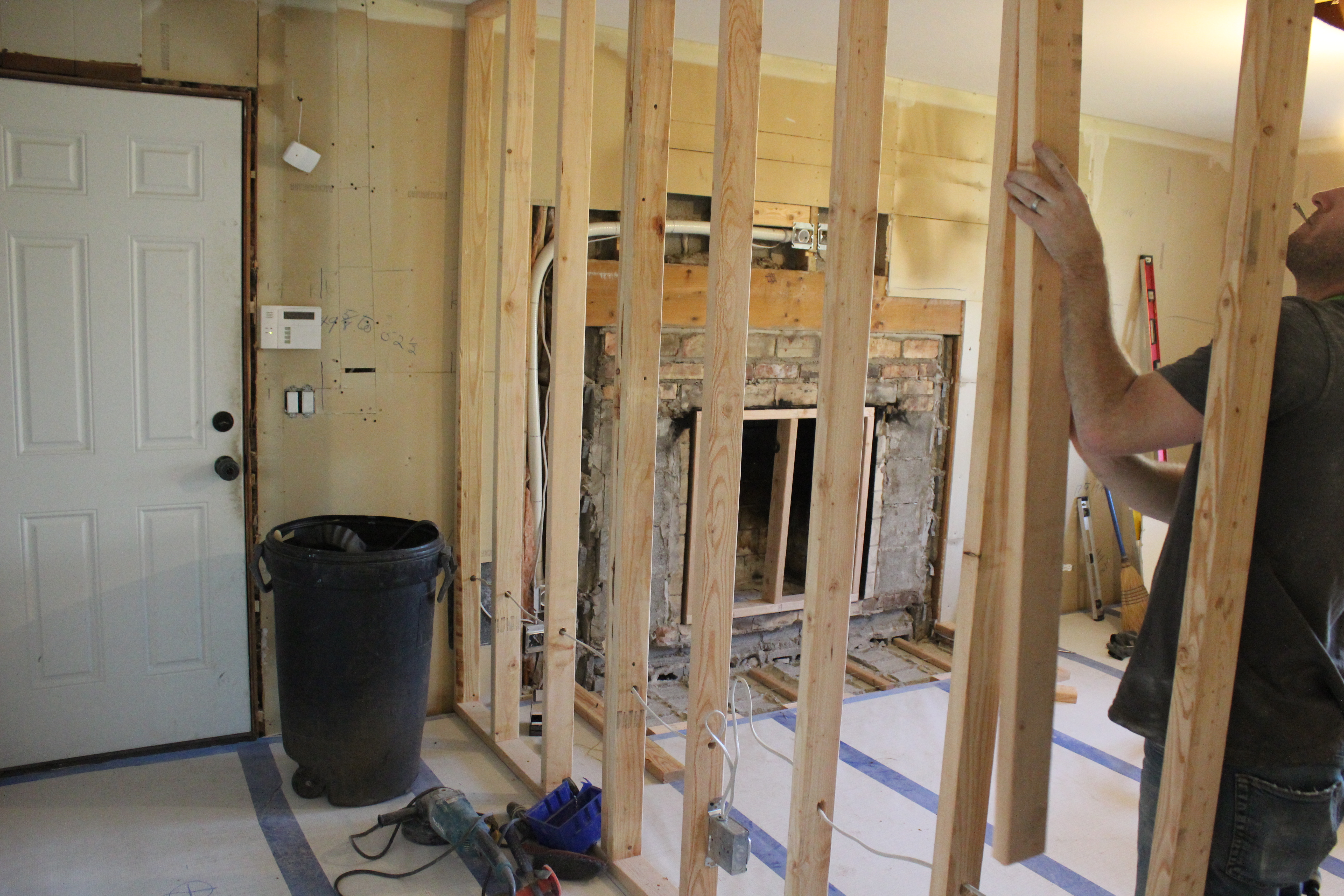
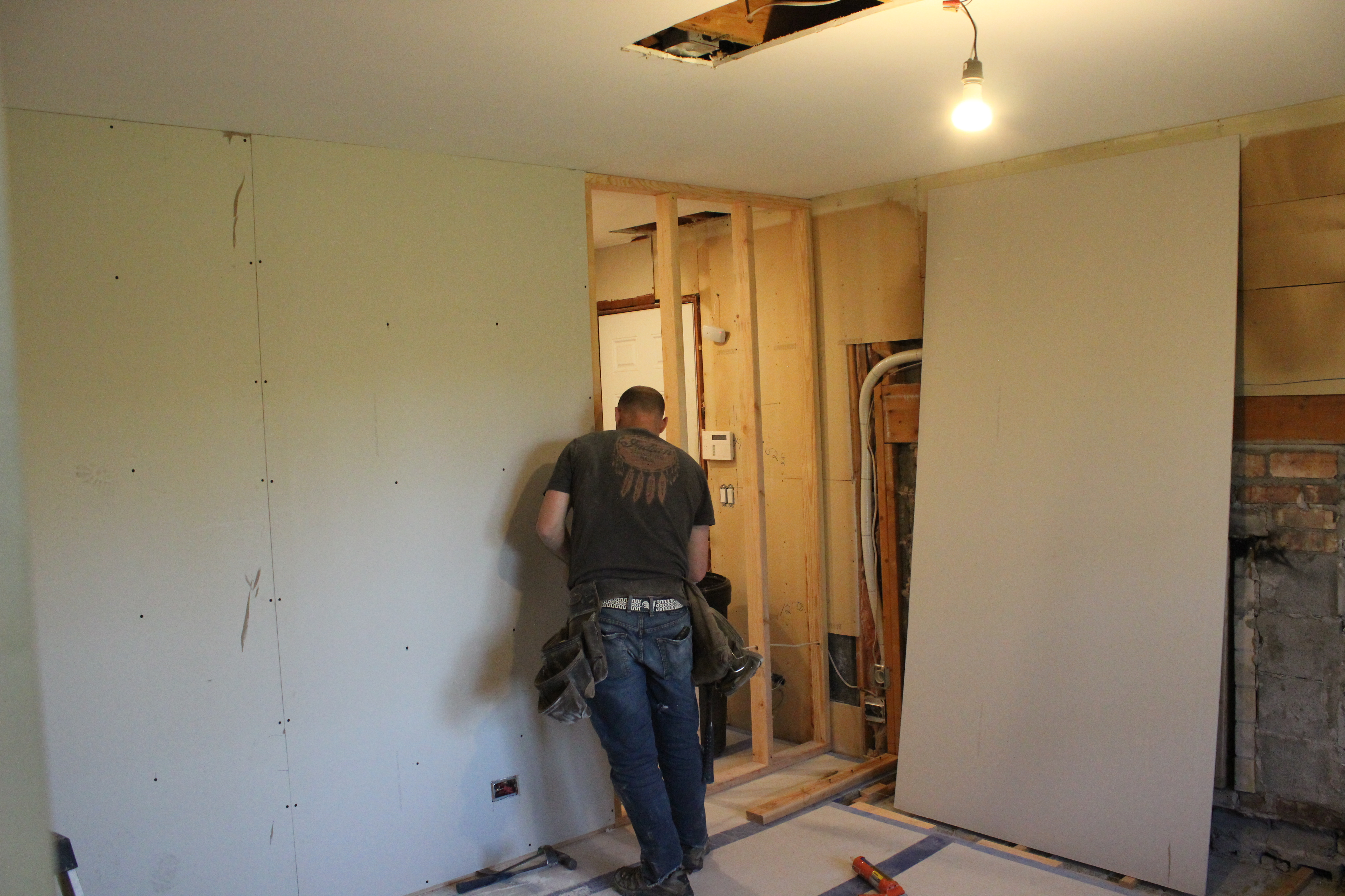
So first things first we cleaned out the room, ripped out the fireplace and removed the paneling from the walls.

IMG_5601

We were happy to find drywall (unfinished) behind the paneling, so we only had to hire drywallers to finish it rather than hang new stuff too.

Next Ben built the wall….

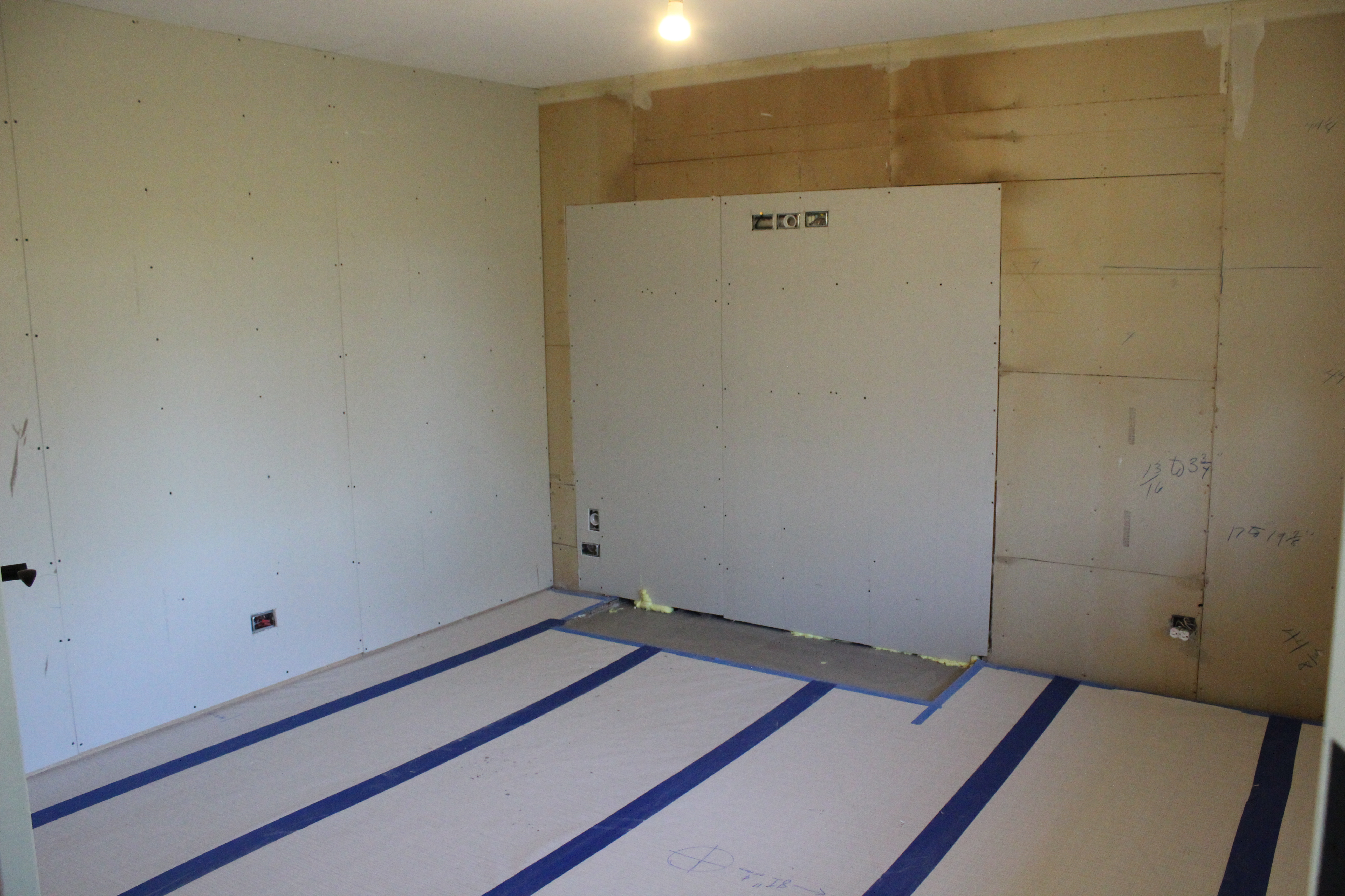
Then we had an electrician come in to add some can lights in the new mudroom, center the light in the playroom, and add some outlets. Then Ben hung drywall on the new wall and over the old fireplace.

Next we had the drywallers come in to tape and finish the drywall. And then Ben primed all the walls.

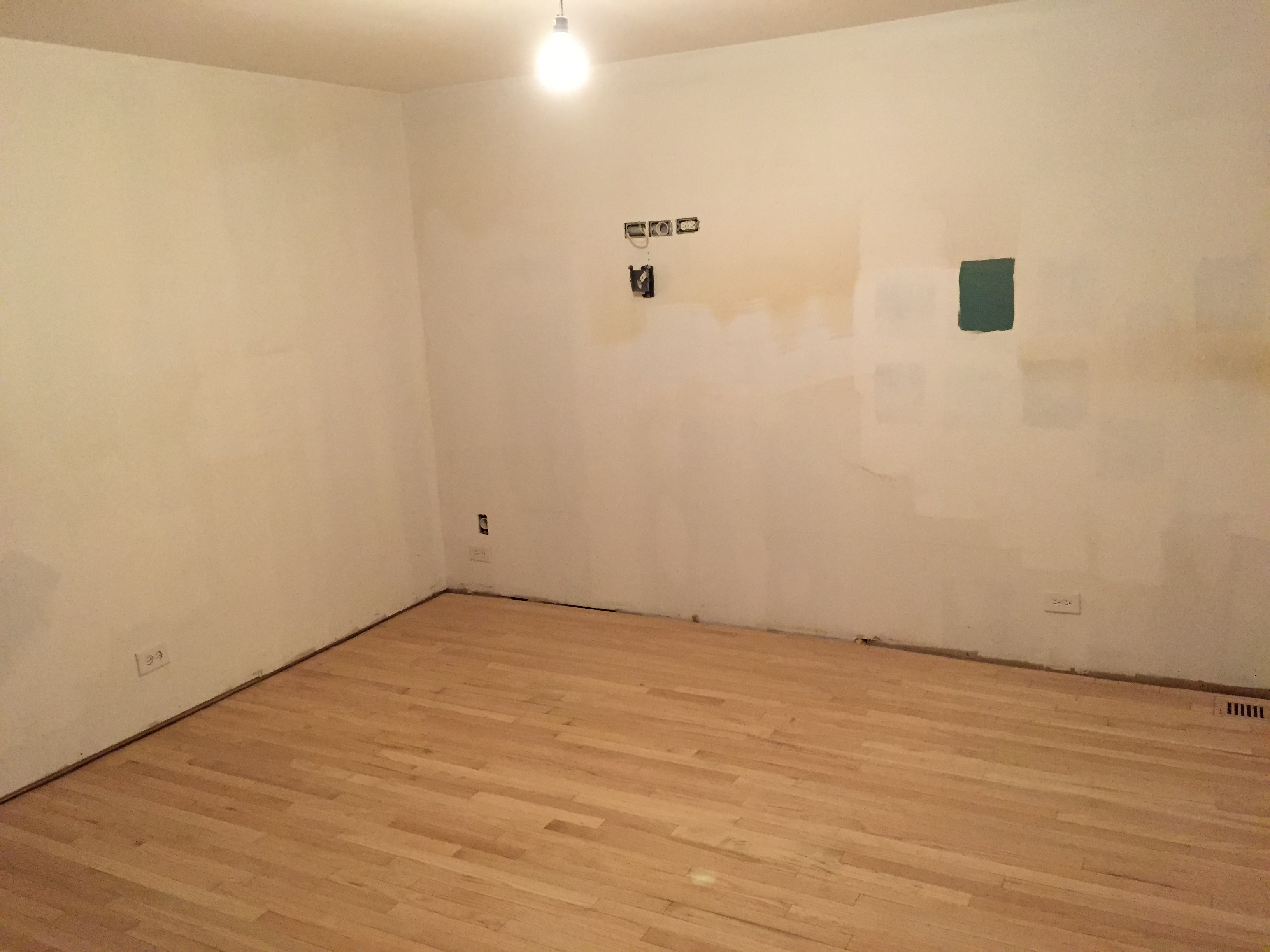
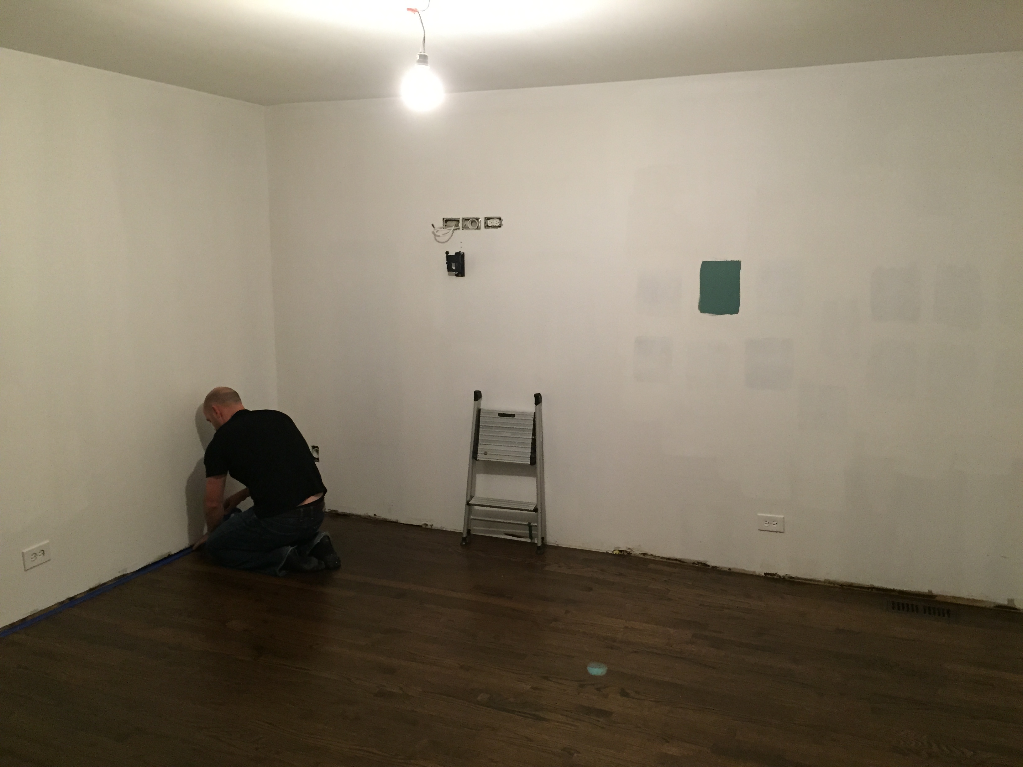
Unfortunately we also had to re-do the hardwood floors because of the old fireplace hearth that left a big hole in the floor. So the flooring guys patched the hole, sanded all of them back, and re-stained them to match the rest of the house. You can’t even tell the fireplace was there.

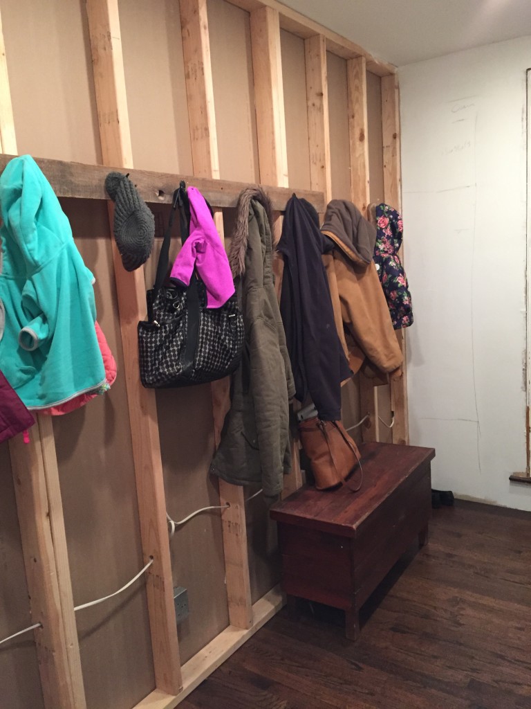
Here’s how the mudroom is shaping up so far.

We are building floor to ceiling cabinets in here, but it is already so much better! Ben threw together a hook rail so we can hang all our stuff as soon as we come in the door.
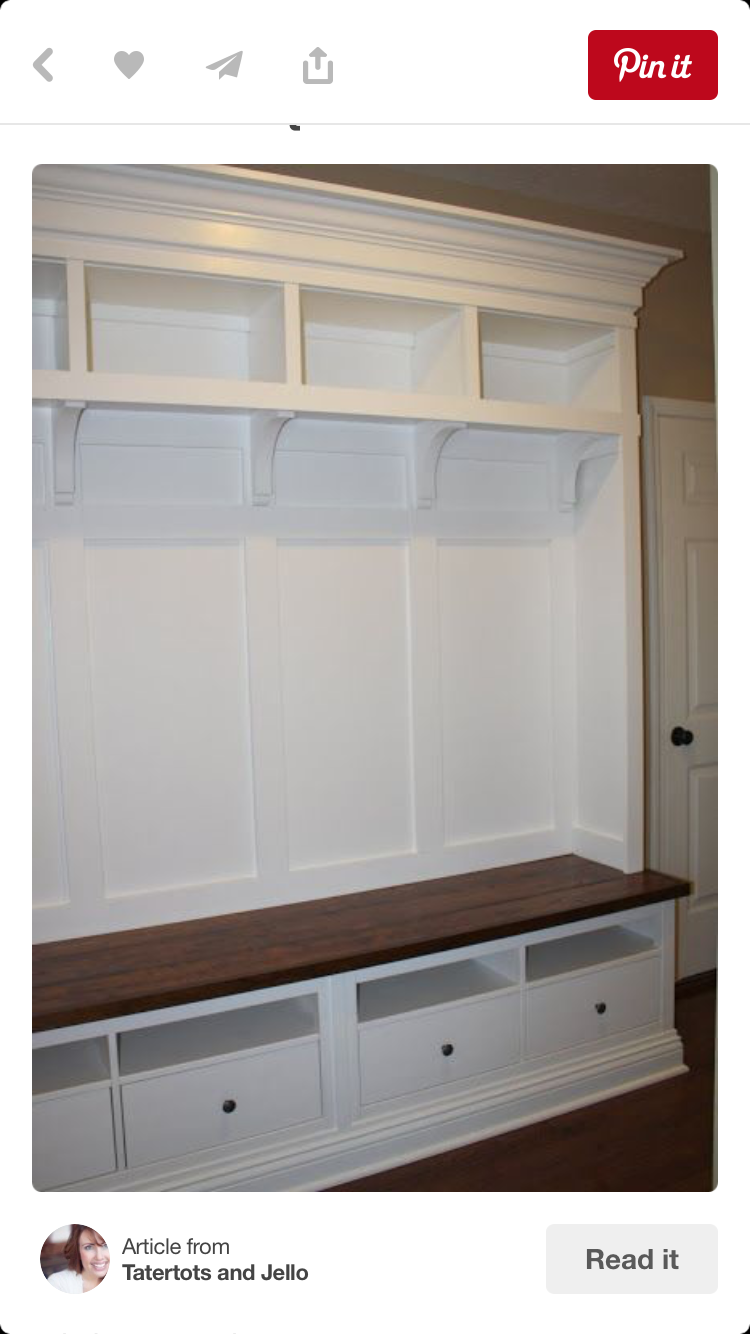
Here is some of my inspiration for the mudroom cabinets. I cannot wait!

IMG_0713

We’ve already painted the playroom and have started putting it all back together, so I hope to share a finished reveal before the end of the year.

Master Bathroom Reveal

18 Dec carrera marble shower

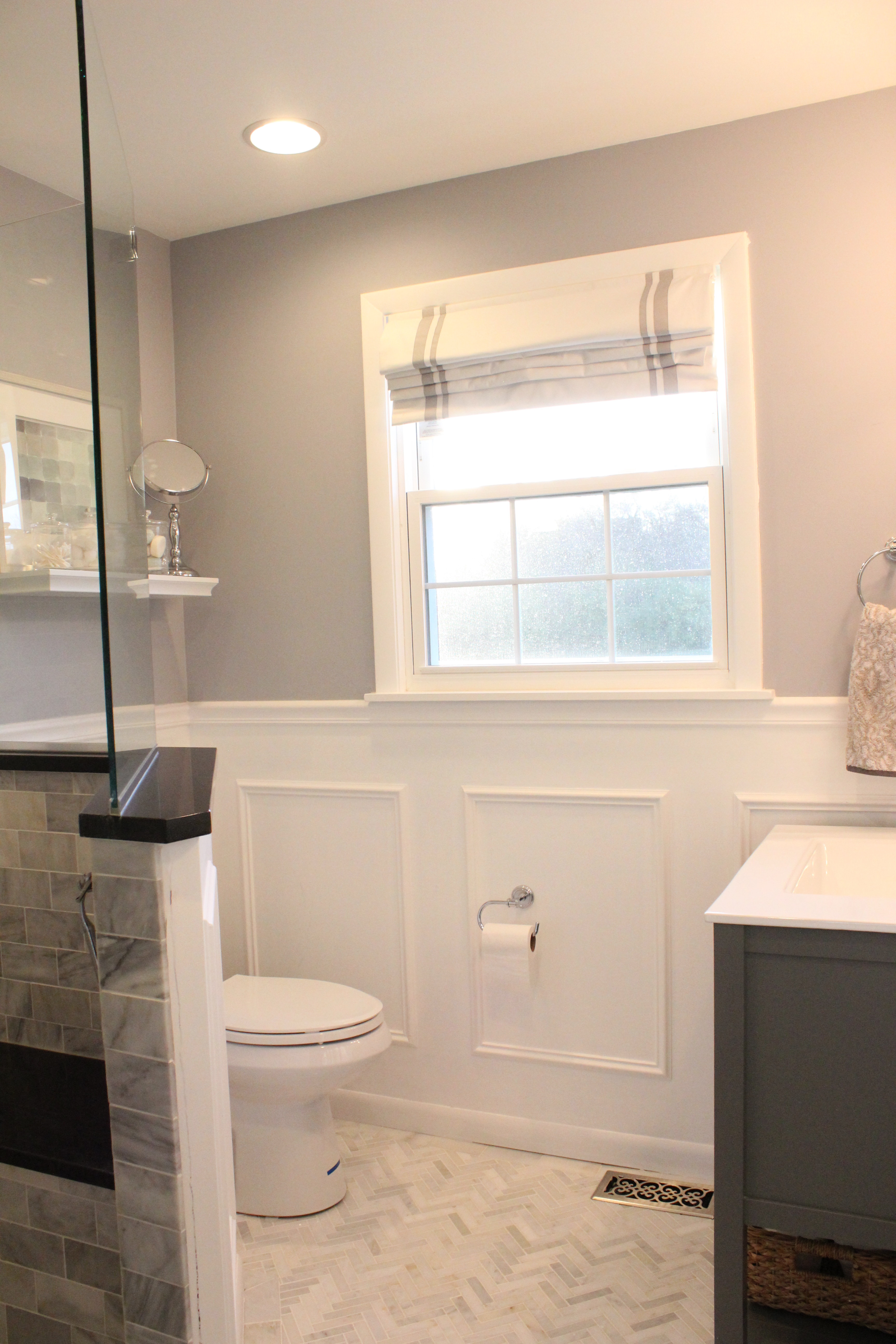
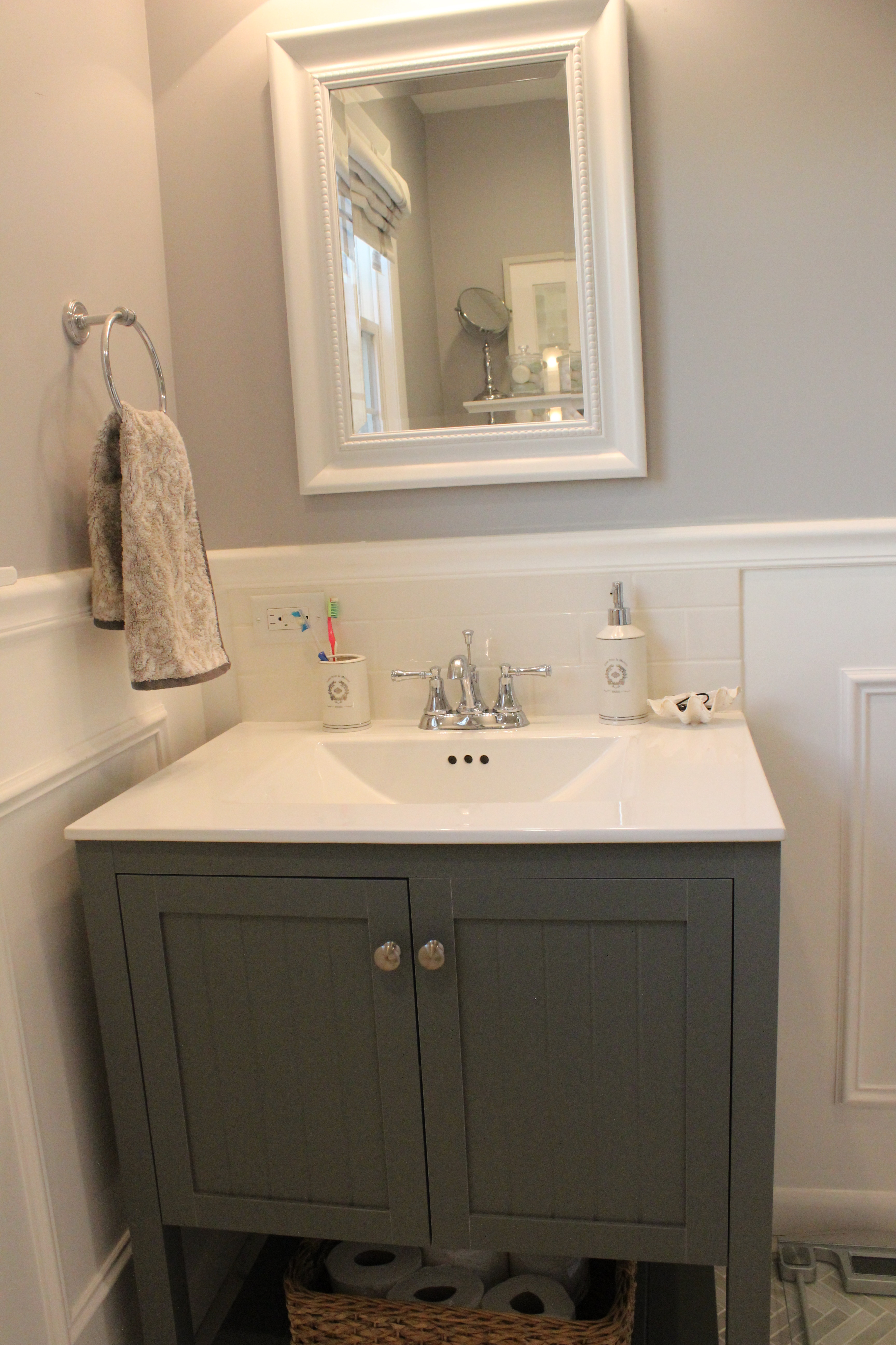
Our master bathroom has been done for months, but I finally got around to taking finished photos and now it’s time to share! This is the last of the four bathrooms we have remodeled/built in this house. As a reminder, this is a completely new room that was part of our small addition we put in on the back of our house.

The last time I blogged about the master bathroom, it was looking like this.

IMG_5213-e1418339744772-682x1024

And here it is now all complete:

IMG_5571

We installed white wainscoting on the bottom half of the walls and the top half is Lazy Gray by Sherwin Williams.

IMG_5591

The gray vanity and top is the Cranberry from Home Depot and the recessed medicine cabinet is this one from Amazon. We added a little backsplash to the vanity ourselves using plain white subway tile.

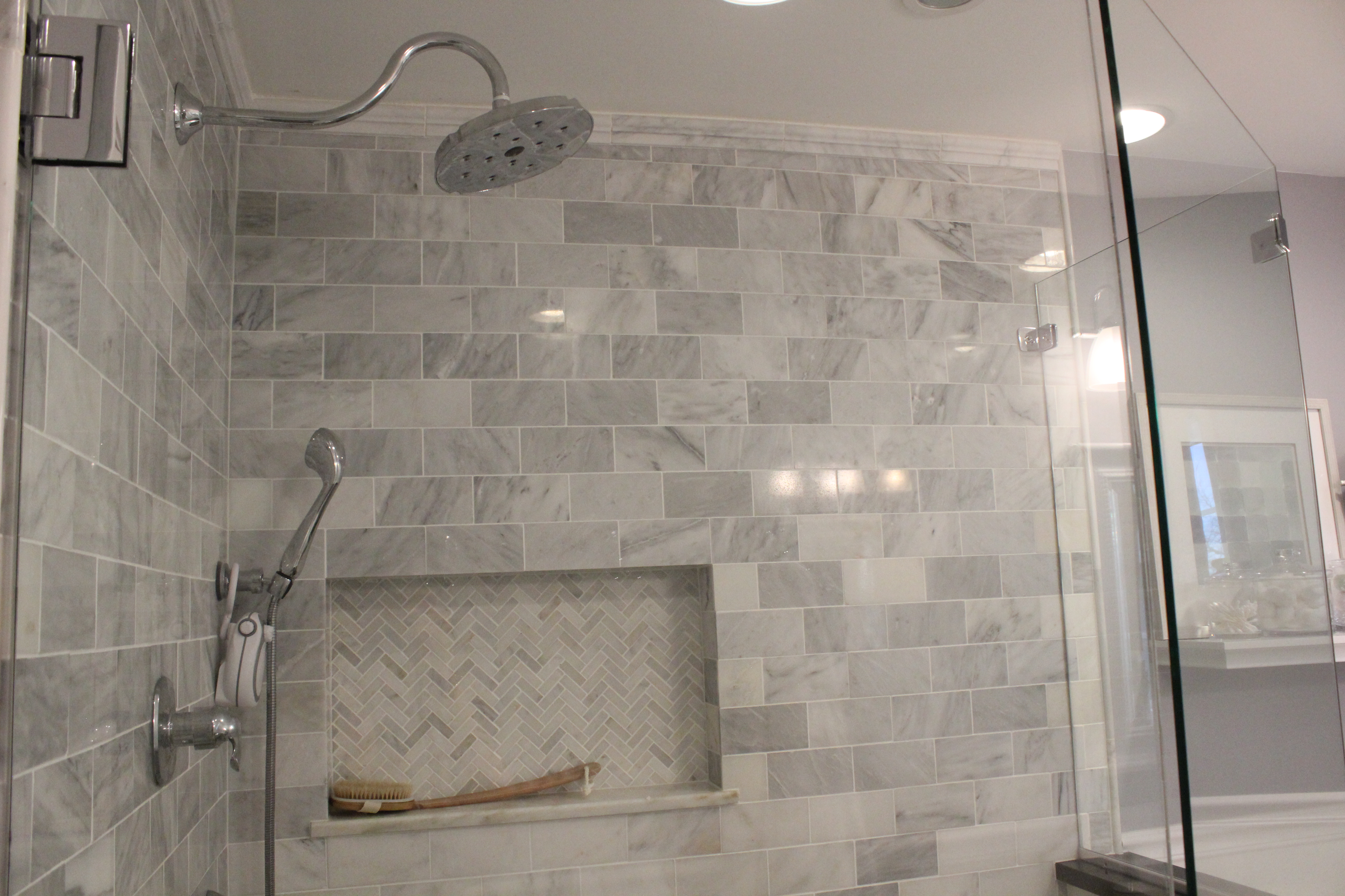
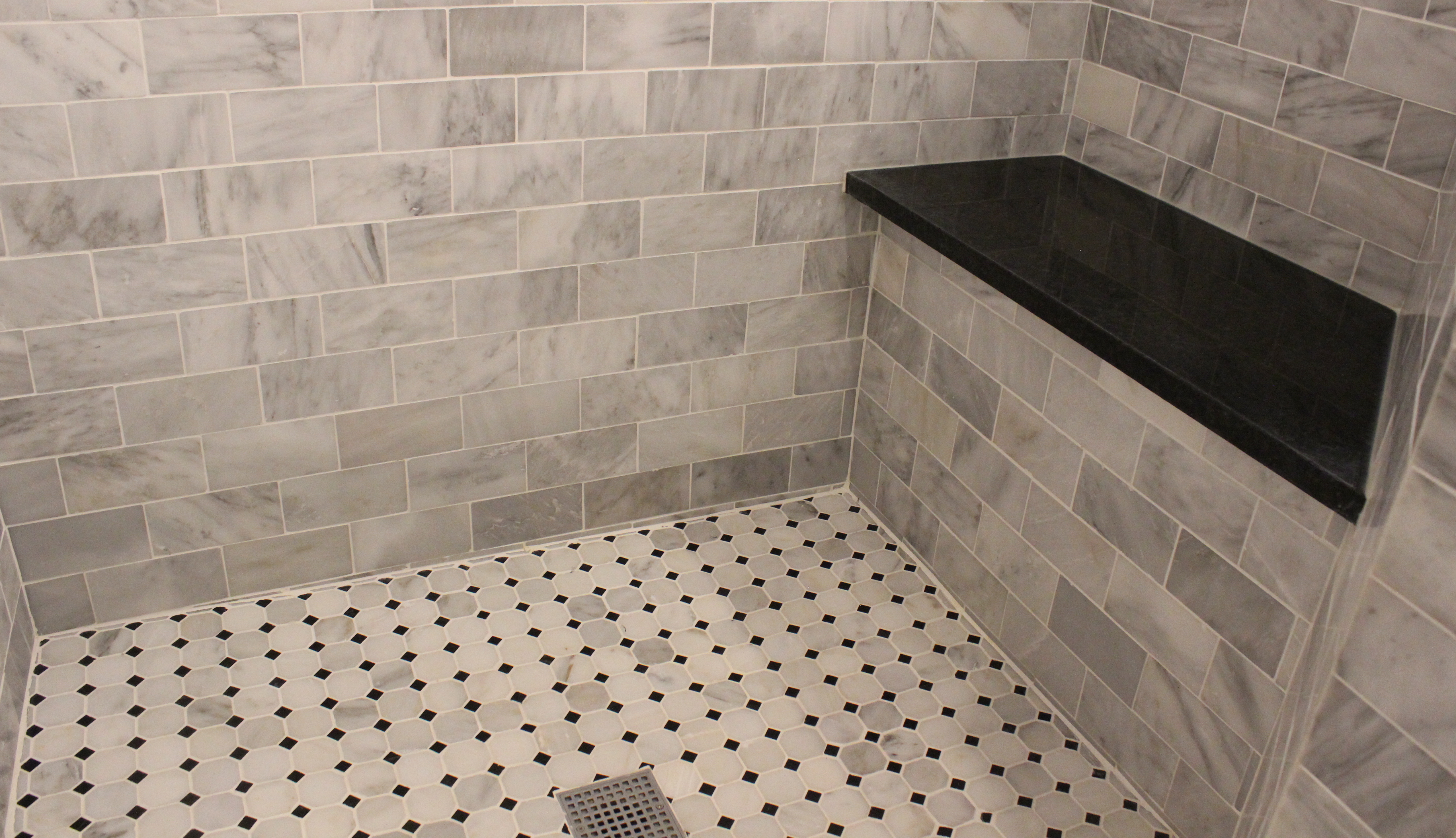
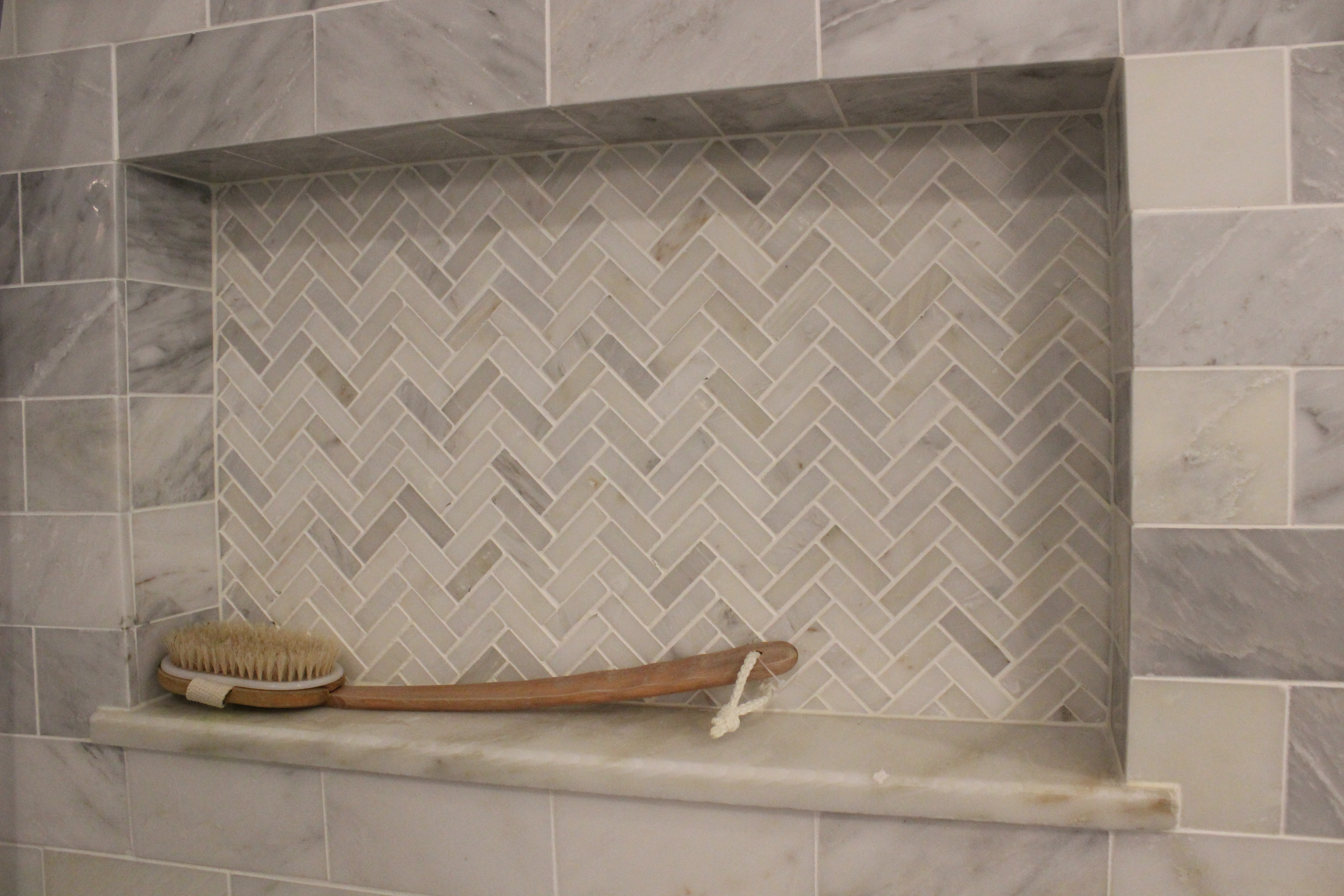
The shower is a combination of three types of Carrera marble tile: subway tile on the walls (from Floor & Decor), a small herringbone pattern in the niche, and an octagon pattern on the floor, both from the Tile Shop. And black granite on the bench seat and threshold.

carrera marble shower

shower floor

IMG_5586

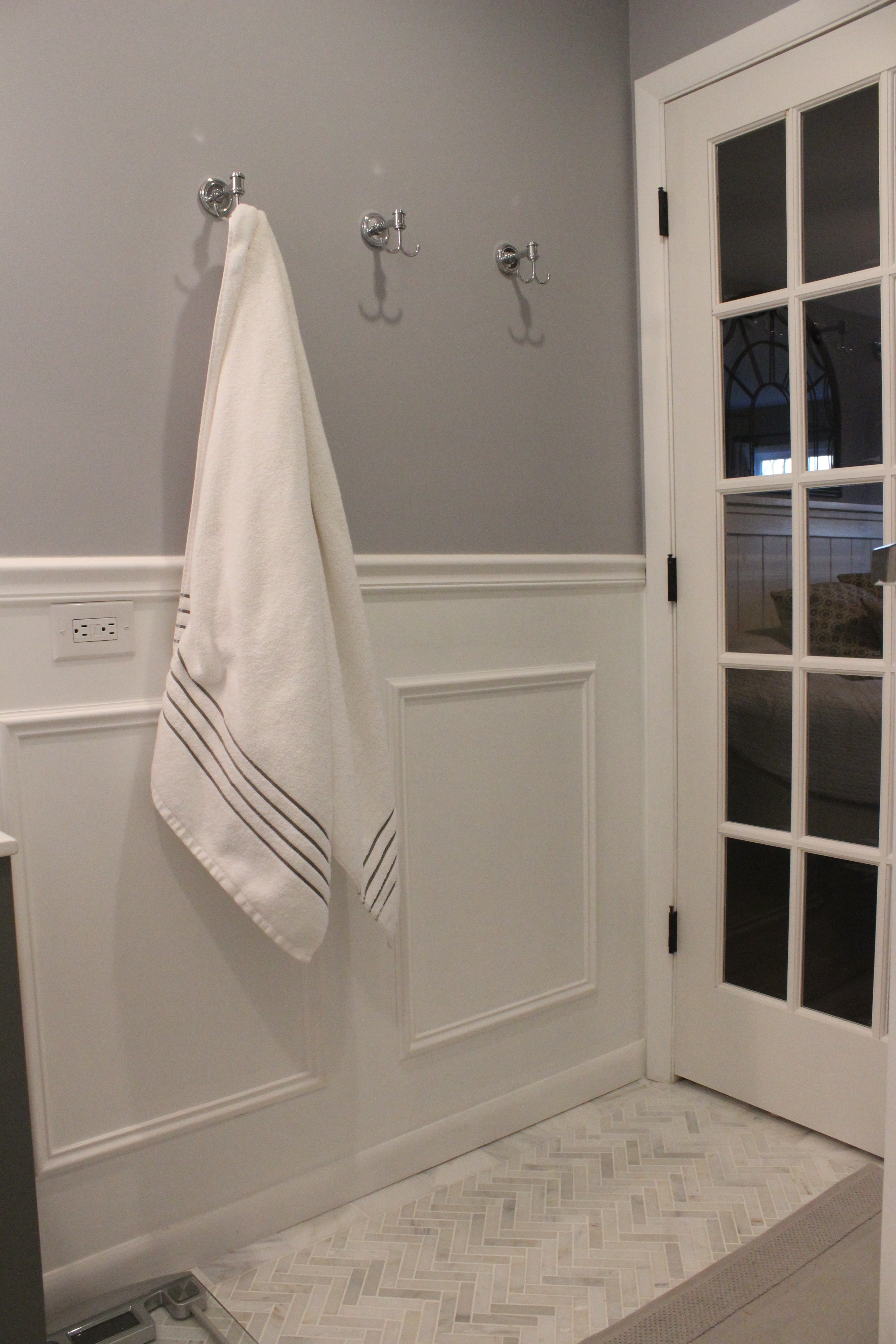
Here is the other side of the room, which we hung 3 robe hooks from Target, and you can see the glass french door leading to our bedroom.

bathroom towel hooks

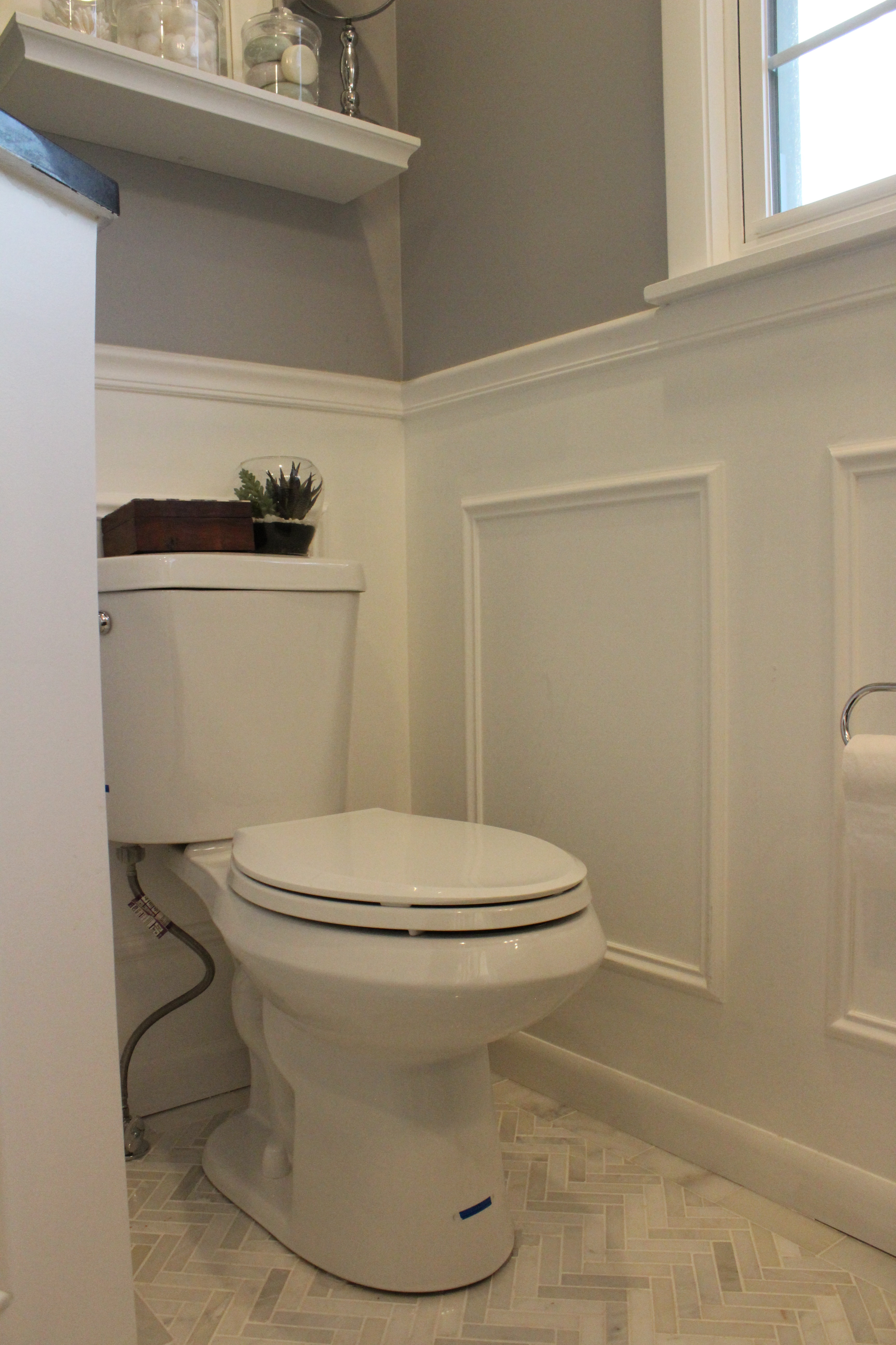
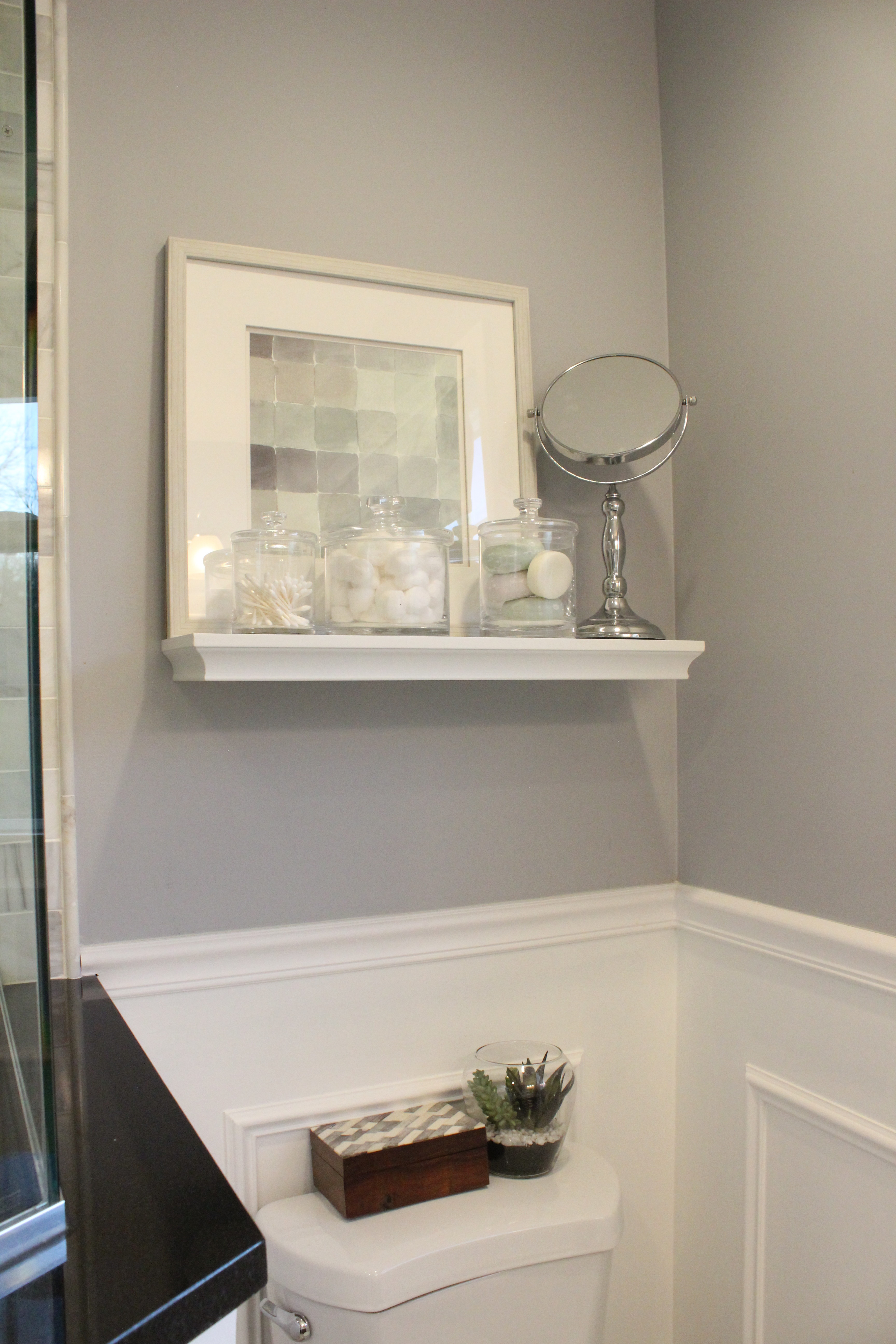
And here is the toilet “nook” area.

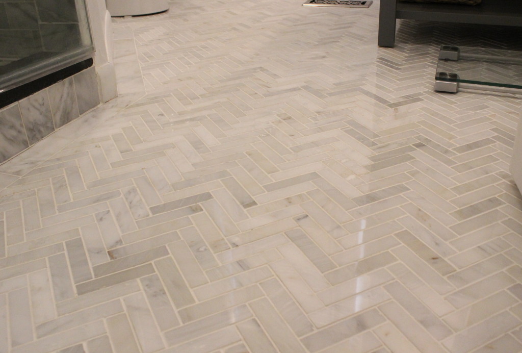
My very favorite part of the room is the Carrera marble herringbone floor (also from Tile Shop). It’s so so pretty. And the floors are heated!

IMG_5594

We are very happy with the space and after 3+ years, are glad to FINALLY be done renovating bathrooms in our home.

Here is a full source list for anyone who is wondering where to get anything.

Wall paint: Benjamin Moore’s Lazy Gray; floor tile: Large Herringbone carrera marble from Tile Shop; shower tile: Carrera marble from Tile Shop & Floor and Decorvanity: Cranbury from Home Depotfaucet: Delta from Home Depot; can lights and hidden exhaust fan: Home Depottoilet: Glacier Bay from Home Depot; recessed medicine cabinet: this one from Amazon; floor mat: Bed, Bath & Beyondroman shade: this one from Pottery Barn Kids; shower fixtures: Delta from Faucet Directgrout: Polyblend bright white; soap pump/toothbrush holder: Bed, Bath & Beyond; trashcan: Bed, Bath & Beyondwall art: Target; vanity light: this one from Lighting Direct; hand towel: Targetglass canister set: Crate & Barreltoilet paper holderTarget; shower door: custom from a local glass company; french door: Home Depot.

Income Property Reveal

1 Oct

We’re officially landlords! We put the finishing touches on our rental property this week and have tenants moving in today. We are SO pleased with how the home turned out and thankfully had an easy time finding good tenants.

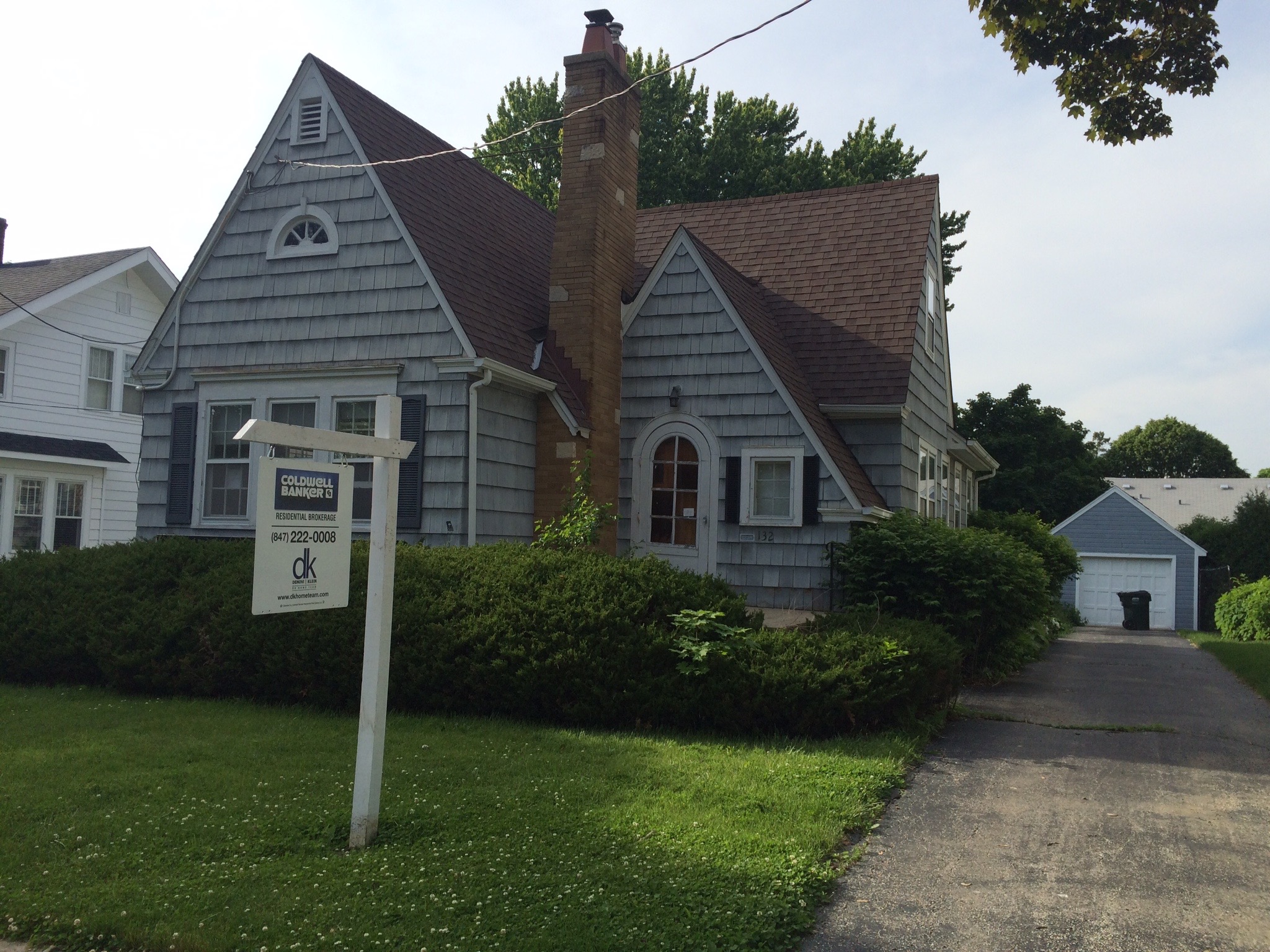
Here is a before look at the front exterior of the home:

IMG_6935

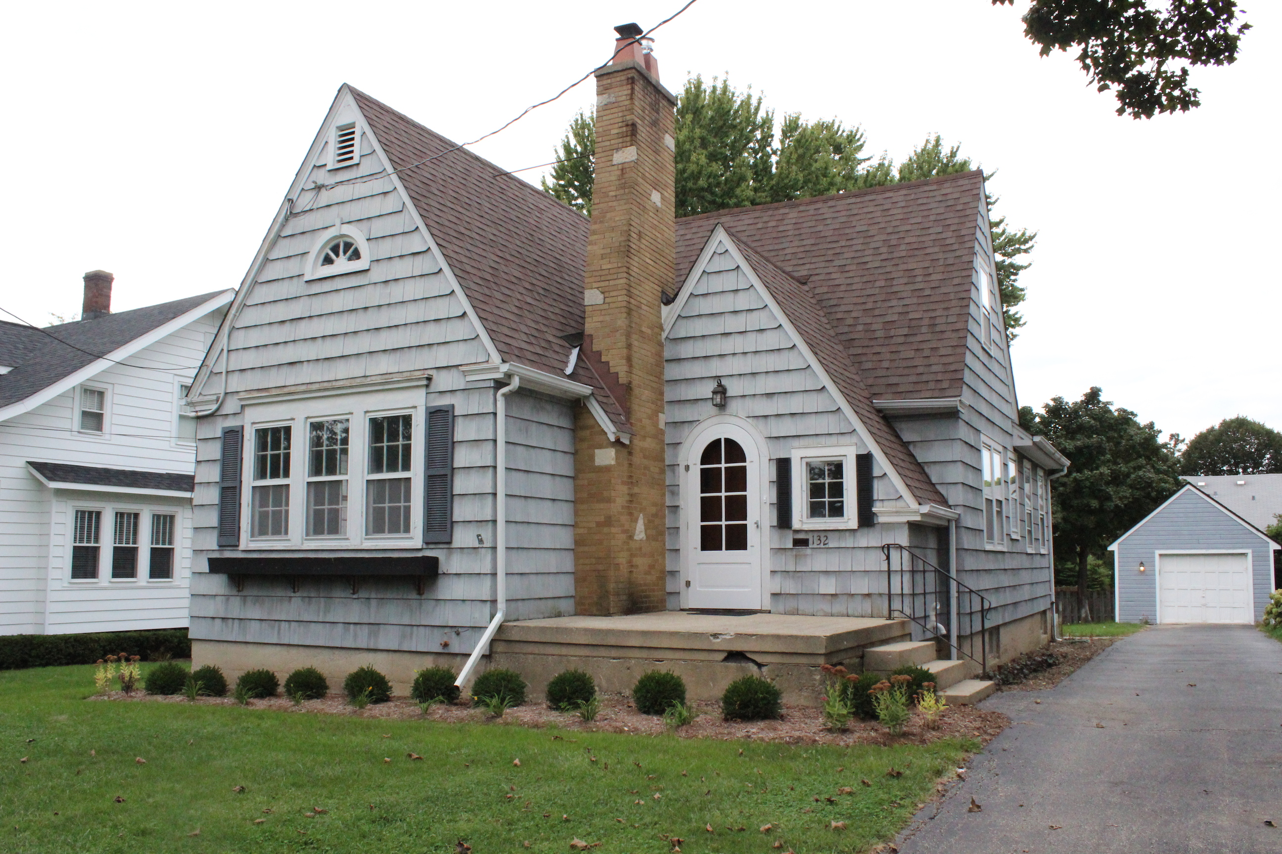
And now it looks like this:

IMG_5535 resized

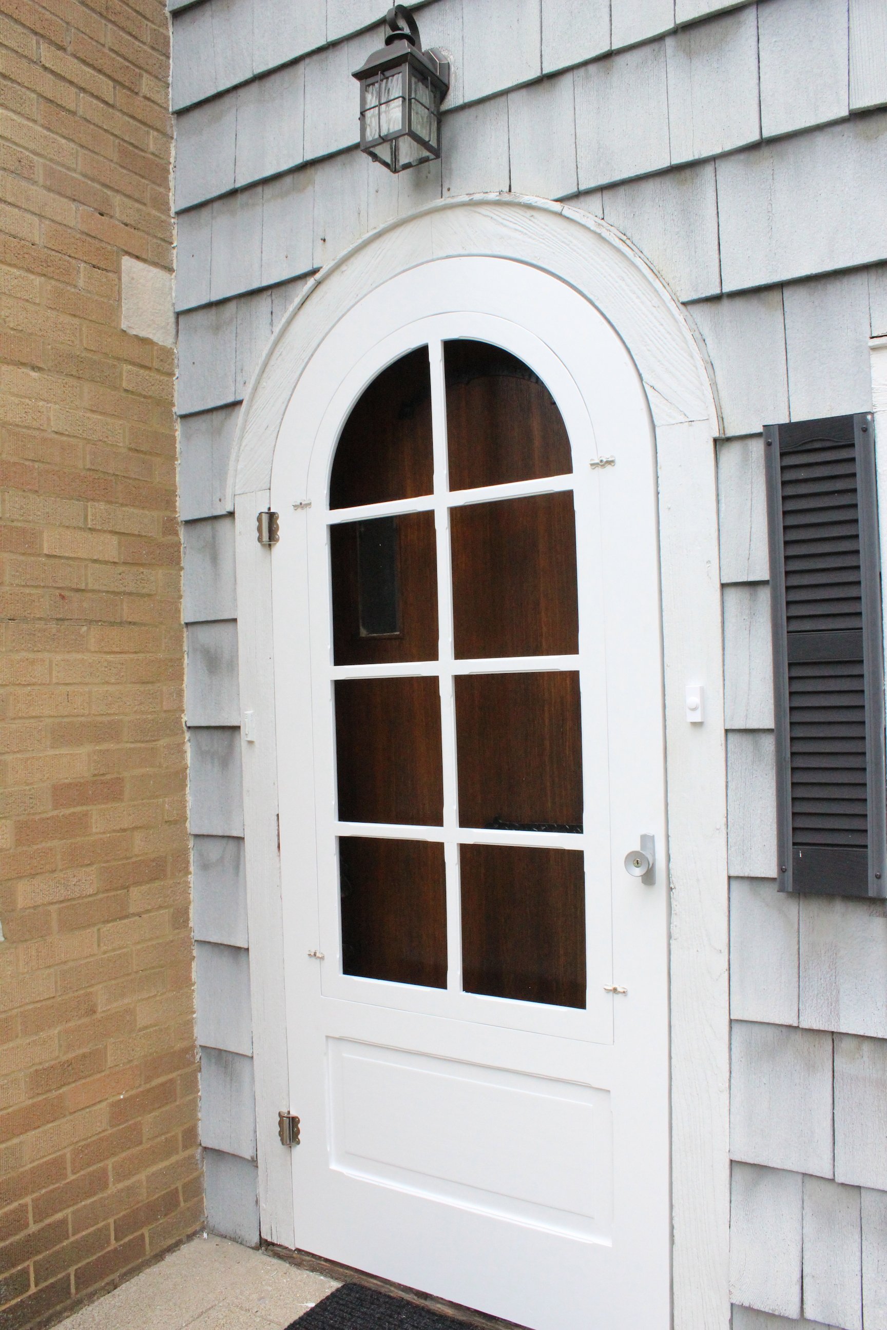
Admittedly, not much of a transformation, but we did rip out all the overgrown bushes and plant some boxwoods and other plants. We also replaced the light over the front door, had a new screen door custom built, and stained the front door.

IMG_5536 resized

The home desperately needs an exterior paint job, which is on our radar for next year.

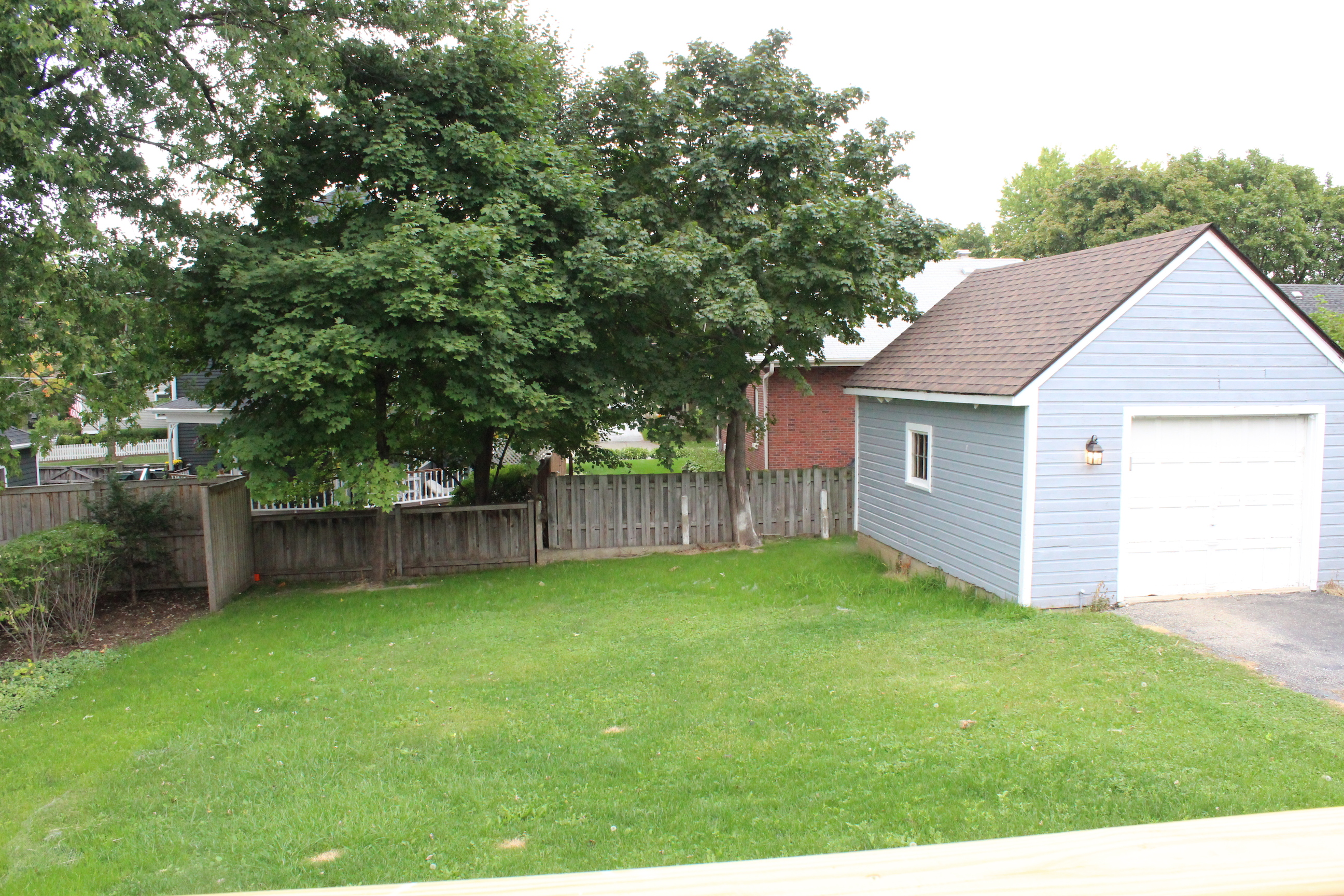
The back yard was also very overgrown and there was a hole in the garage roof.

IMG_6941

After replacing the garage roof and ripping out those bushes, it looks like this:

IMG_5538

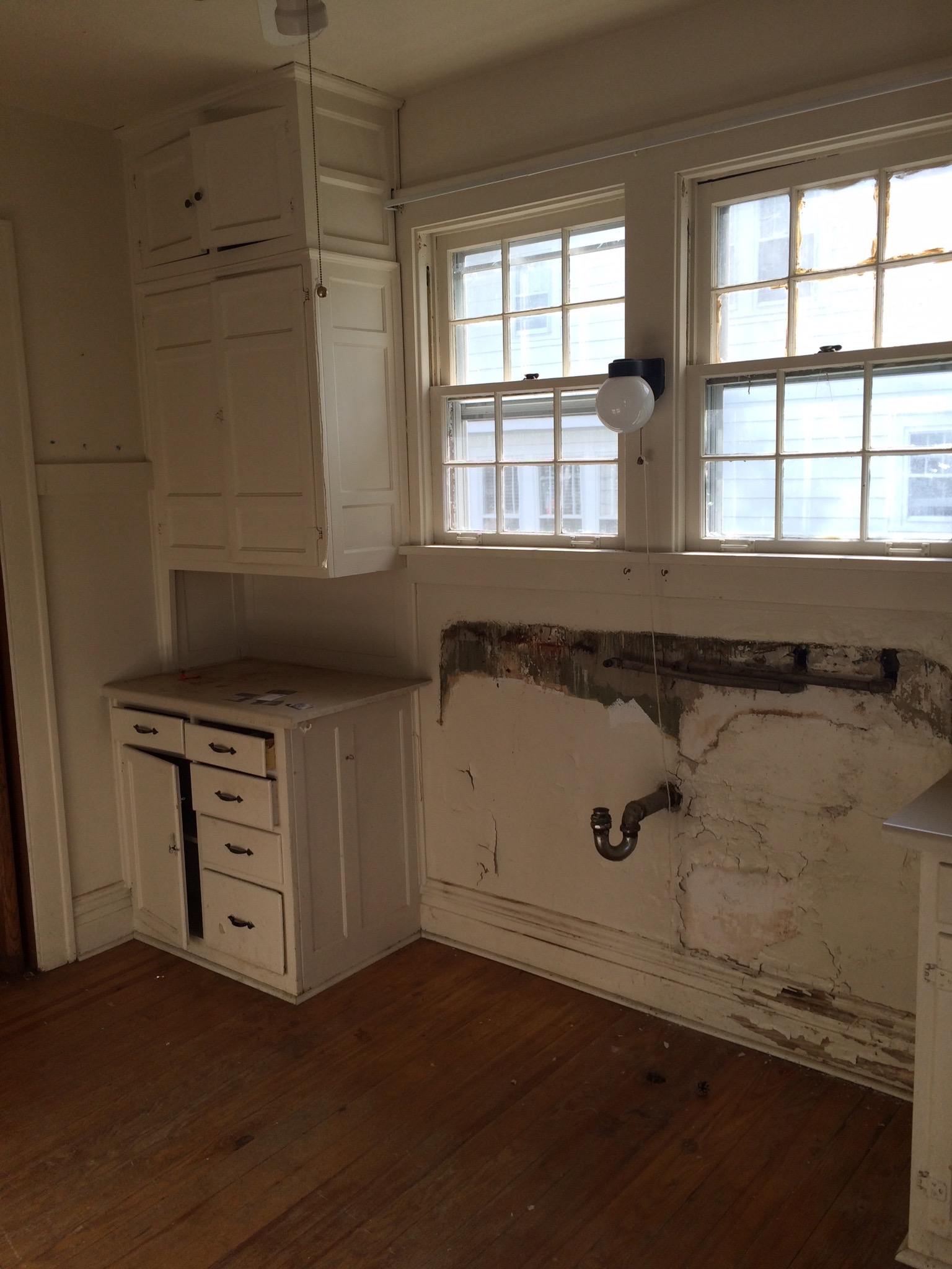
Moving inside is where the big transformation happened. The kitchen looked like this before:

IMG_6942

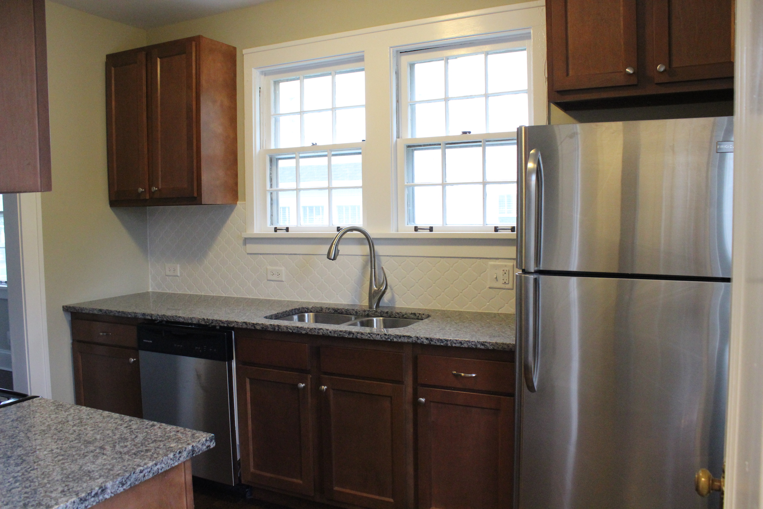
And now after new stainless steel appliances, cabinets, granite countertops, arabesque tile backsplash, new hardwood floors, paint (Analytical Gray by Sherwin Williams), lighting and more:

IMG_5542

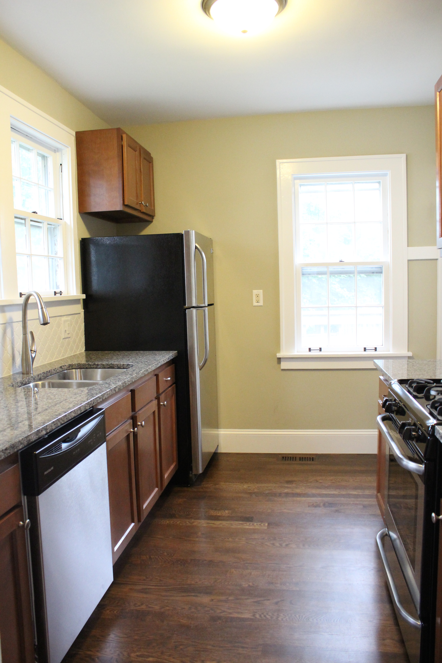
Here’s the other side of the kitchen.


And view from the dining room.

IMG_5545

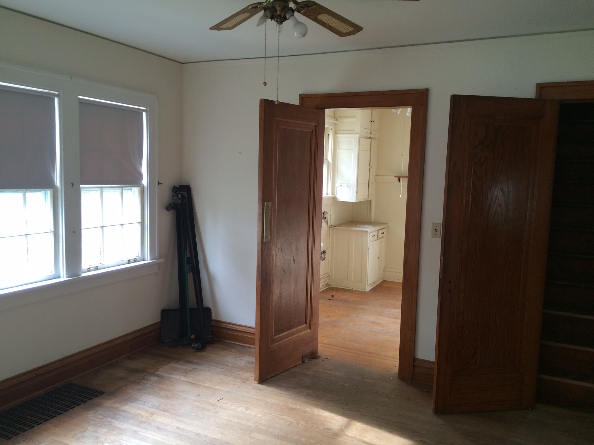
Here was the dining room before:


IMG_6954

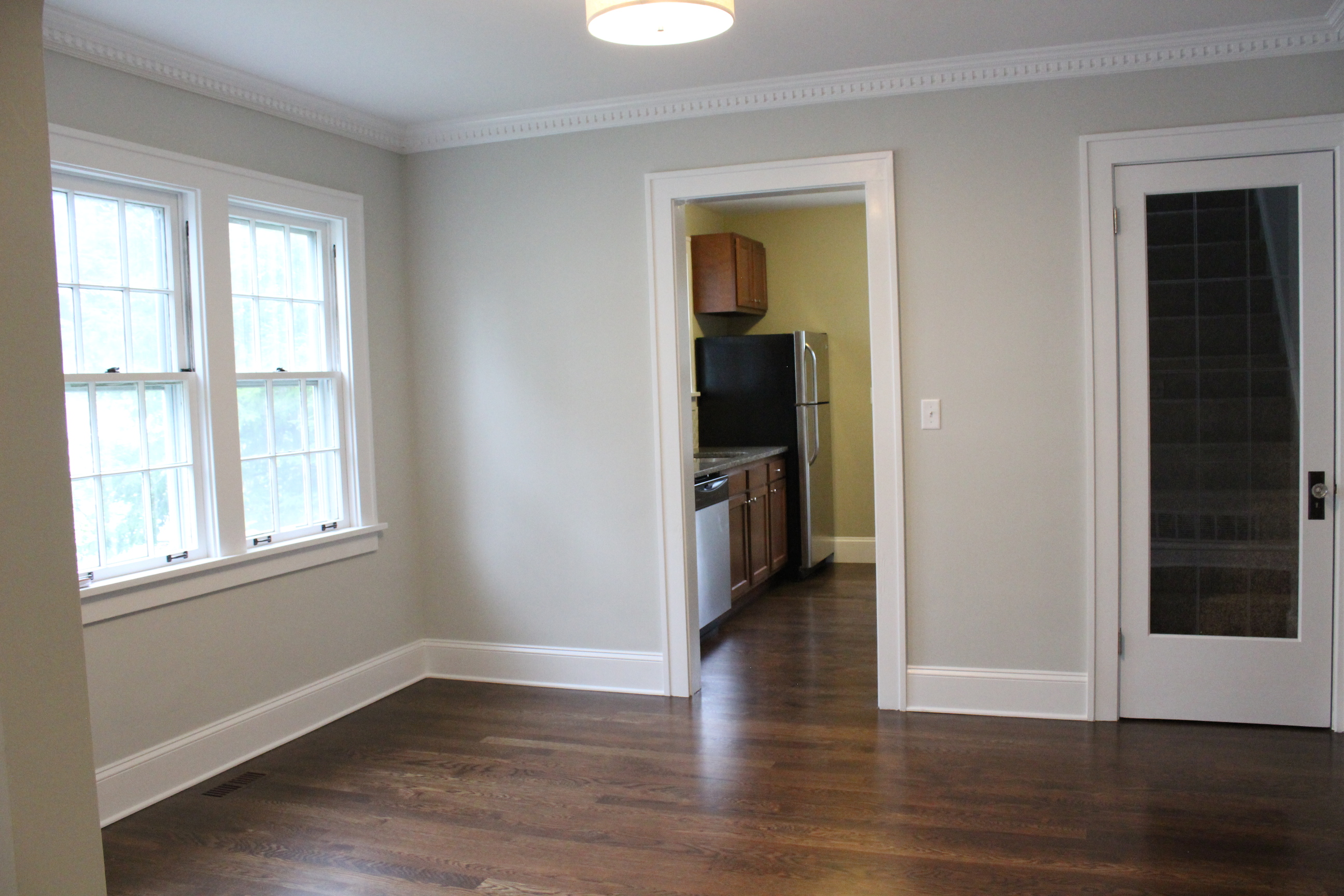
And now after new paint (Gray Owl by Benjamin Moore), crown molding, lighting, hardwood floors, baseboards, and more:

IMG_5546

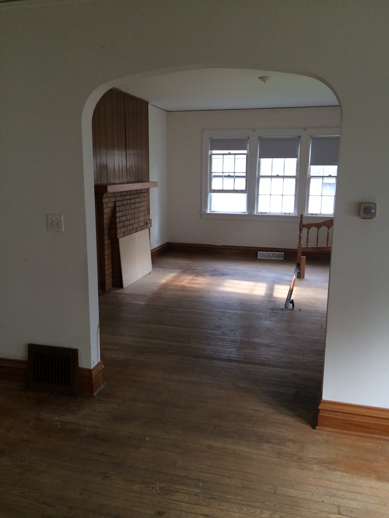
The other side of the dining room looking into the living room used to look like this:

IMG_6957

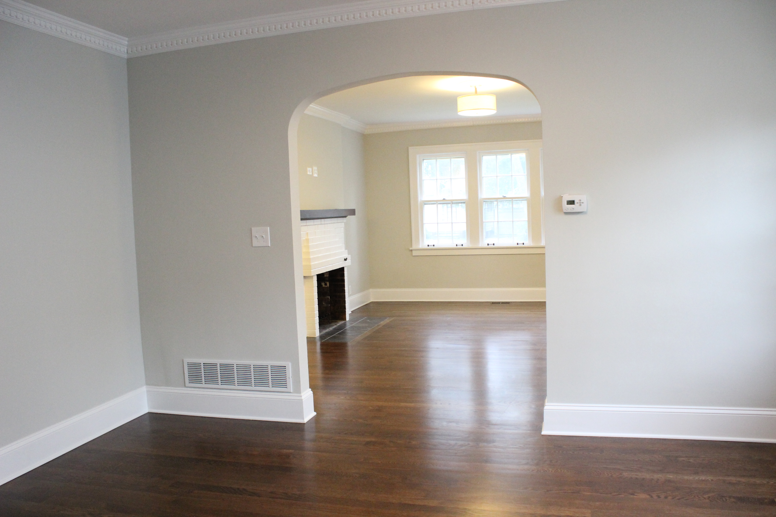
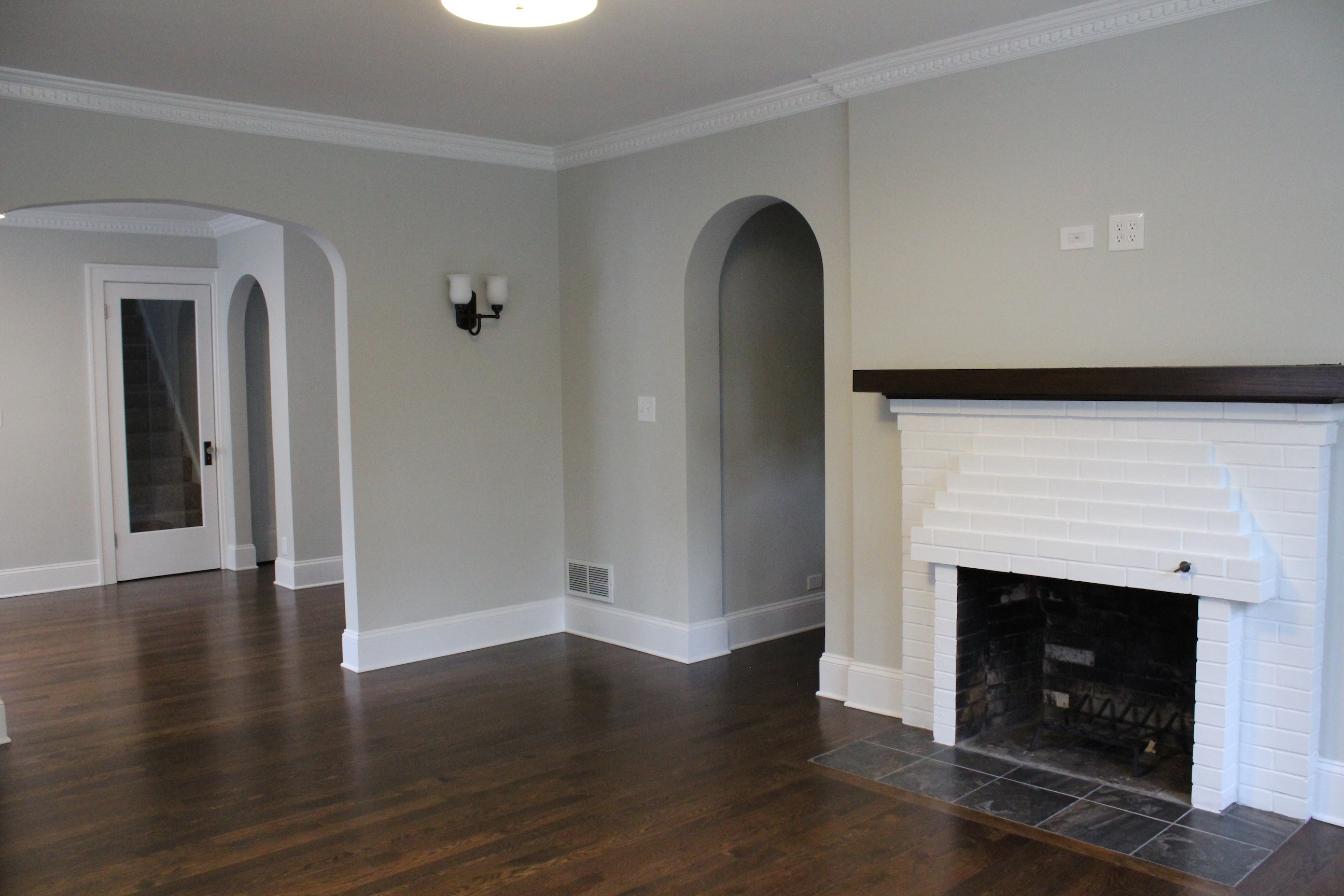
And now:

IMG_5547

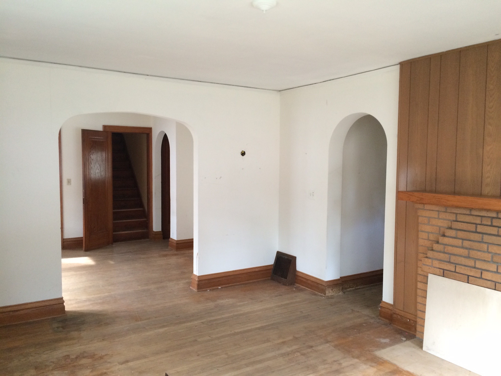
Into the living room, it used to look like this:

IMG_6952

We updated the fireplace, added sconces (from Home Depot), an overhead drum light, and continued the paint, crown, baseboards and new floors.

IMG_5548

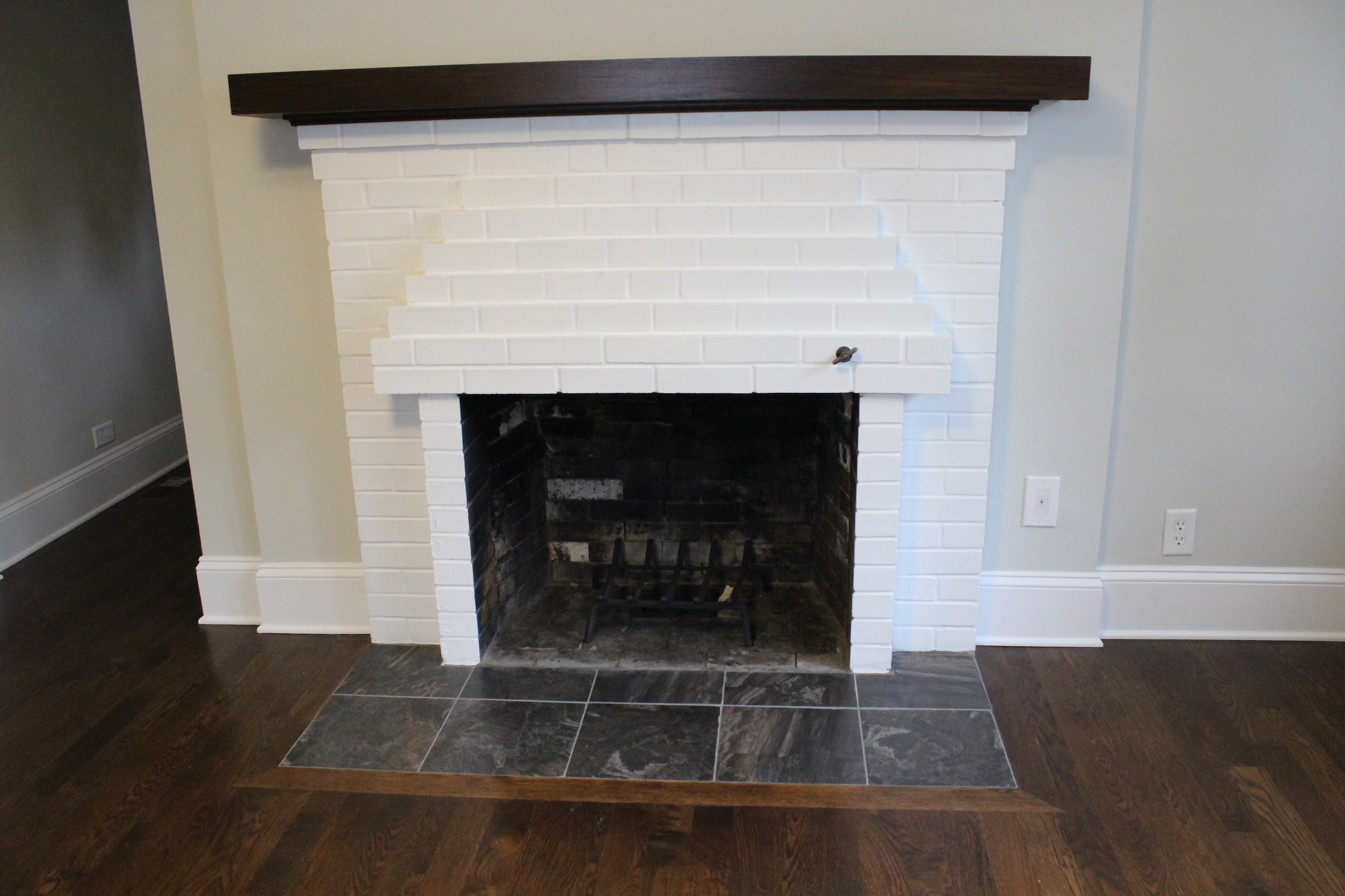
For the fireplace, we replaced the paneling with new drywall, painted the brick white, stained the mantle, and updated the tile on the hearth.

IMG_5549

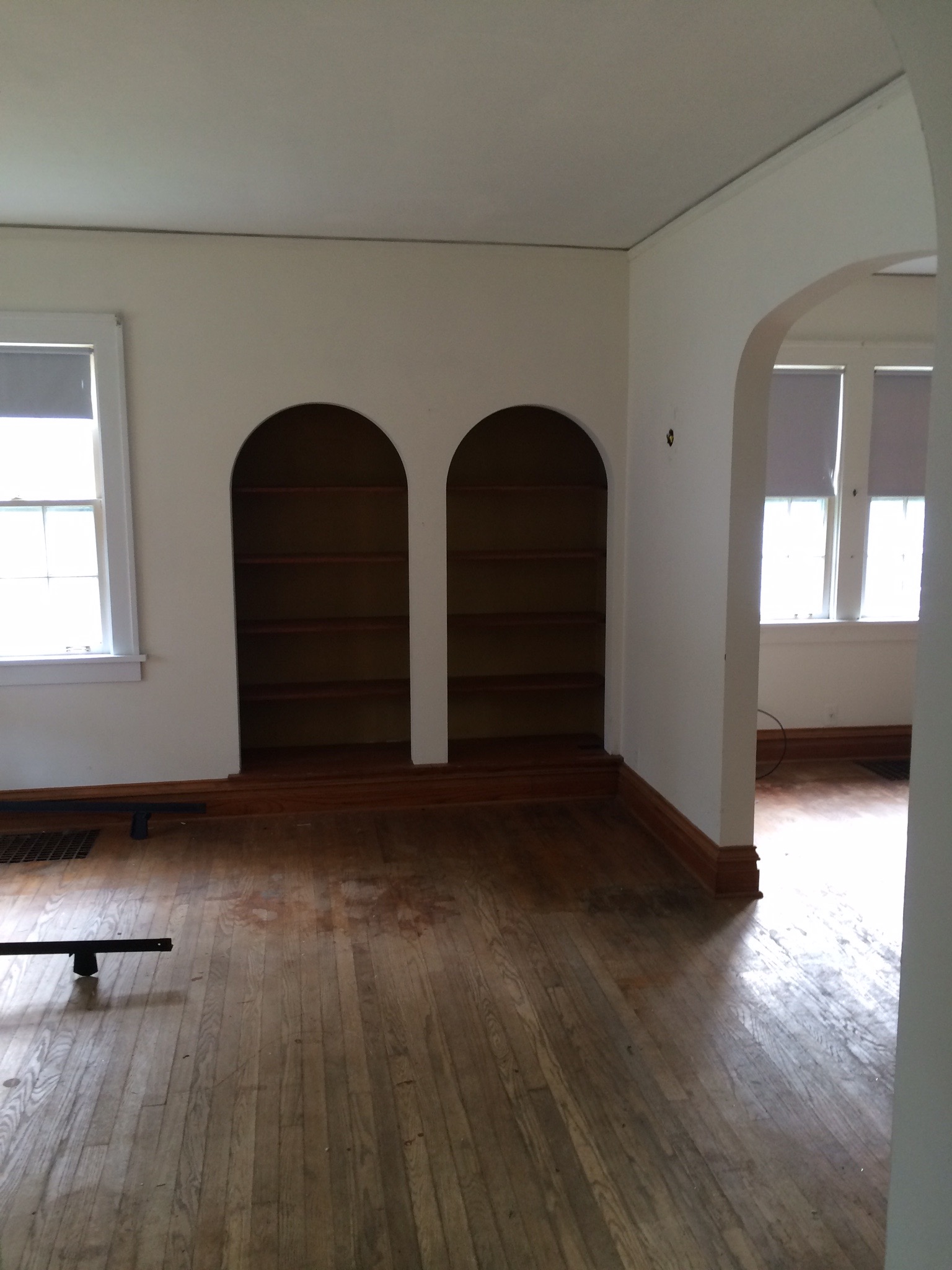
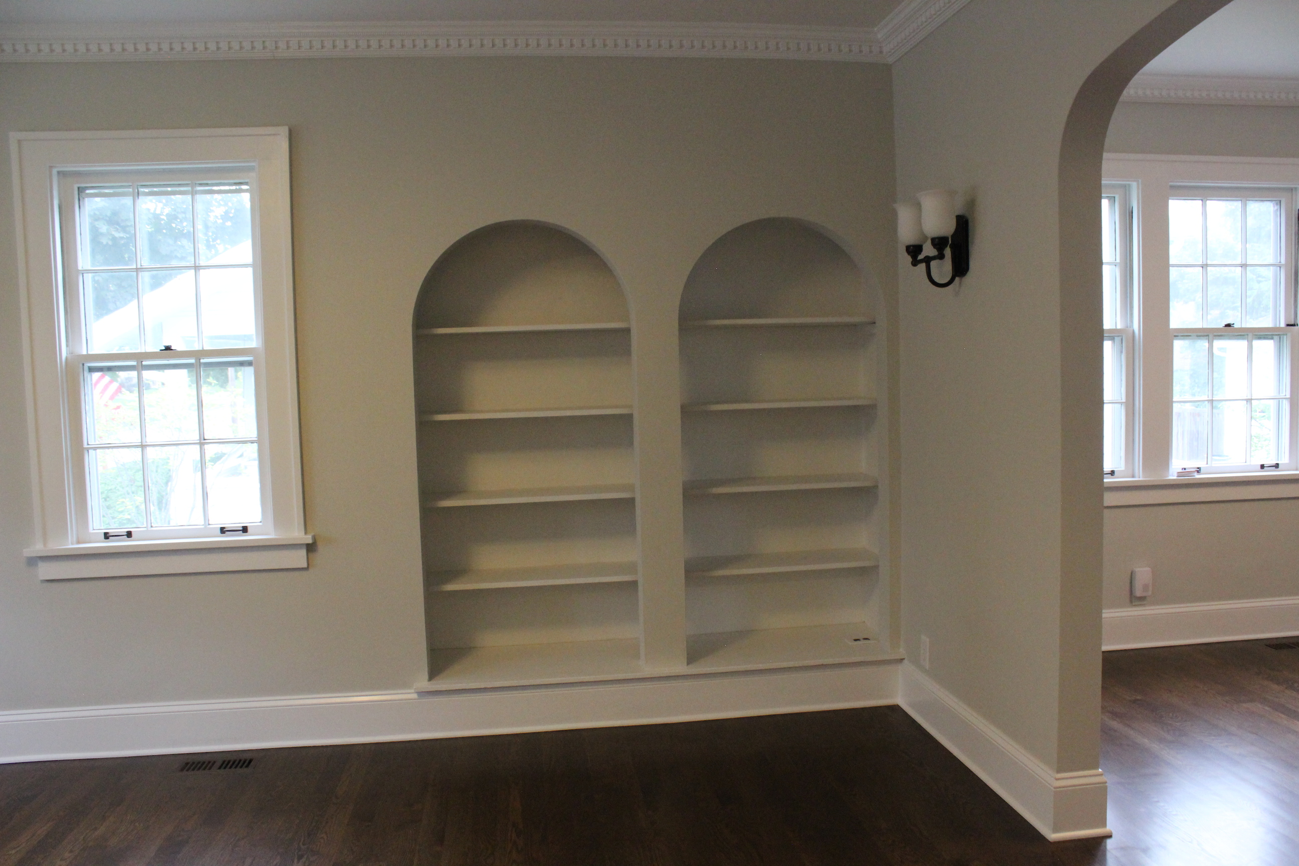
The other side of the living room looked like this.

IMG_6951

And now:

IMG_5551

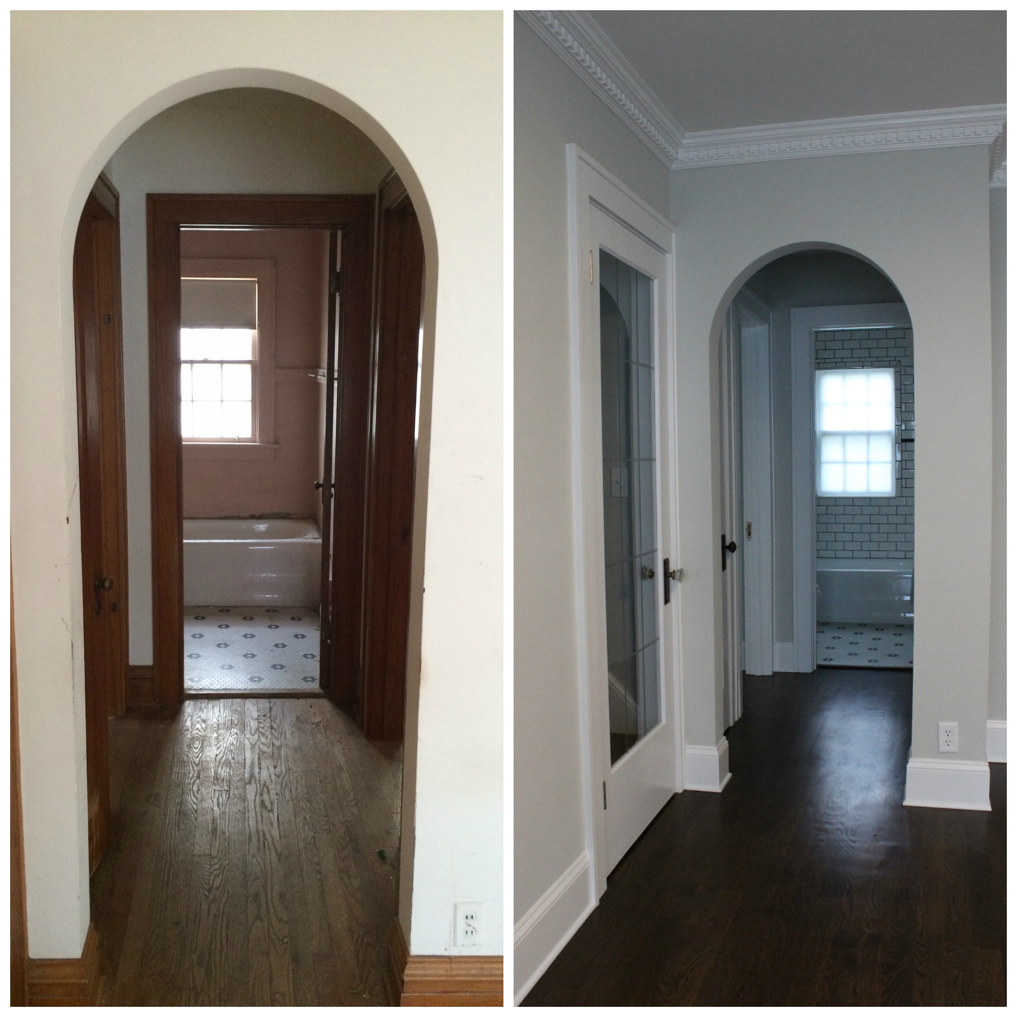
I just love all the arches throughout the home.

Here’s a before & after of the hallway leading to the bathroom and bedrooms:

hallway Coolidge

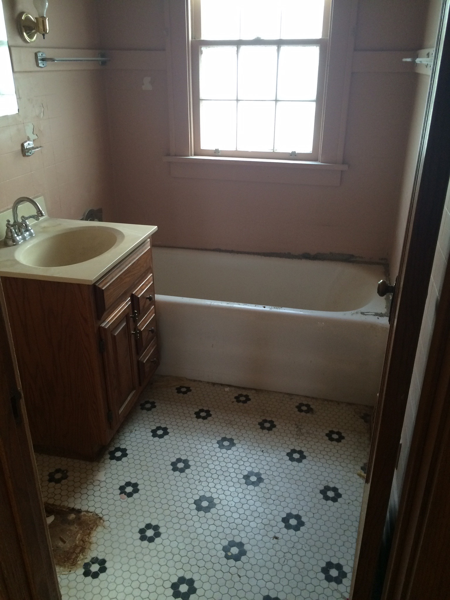
The bathroom looked like this before:

IMG_6946

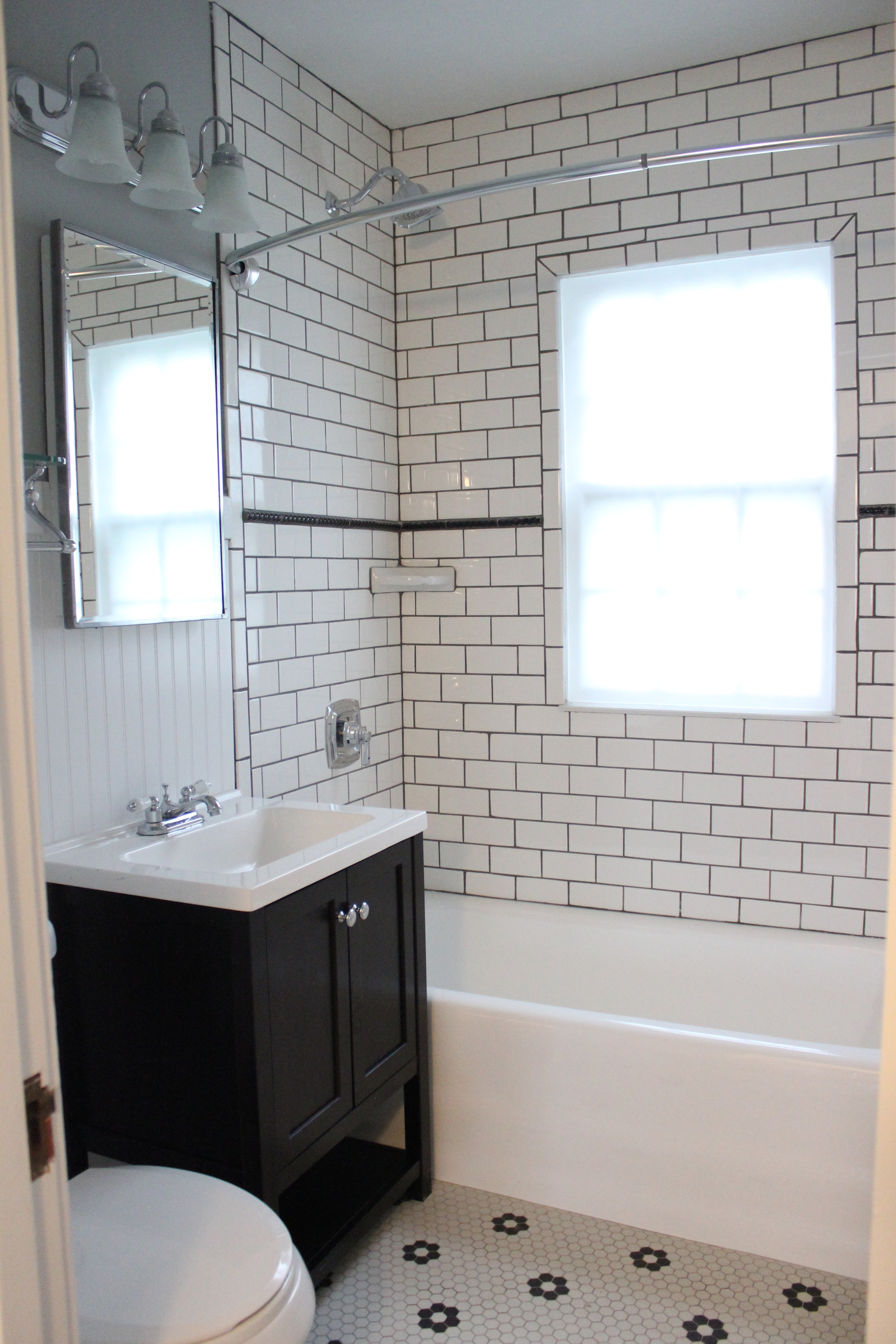
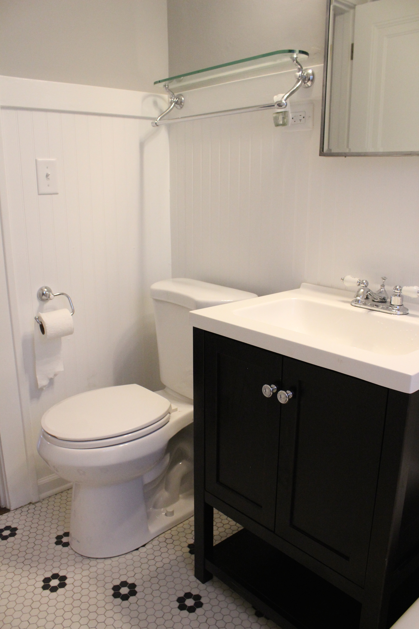
And now after adding a subway tiled shower, refinishing the bathtub, adding a new black vanity (from Home Depot), toilet, lighting, beadboard, and more:

IMG_5554

We were able to save the vintage floor tile, which fits the home perfectly. Here’s a look at the other side of the bathroom.

IMG_5555

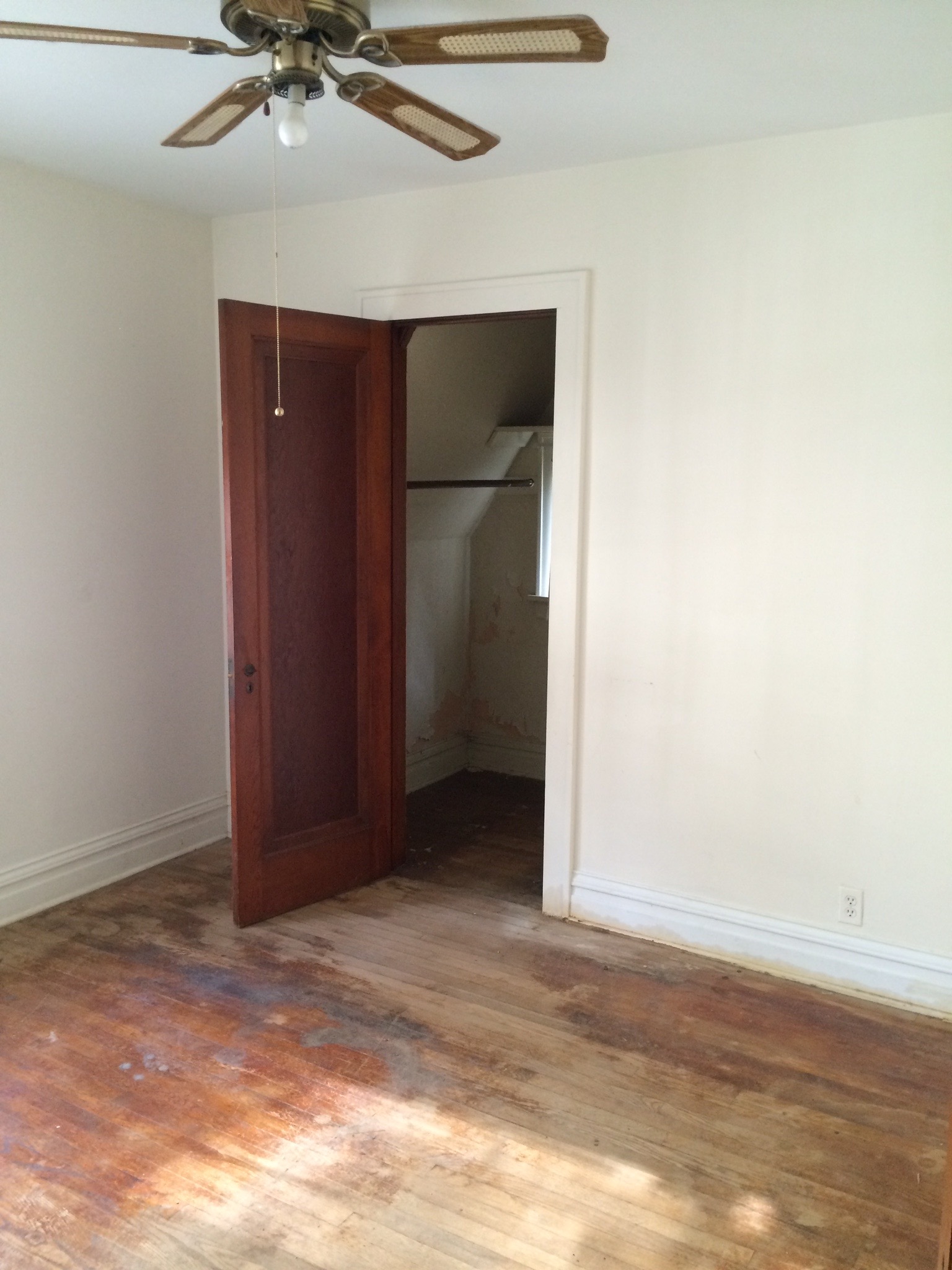
The two bedrooms looked like this before:

IMG_6949

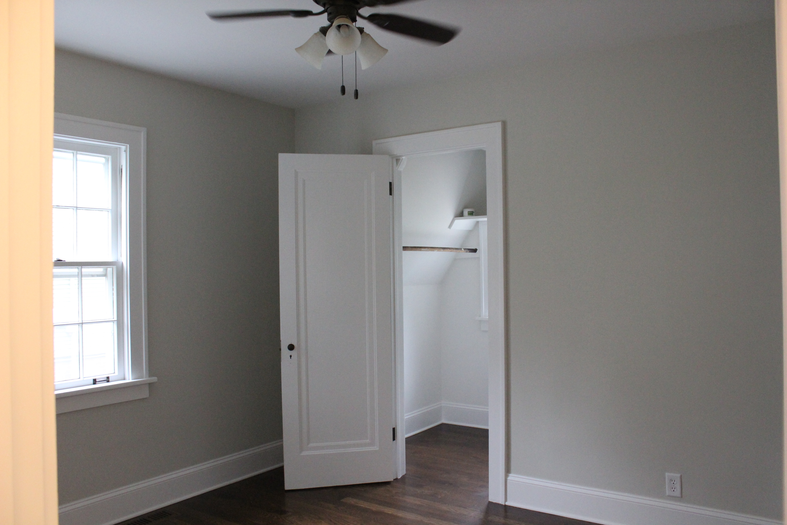
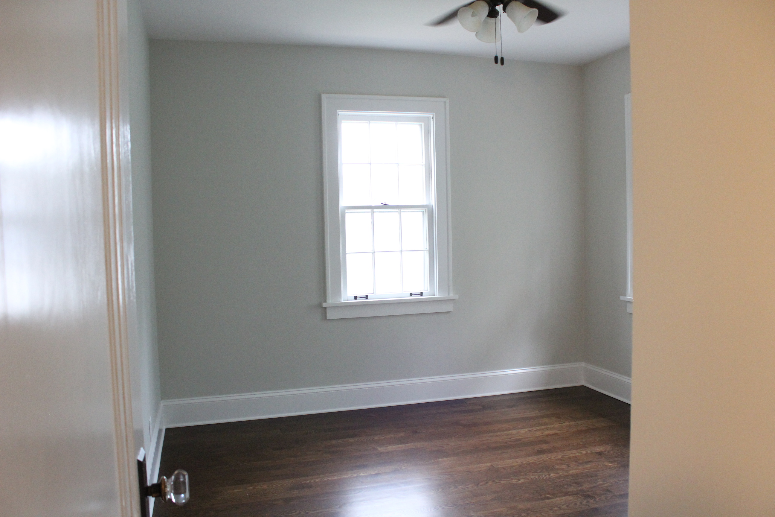
And now with new ceiling fans, paint, baseboards and hardwood floors:

IMG_5557

IMG_5558

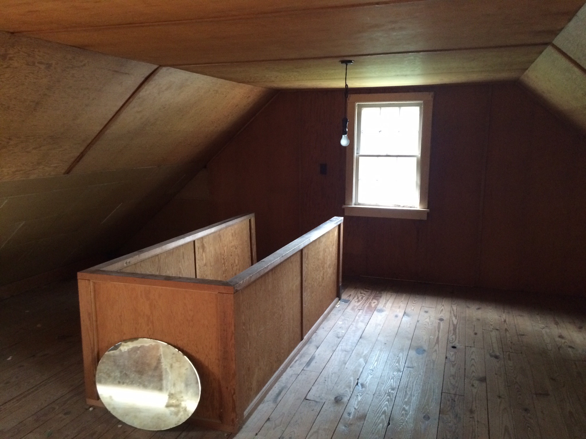
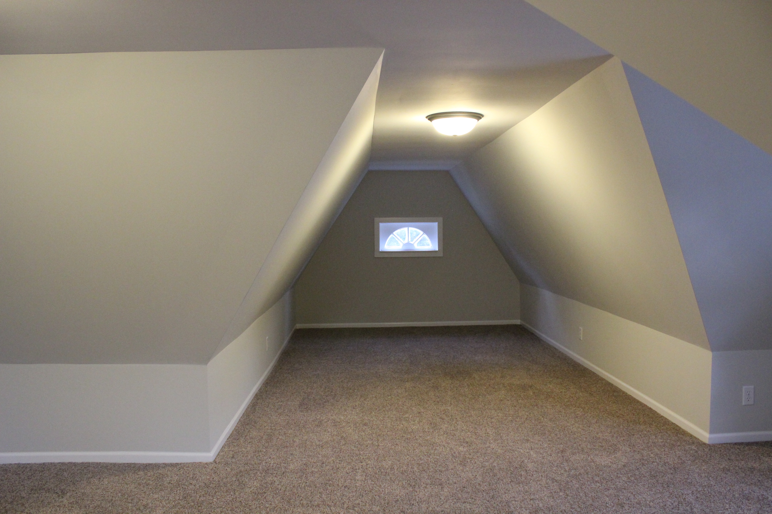
Upstairs used to be unfinished:

IMG_6944

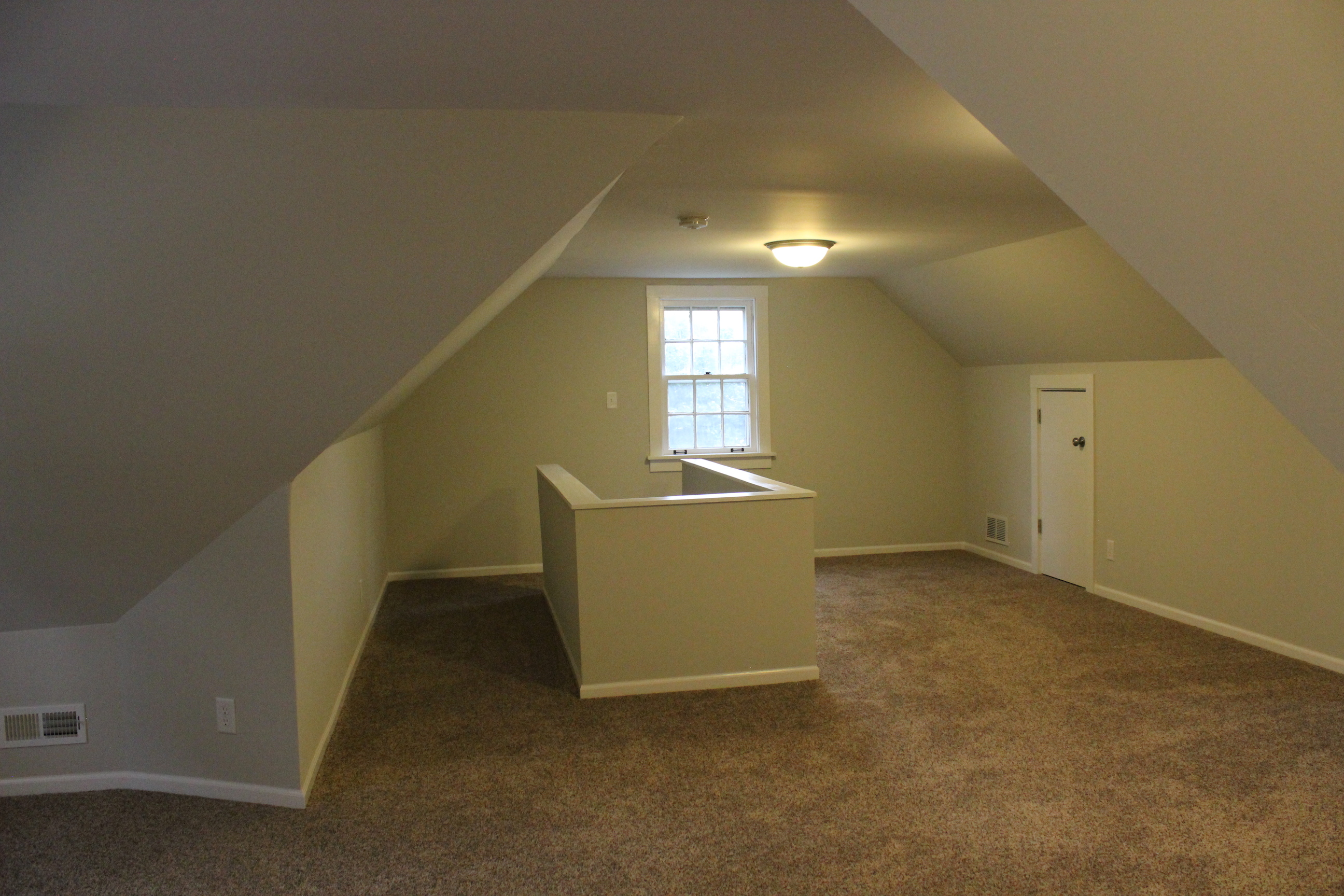
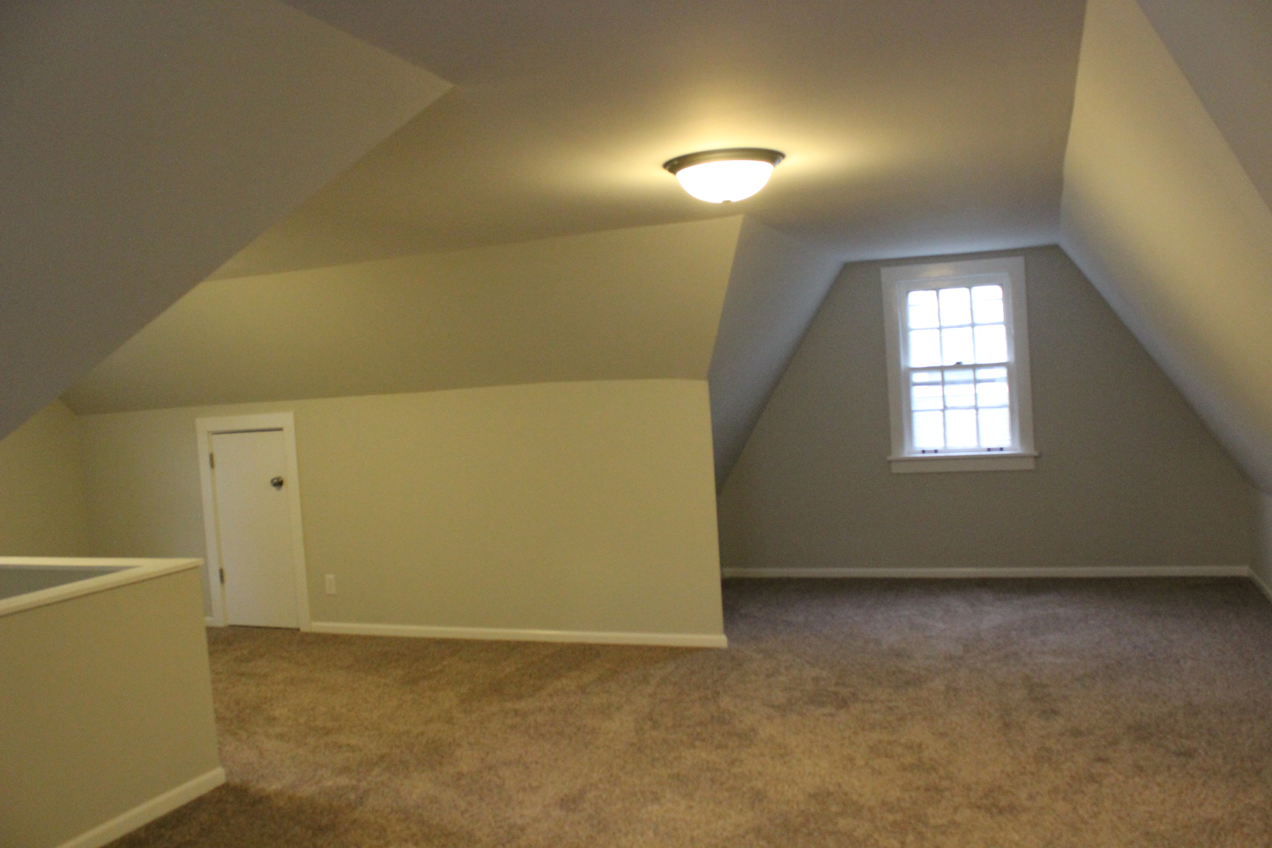
We made it into a 3rd bedroom or bonus space by adding new lighting, HVAC, carpet, paint (Gray Owl as well), baseboards, and more.

IMG_5563


IMG_5564

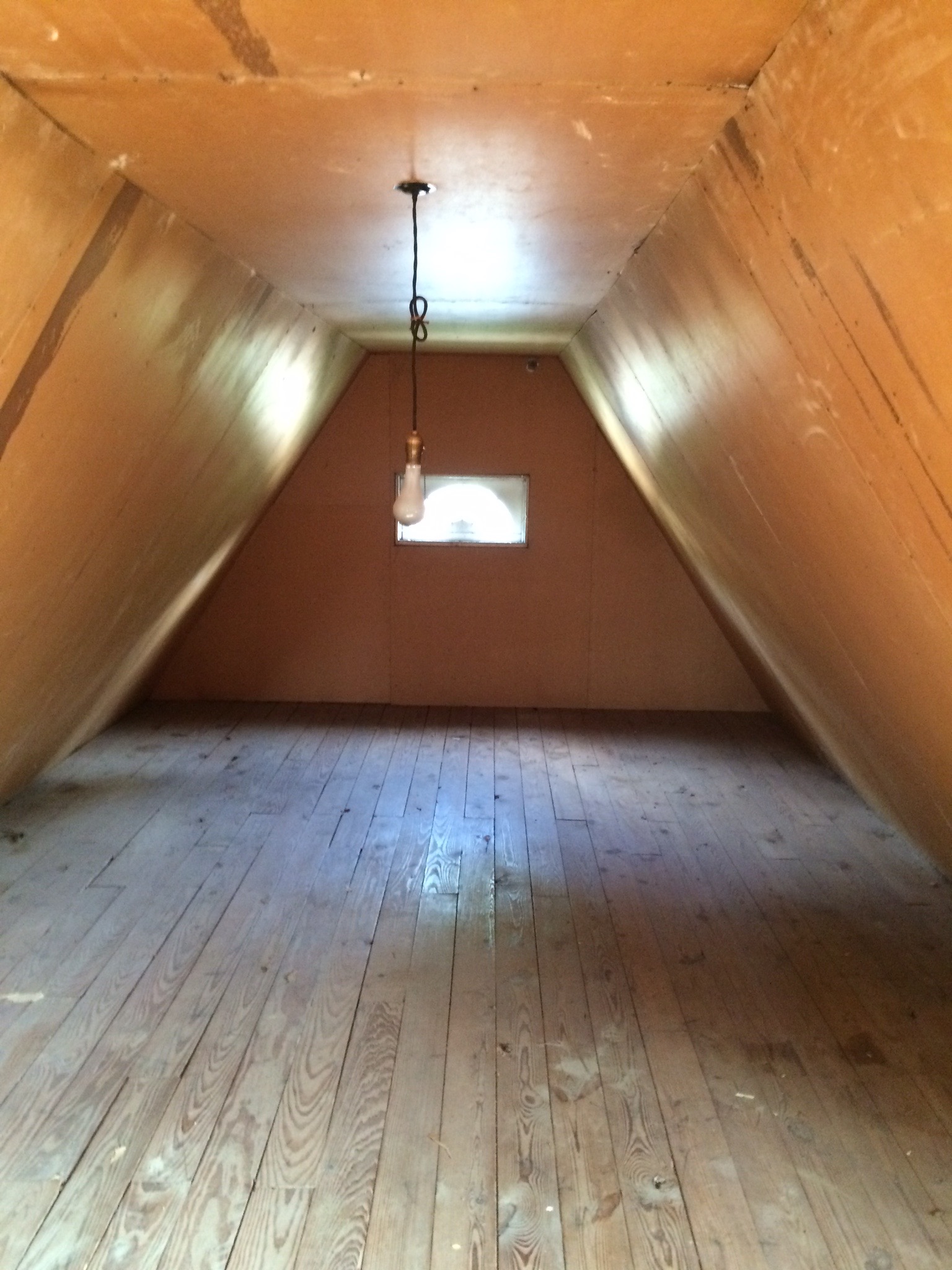
It is a huge space and nearly doubles the square footage of the home.

Before:

IMG_6943

After:

IMG_5562


We absolutely loved bringing this old home back to life and look forward to having this income property for many, many years to come.